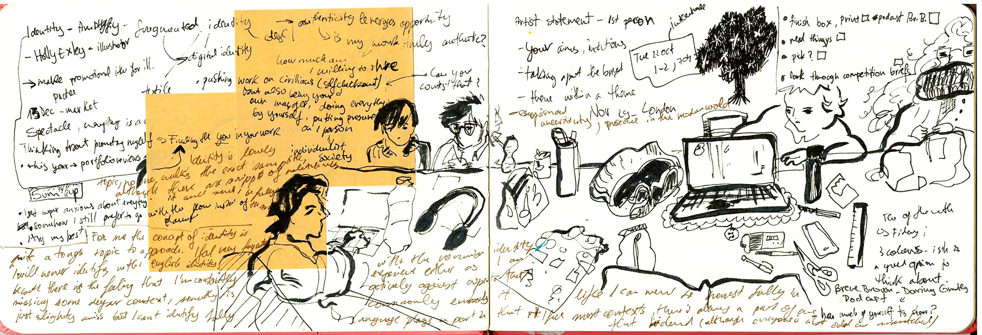
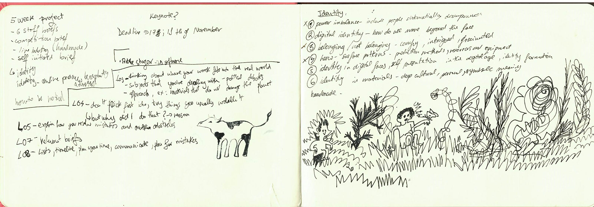


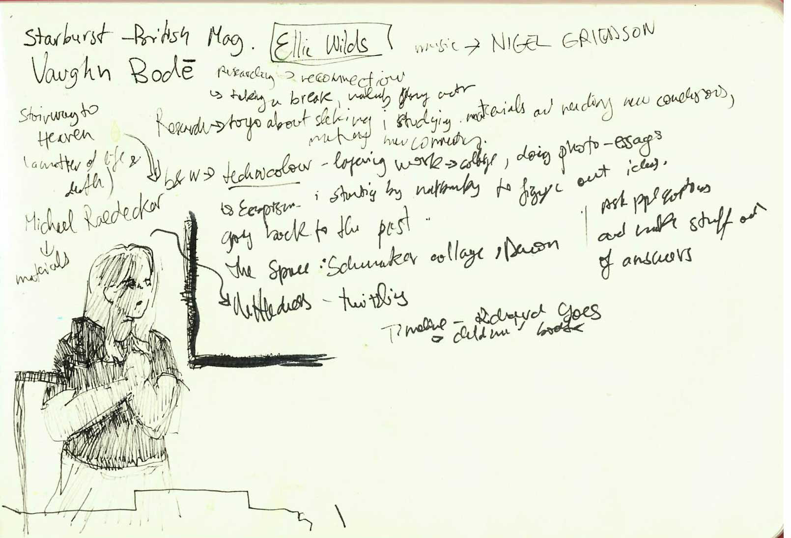
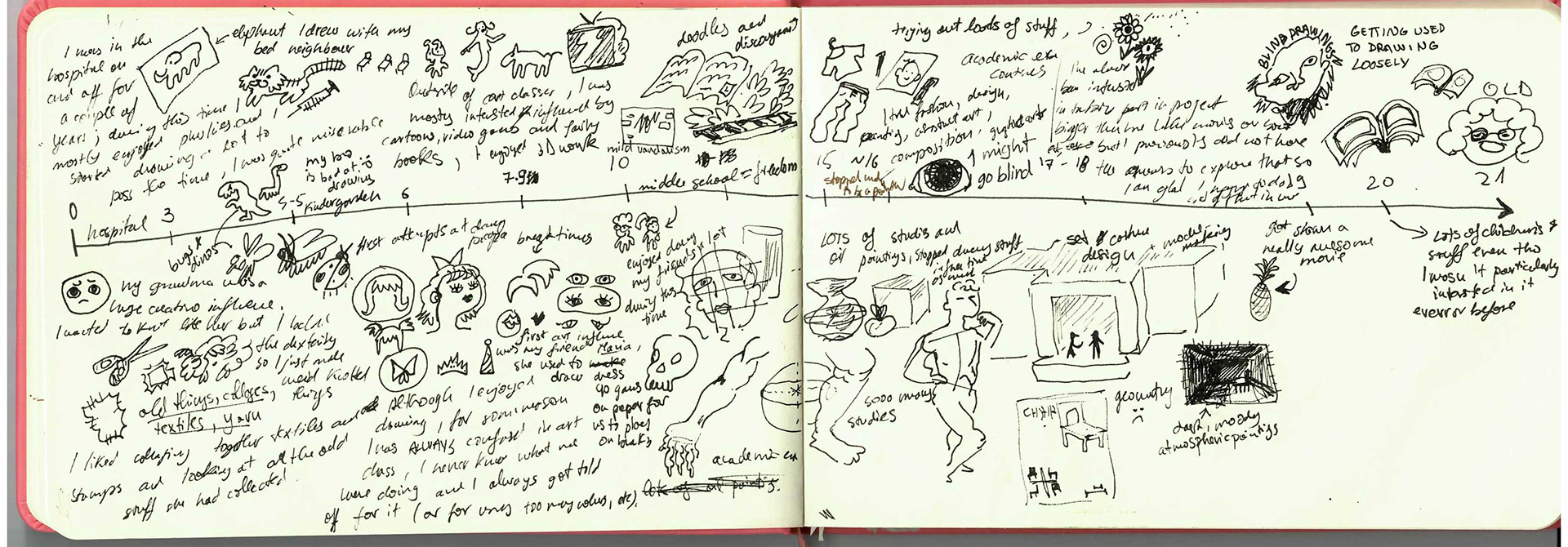
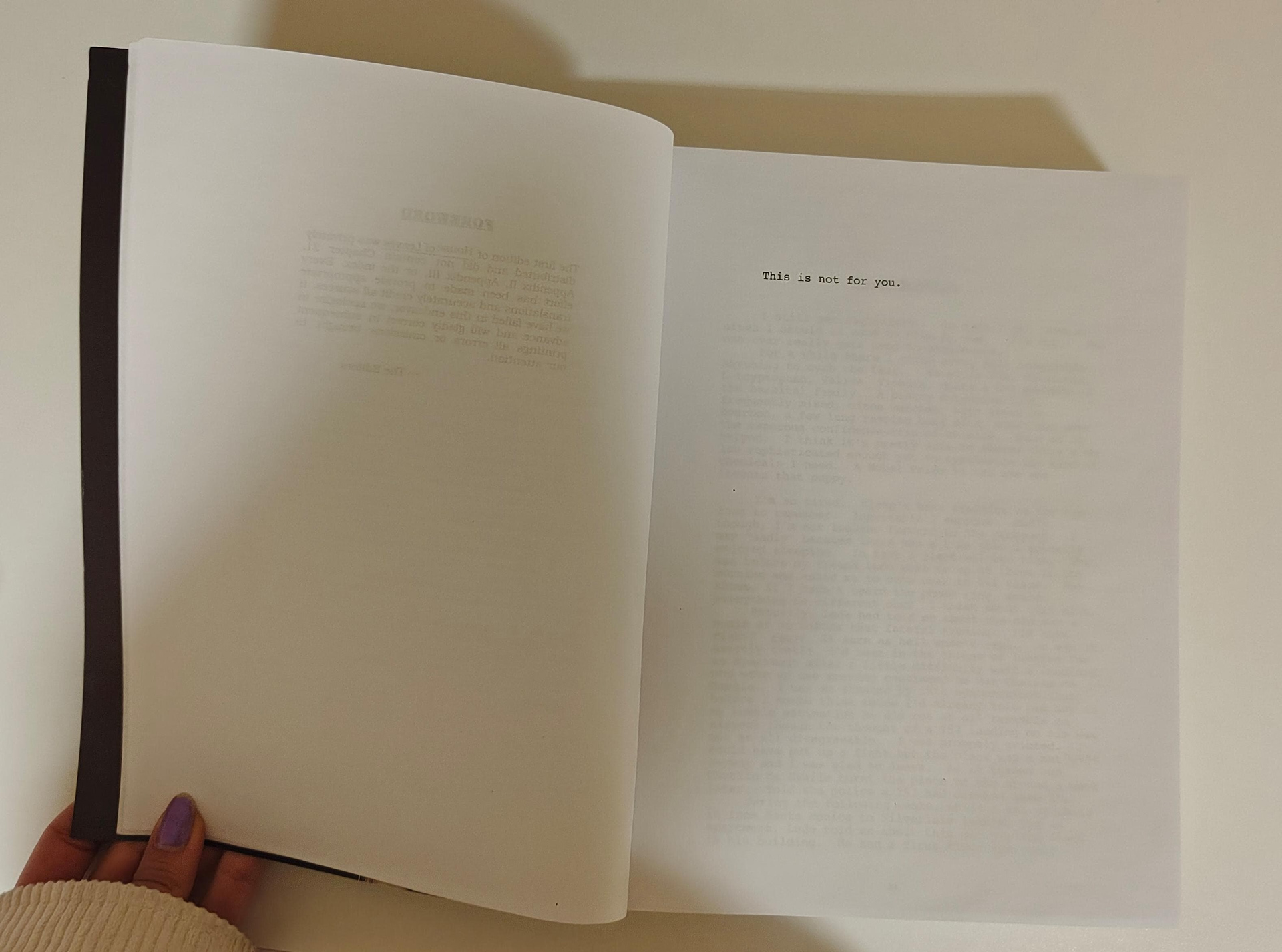
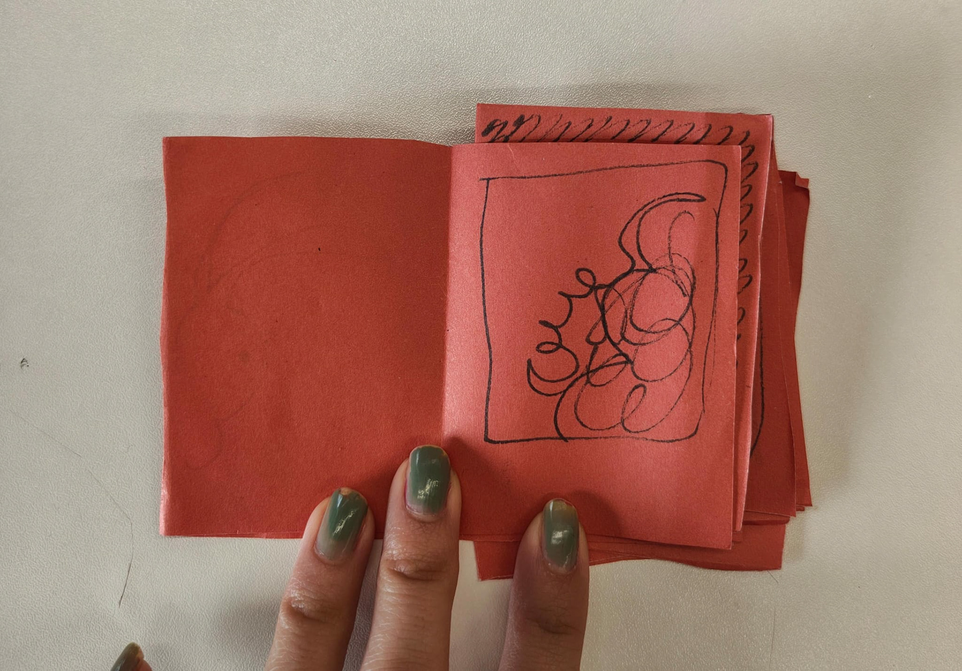
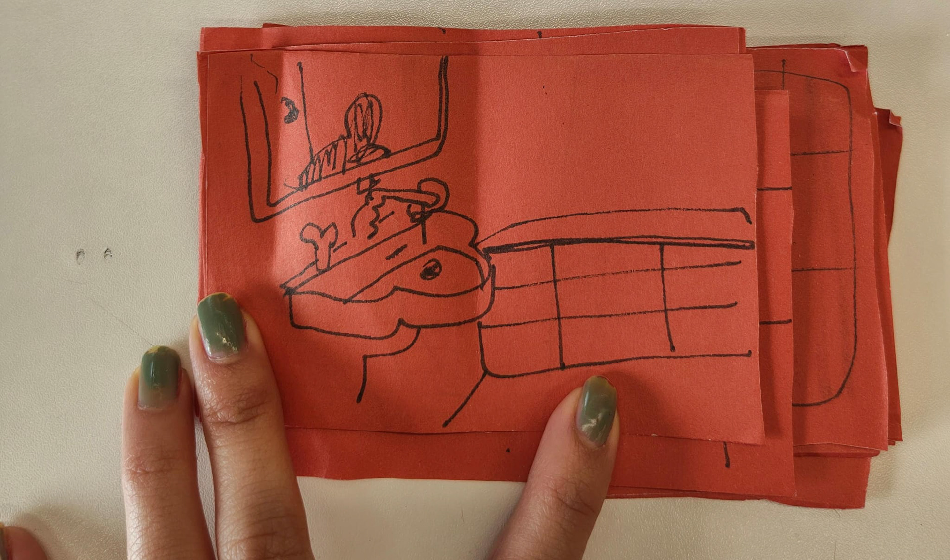
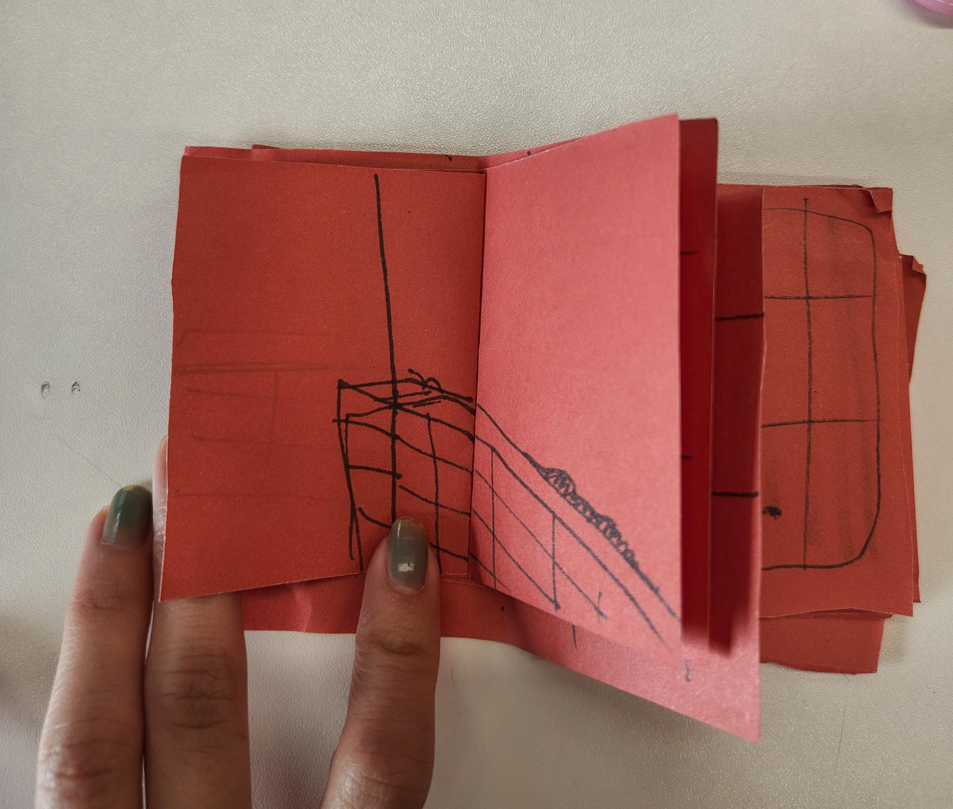
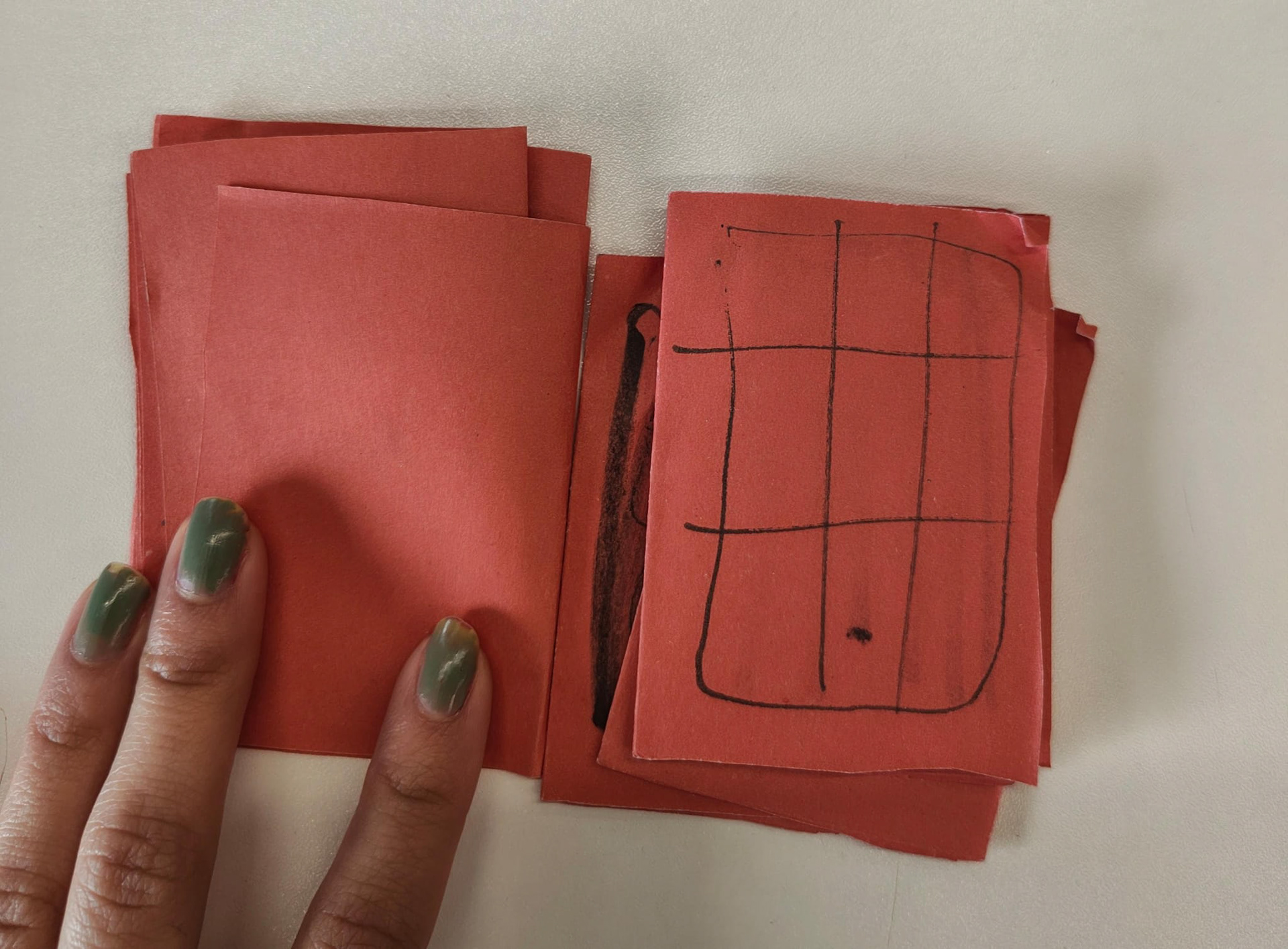
doodles


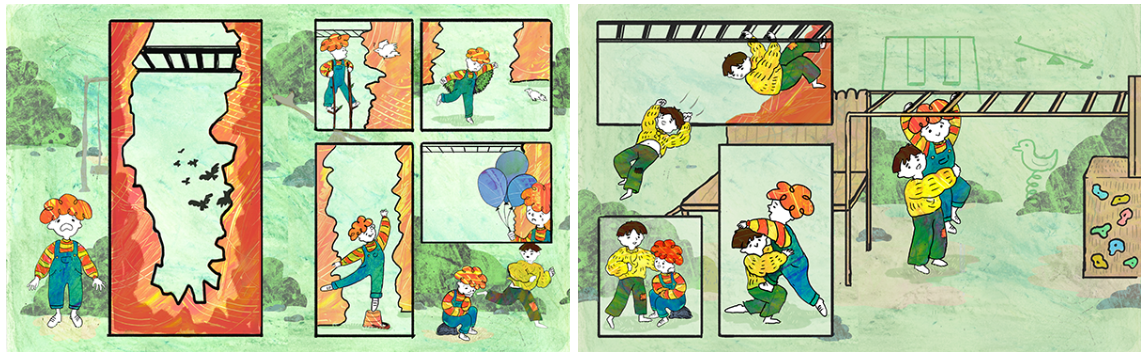
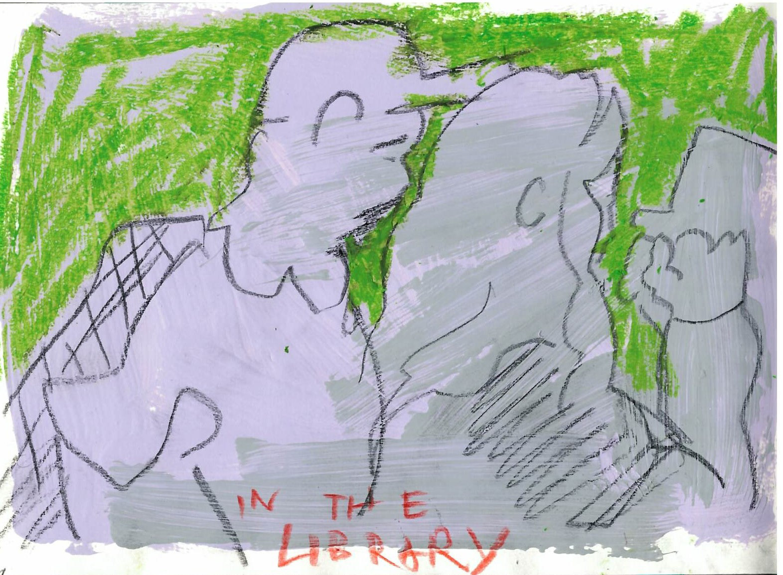
The composition of the second spread of my Anorak submission was more considered and does a better job of guiding the eyes through the page, but overall, I think both spreads feel a bit too stiff, mostly because of the way I drew the figures and the linework. I drew everything separately and pieced it together for easy editing later down the line, but I think not drawing the whole spreads as a whole also had downsides as the whole thing feels a bit too pieced-together, rather than a whole composition. Something to think about in the future: balance between making it easy for myself to make changes while not sacrificing flow.
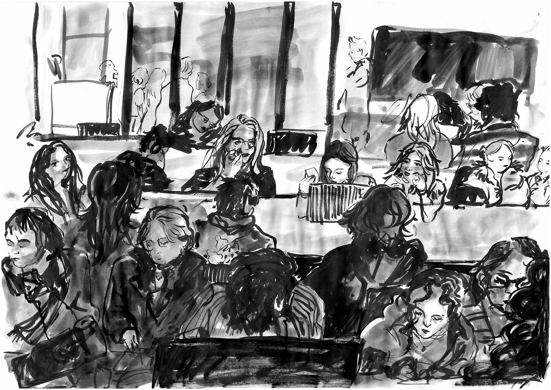
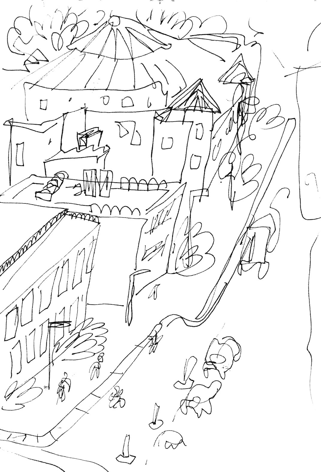
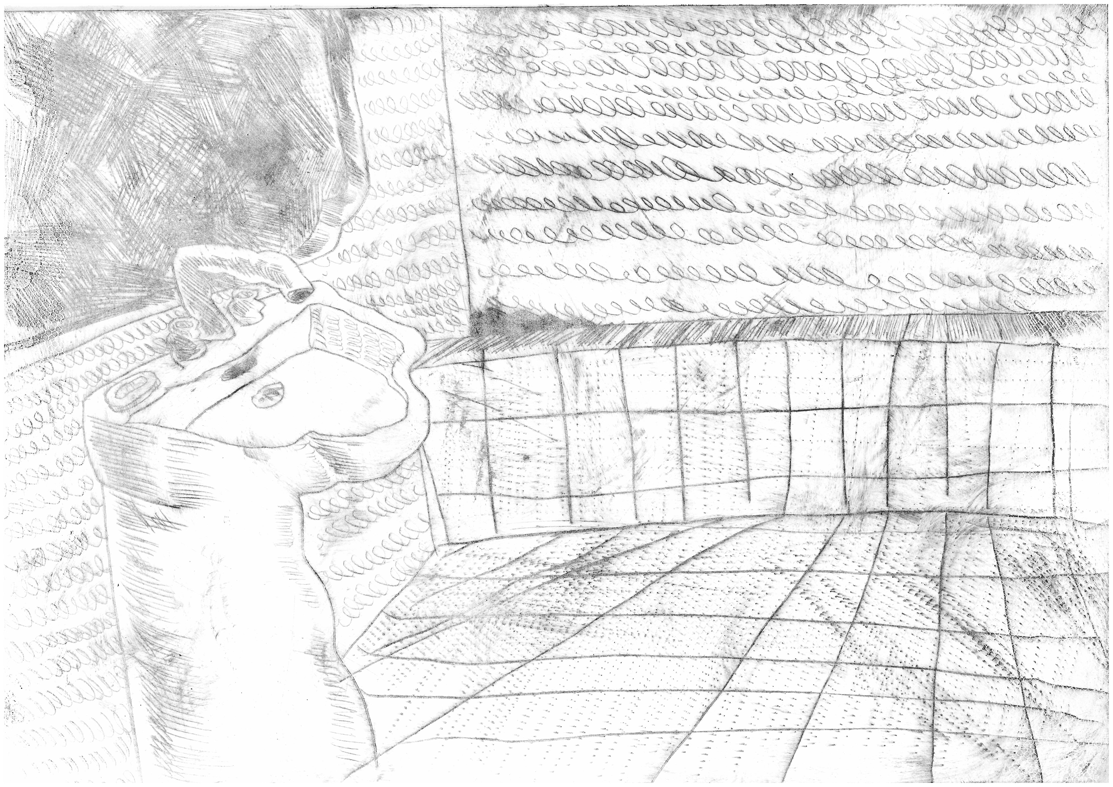
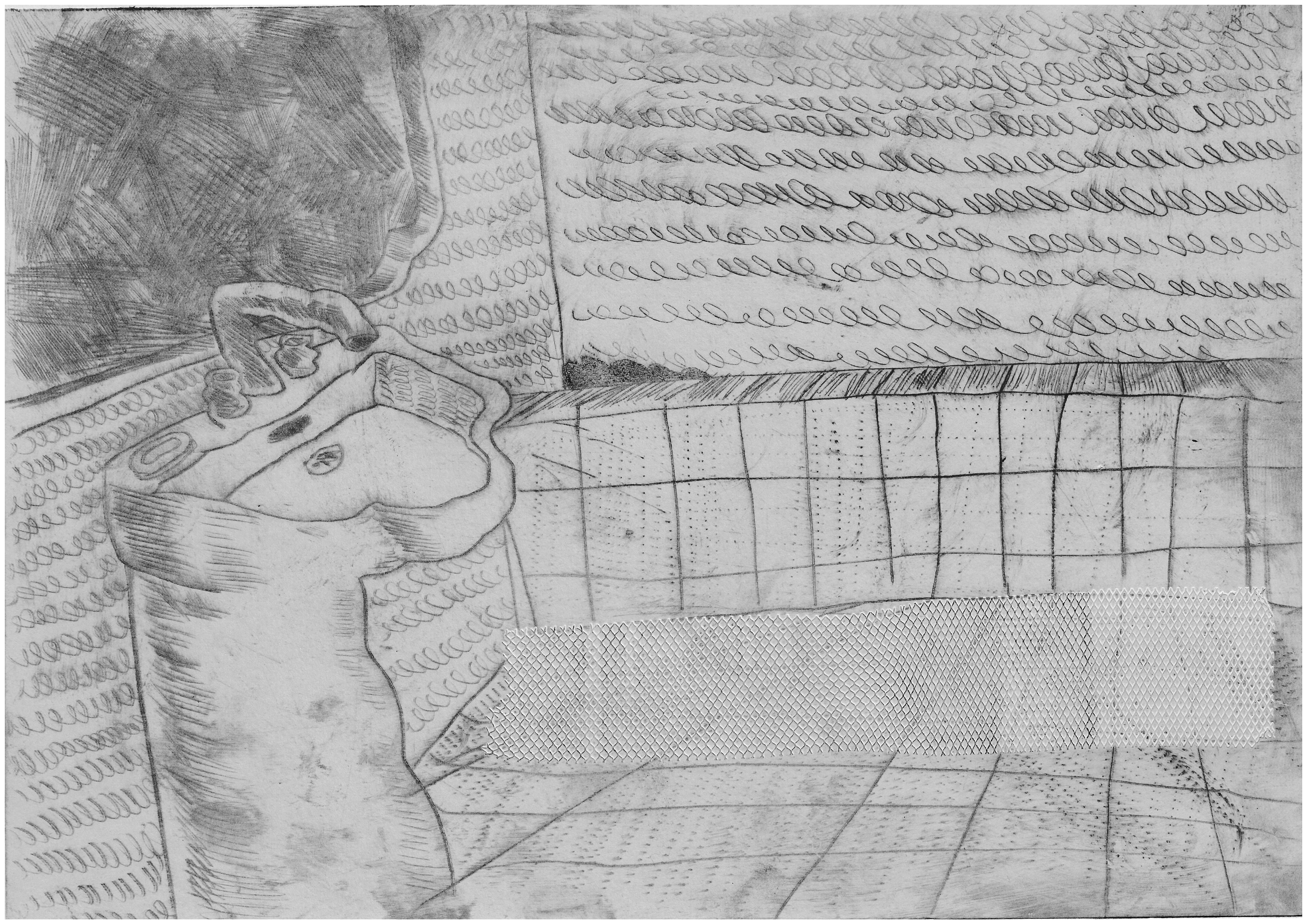
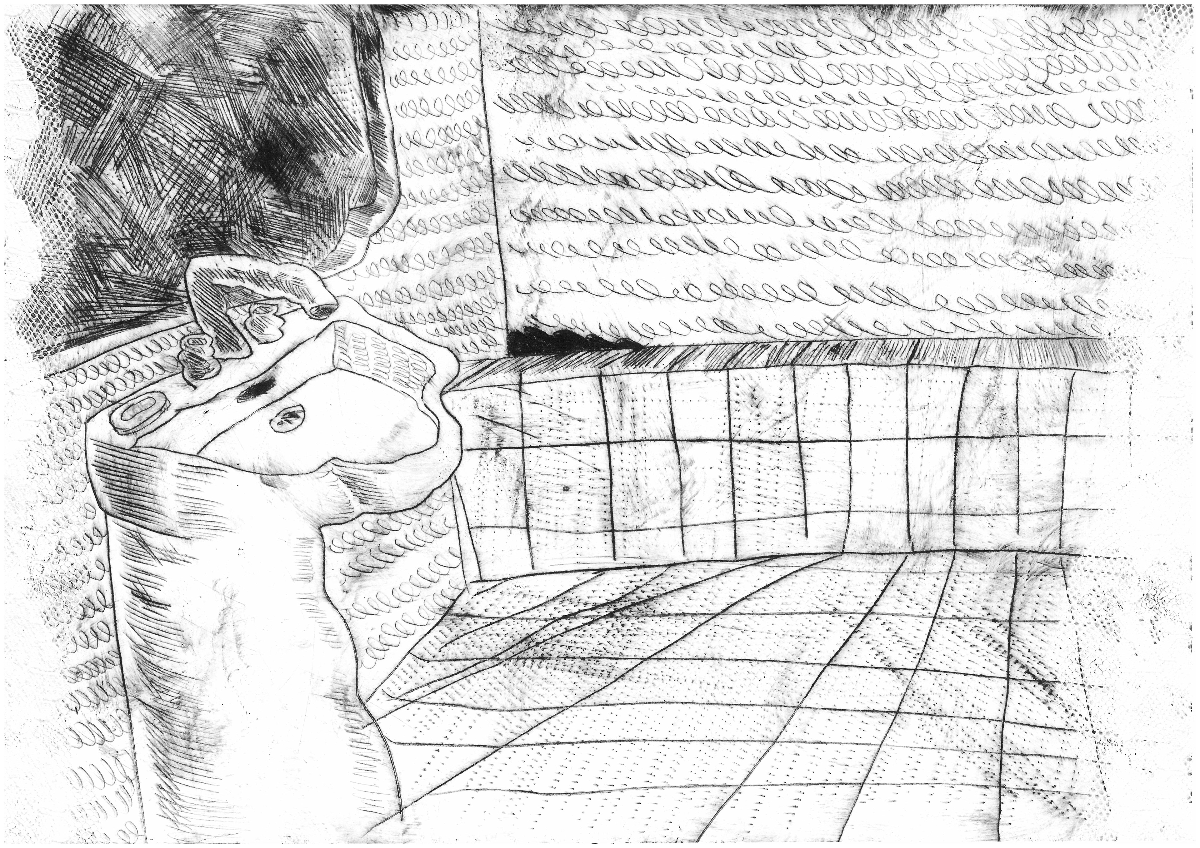
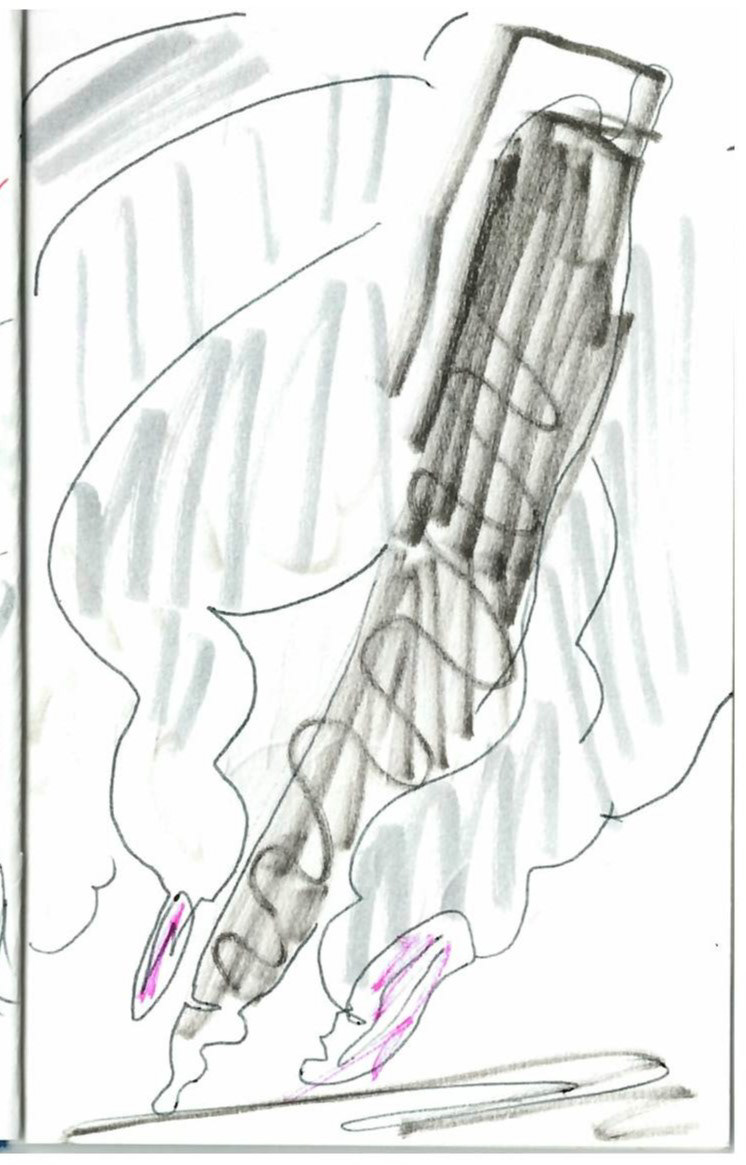
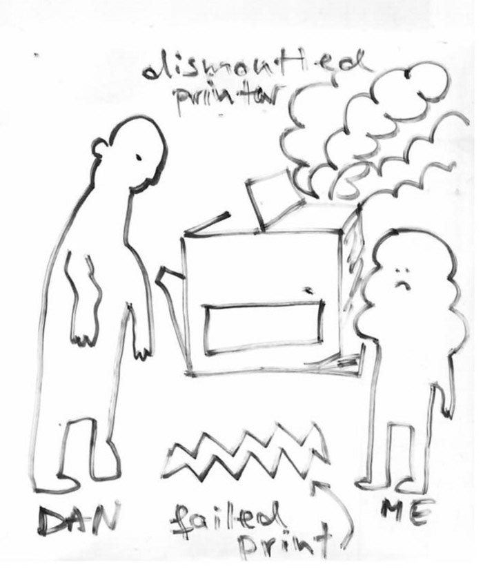
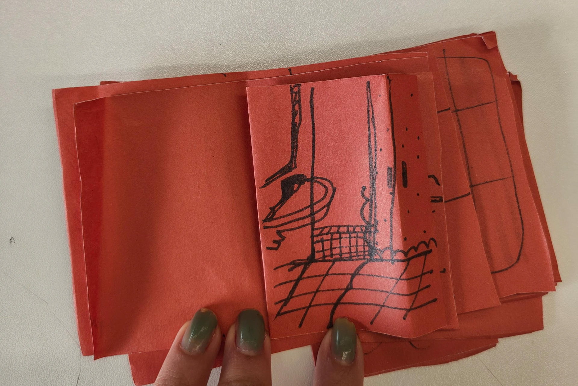
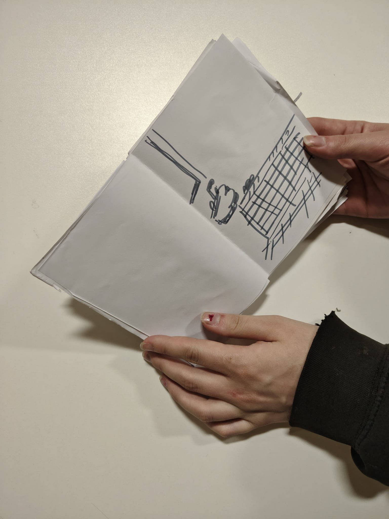
view from the corner window of room 902 - pre-tutorial pen doodle to clear my mind

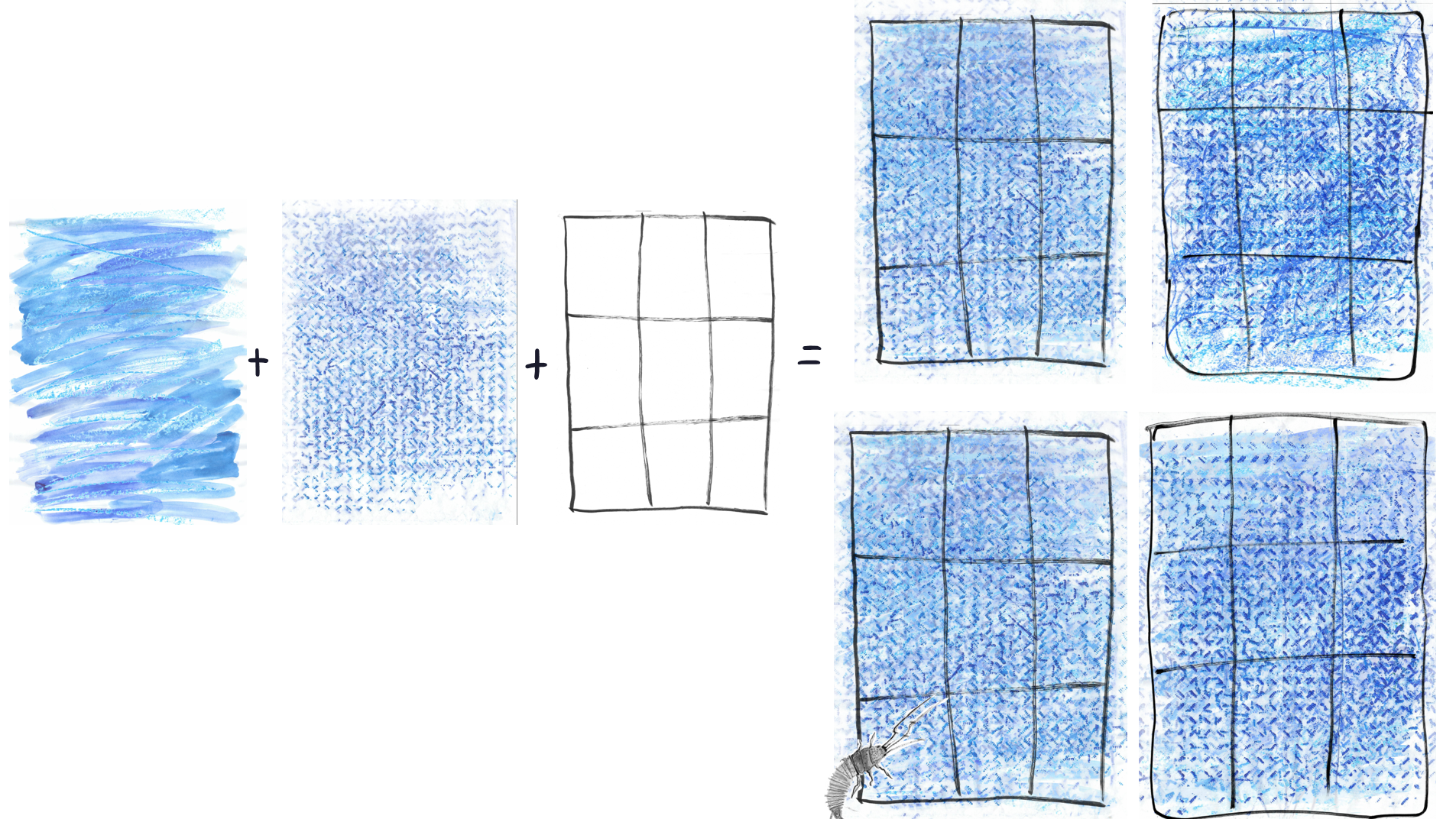
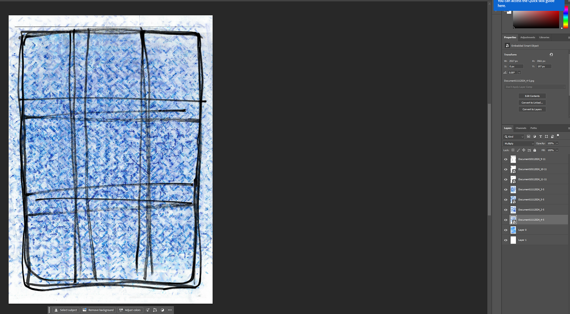
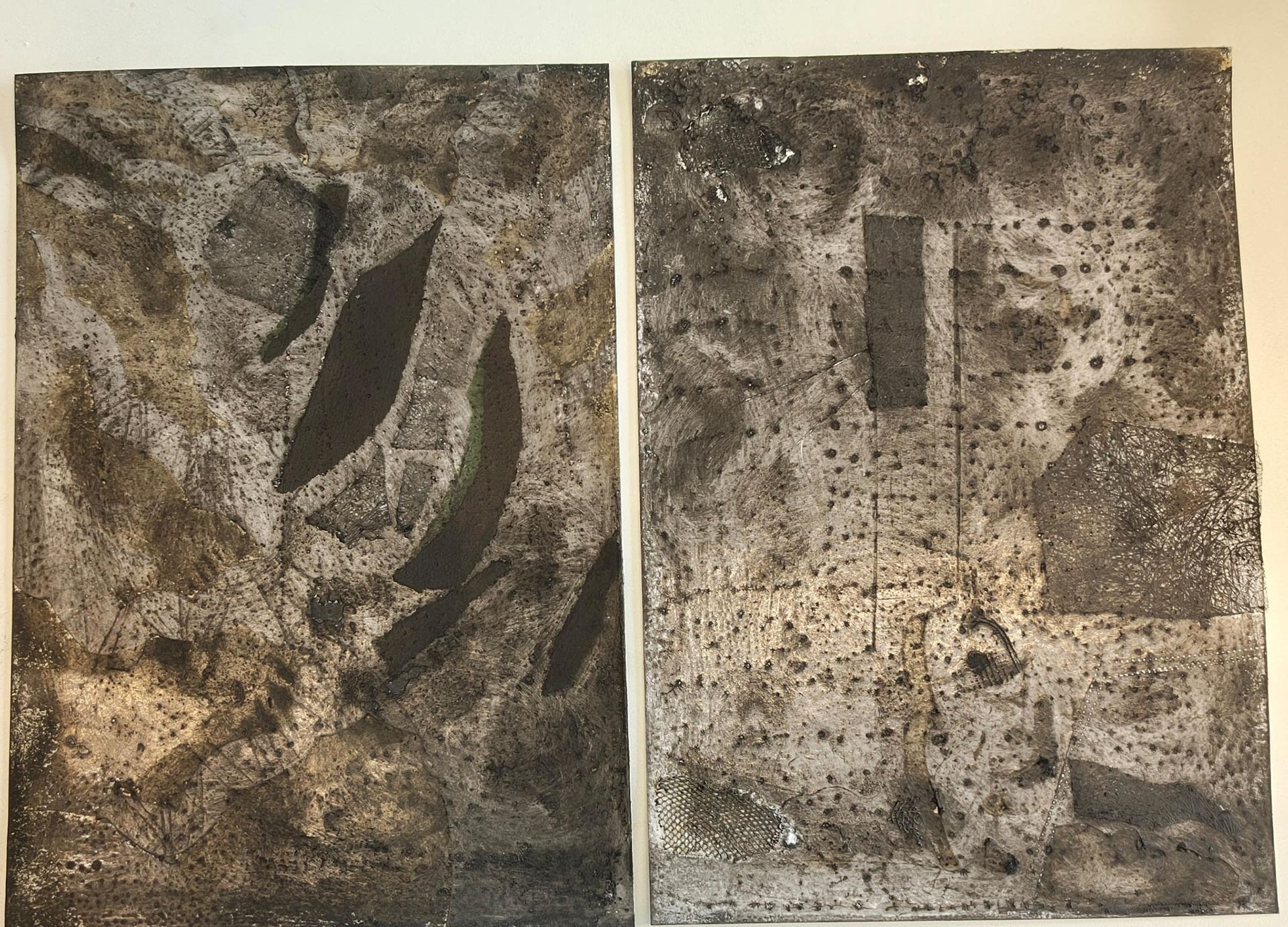
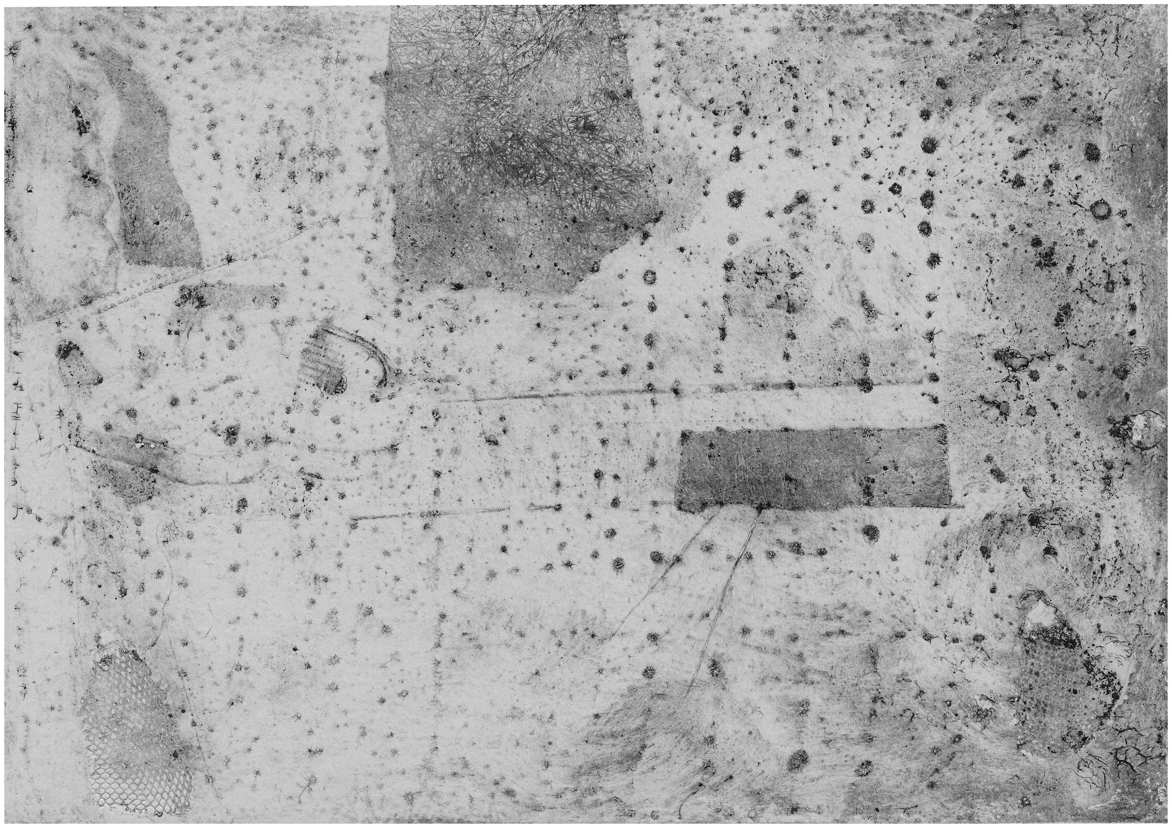
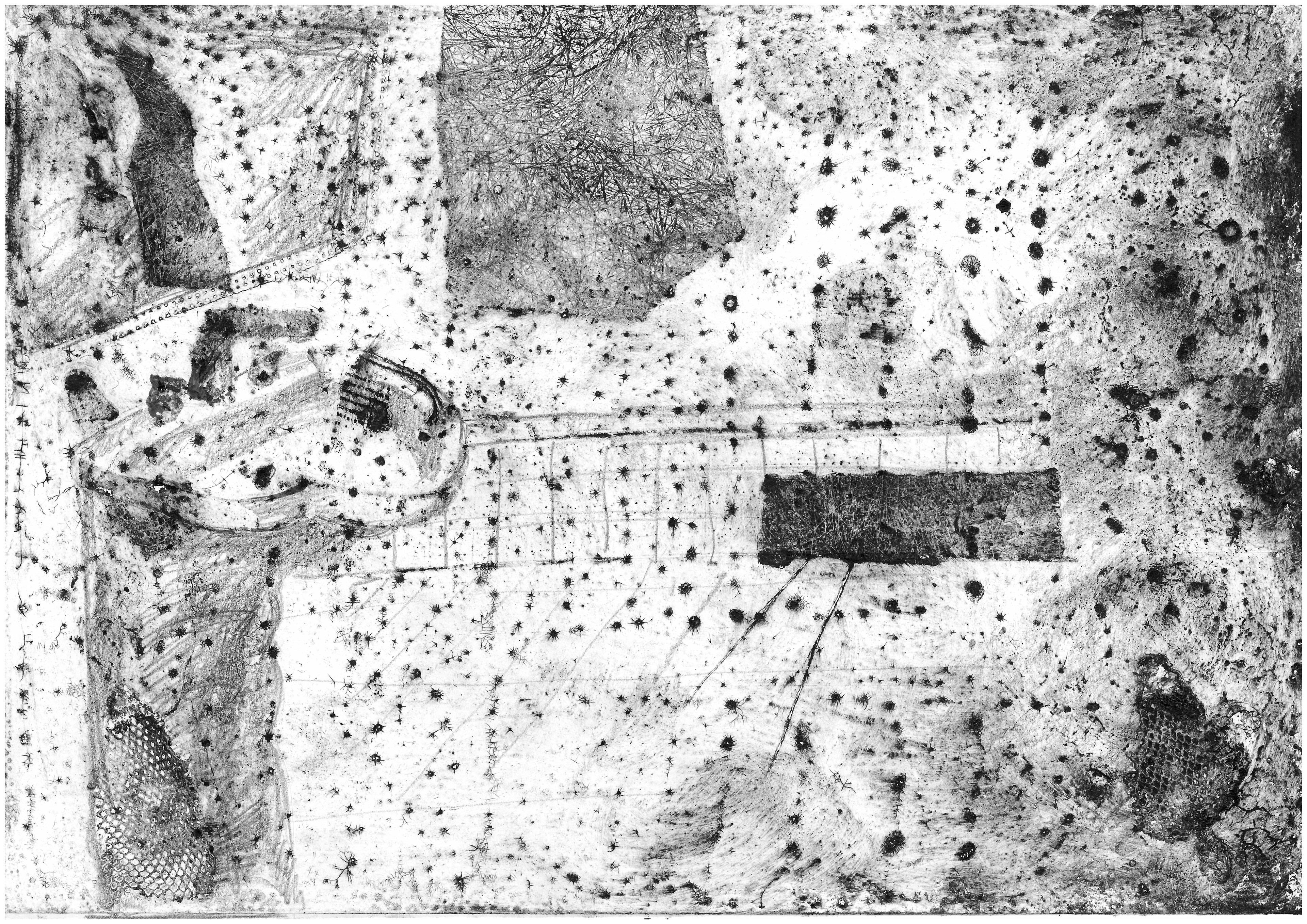
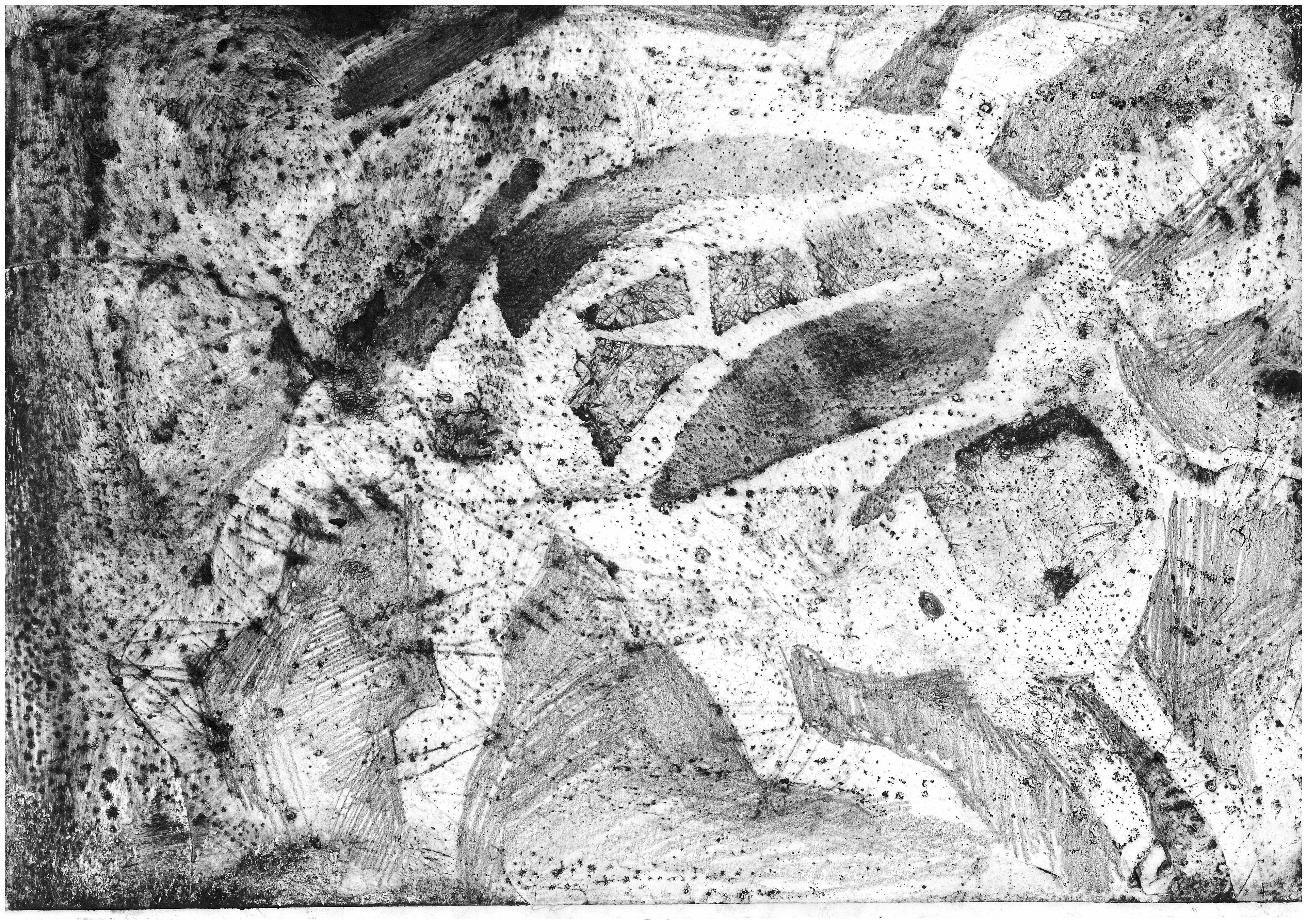
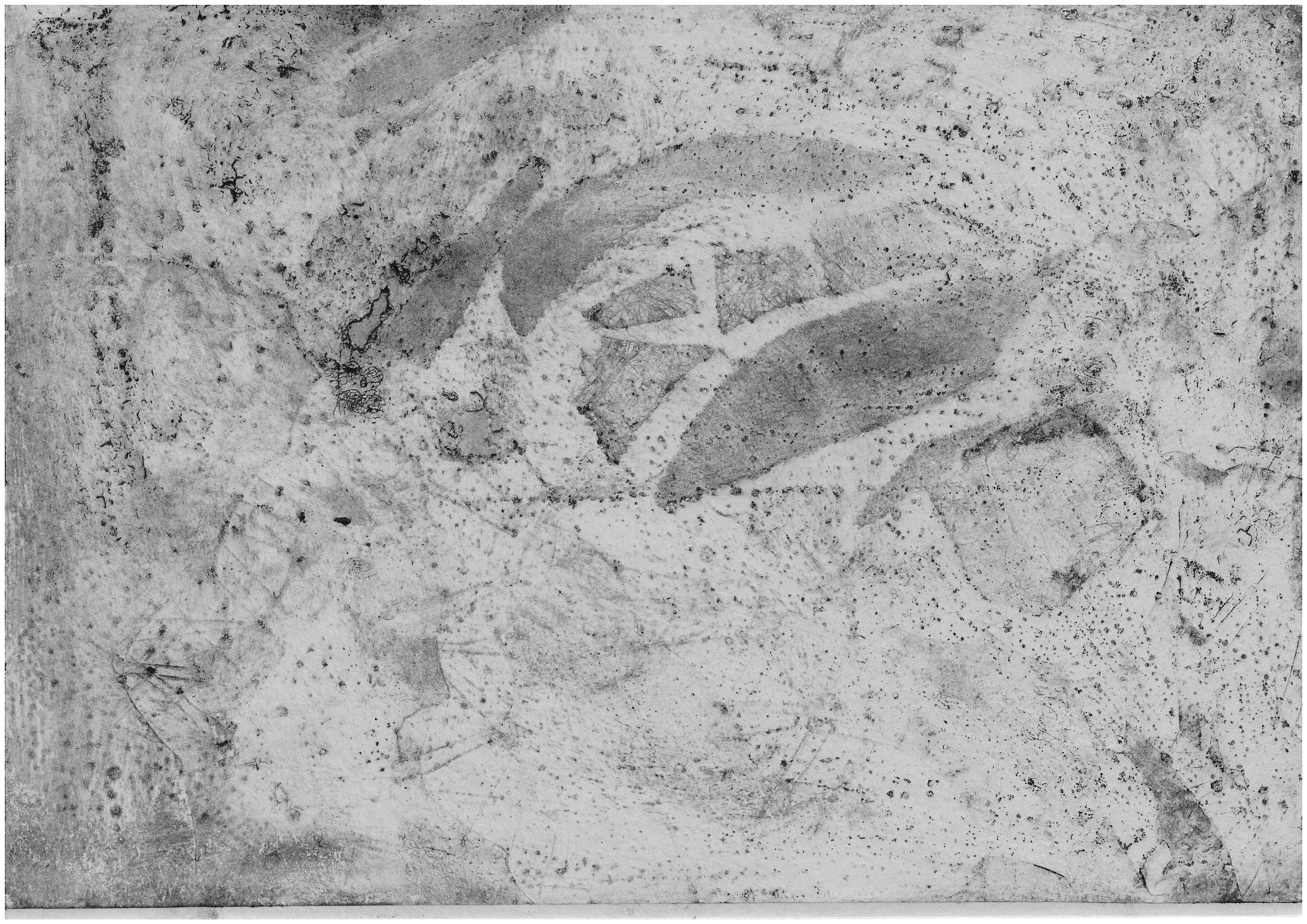
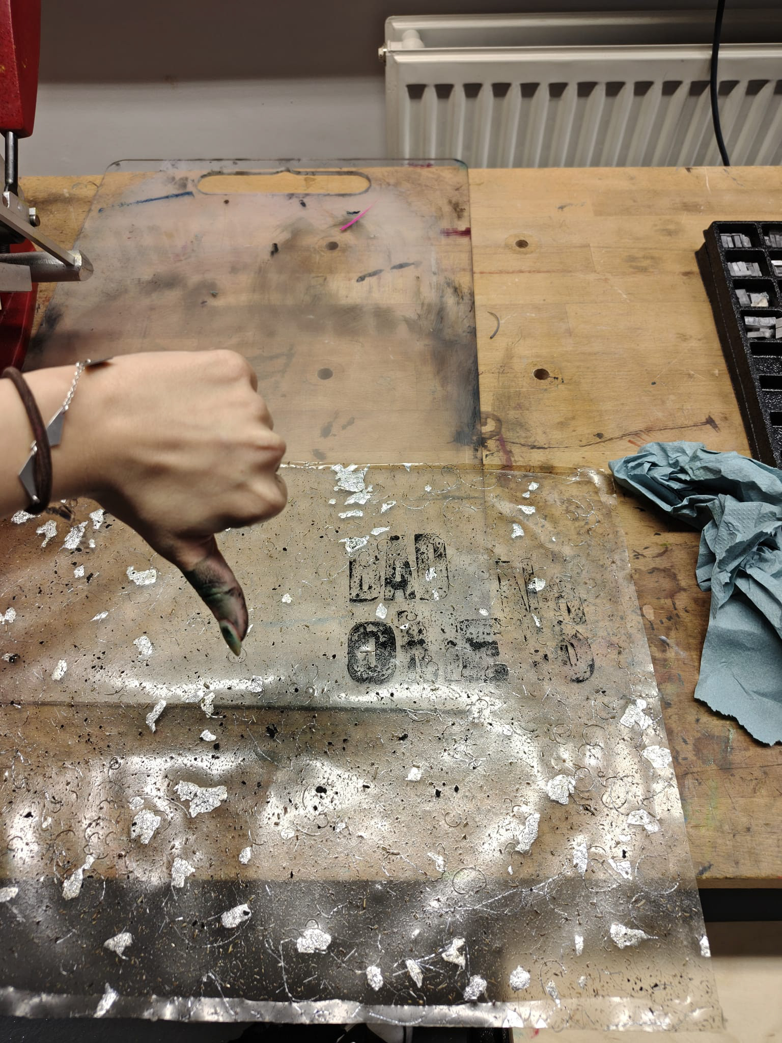
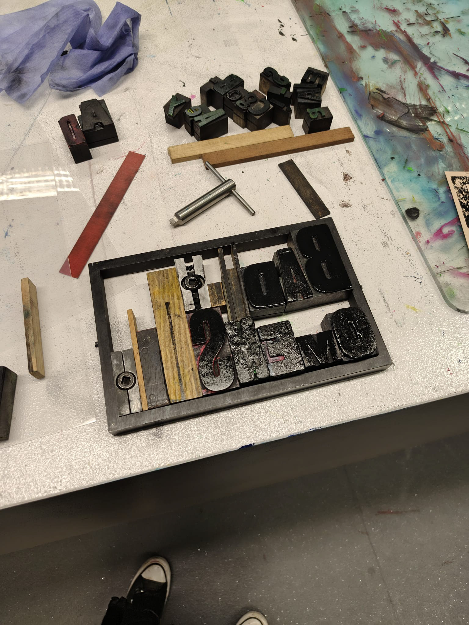
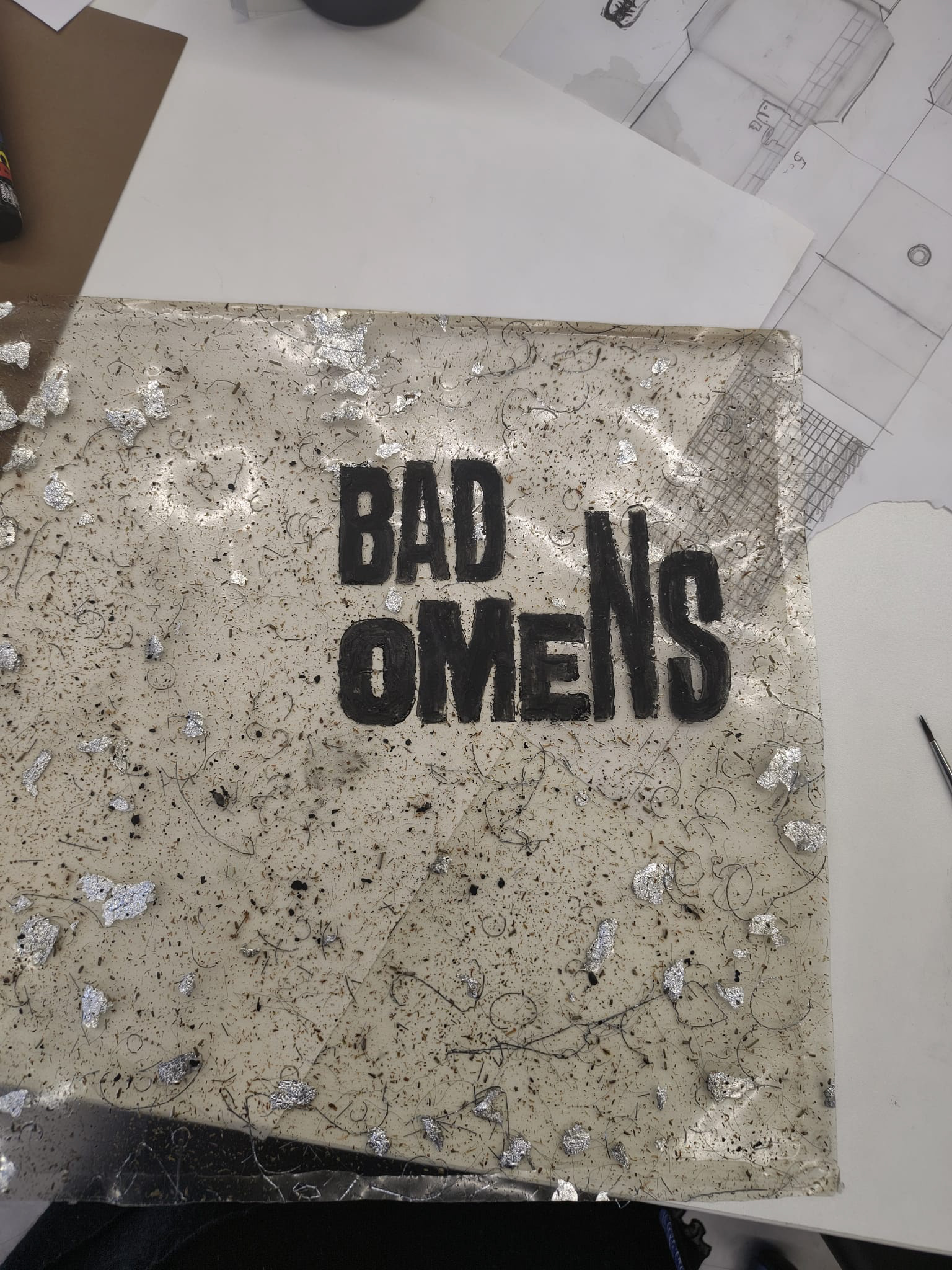
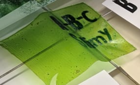
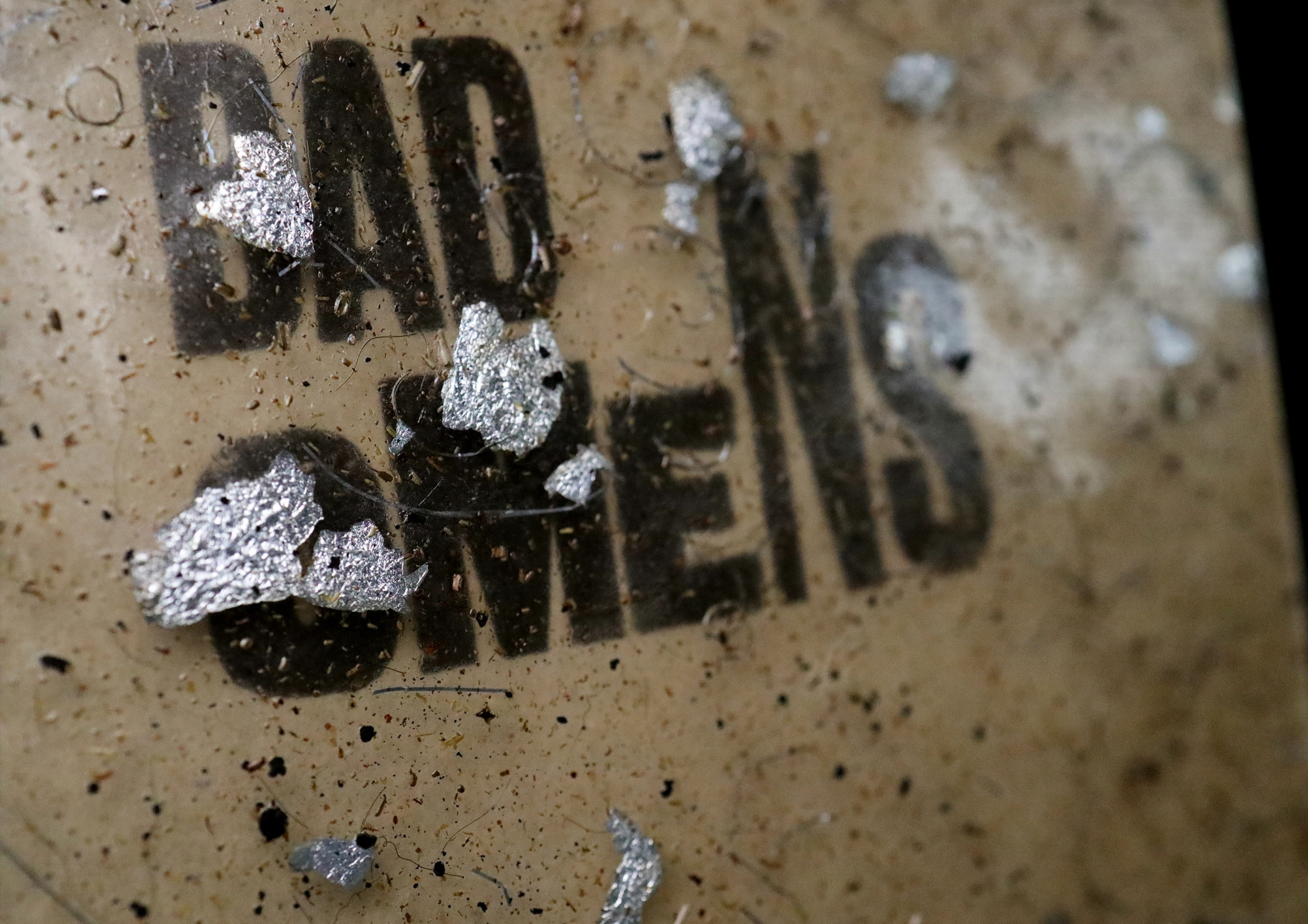
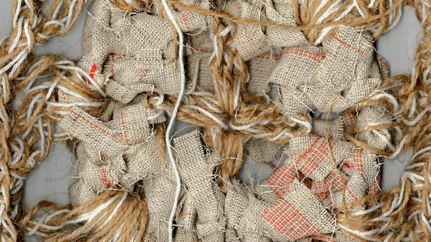
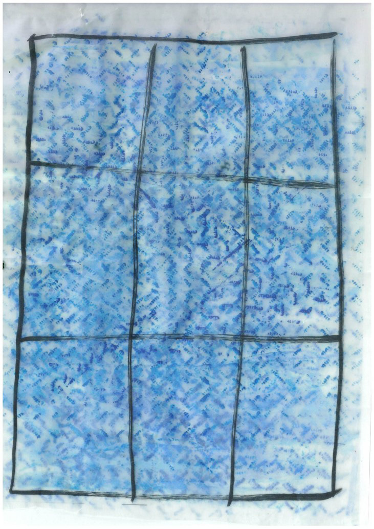
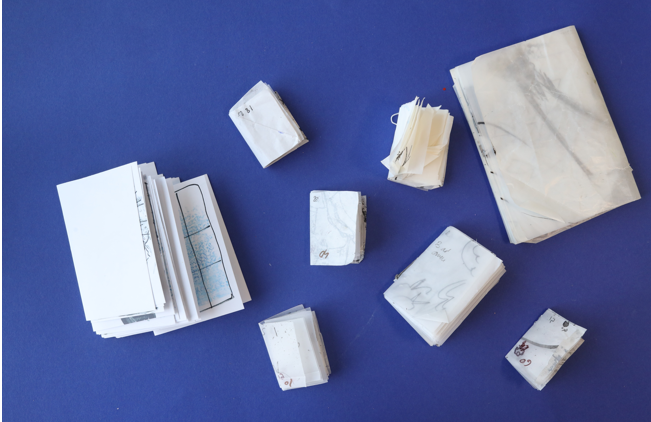
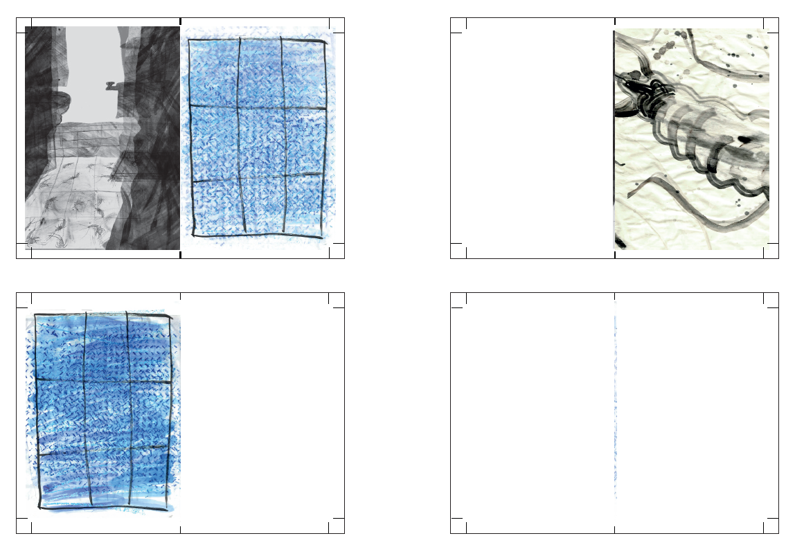
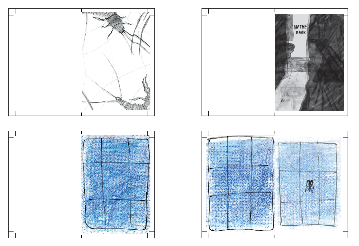
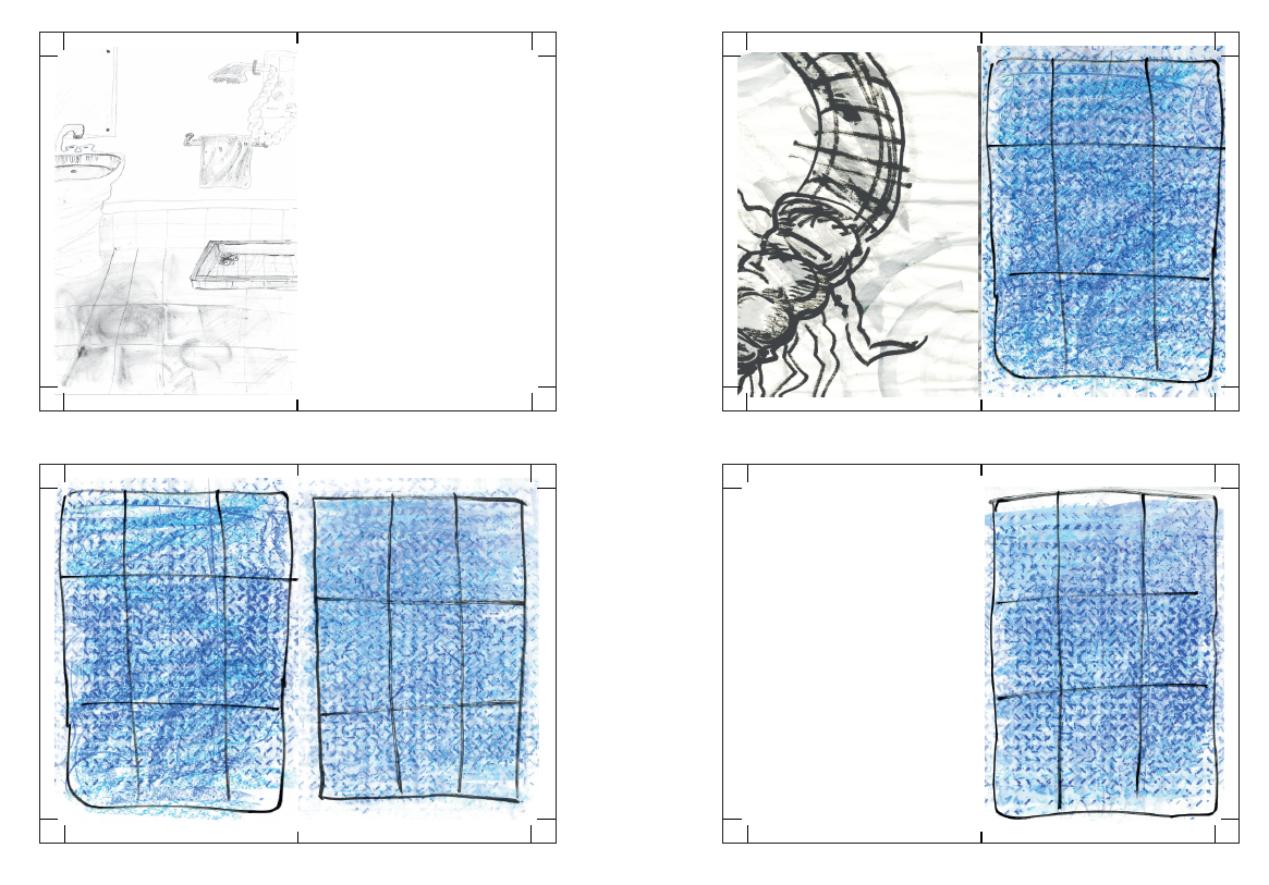
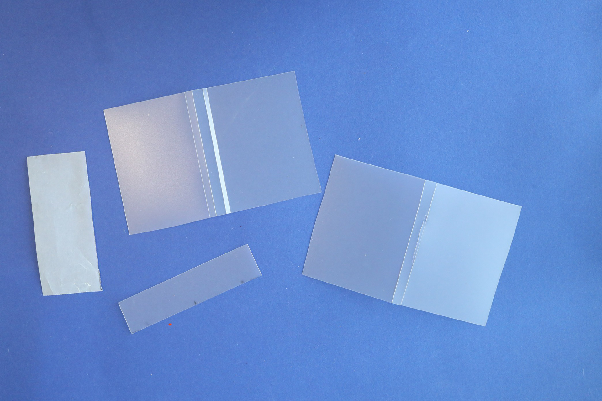
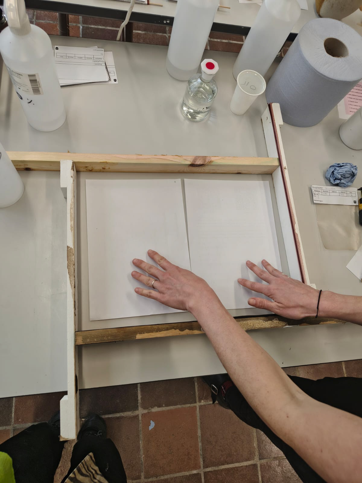
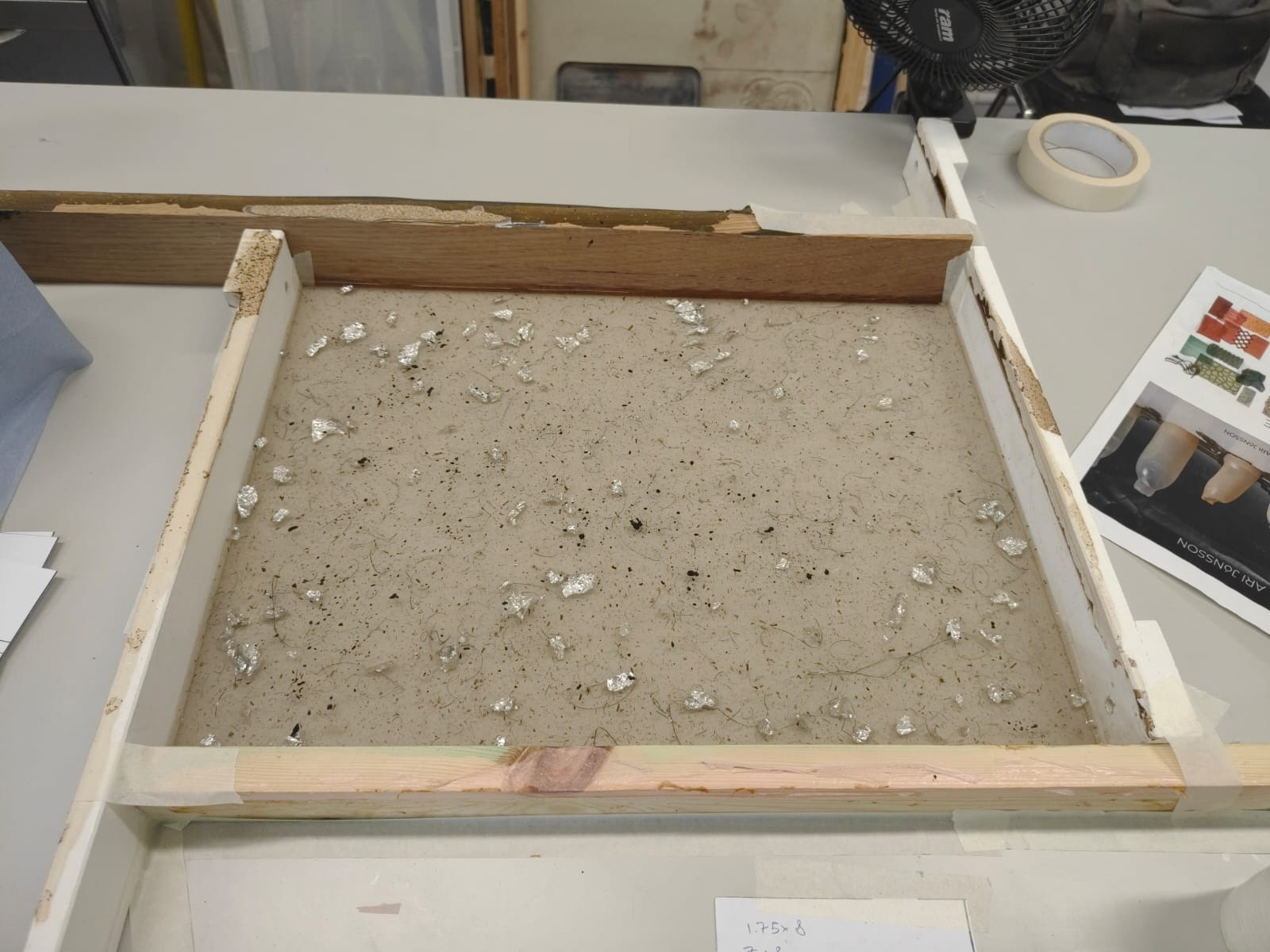
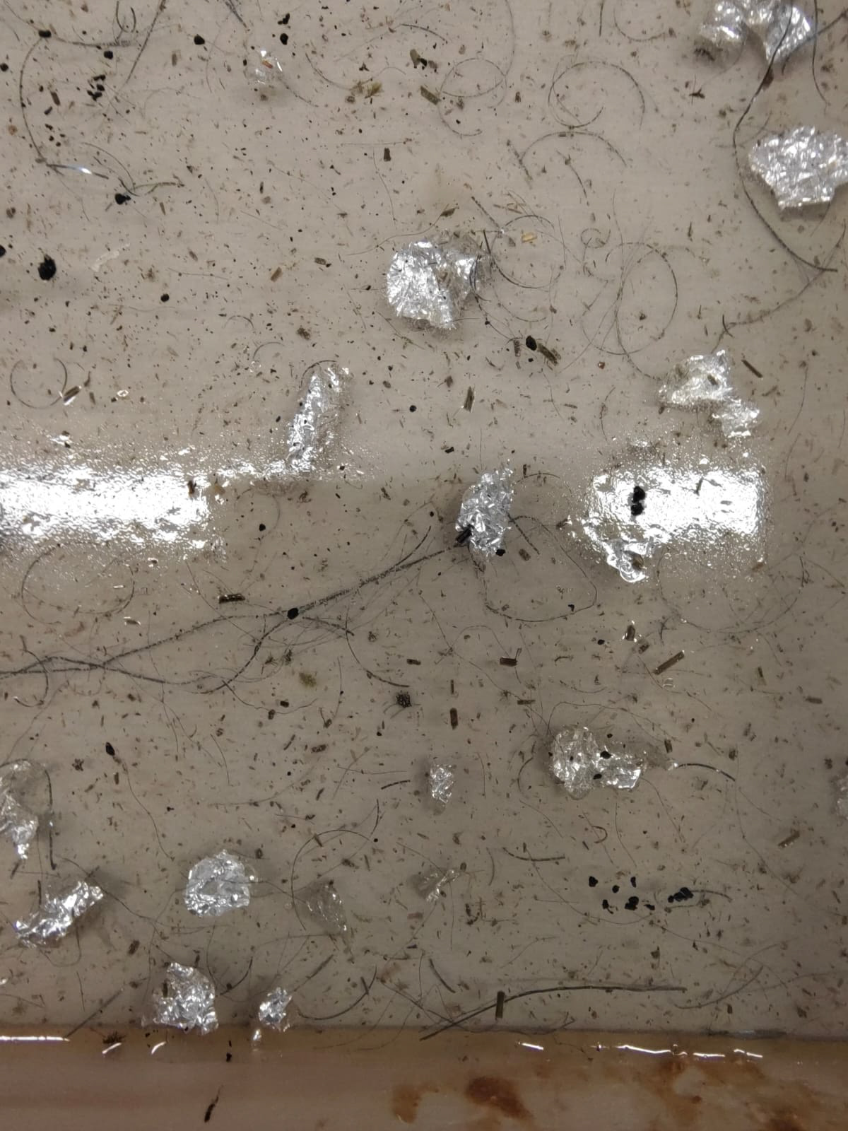
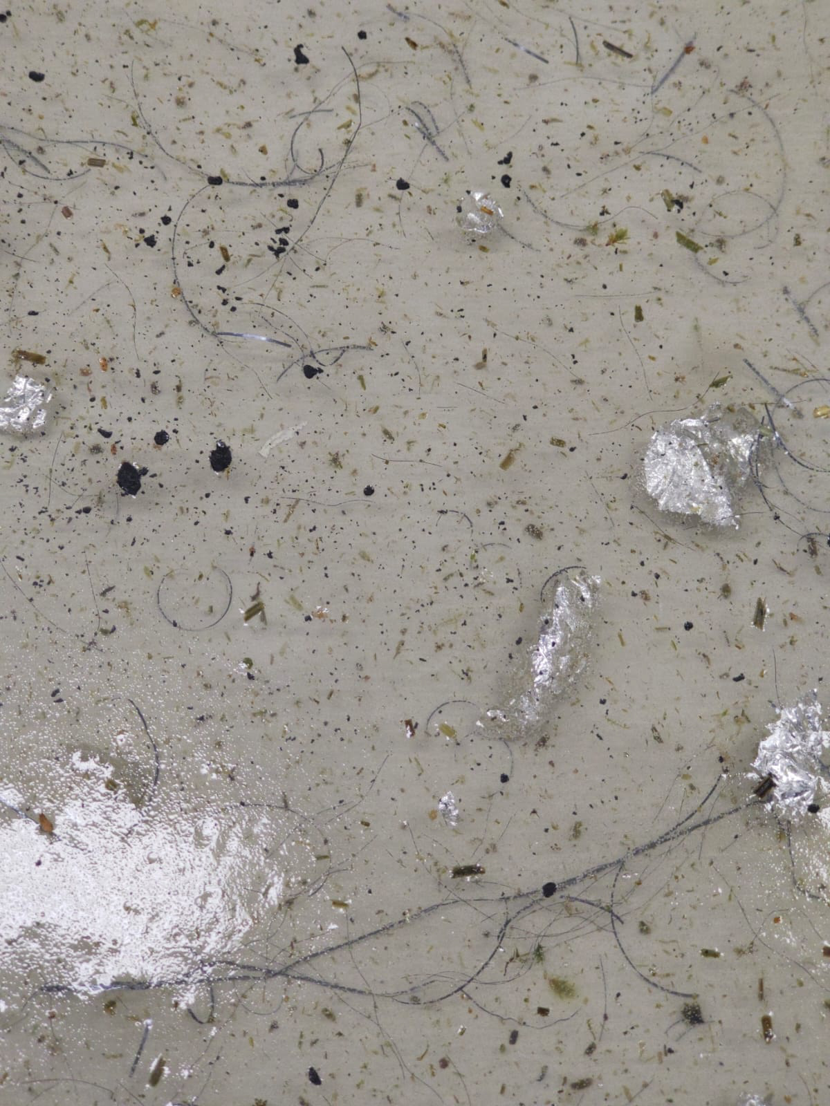
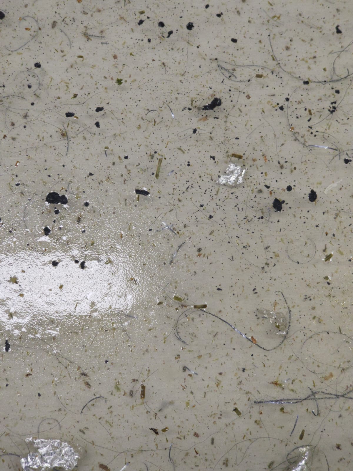
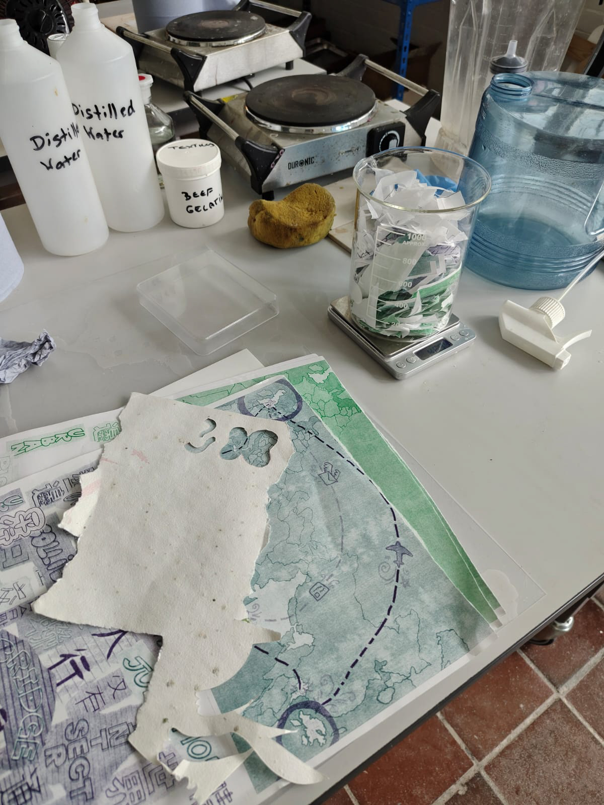
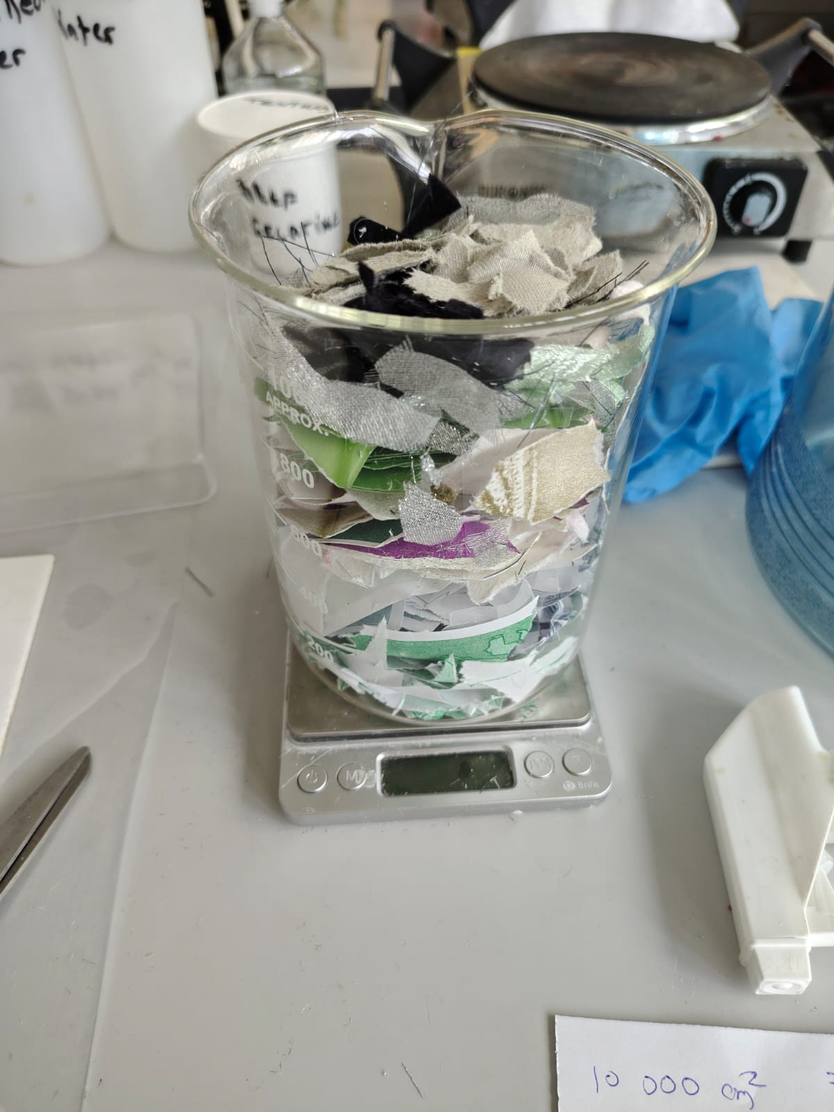
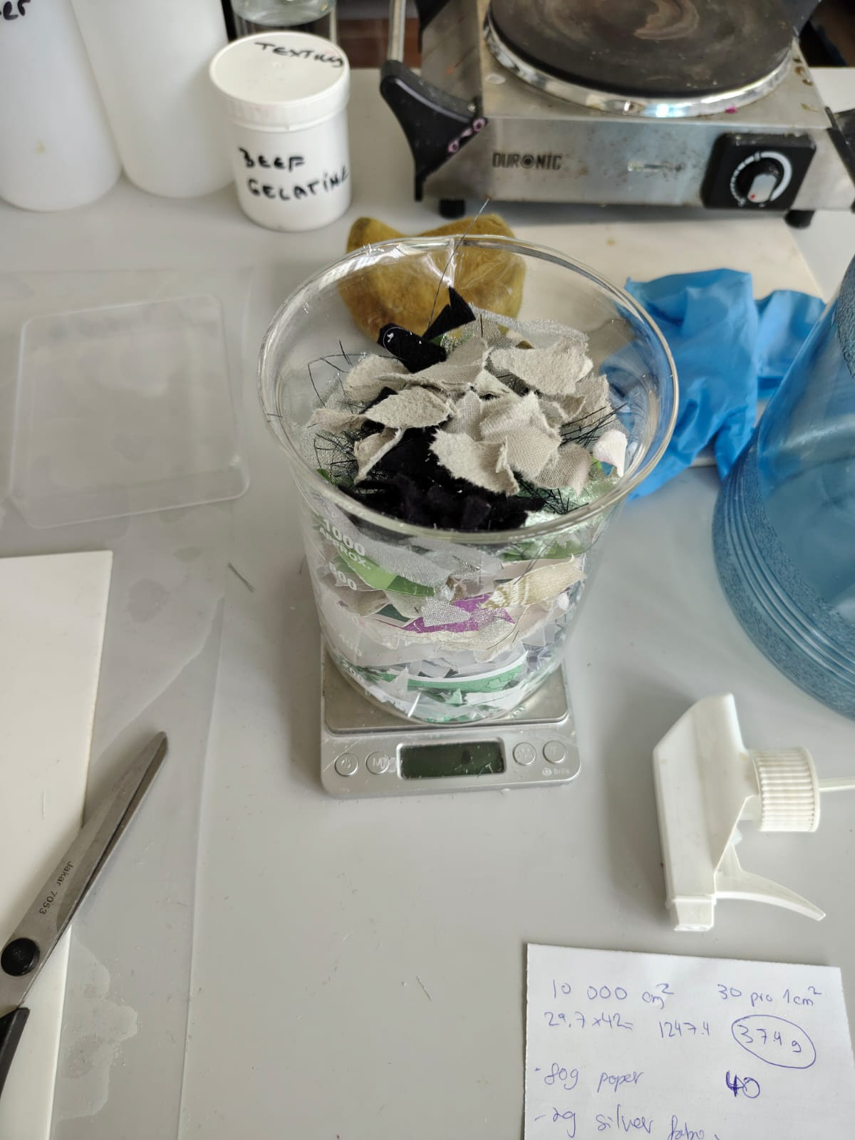
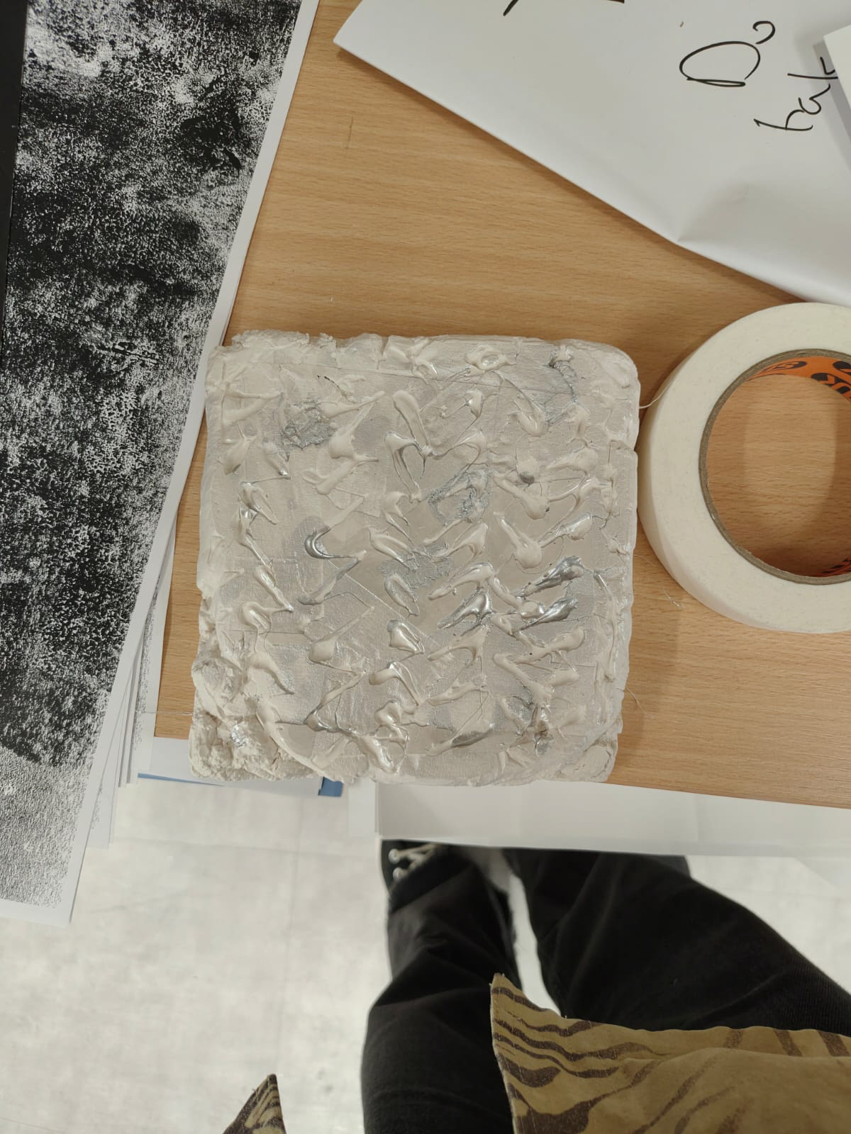
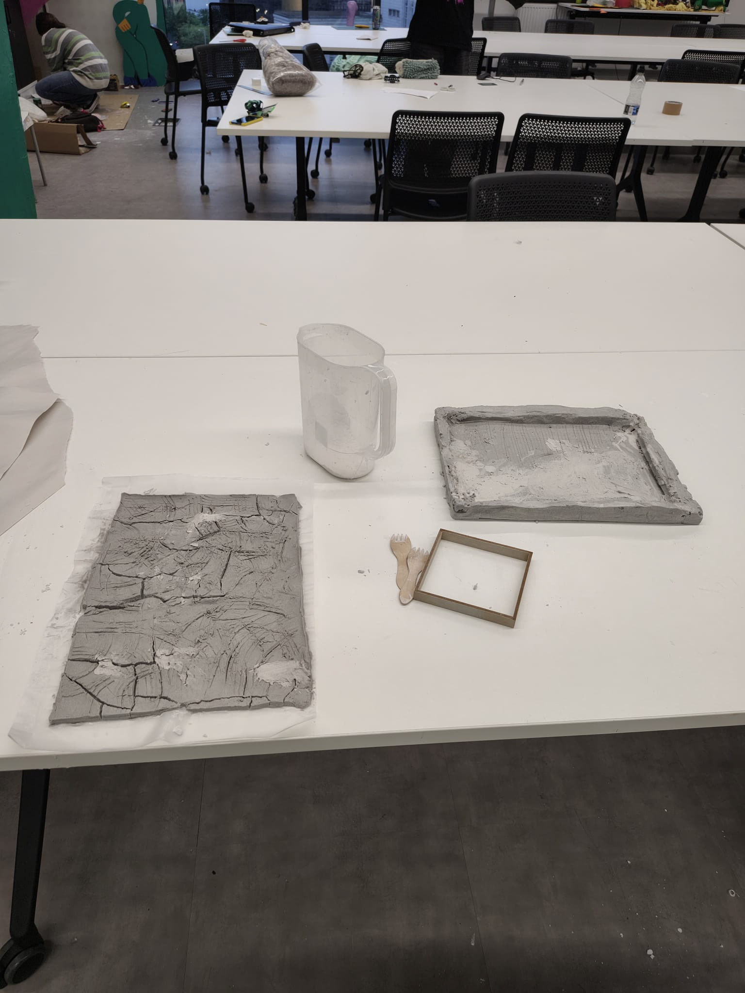
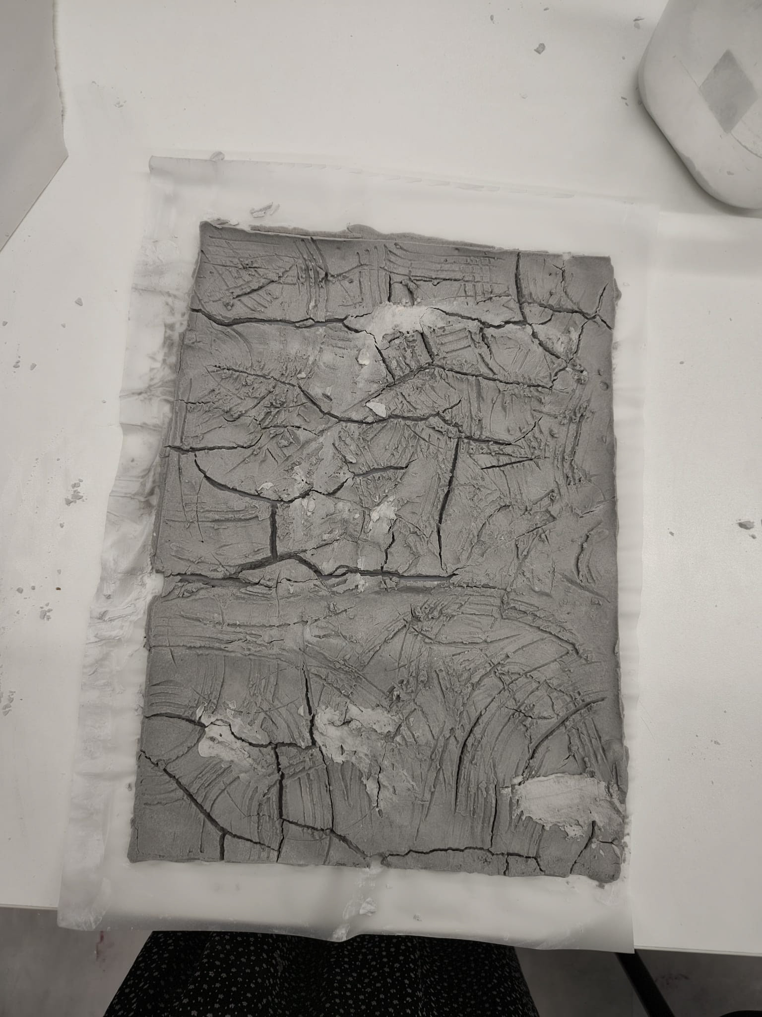
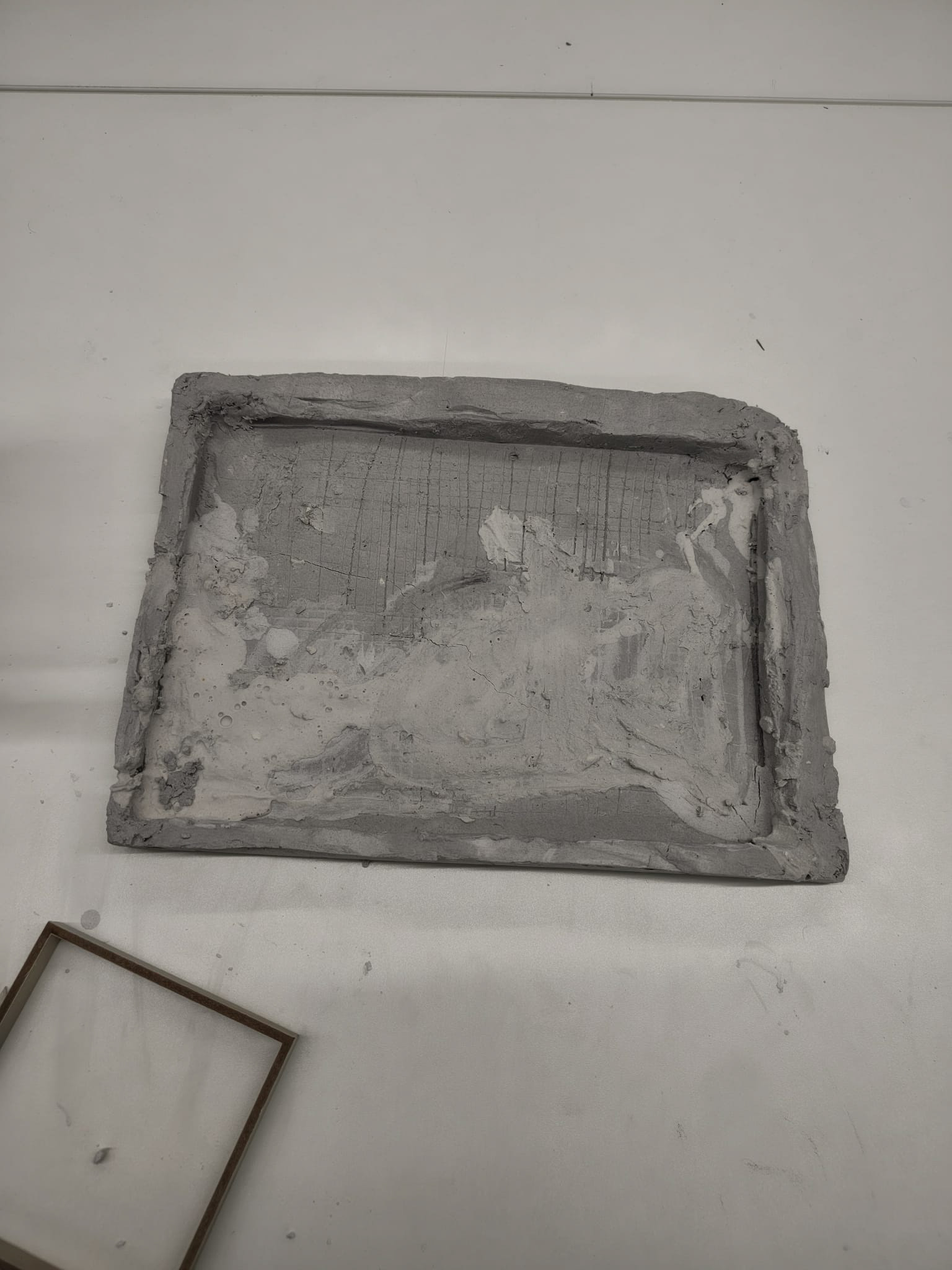
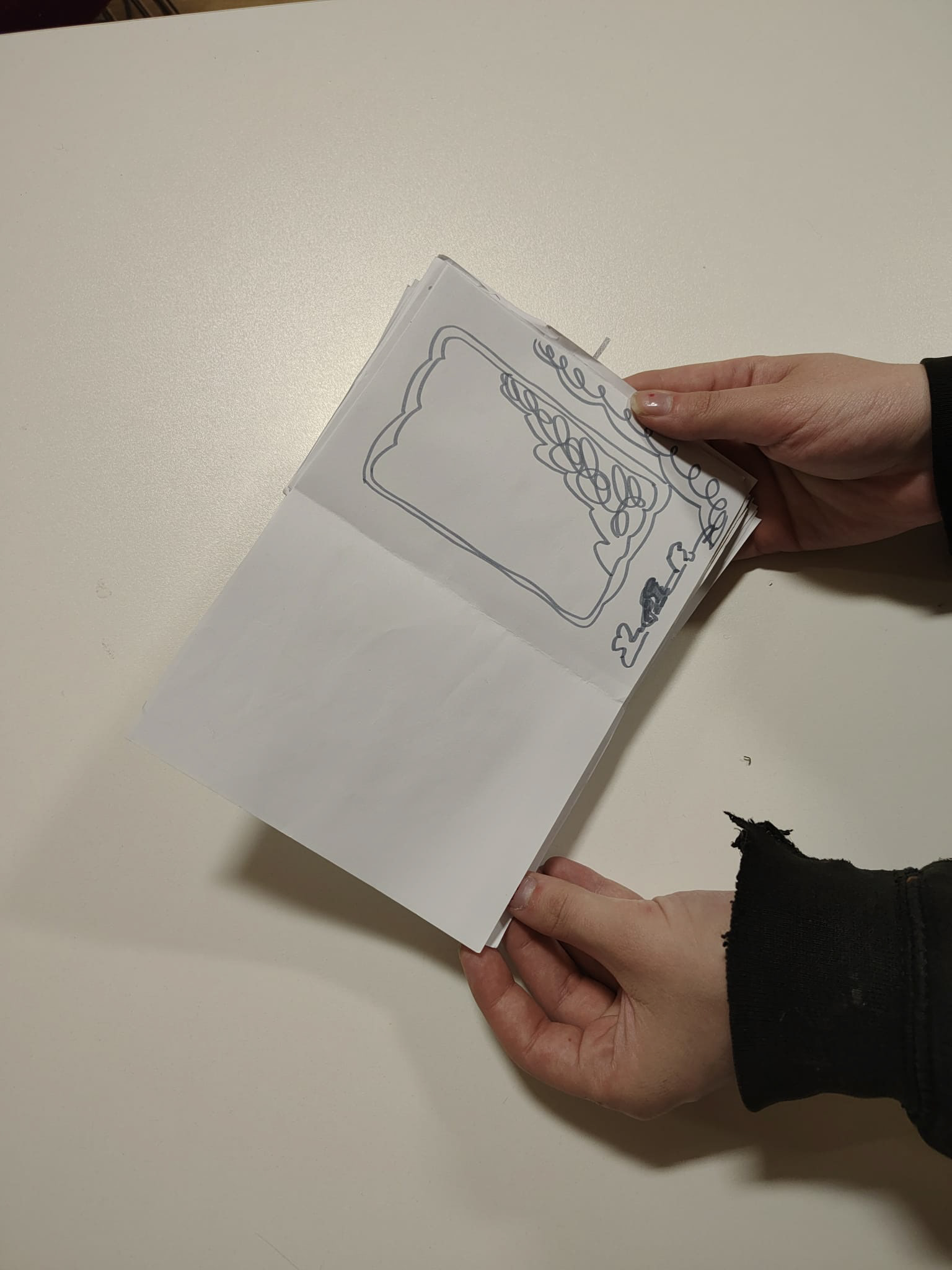
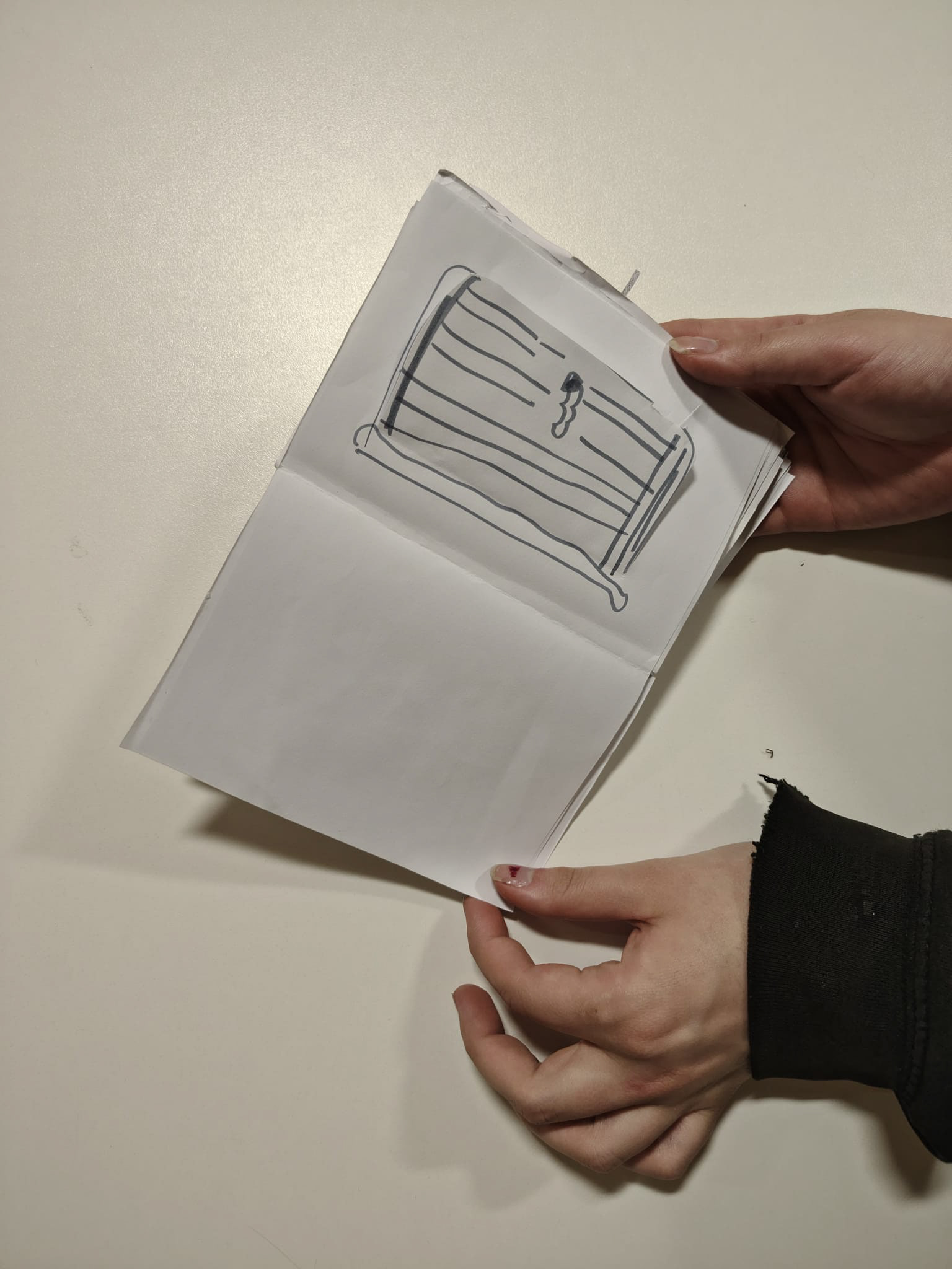
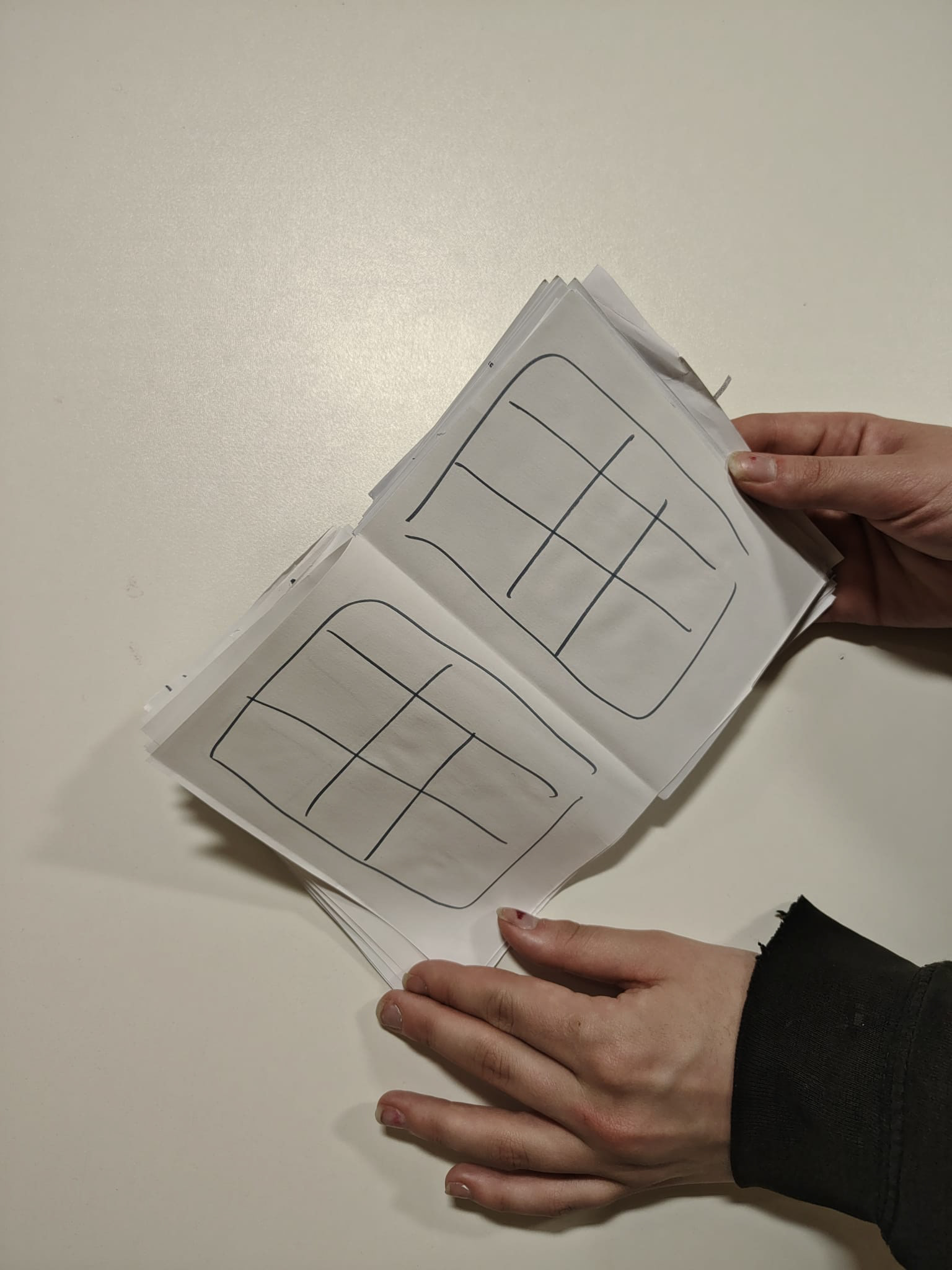
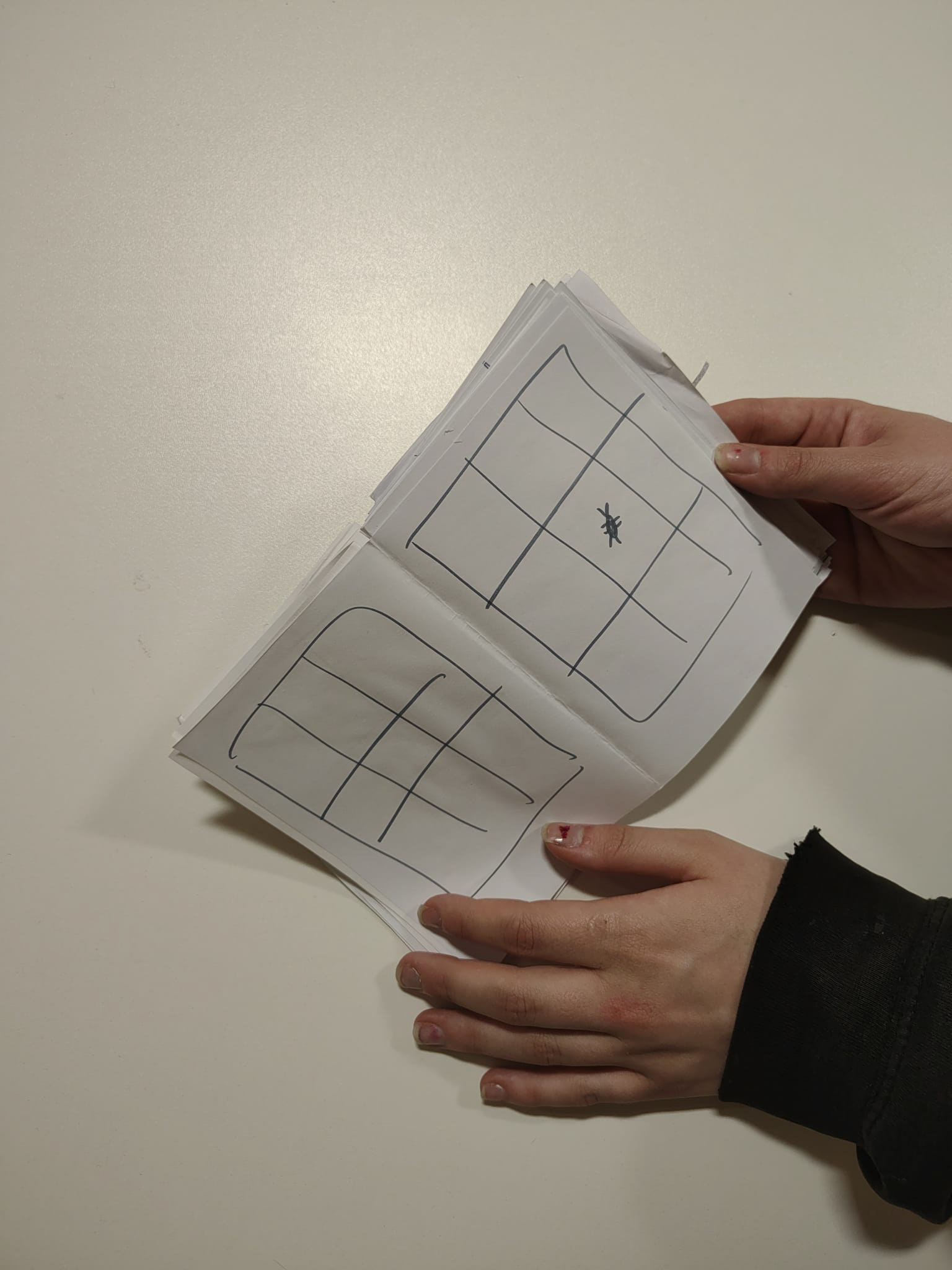
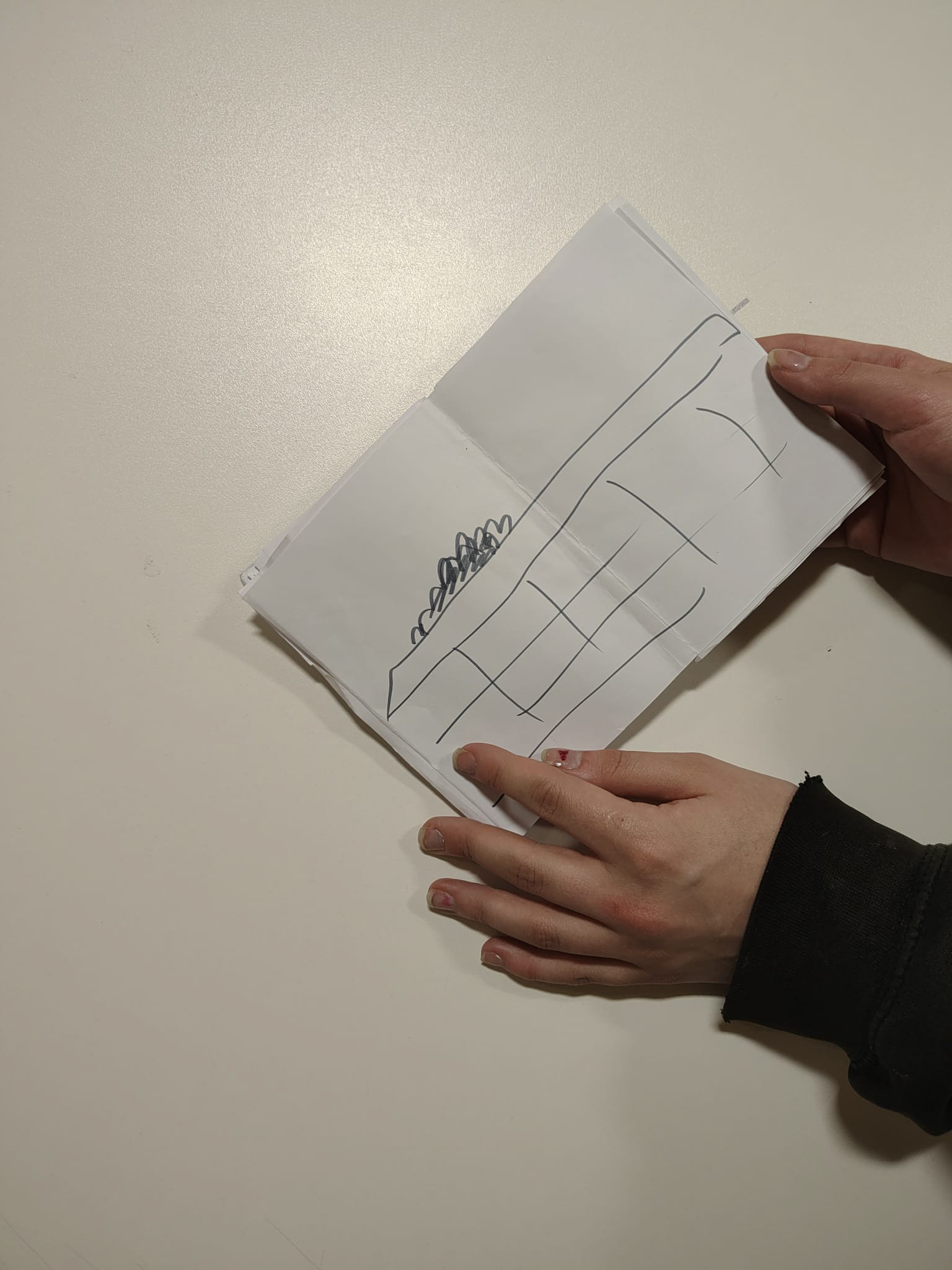
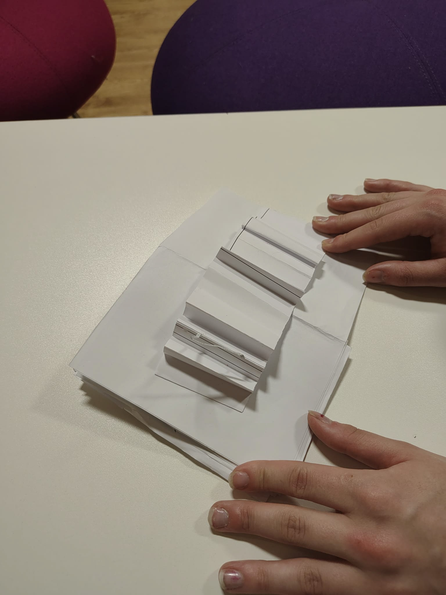
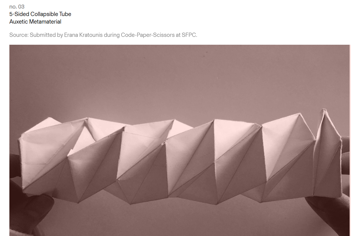
making the tiles
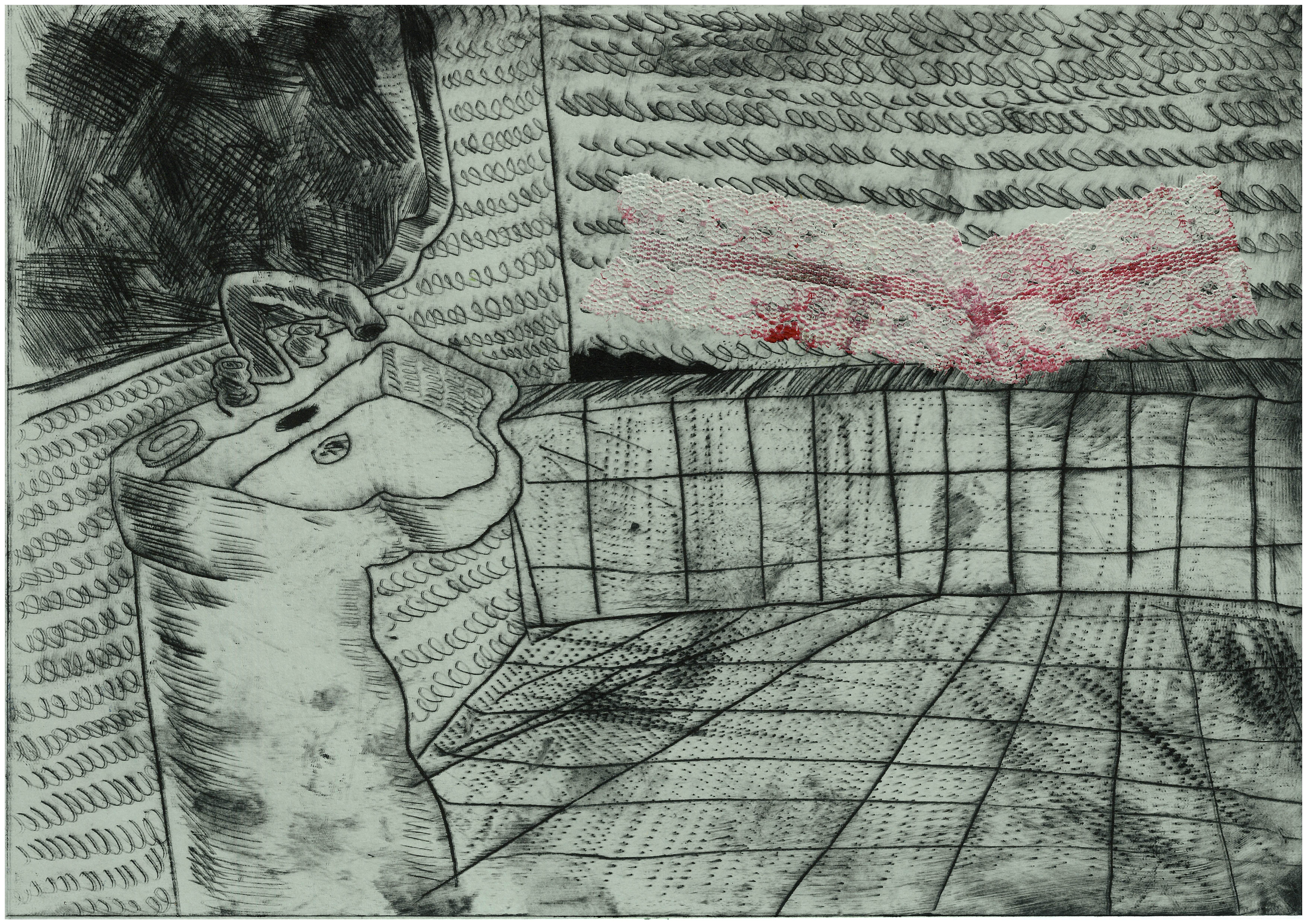
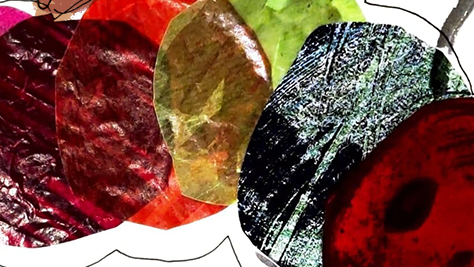
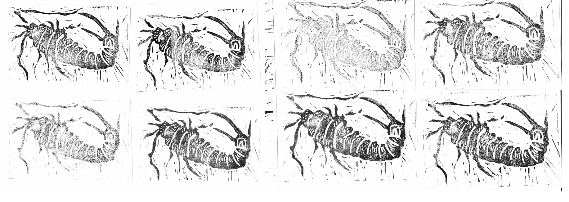
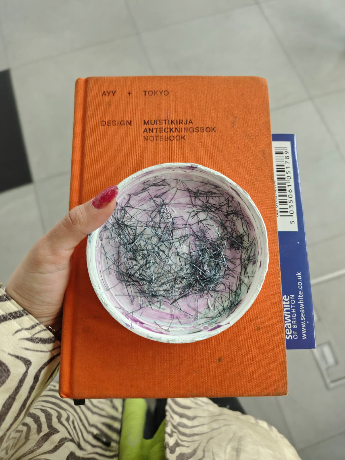
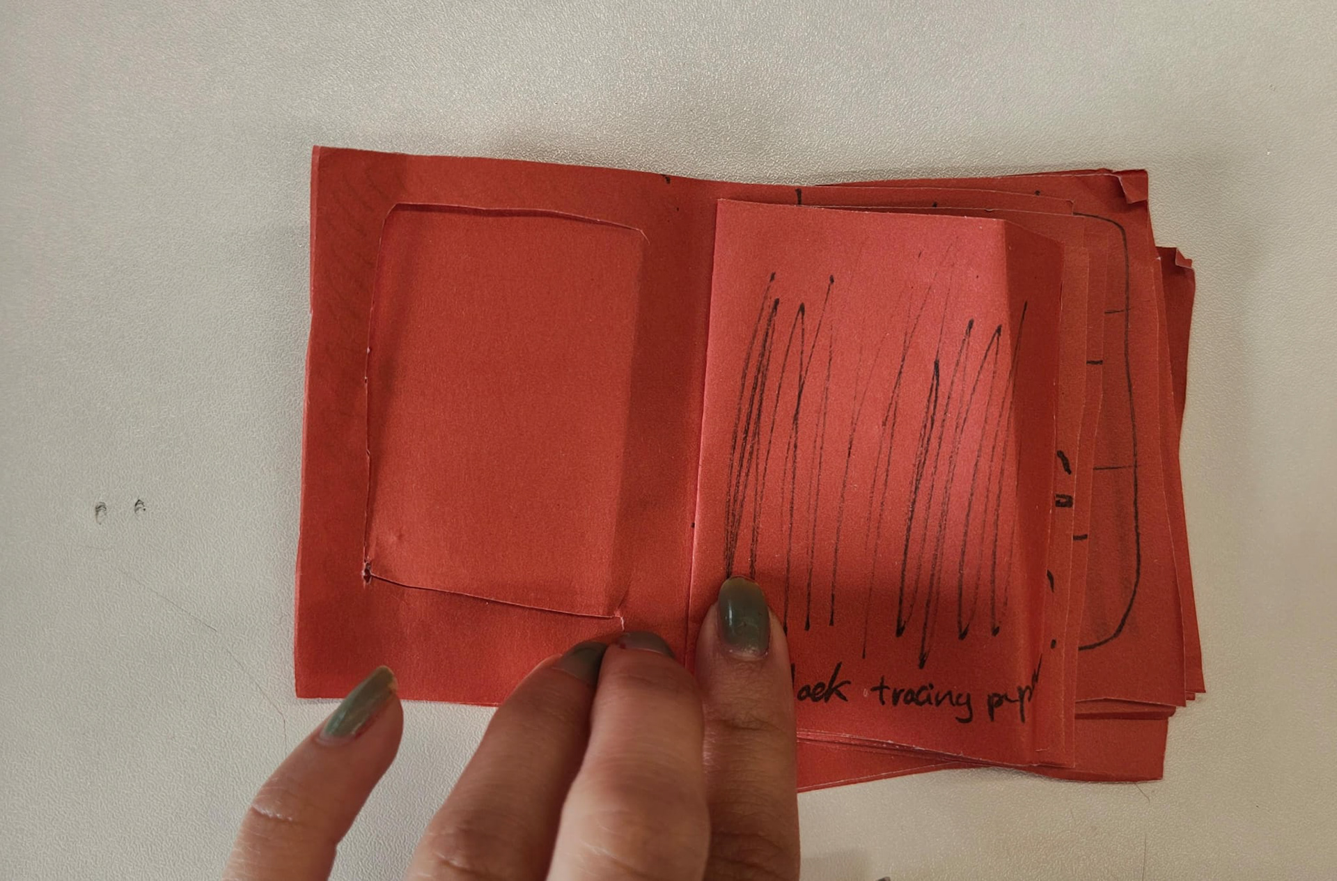
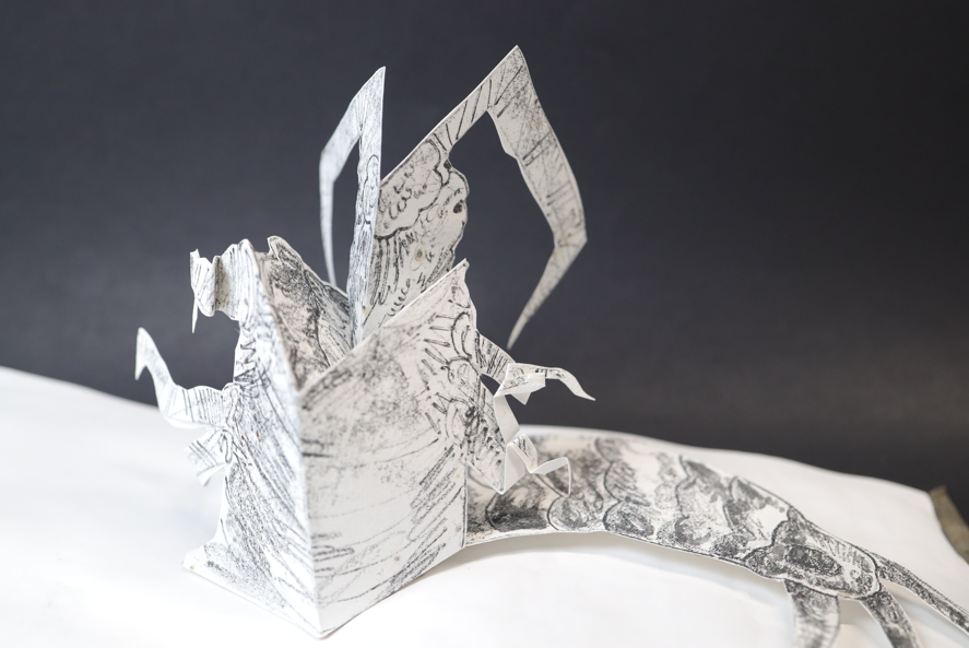
I also got one of the tiles printed on tracing paper to see what it looks like - I like the way the overlapping textures came out as it feels like they pop out of the page.
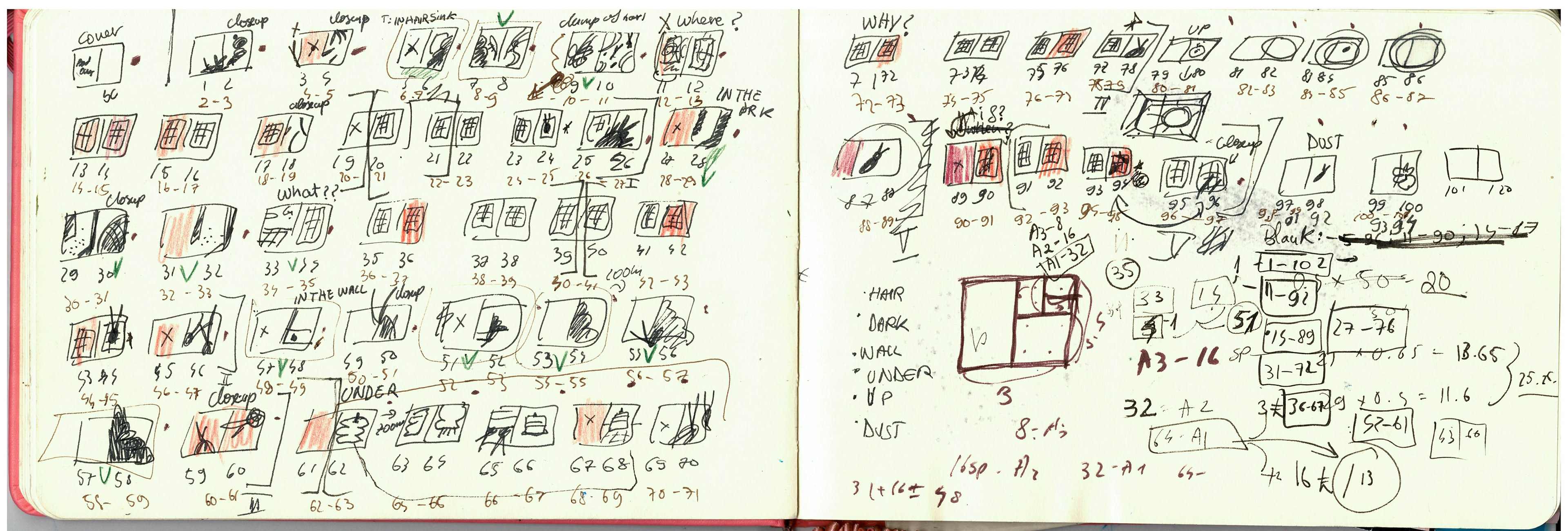
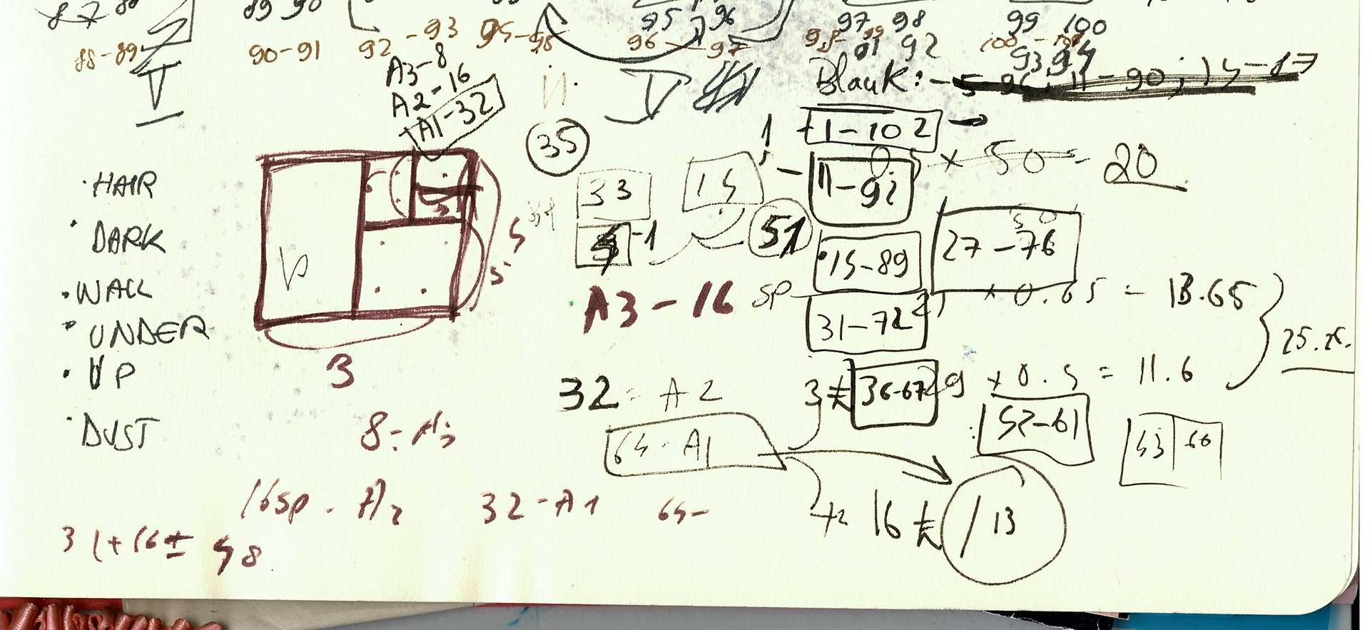
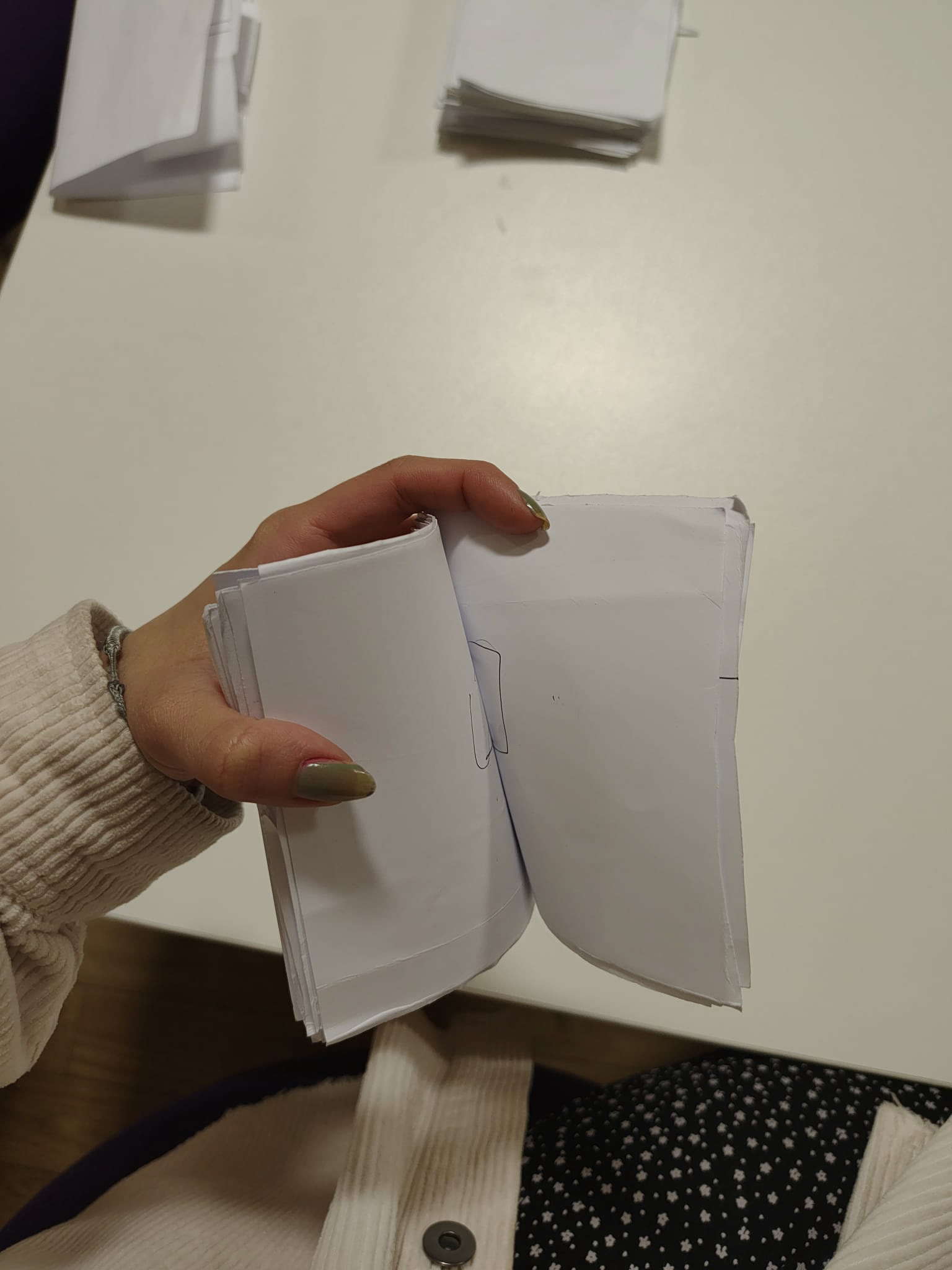
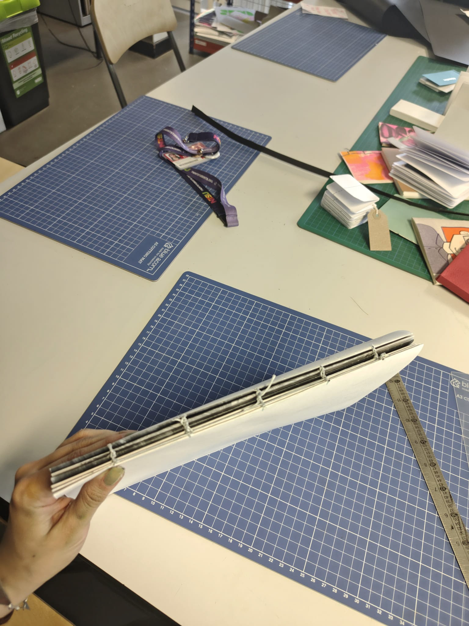
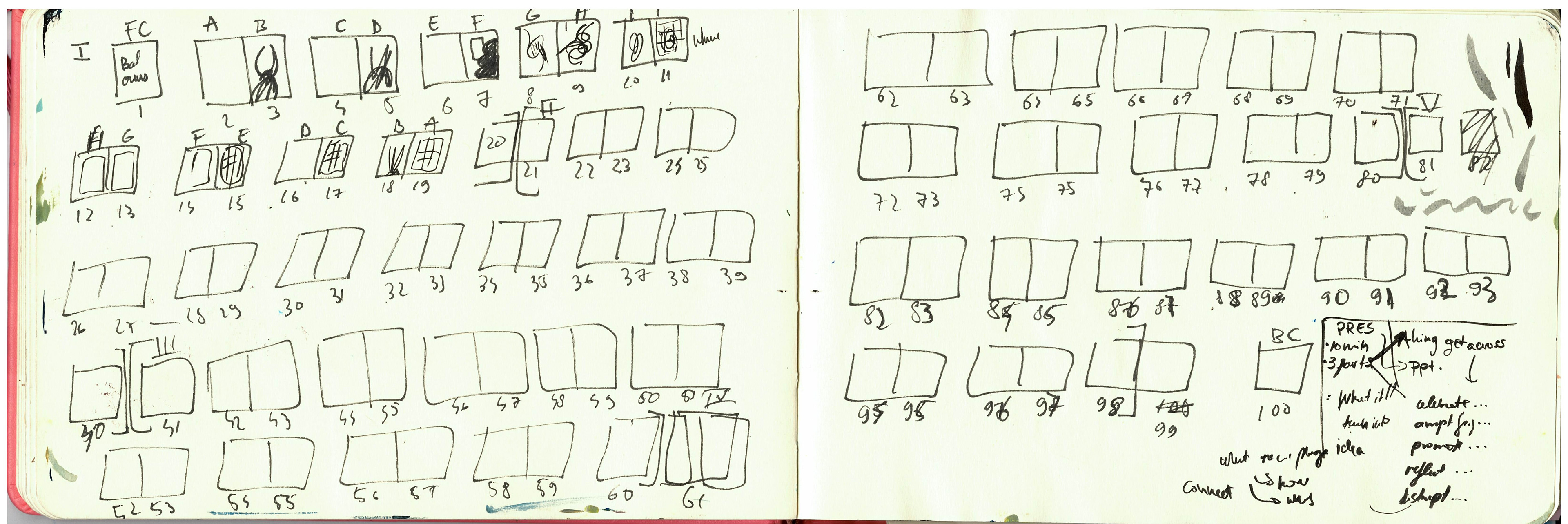
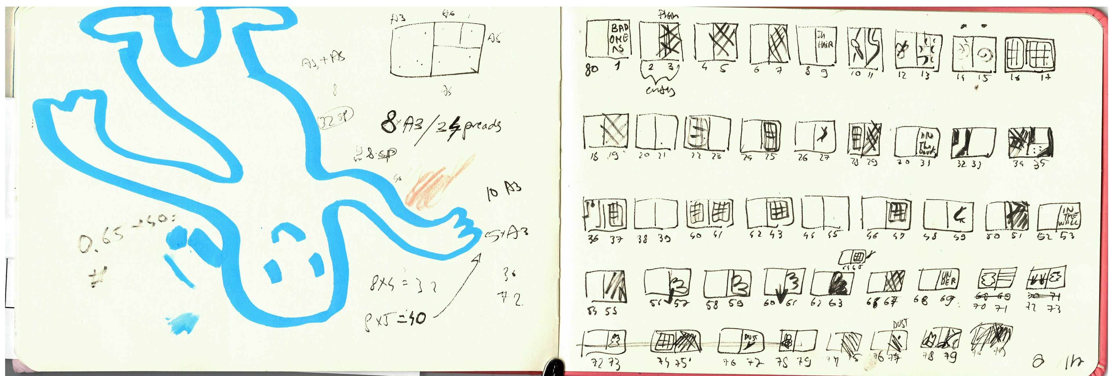
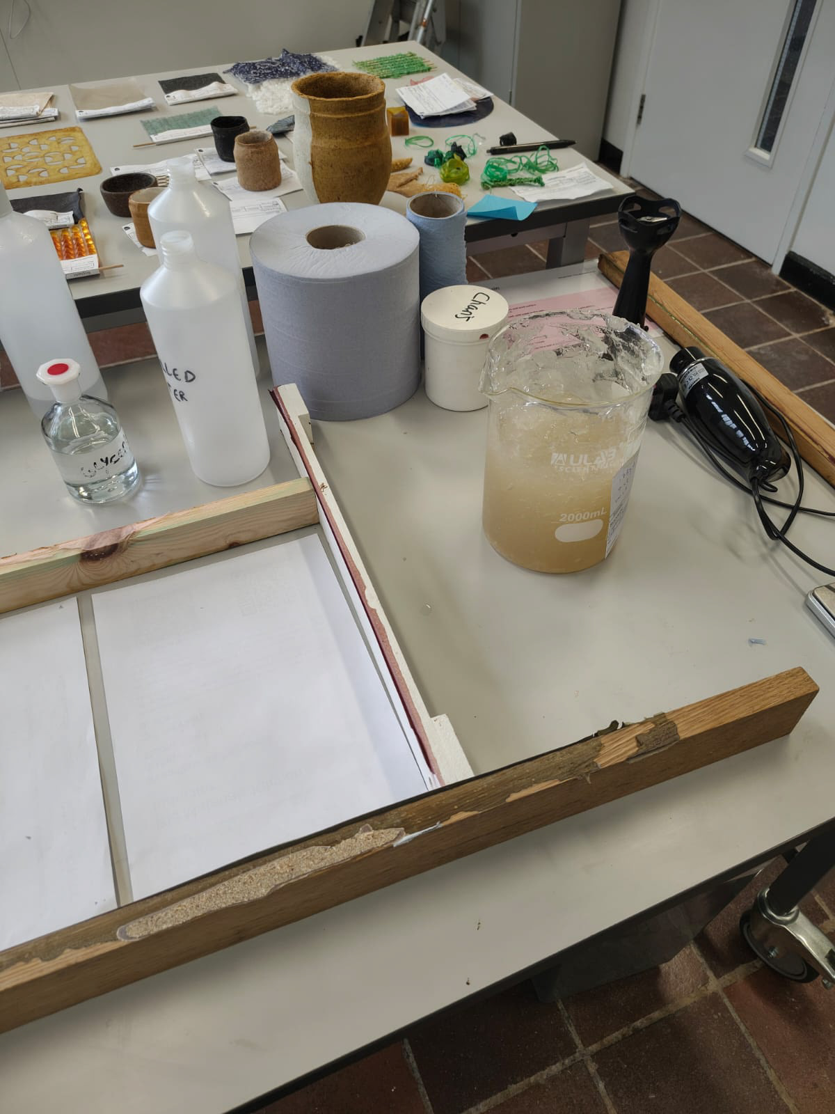
Planning: lot of maths involved in trying to make this book cost effective; trying to plan out how many pages can fit on a bigger sheet of paper and how small the book has to be to not cripple me financially
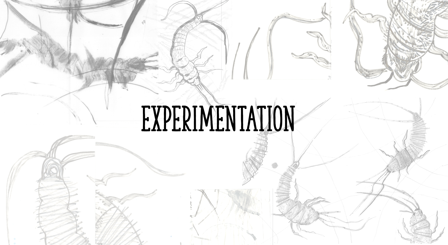
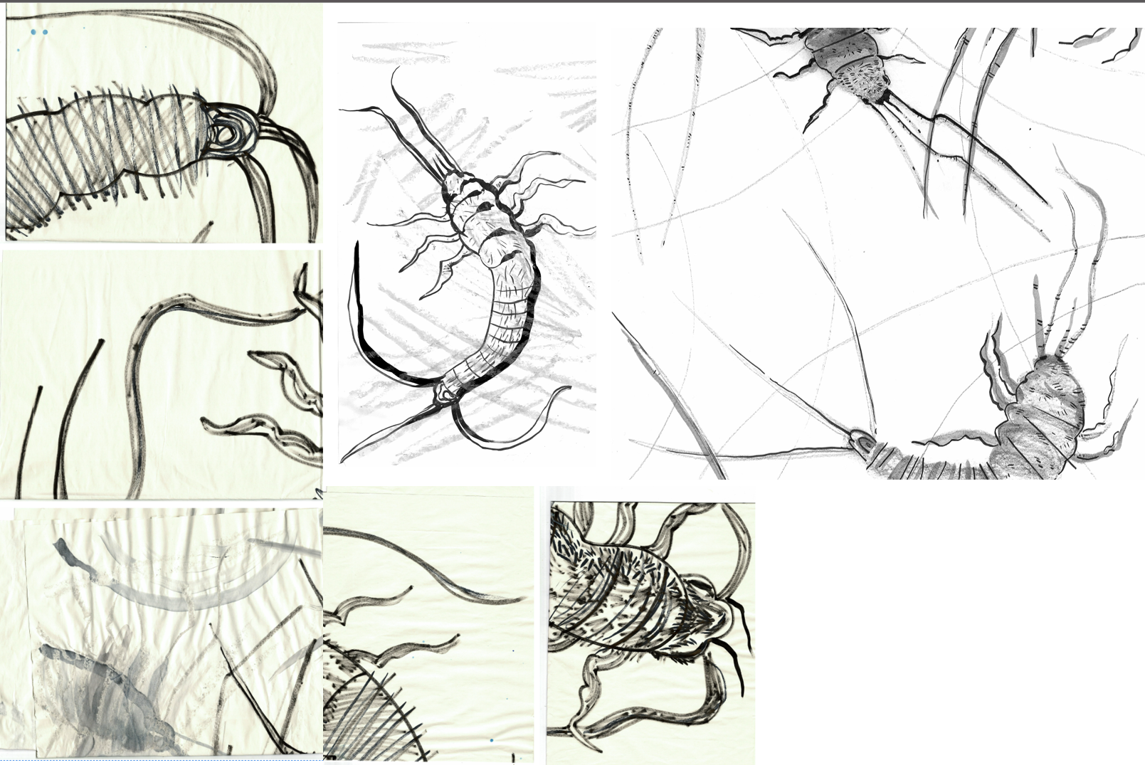
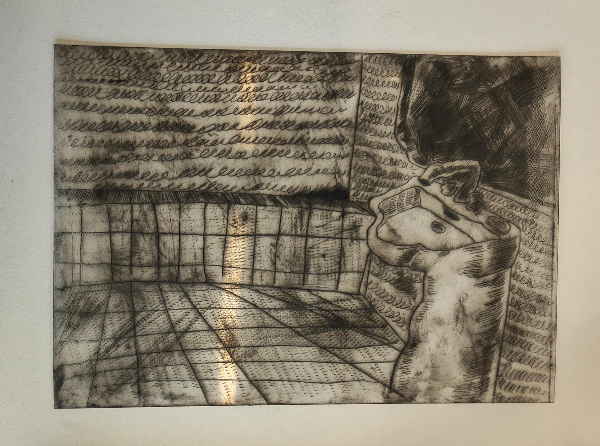
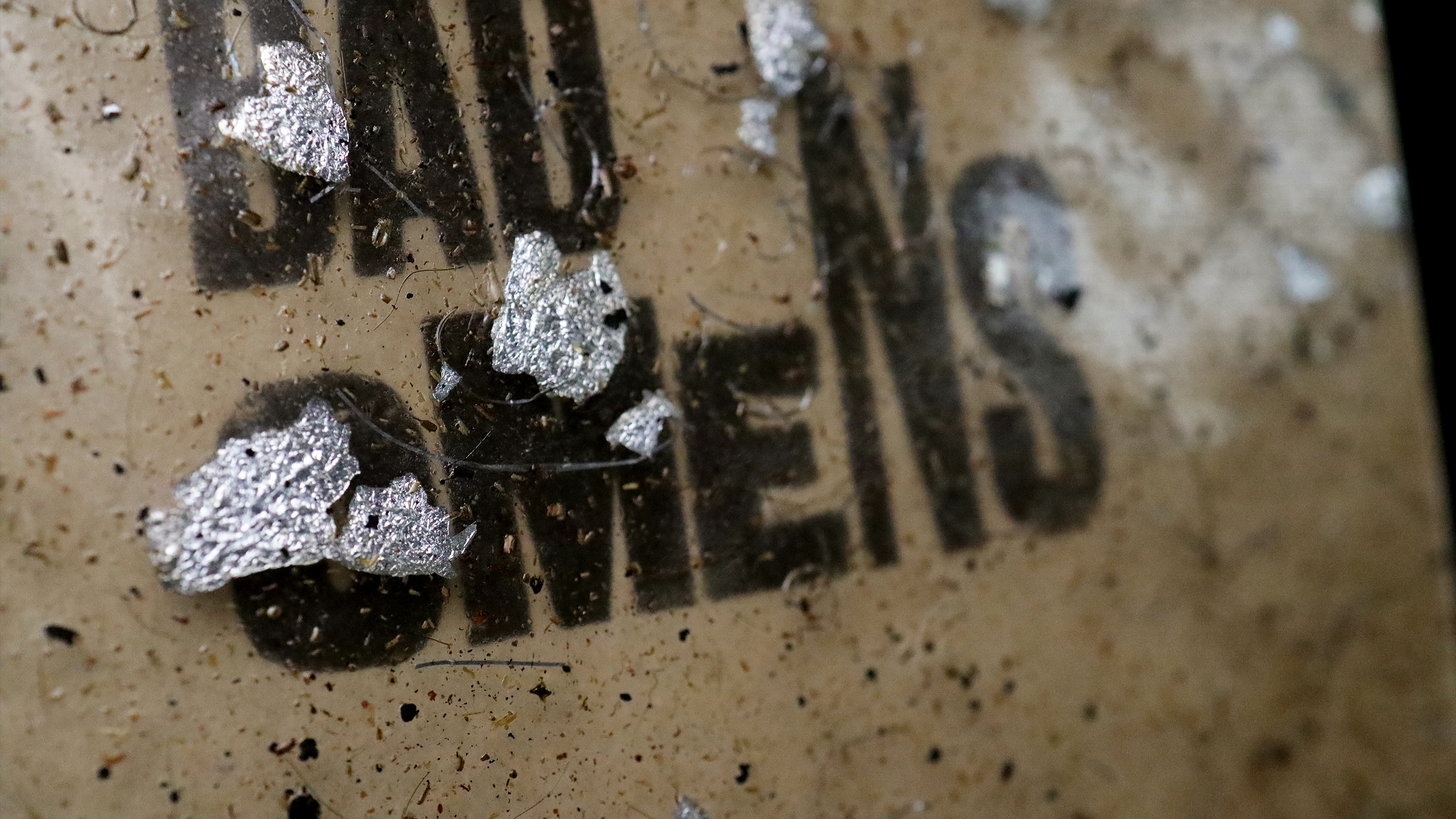
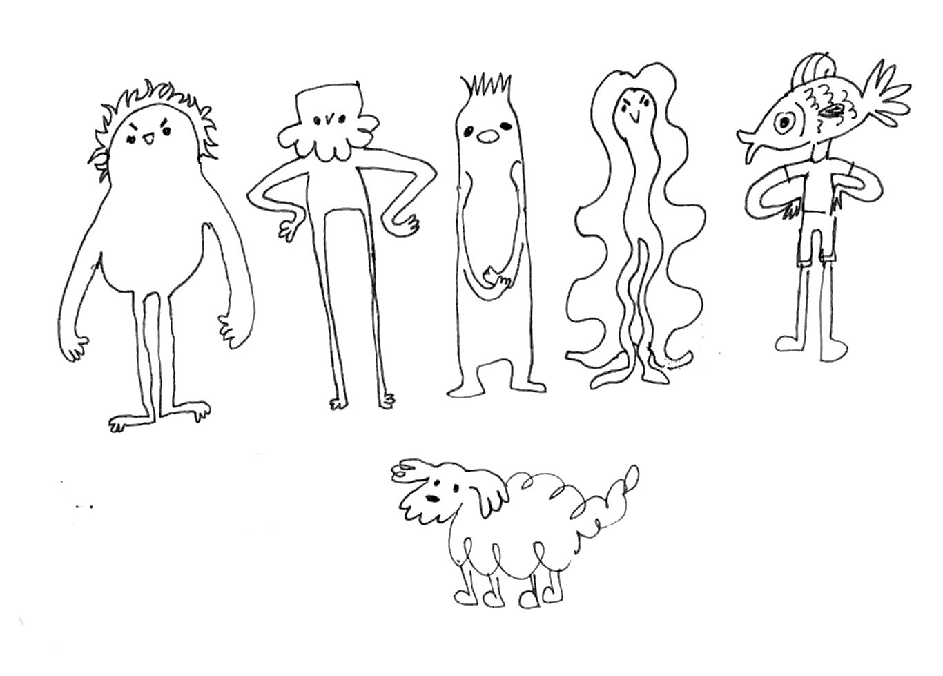
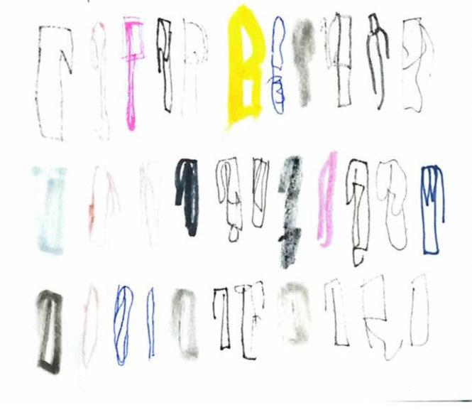
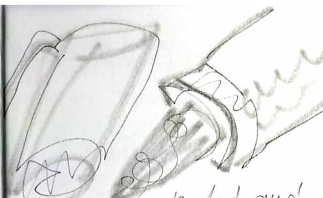
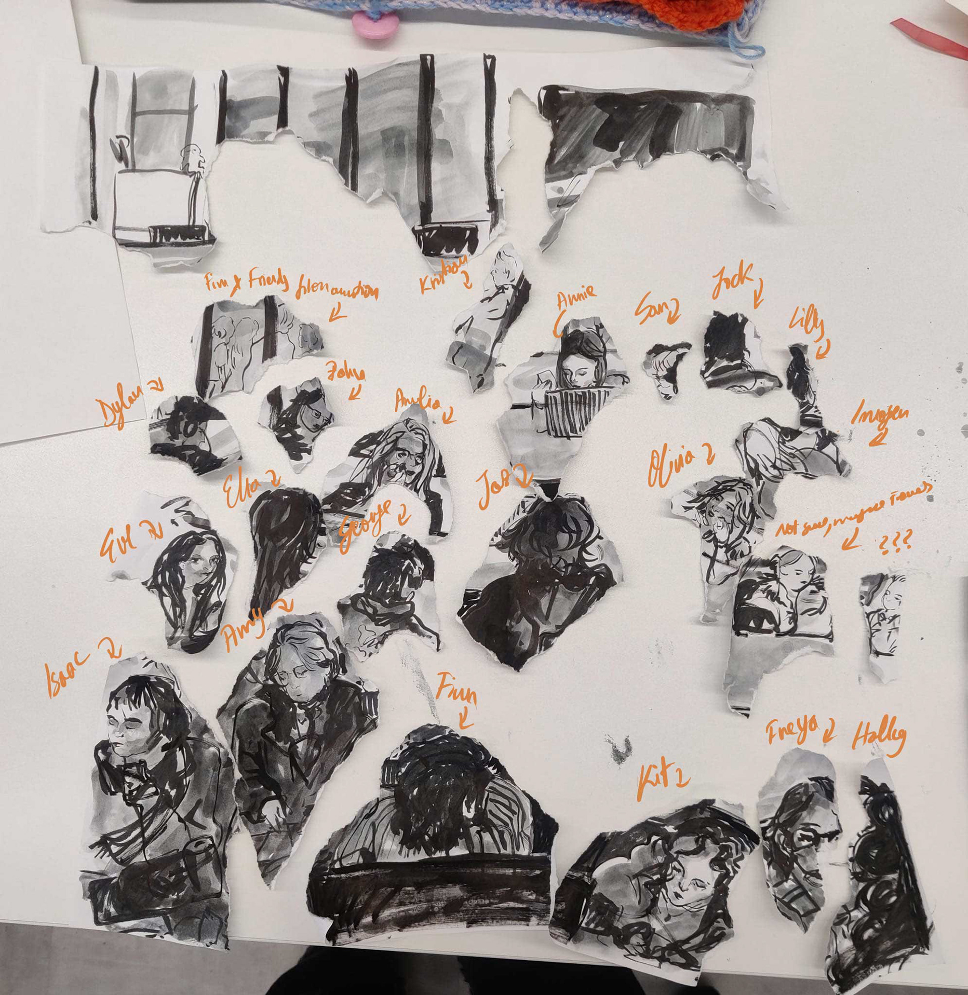
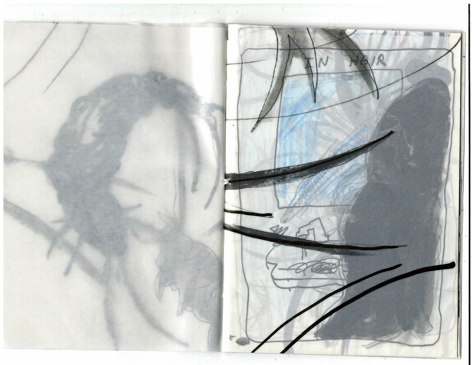
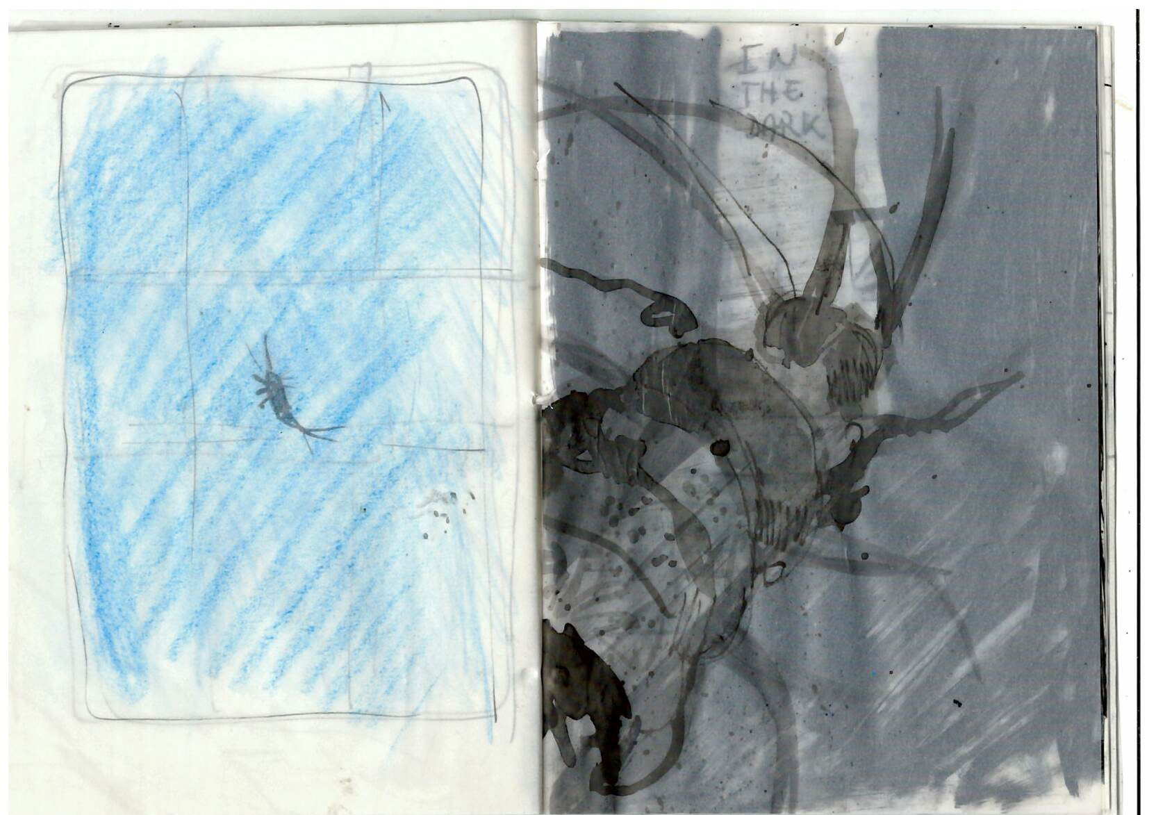
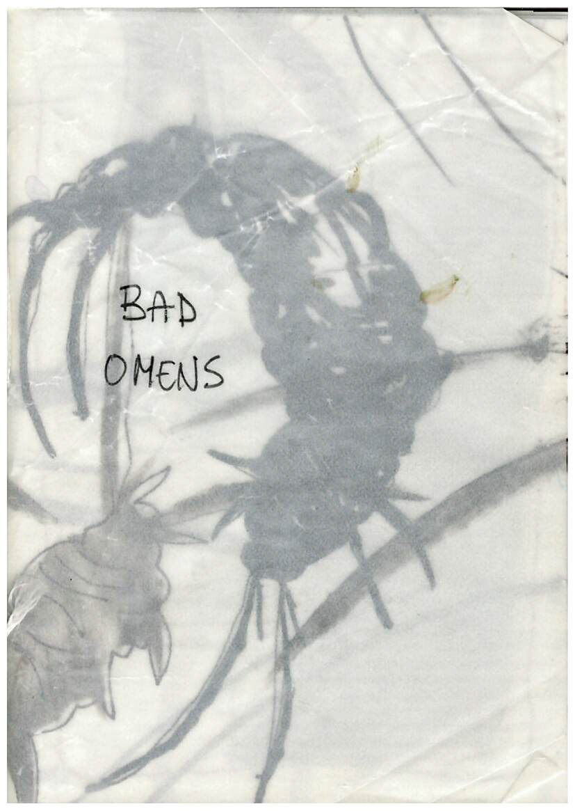
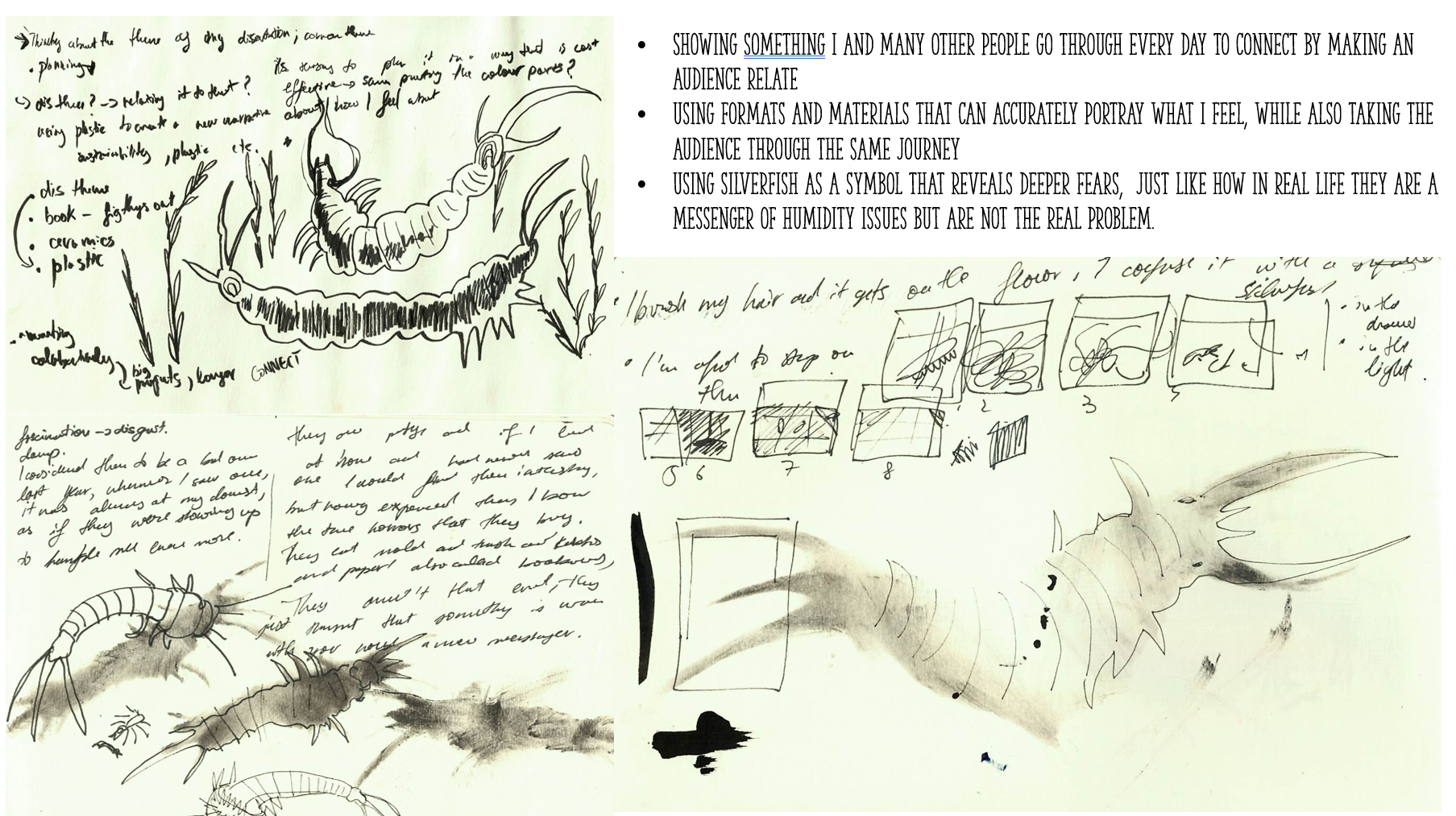
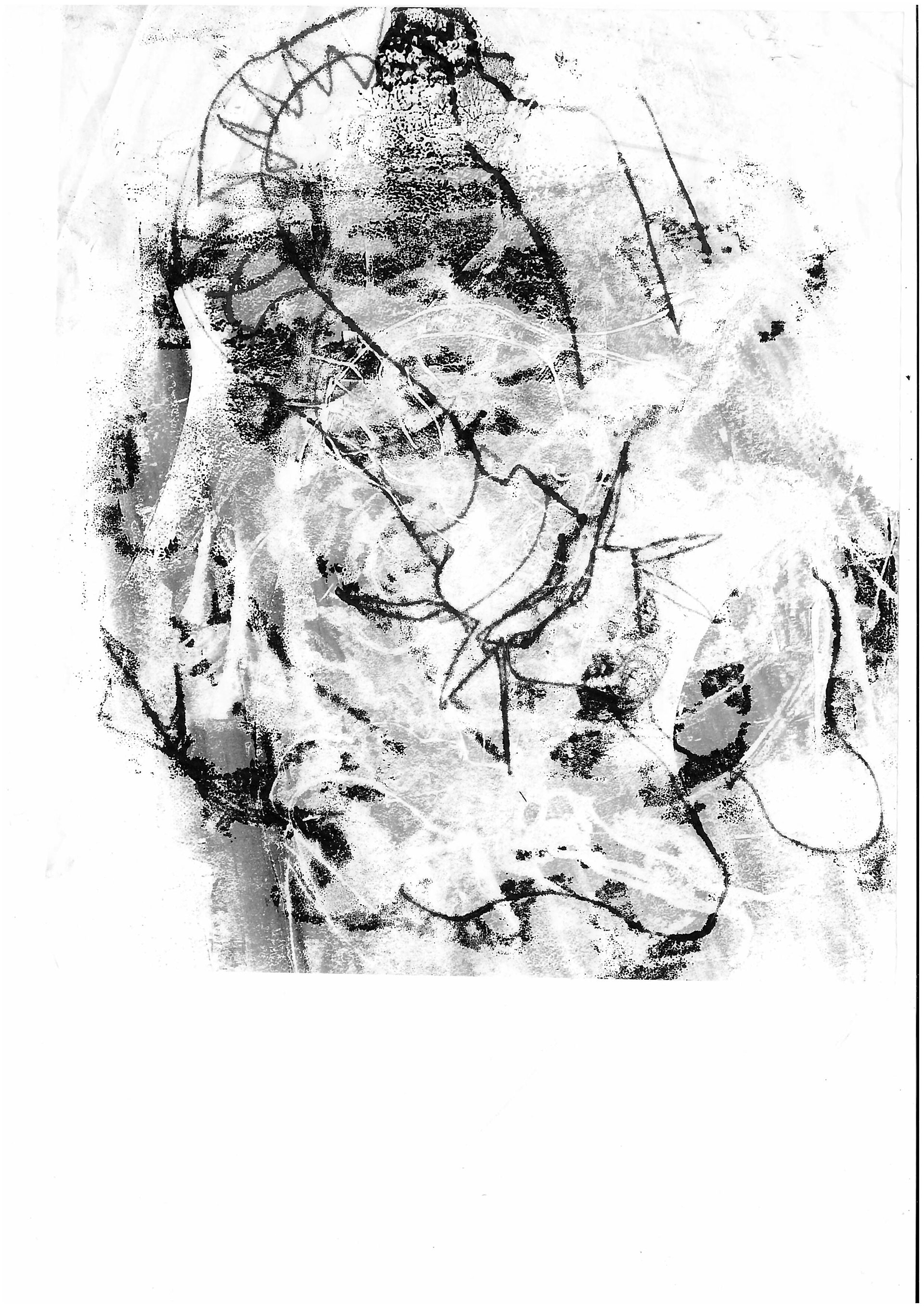
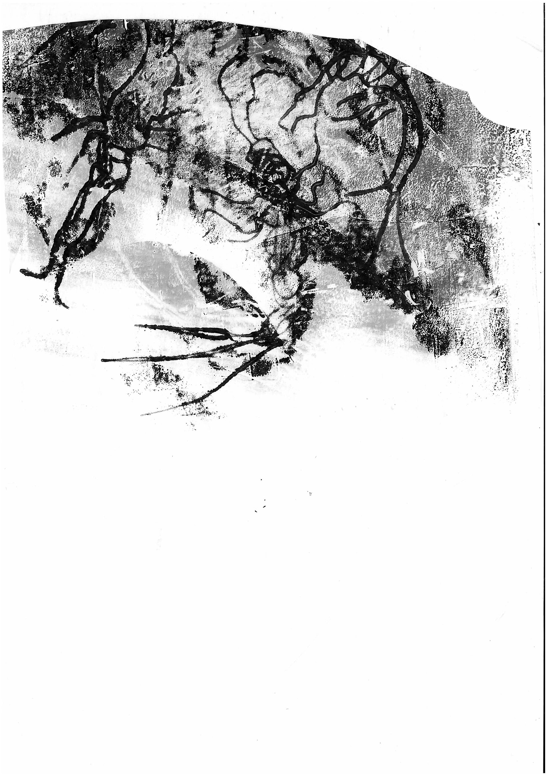
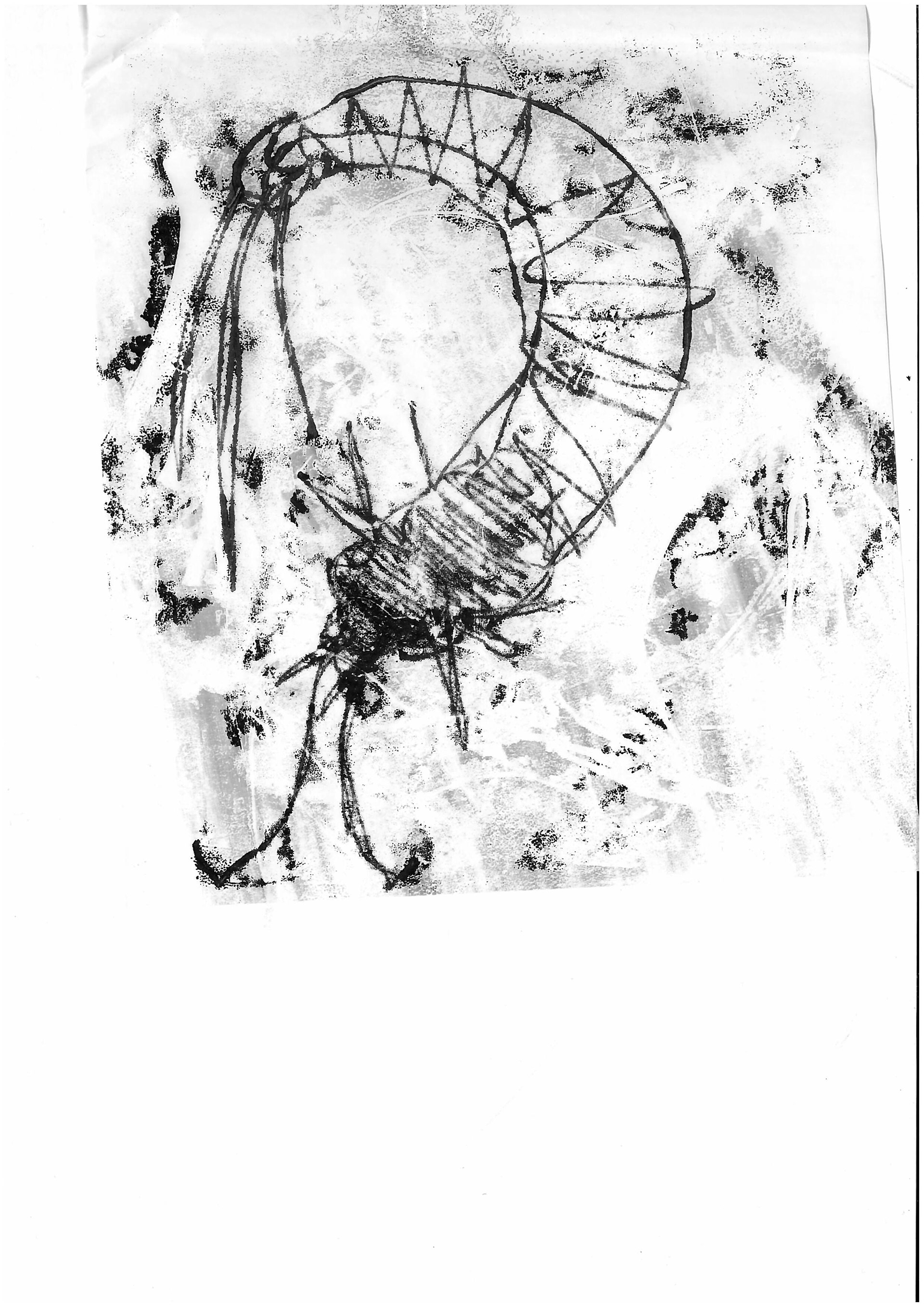
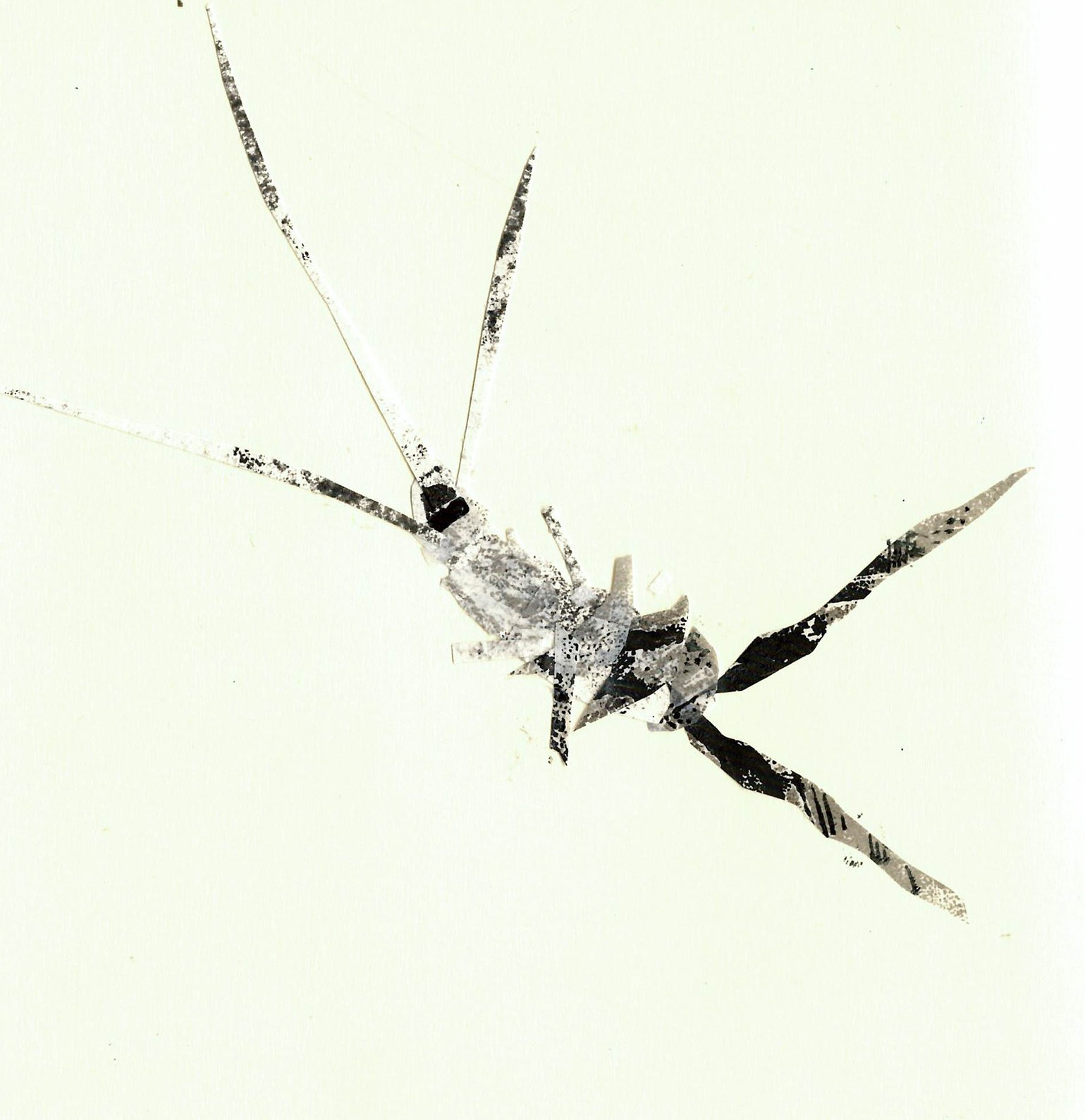
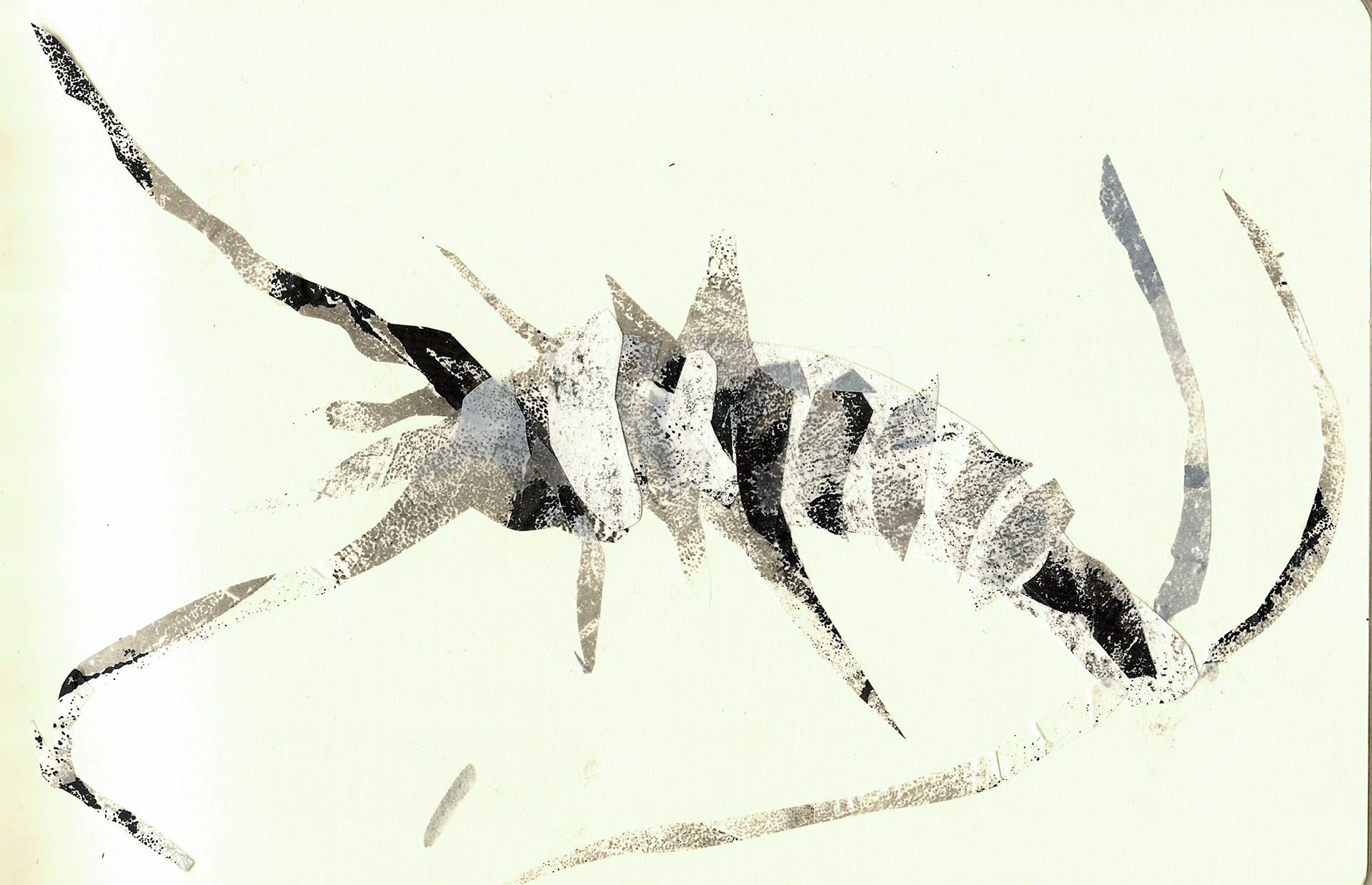
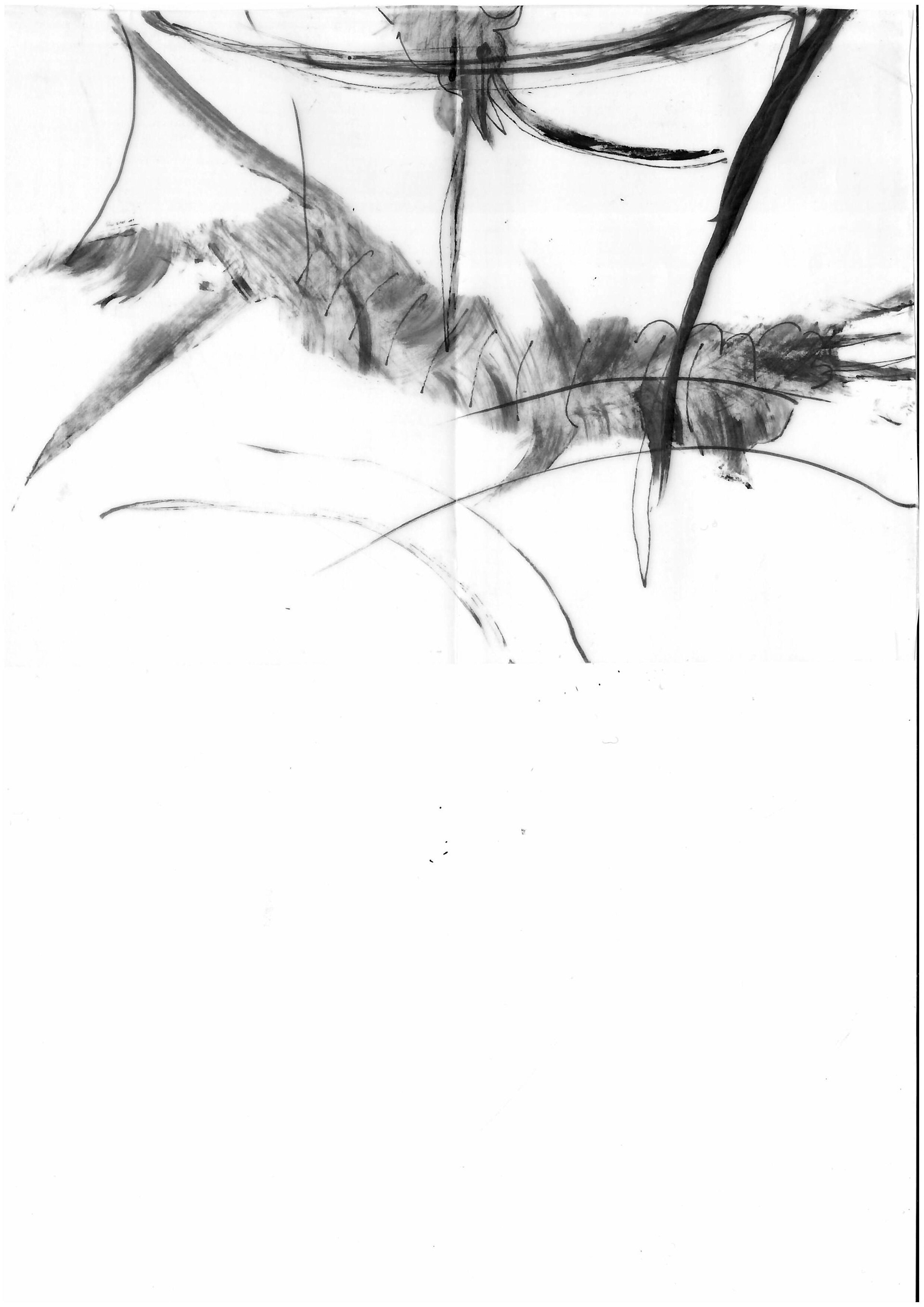
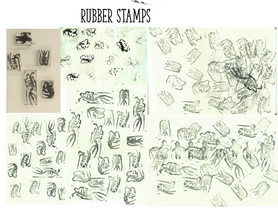
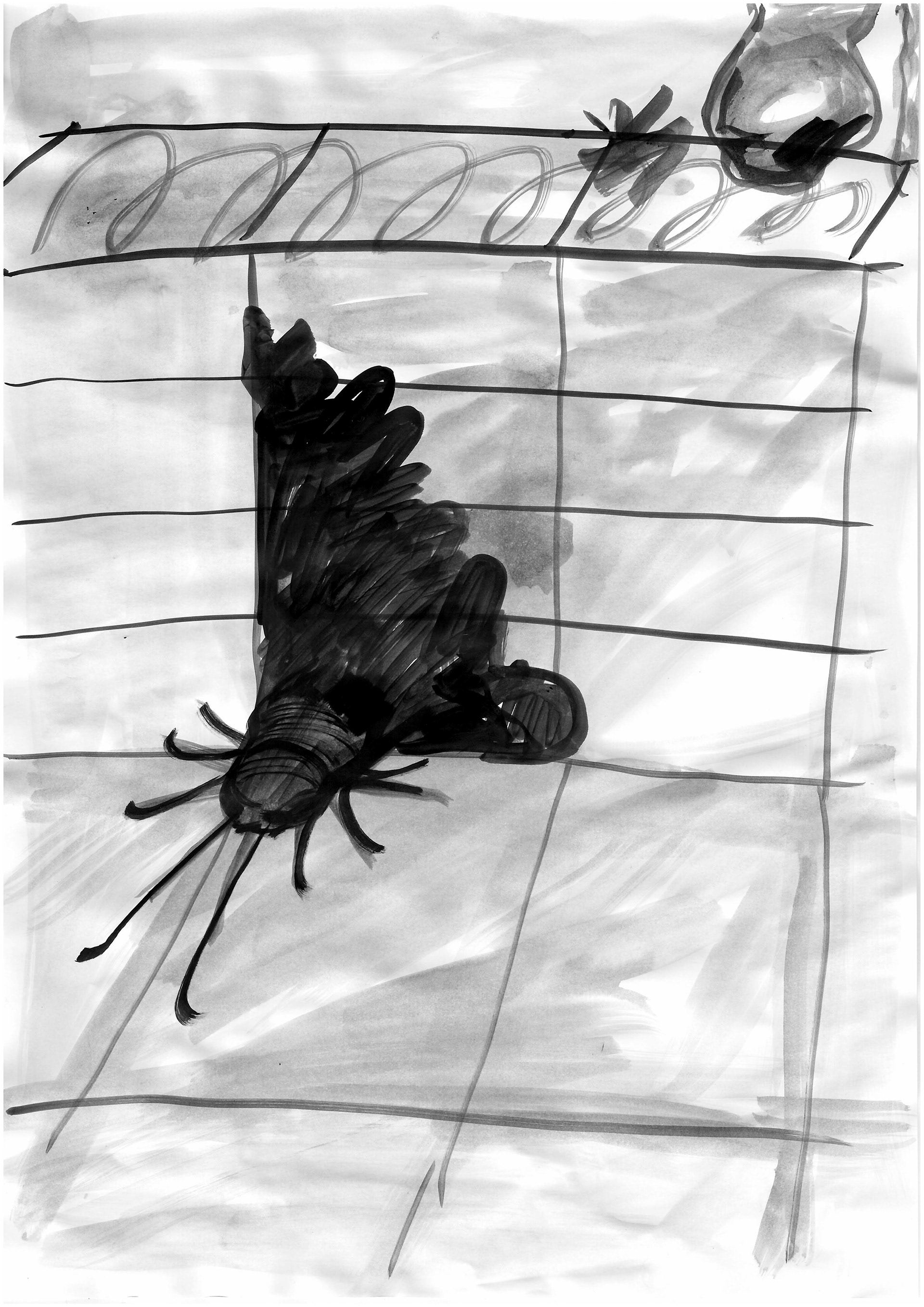
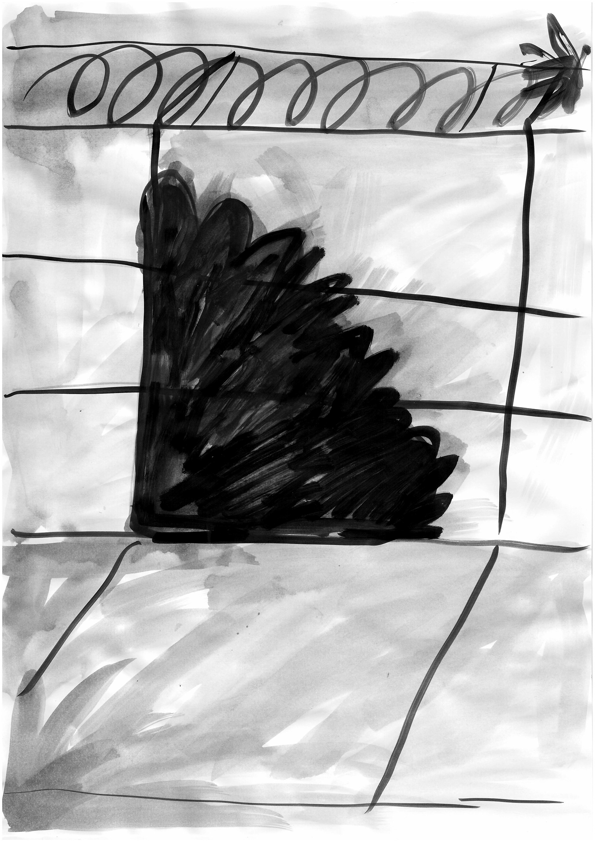
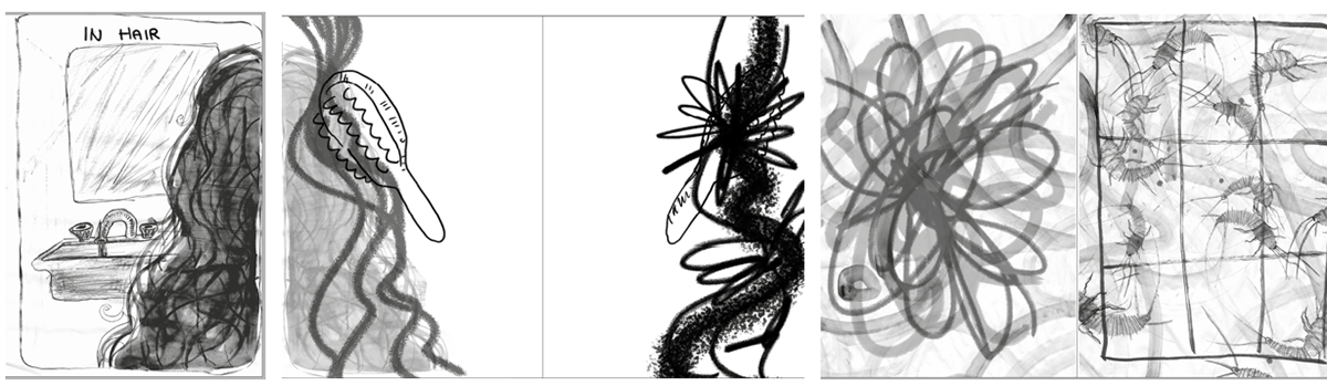
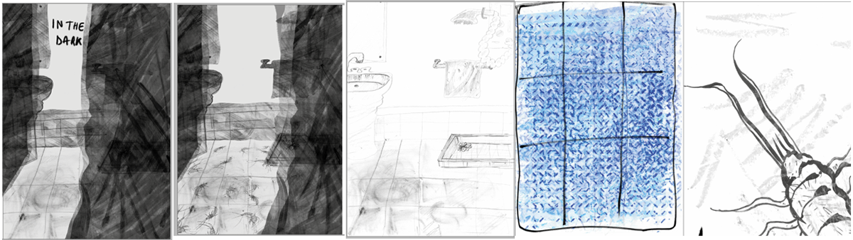
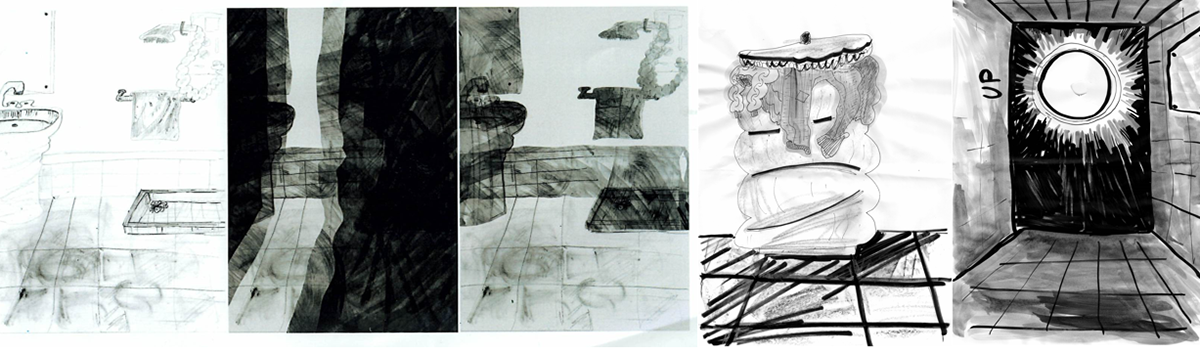
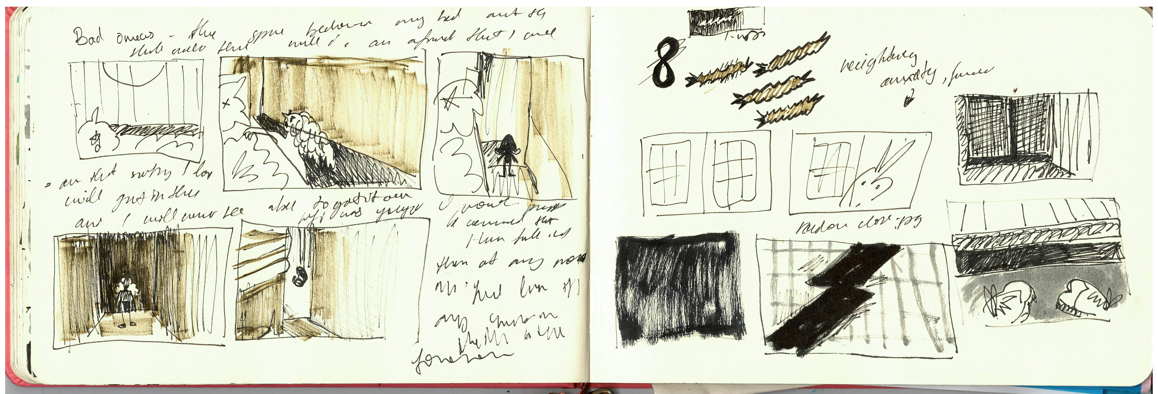
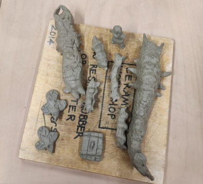
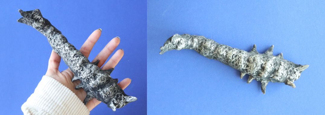
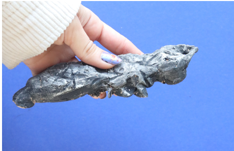
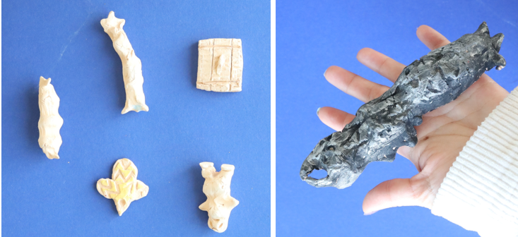
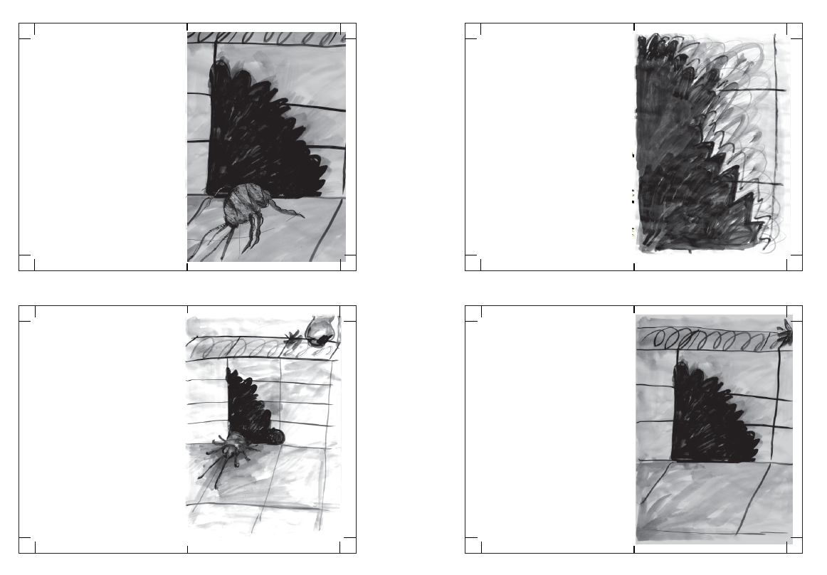
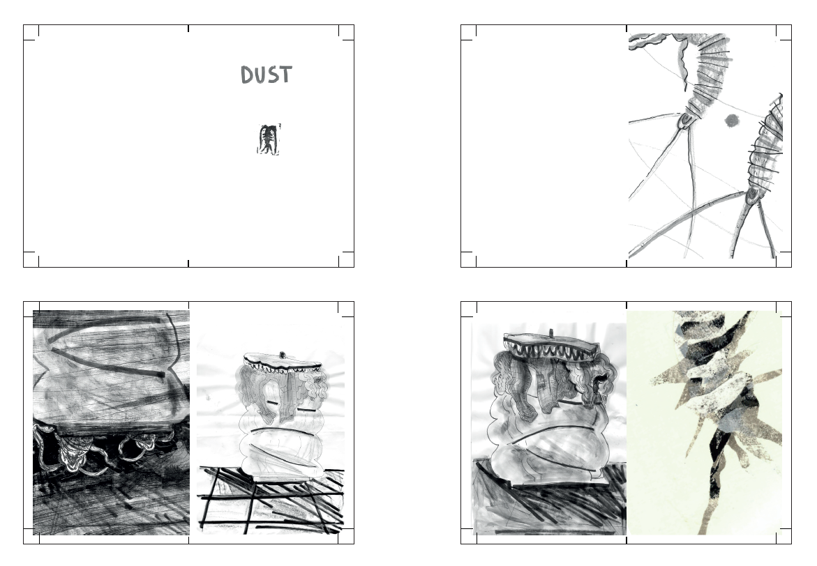
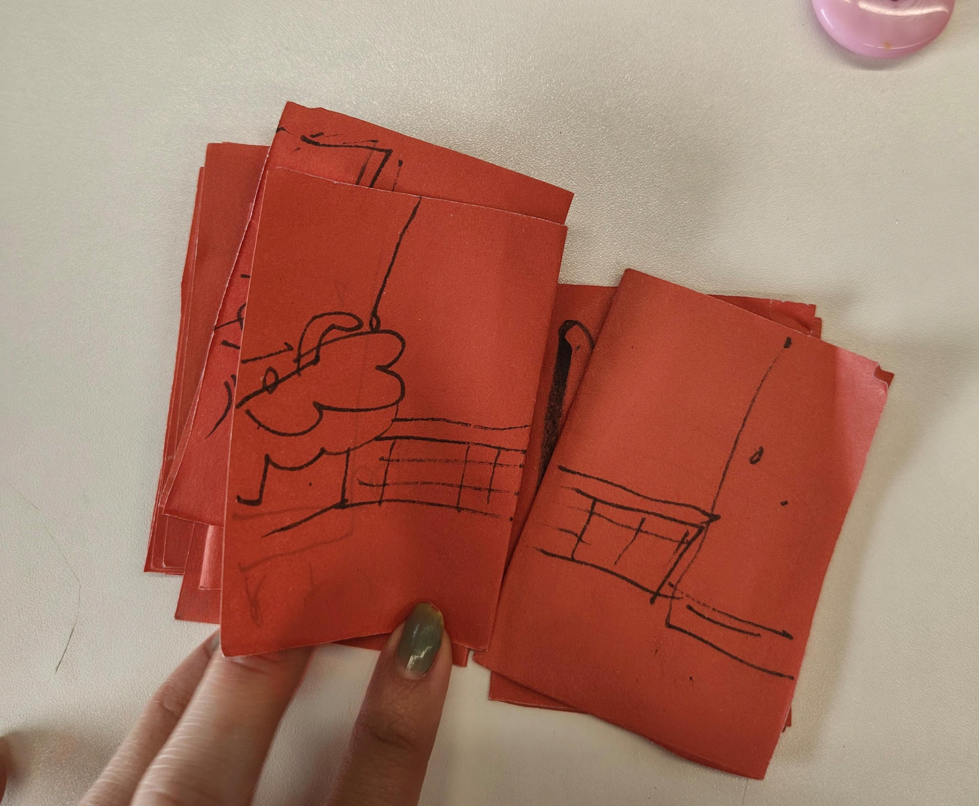
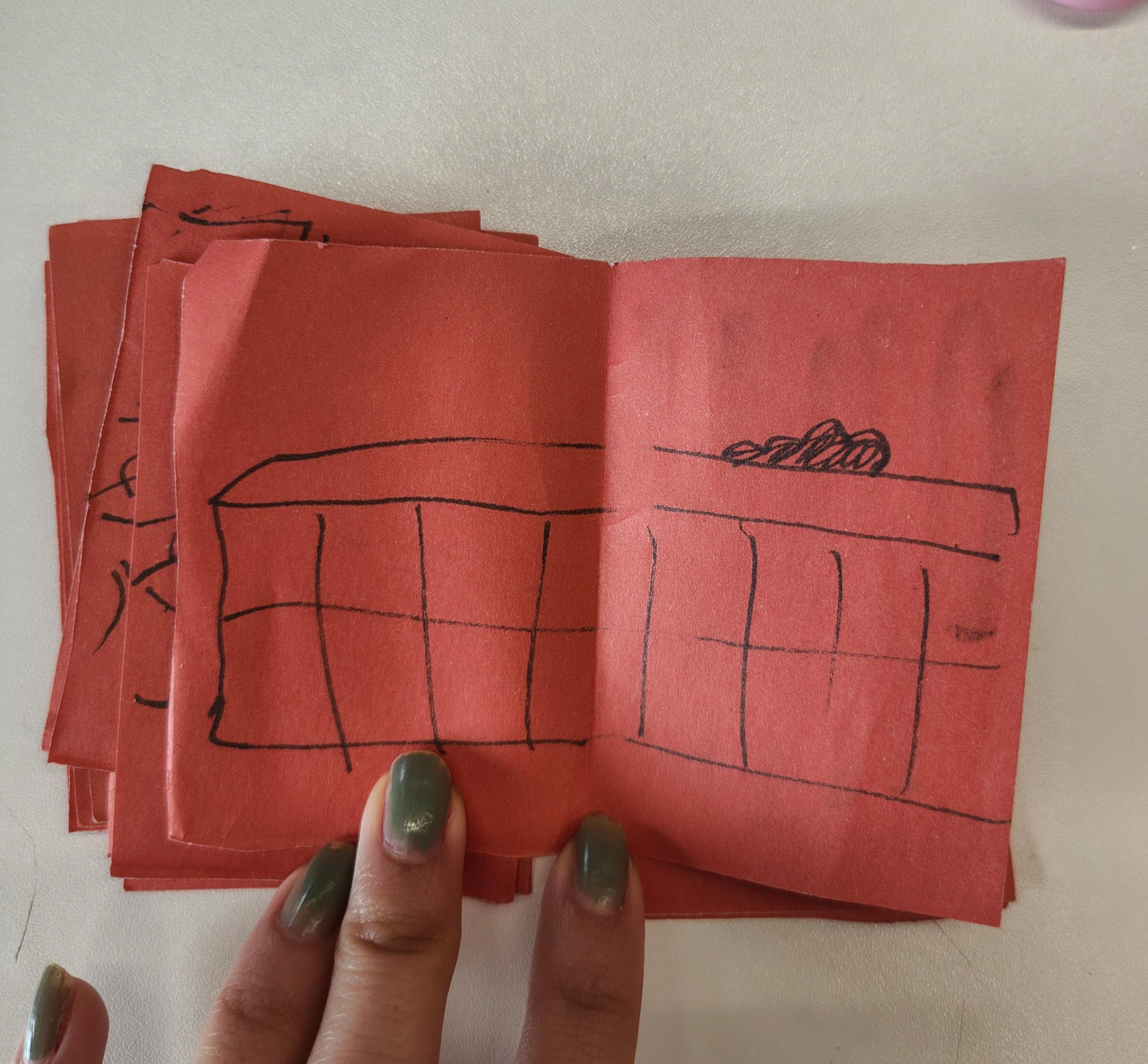
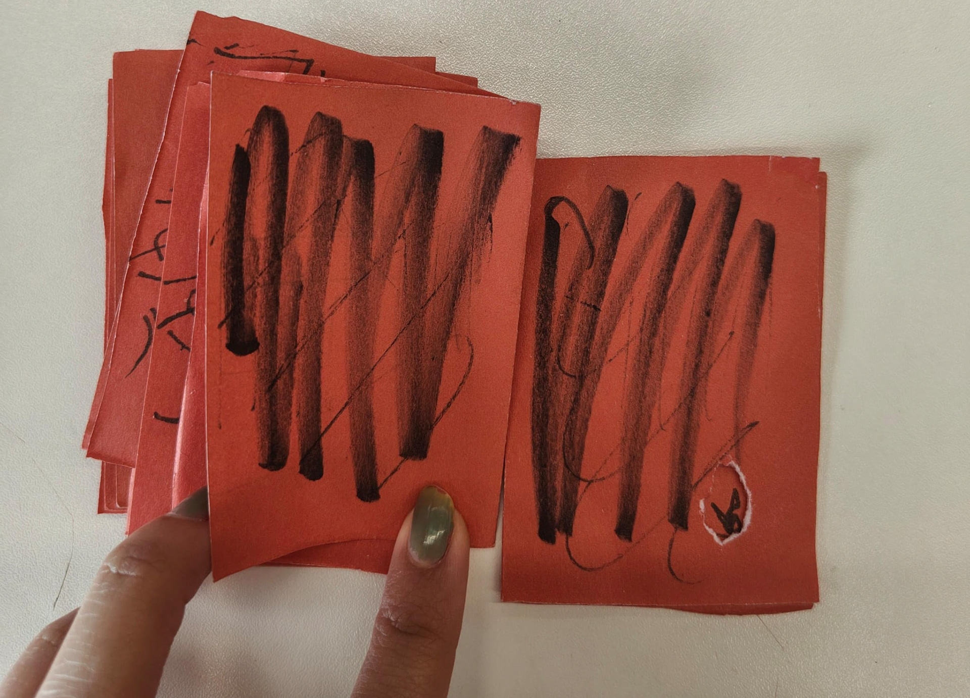
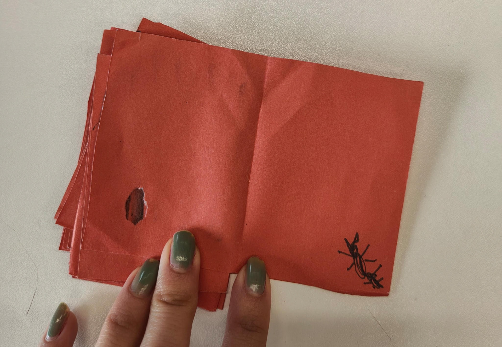
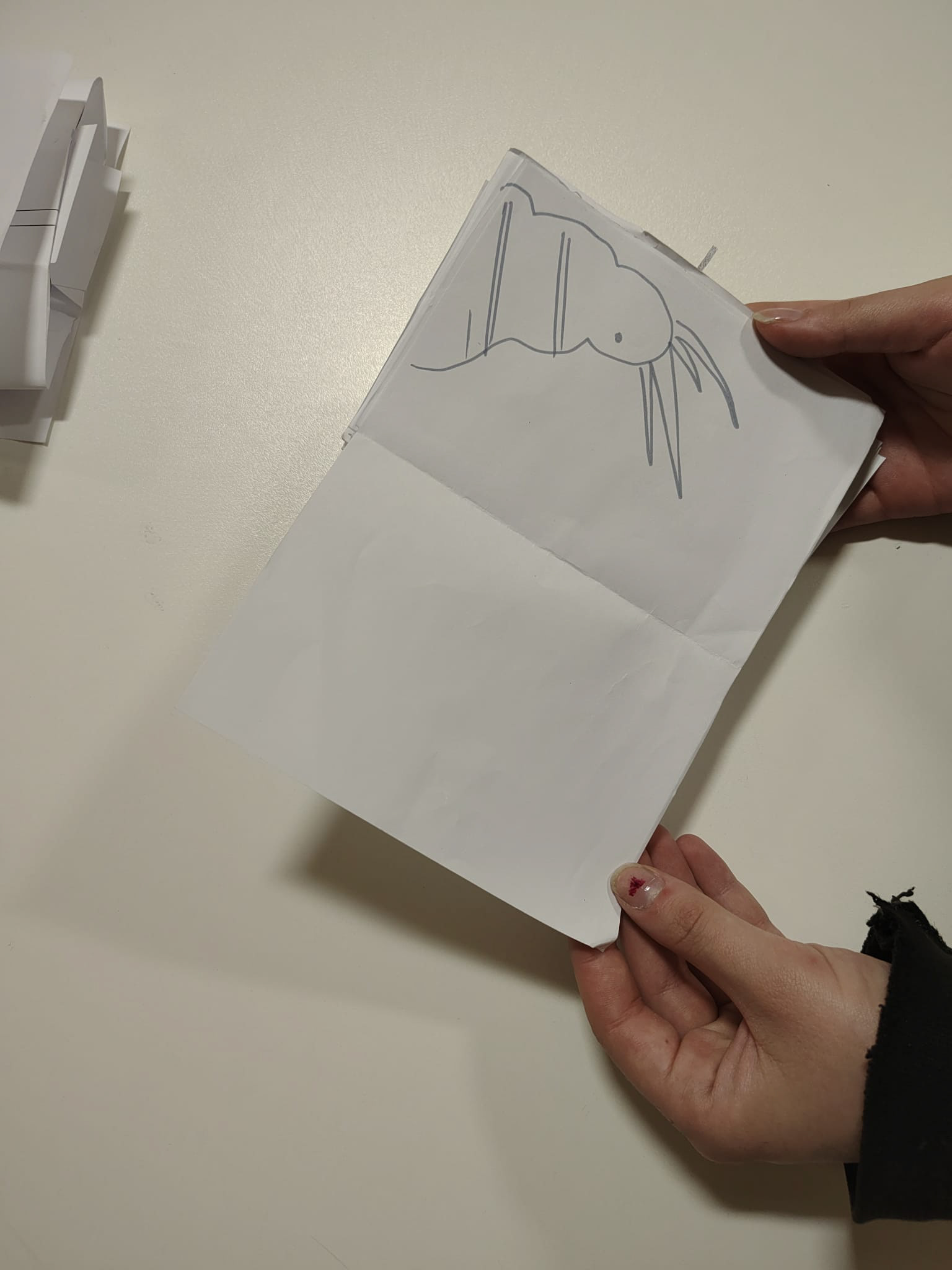
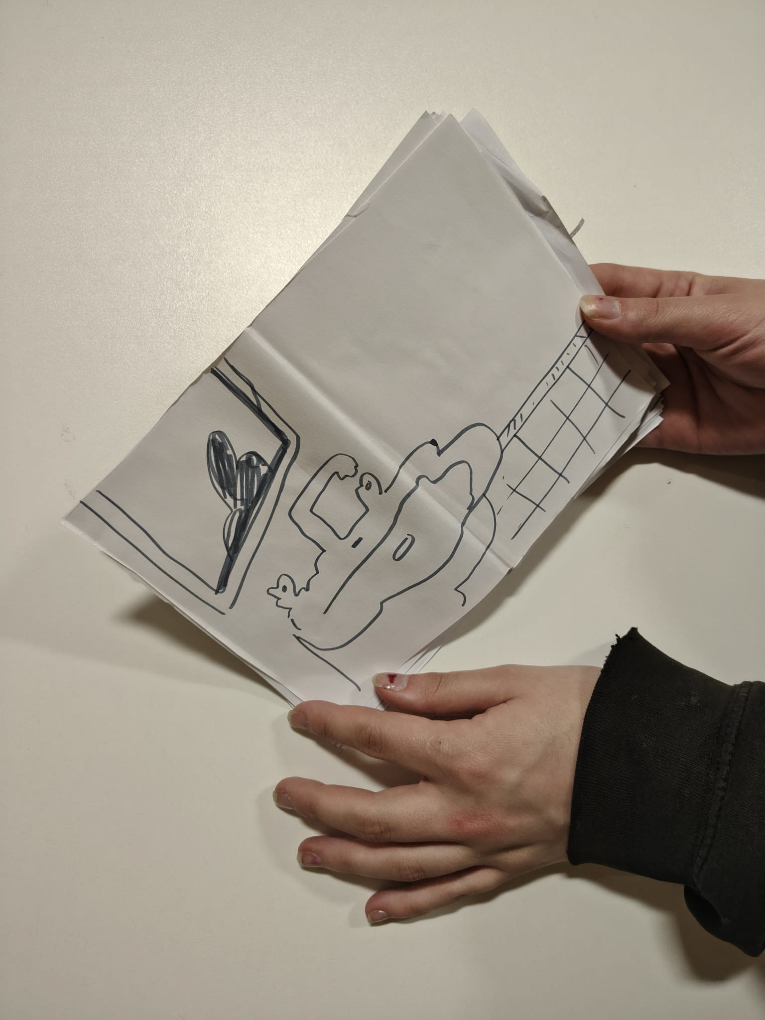
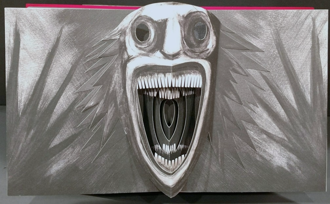
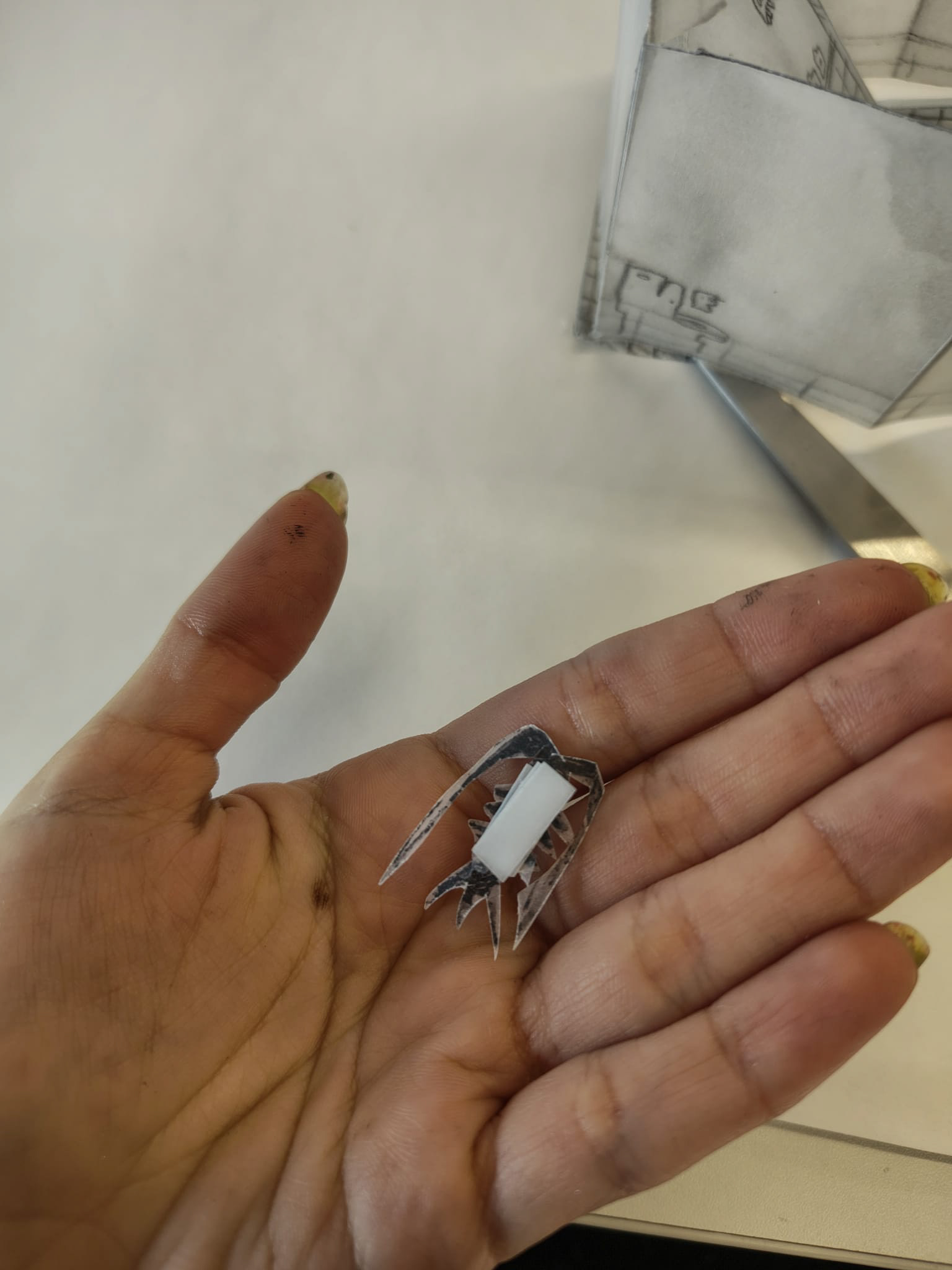
drawing drawing drawing silverfish


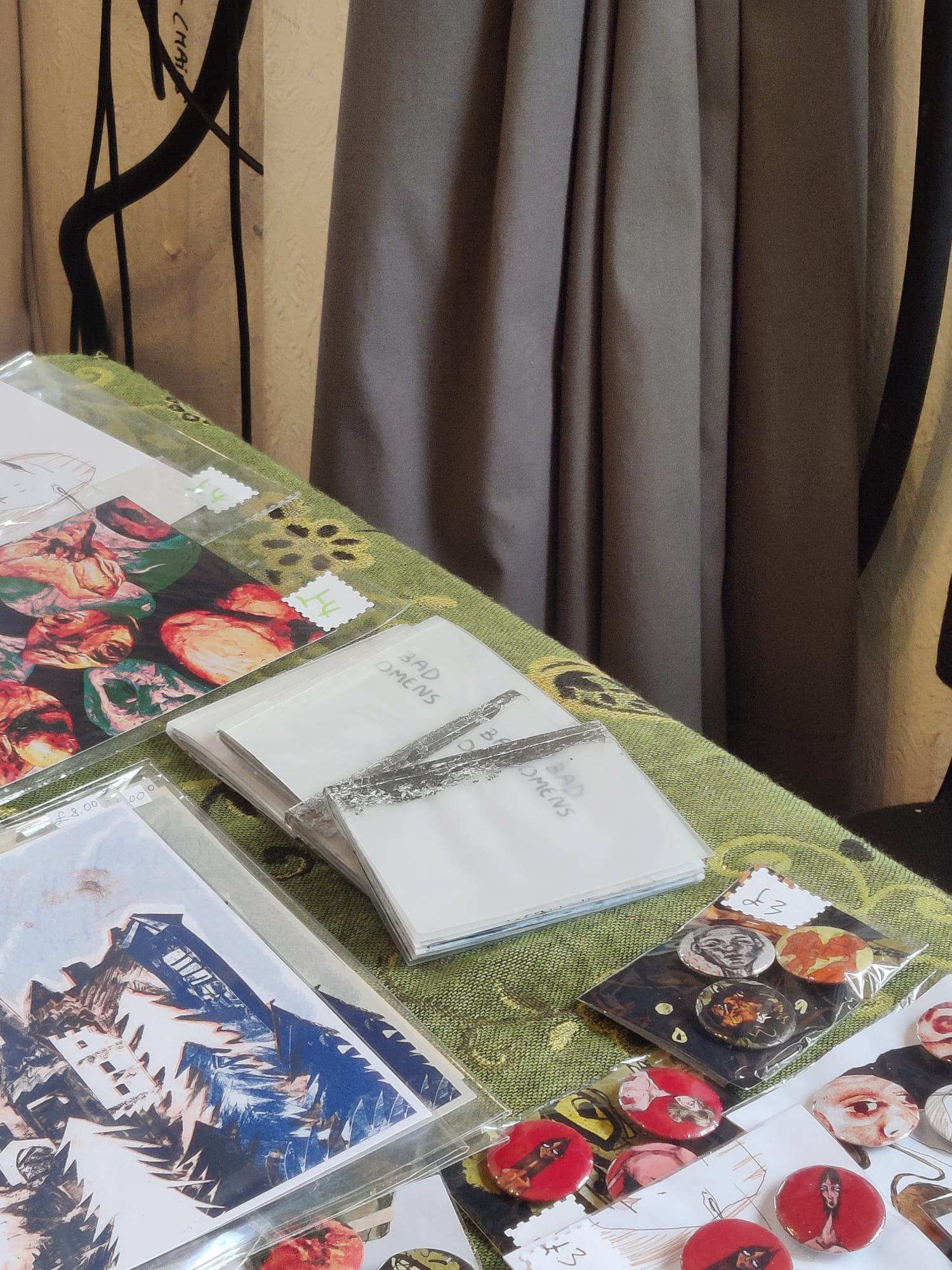
I also sold a couple of the books!
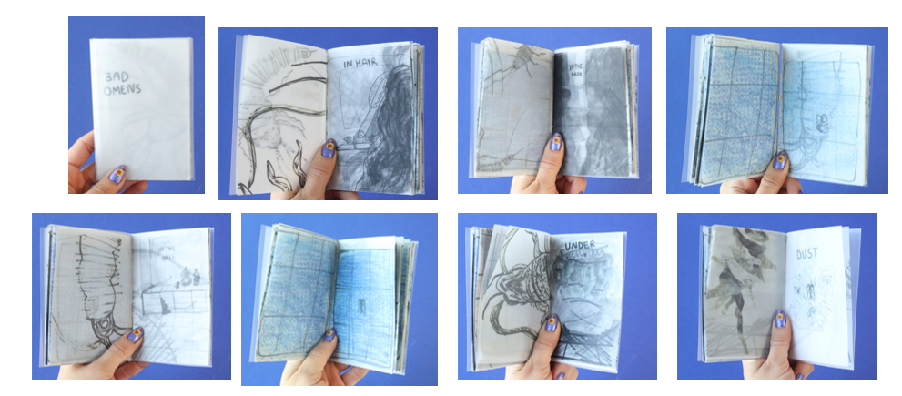
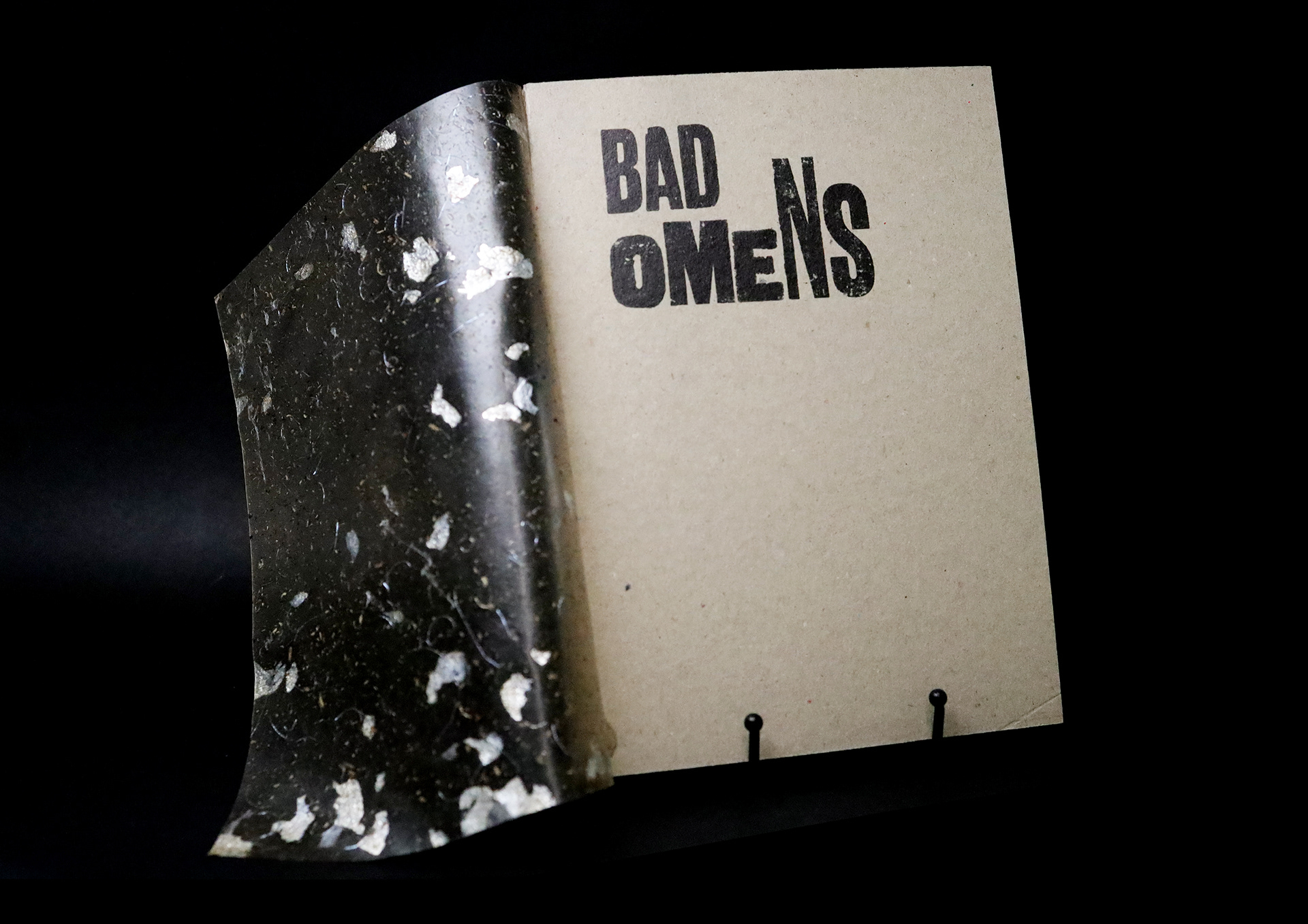
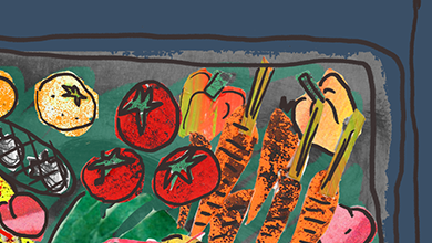
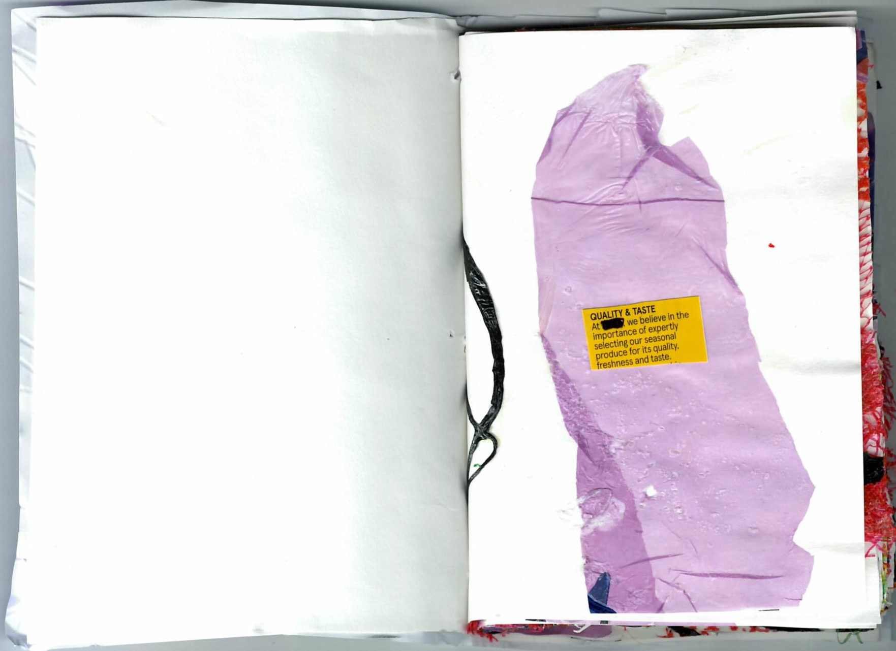
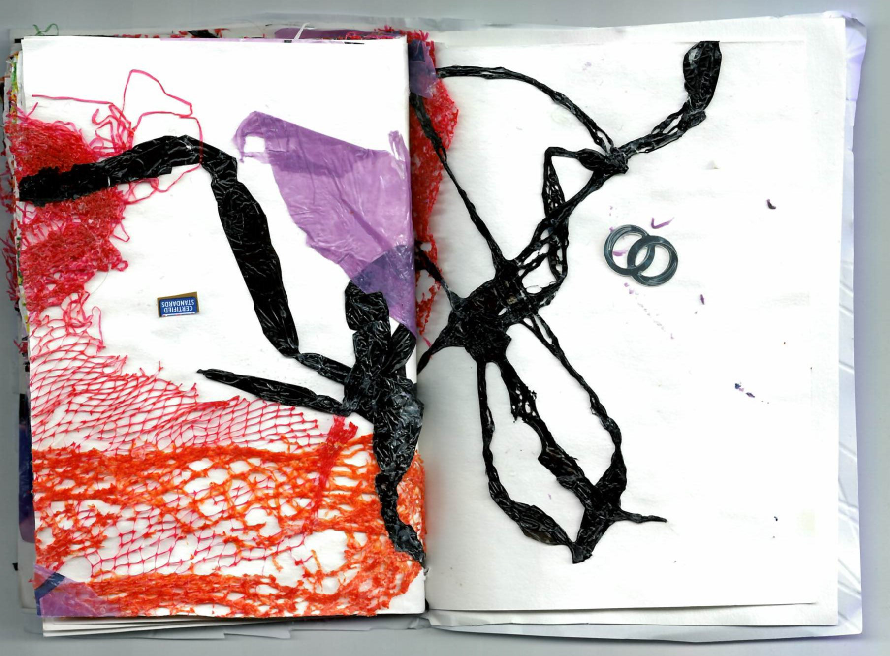
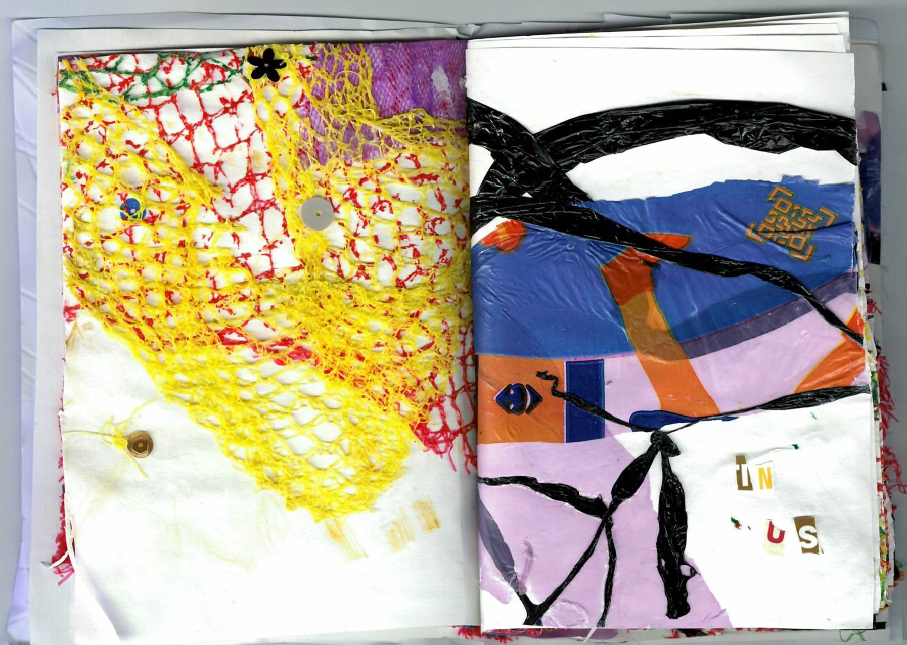
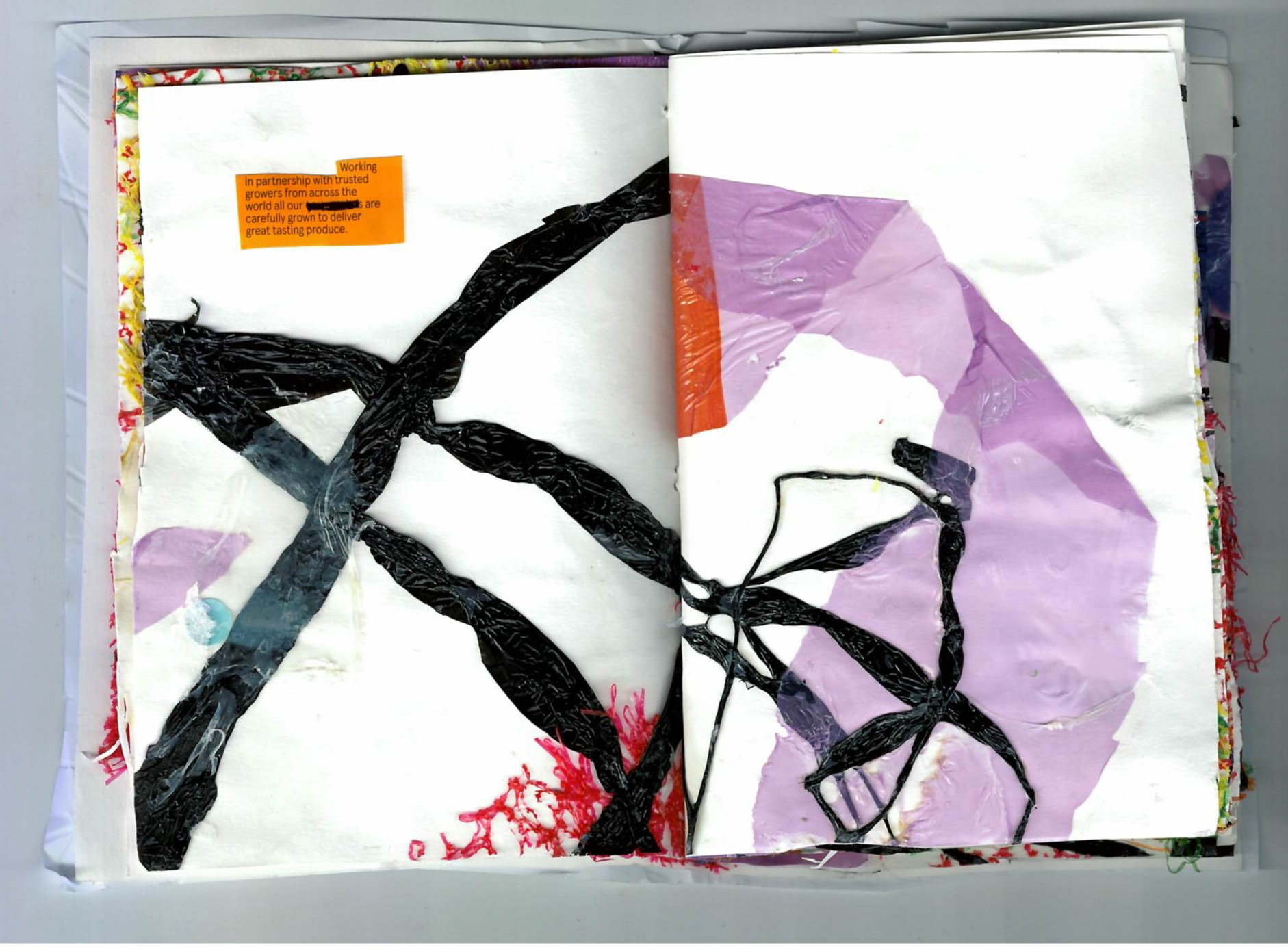
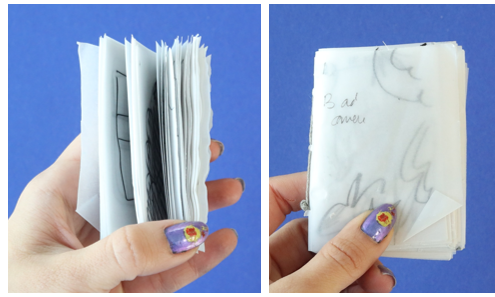
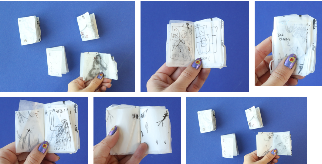
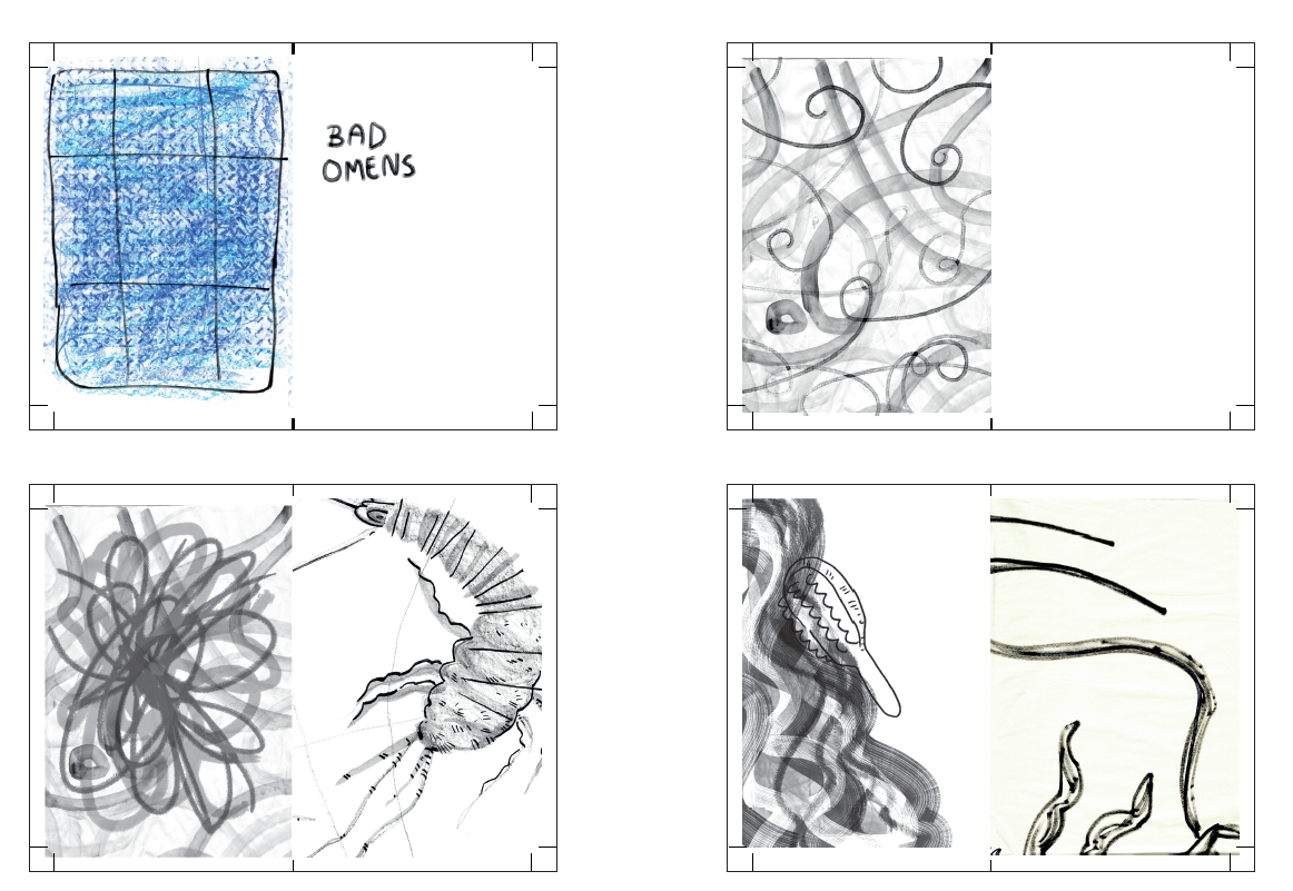
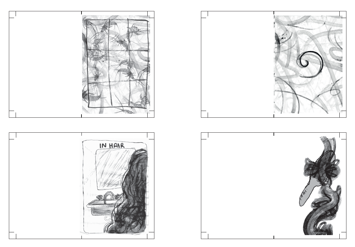
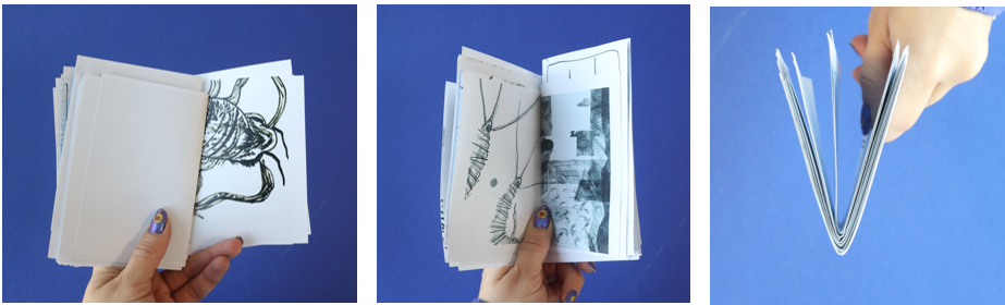
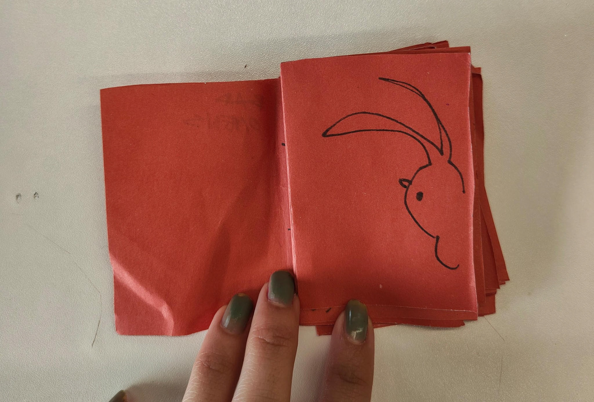
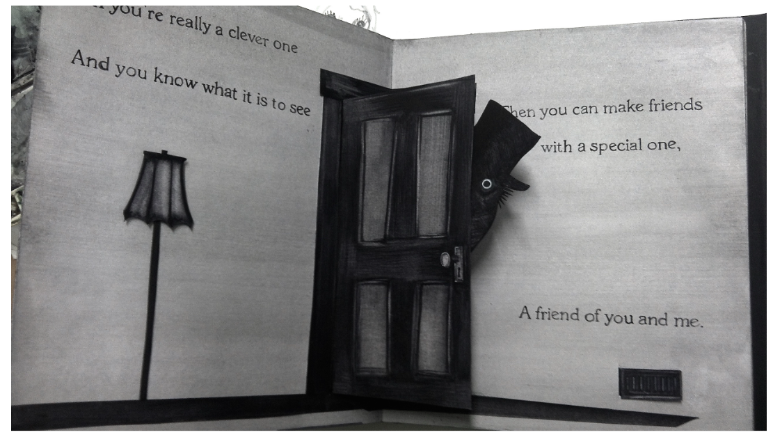
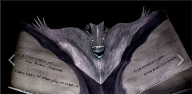
Some highlights of the final book
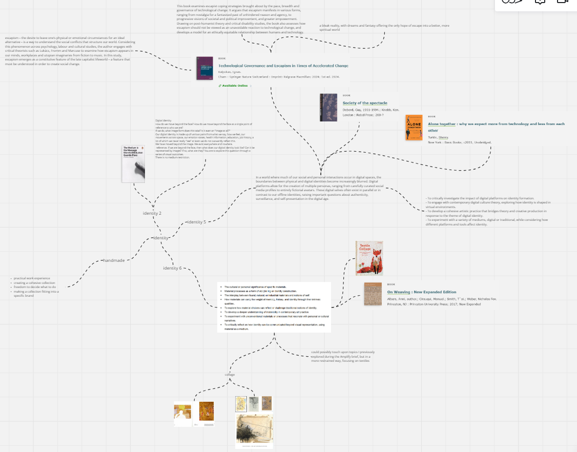
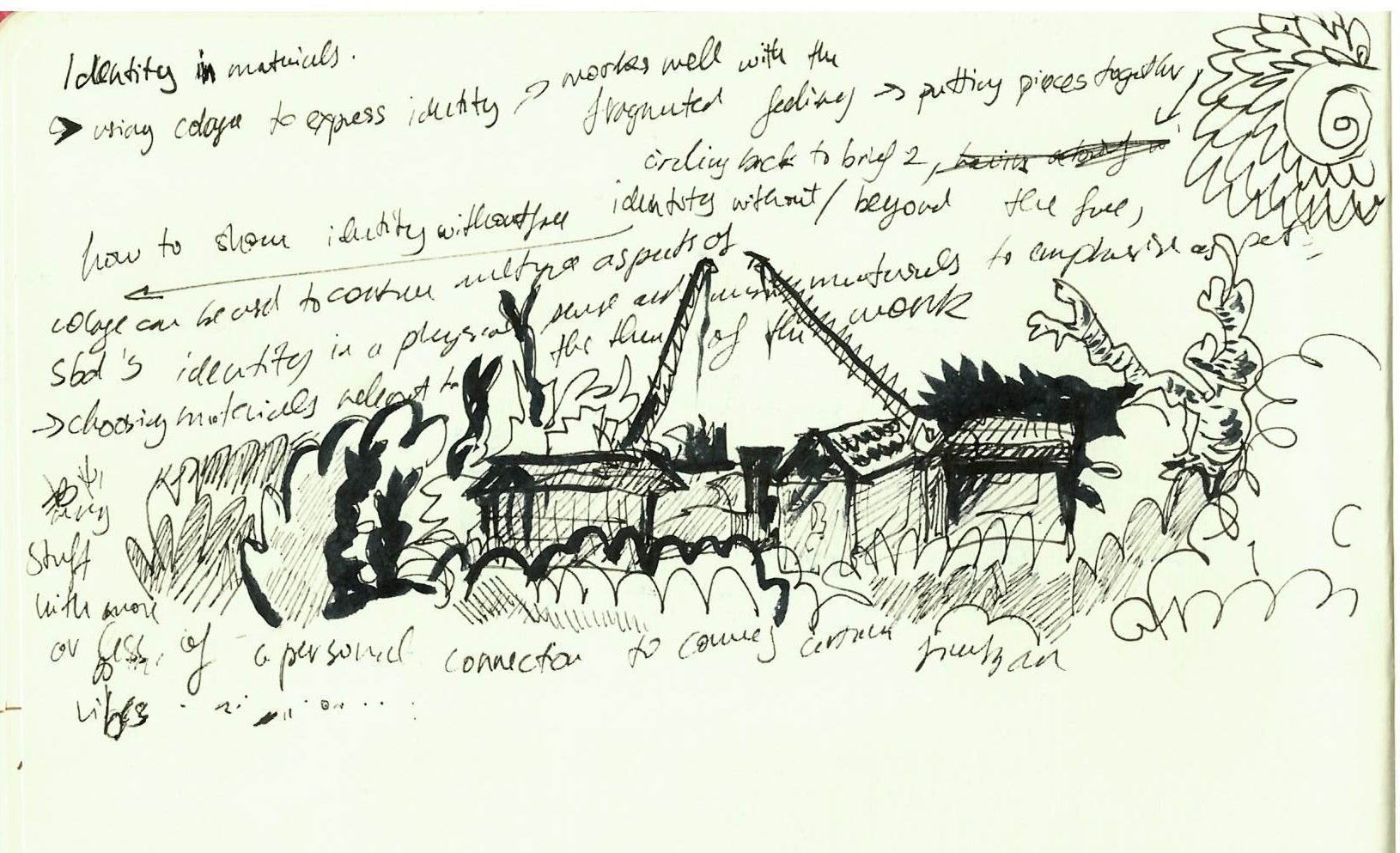
tell a story about who we are or where we come from? Can identity be embedded within the physical
properties of the materials themselves—through texture, form, or process?'
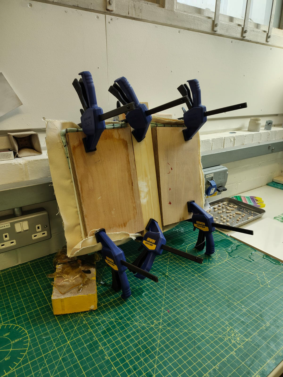
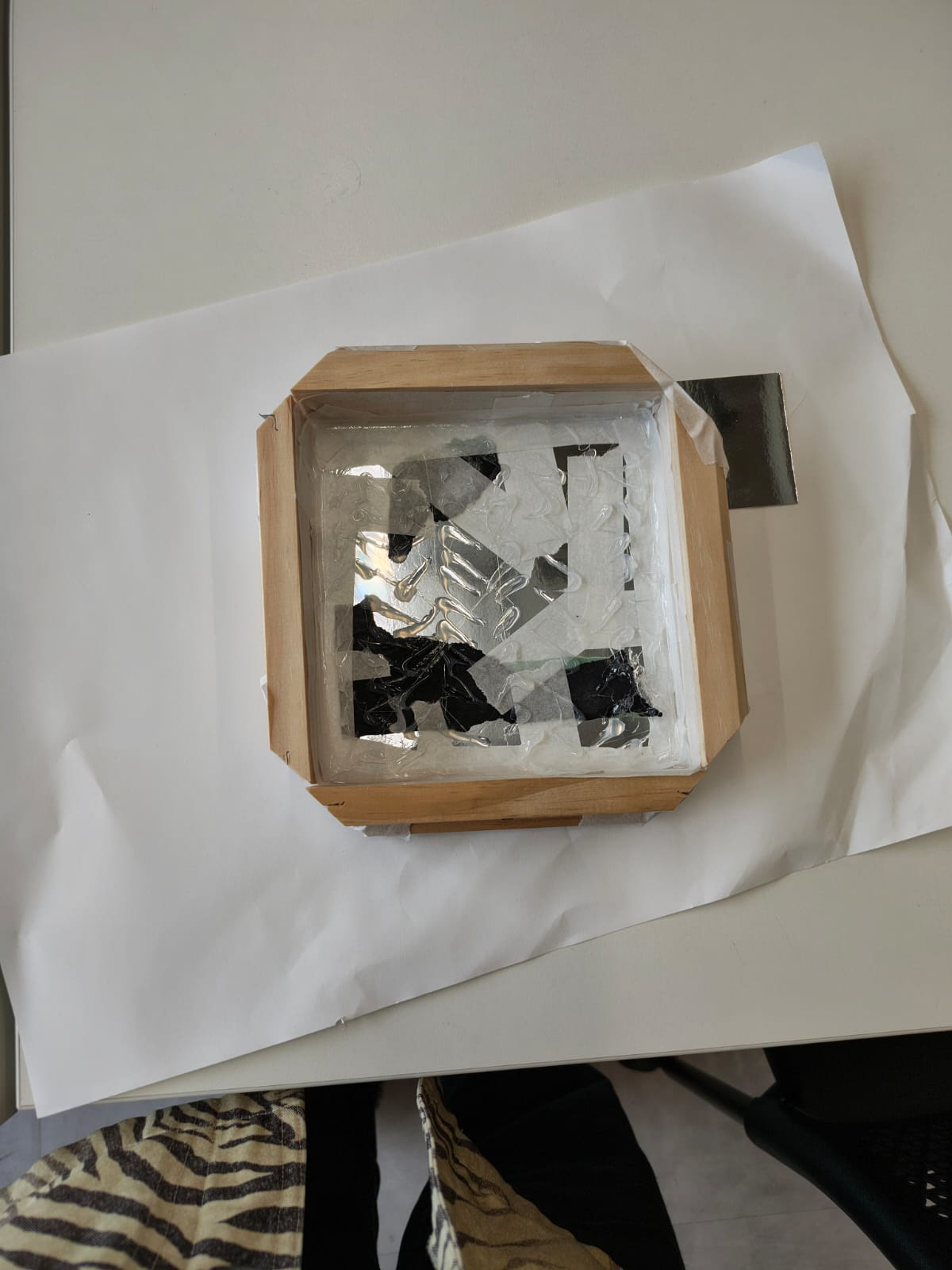
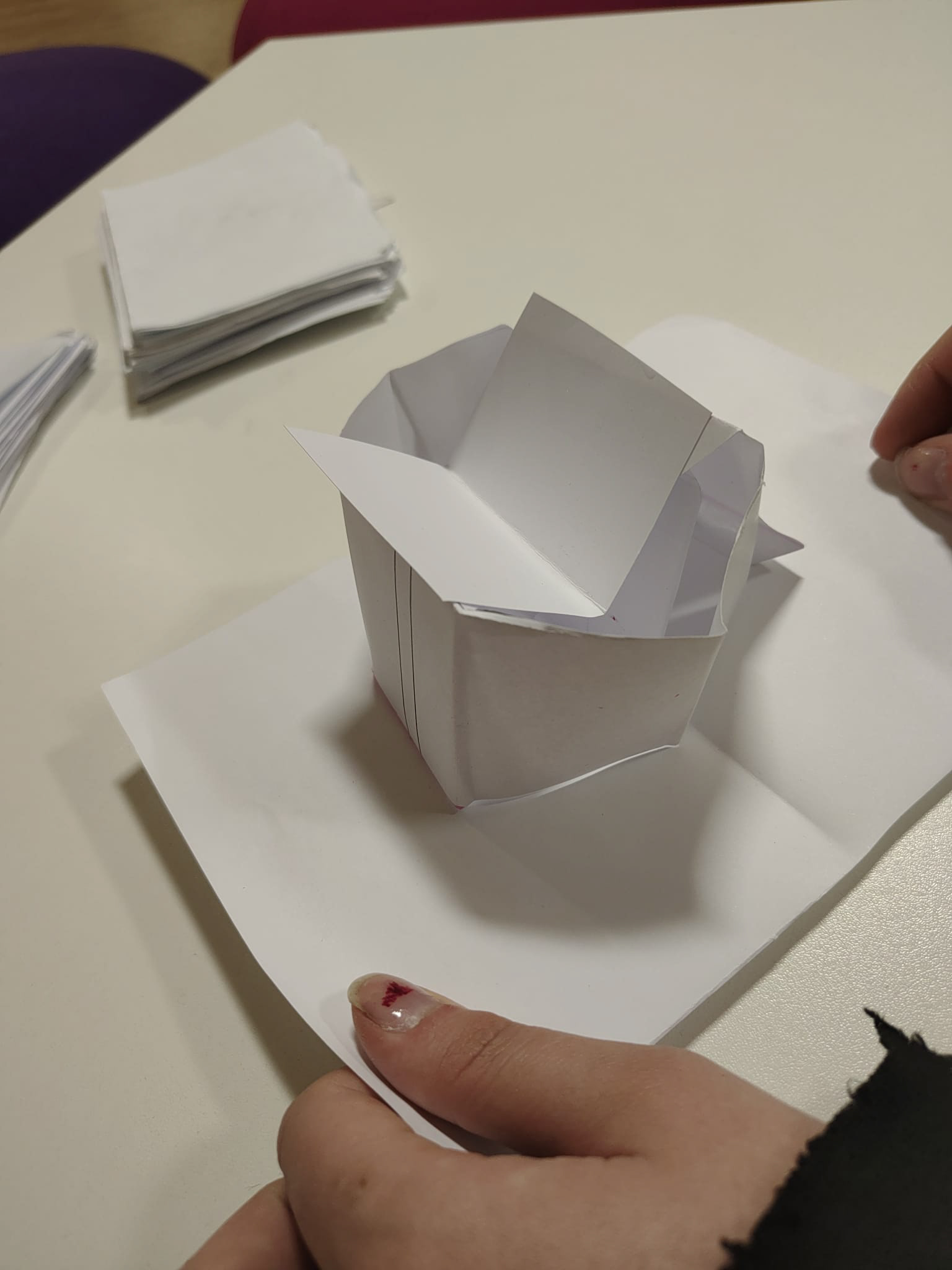
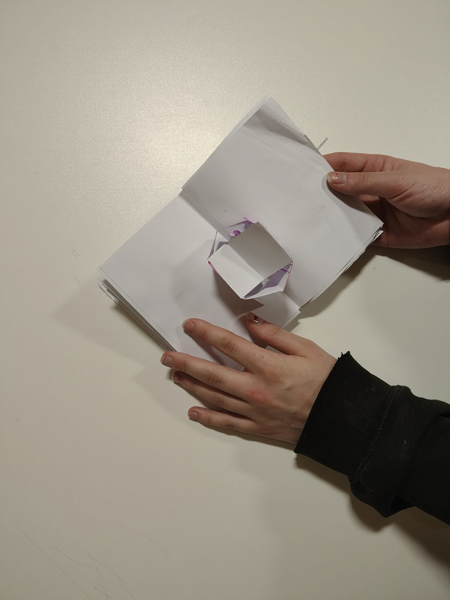
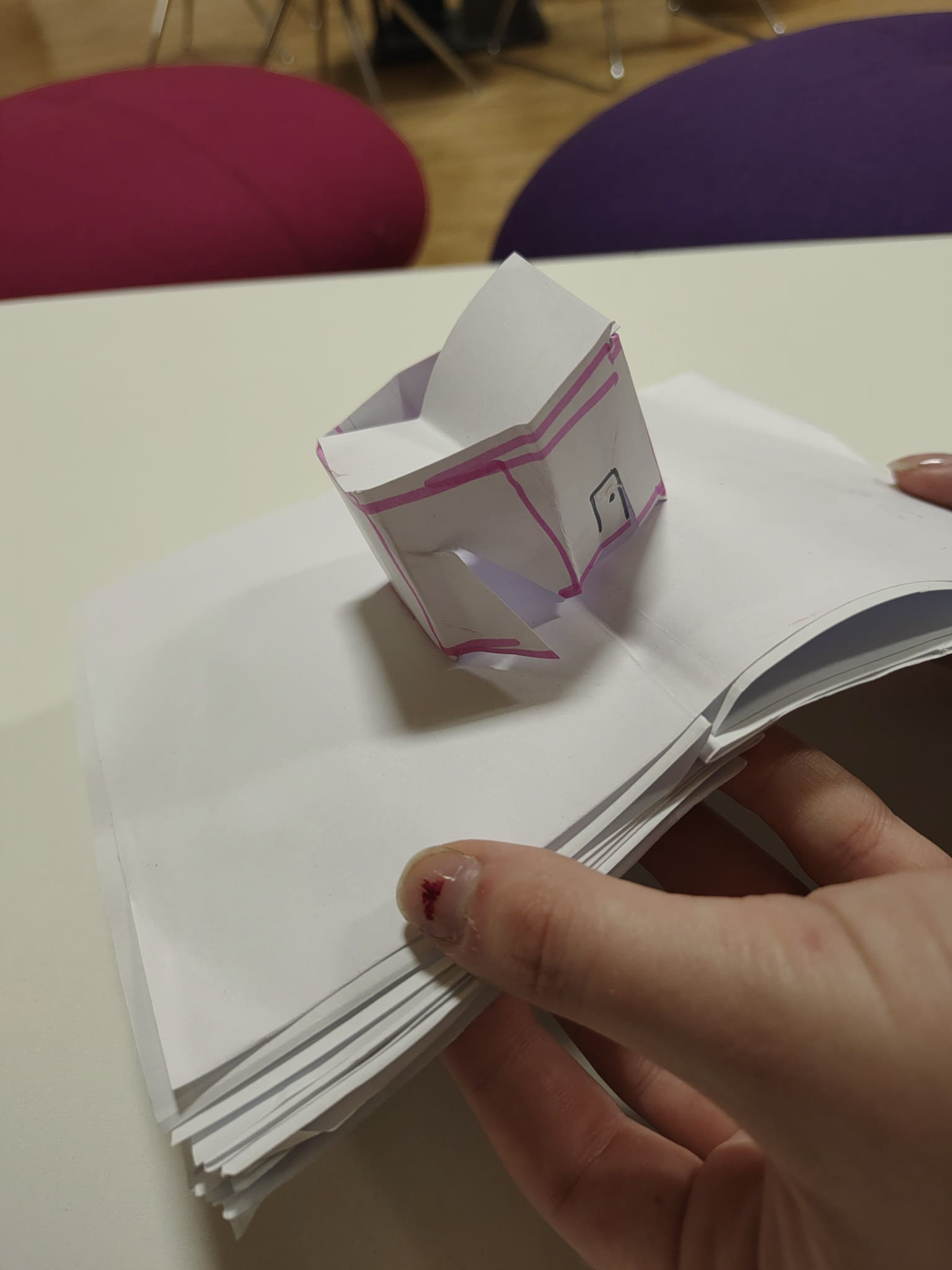
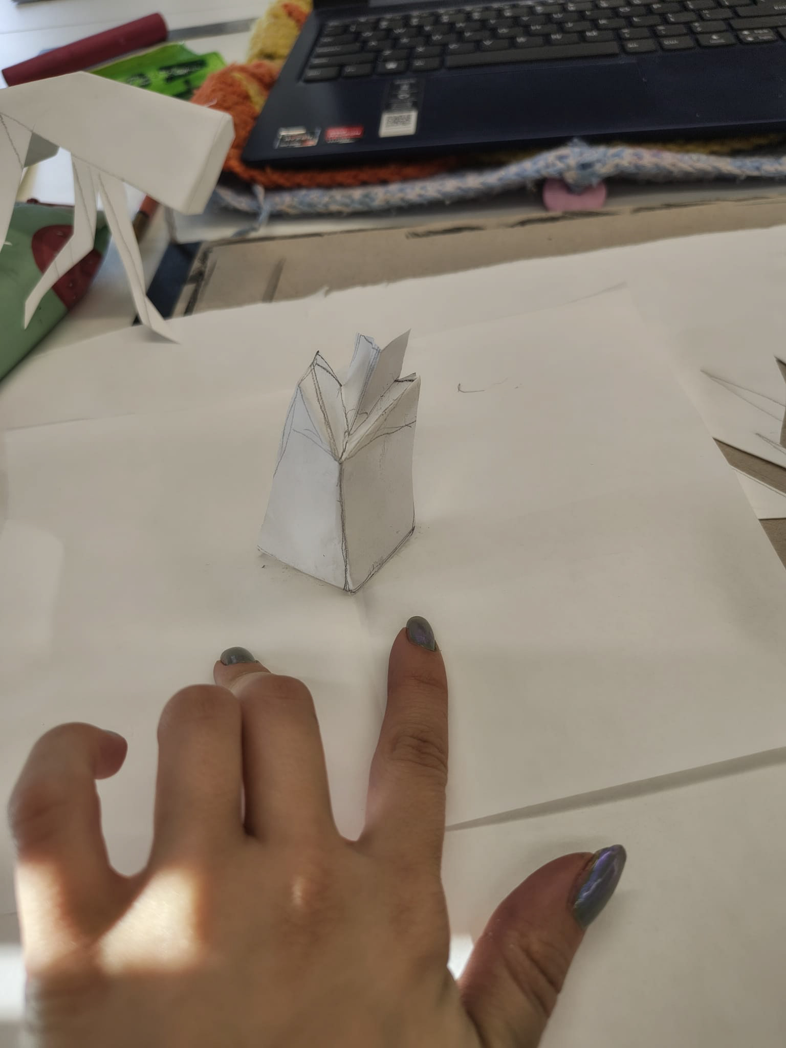
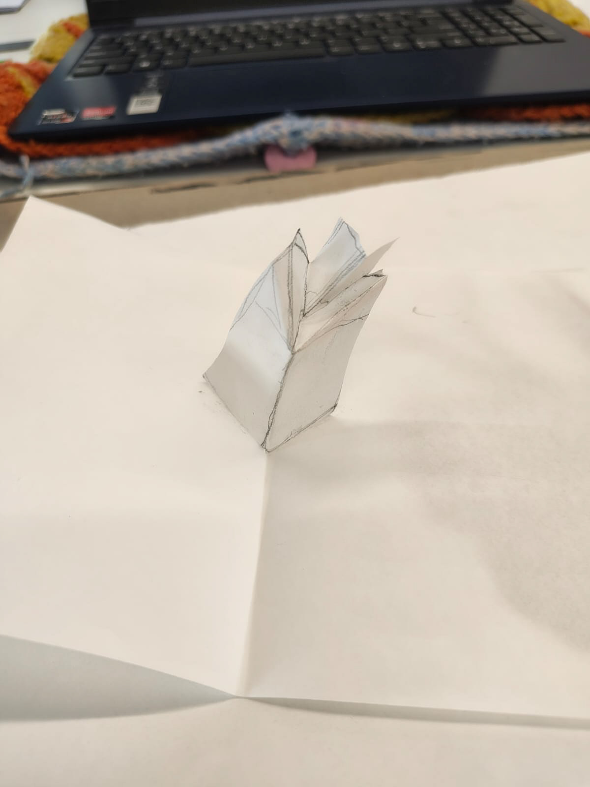
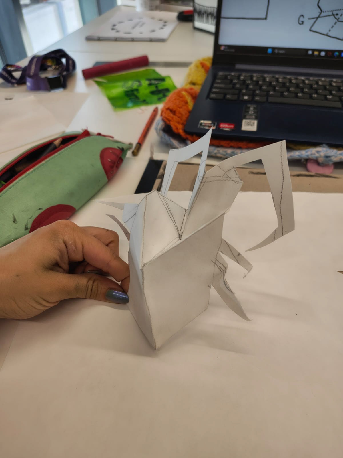
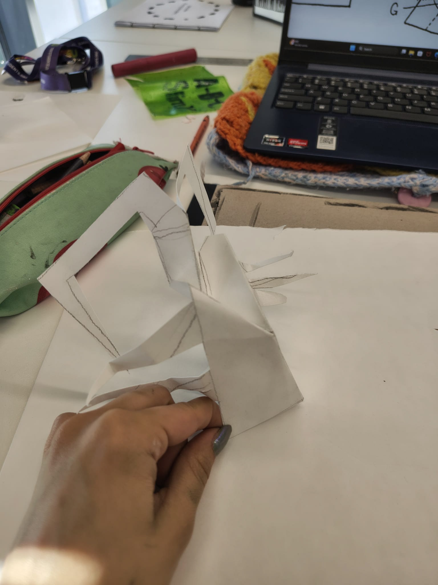
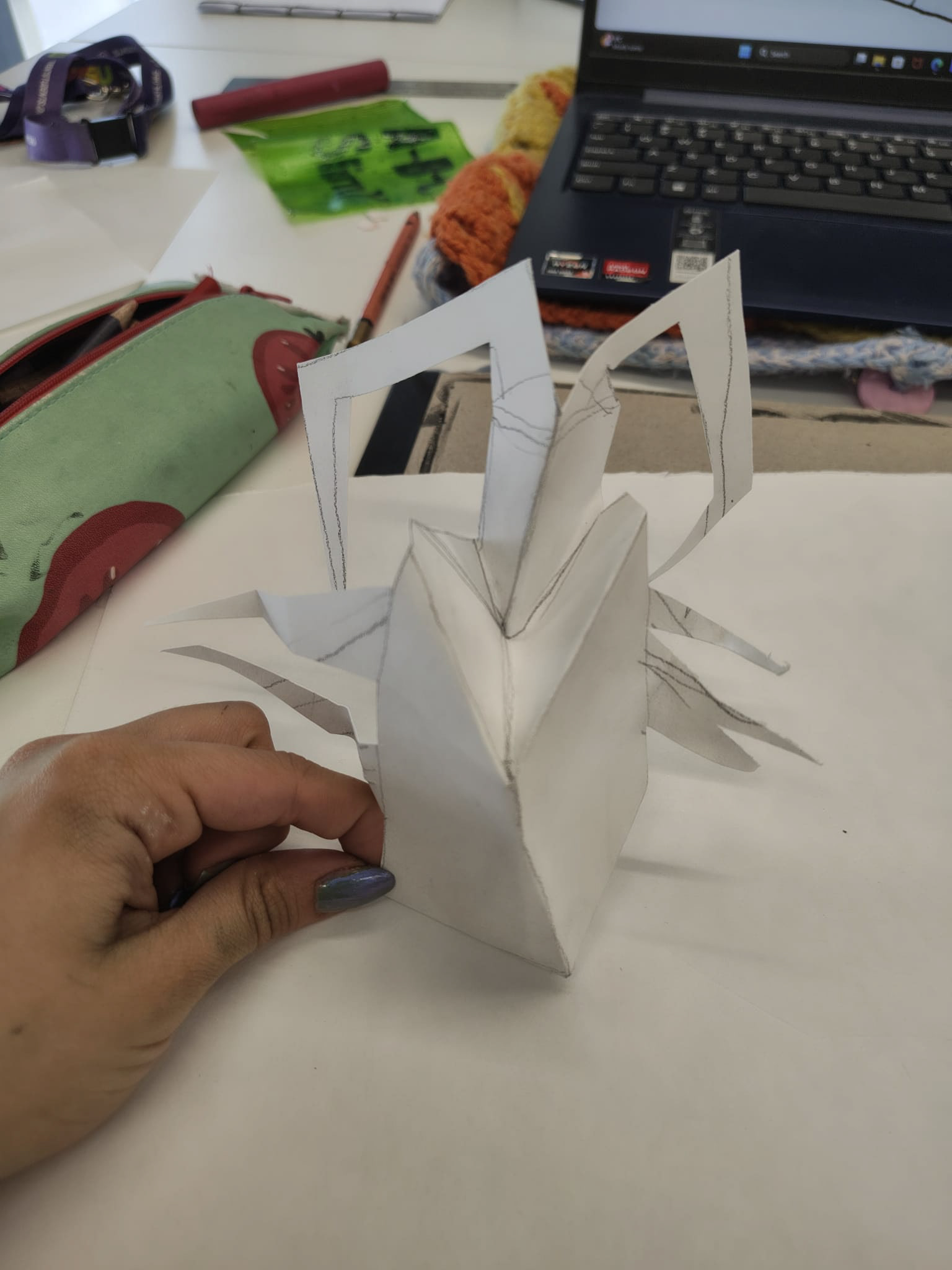
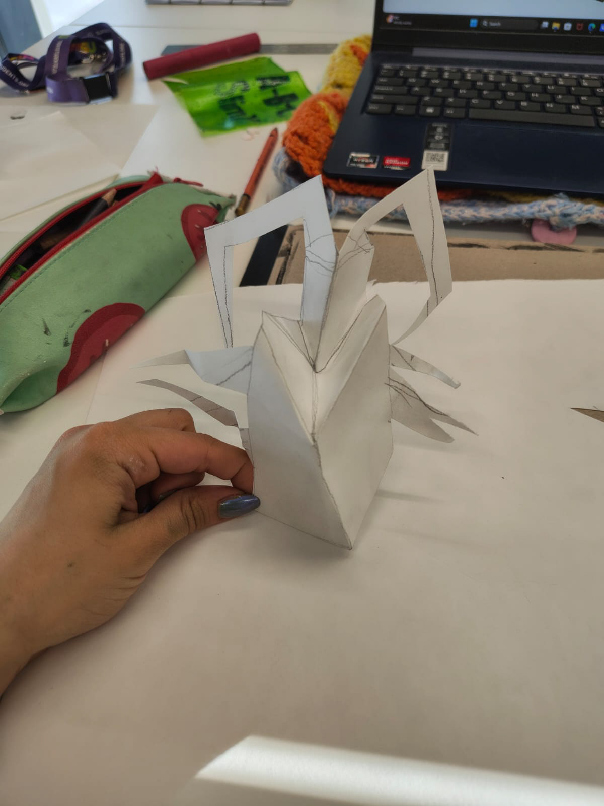
my first attempt at making the cube
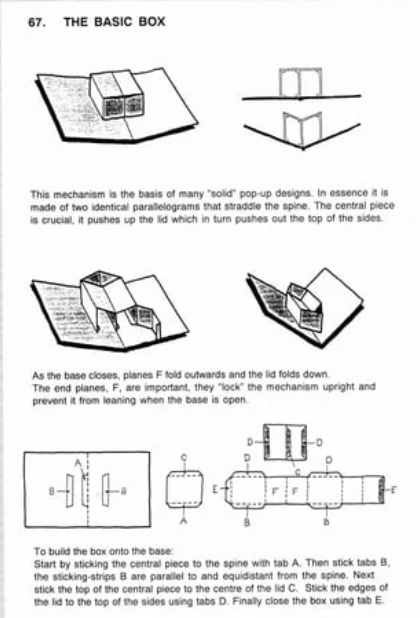
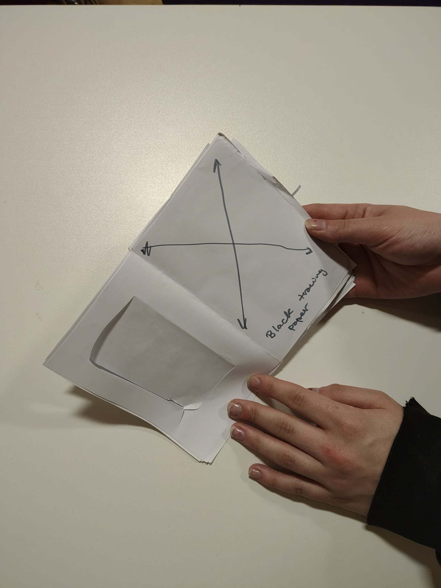
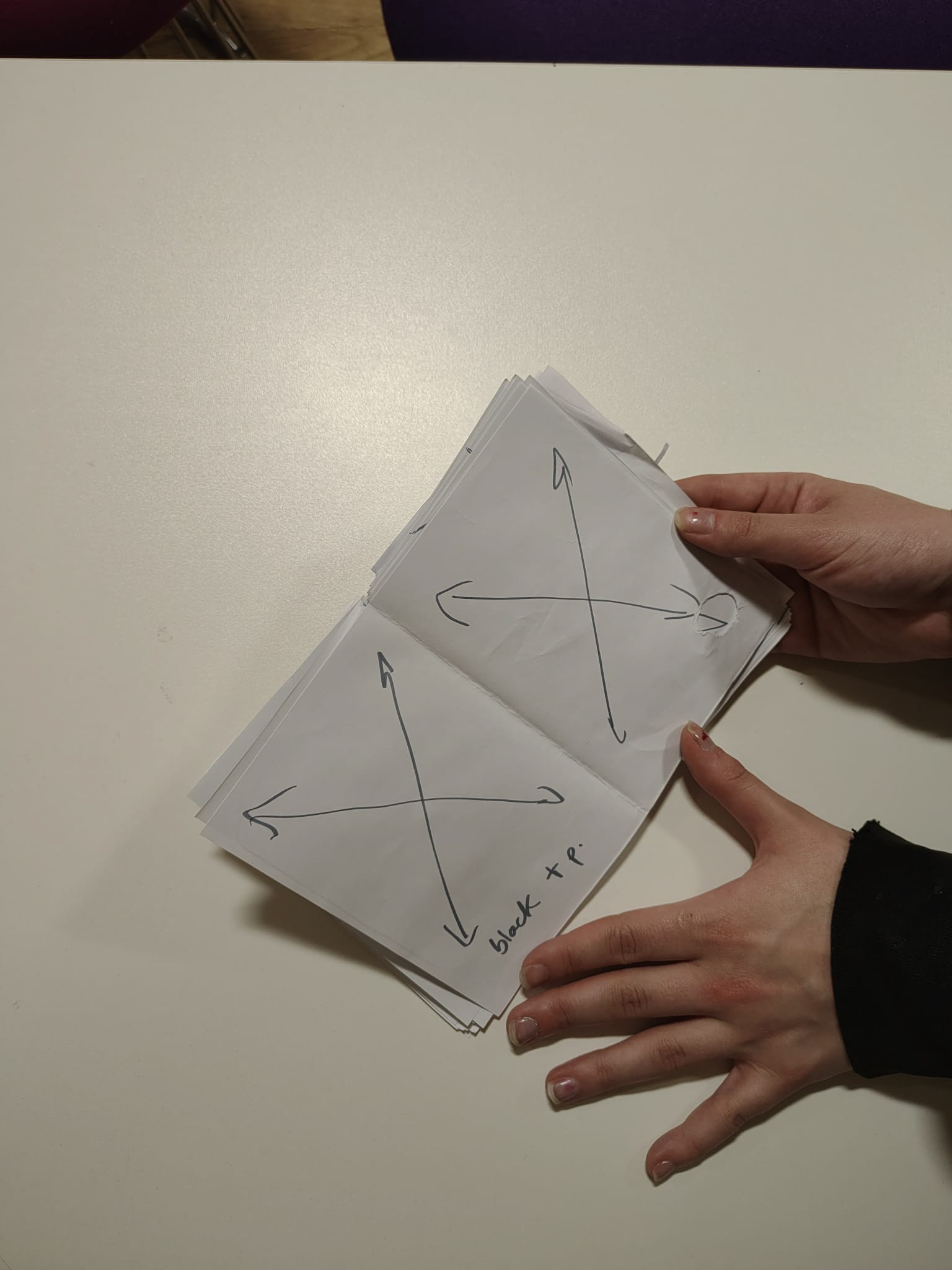
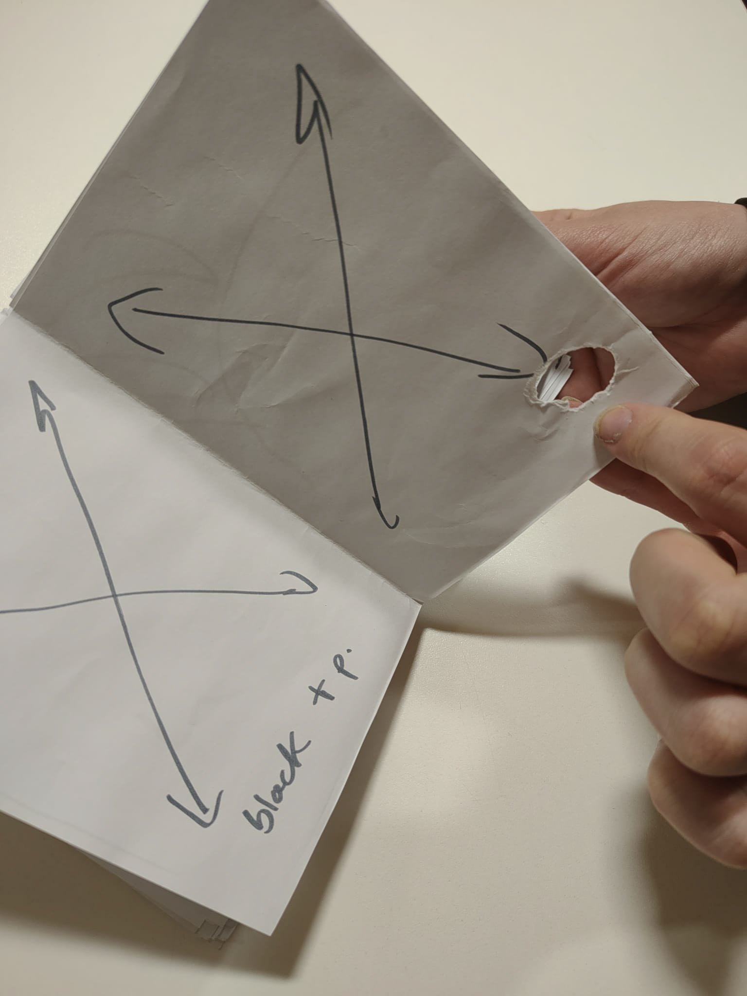
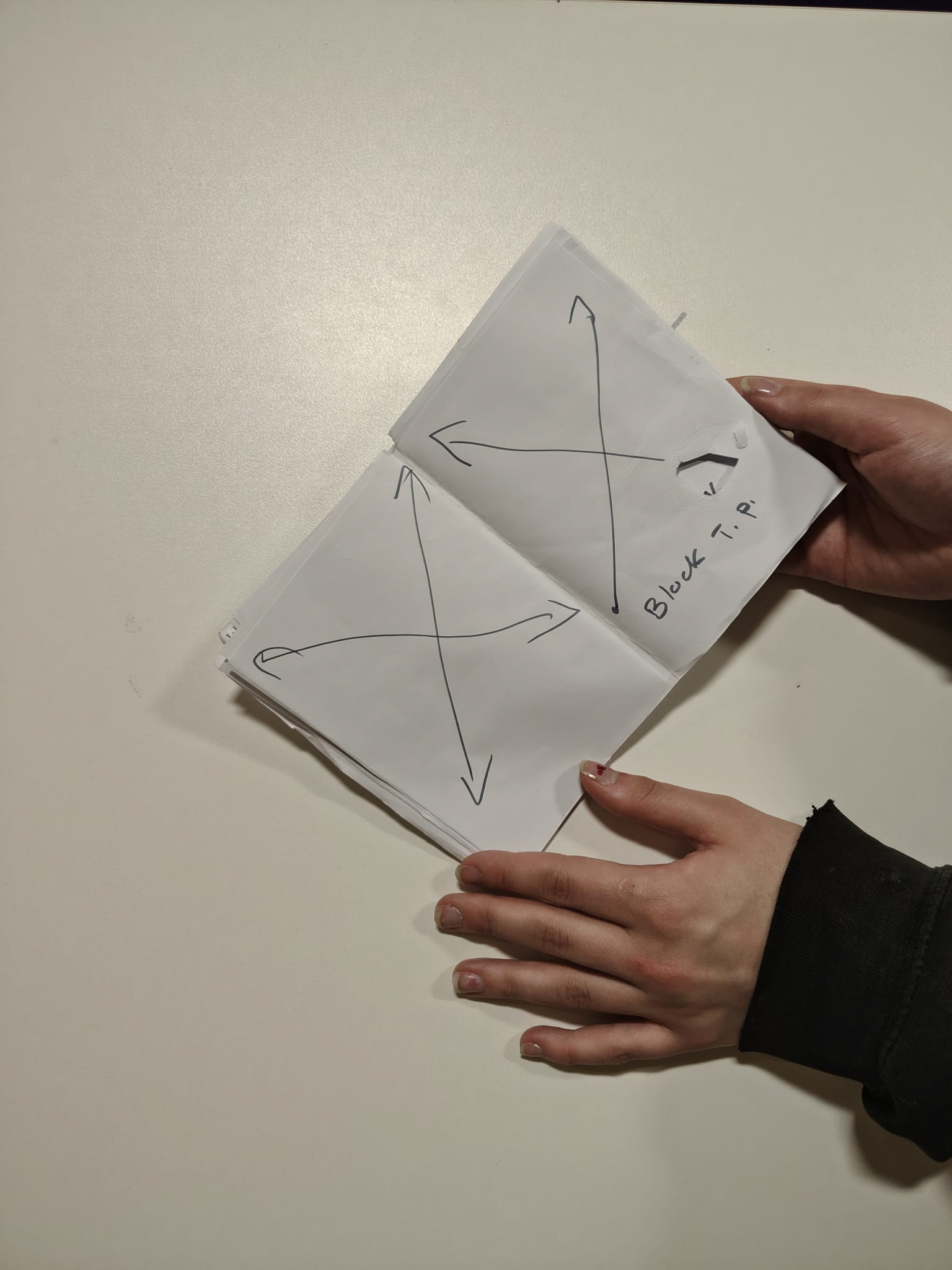
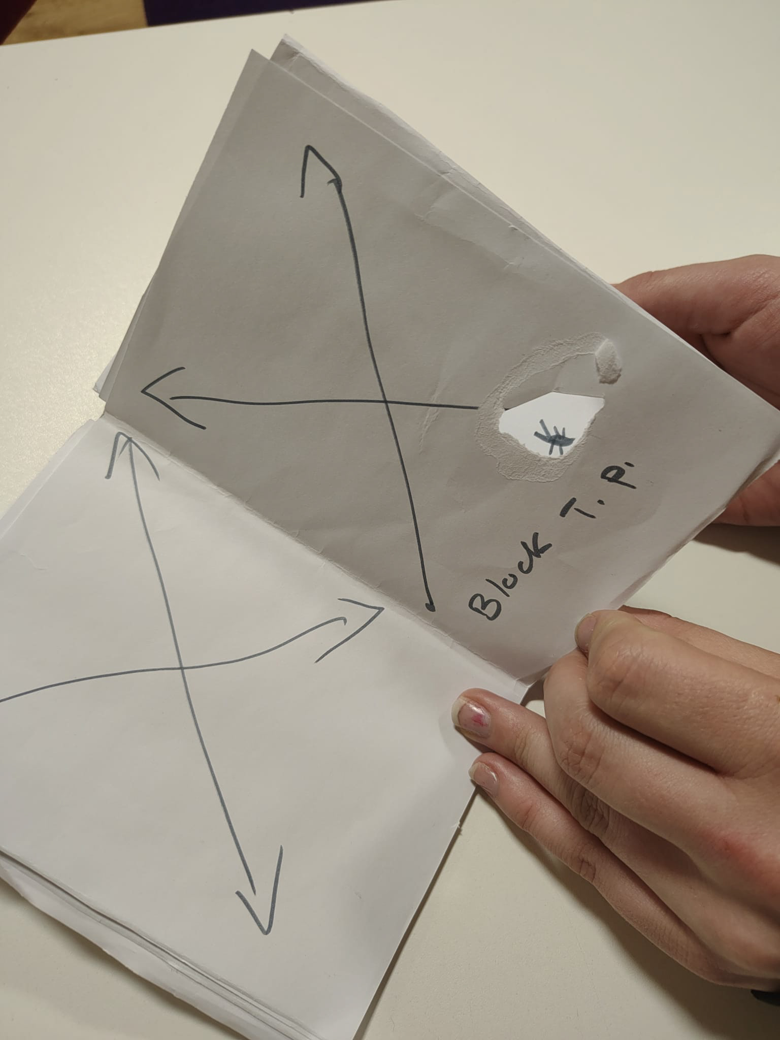
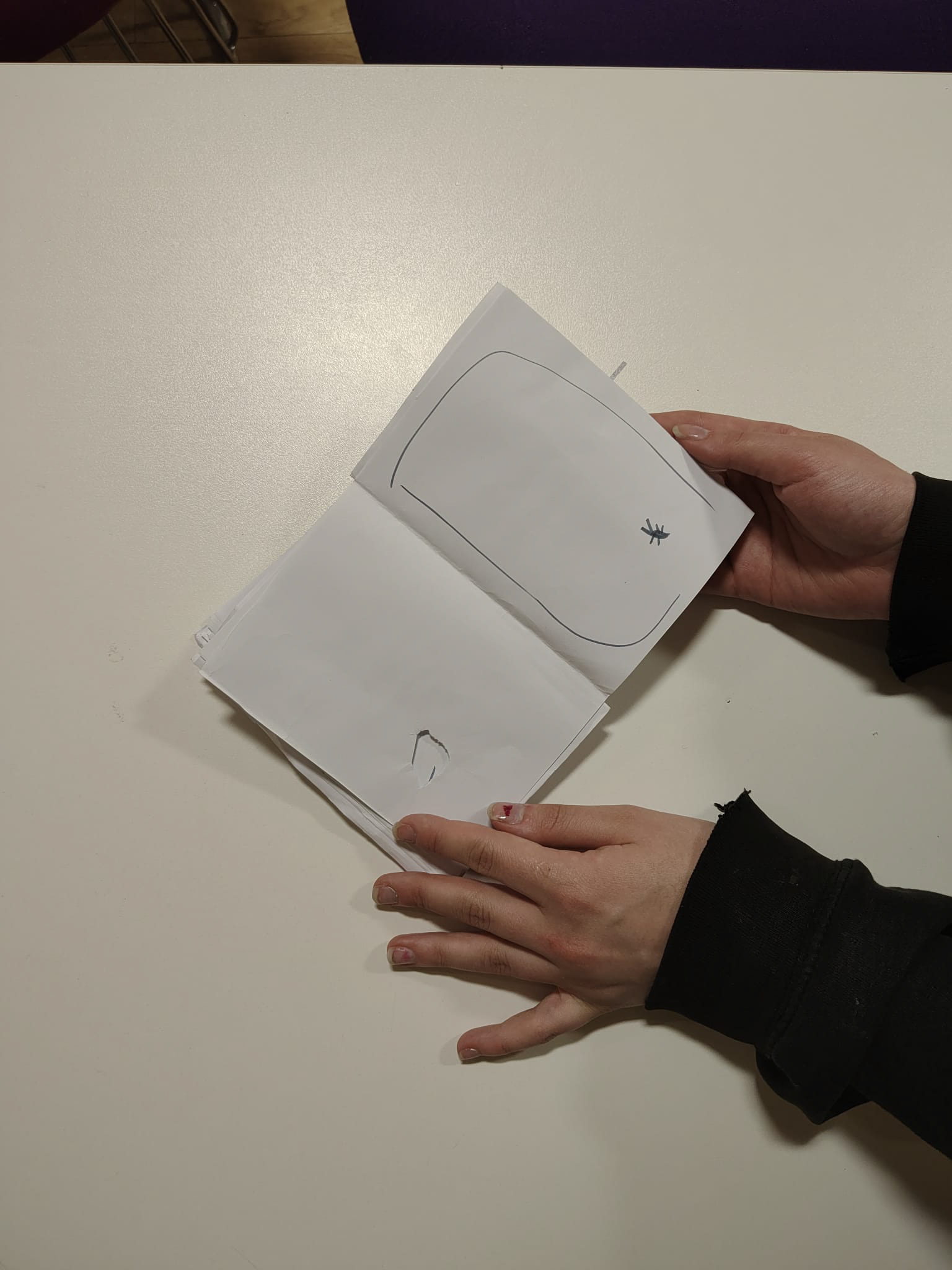
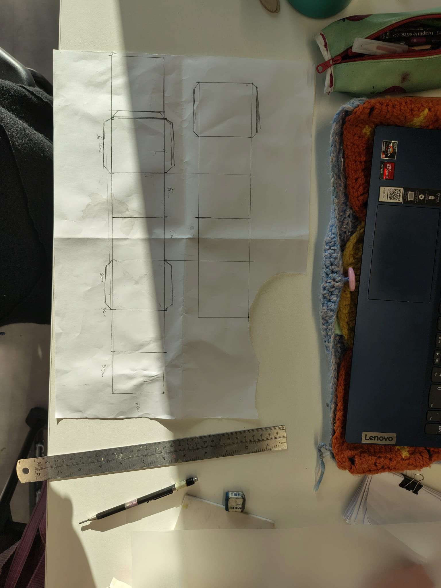
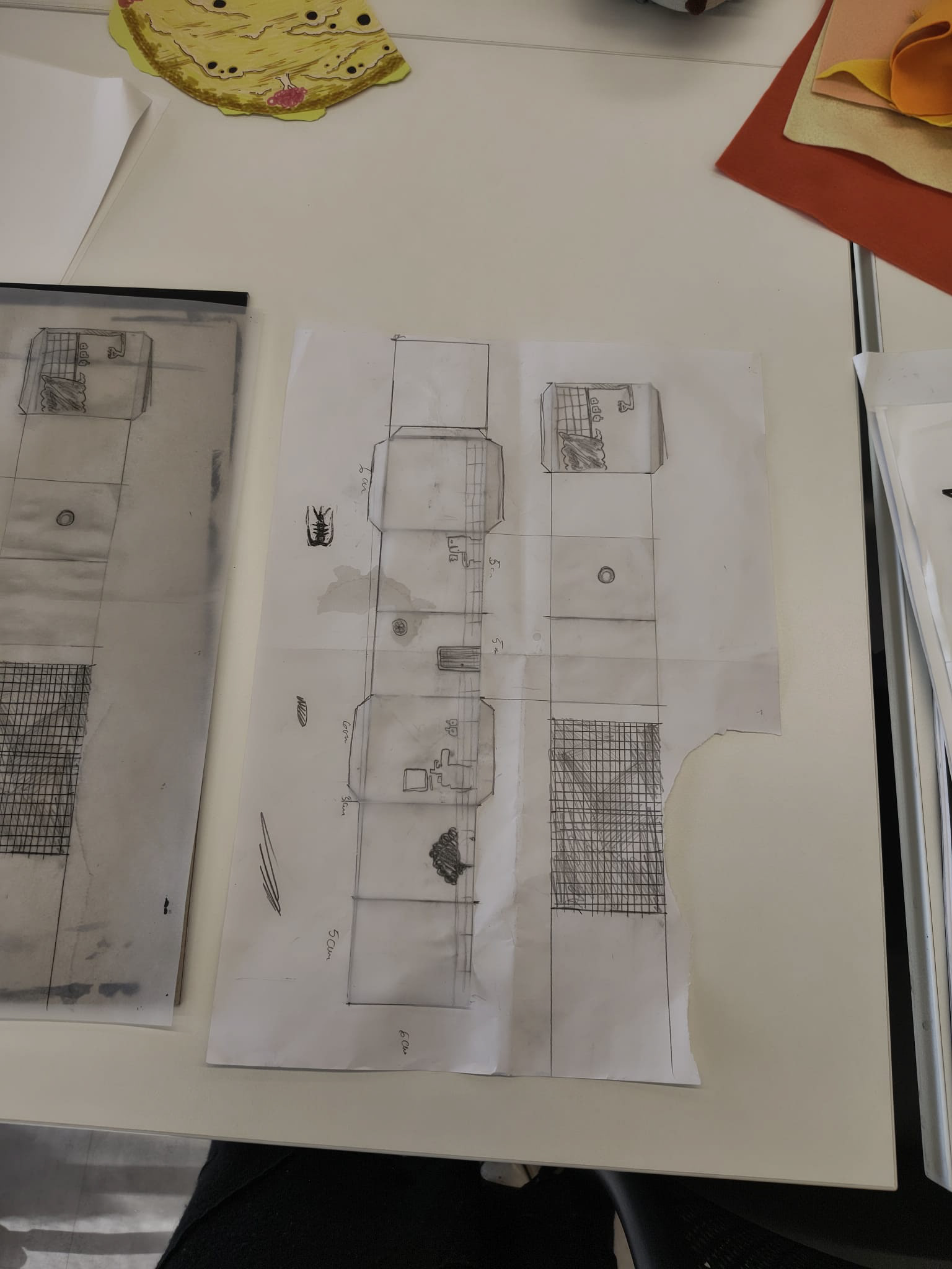
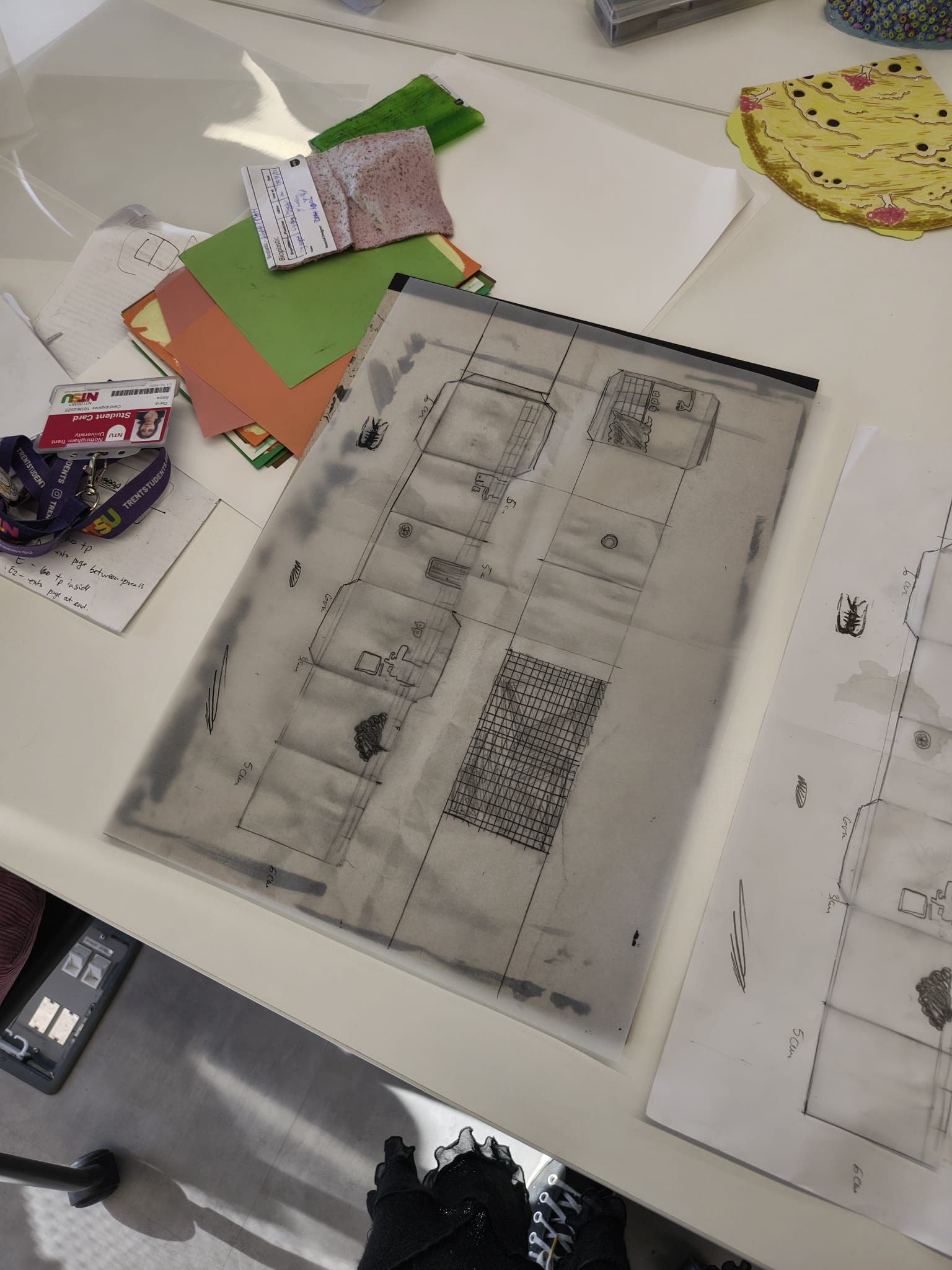
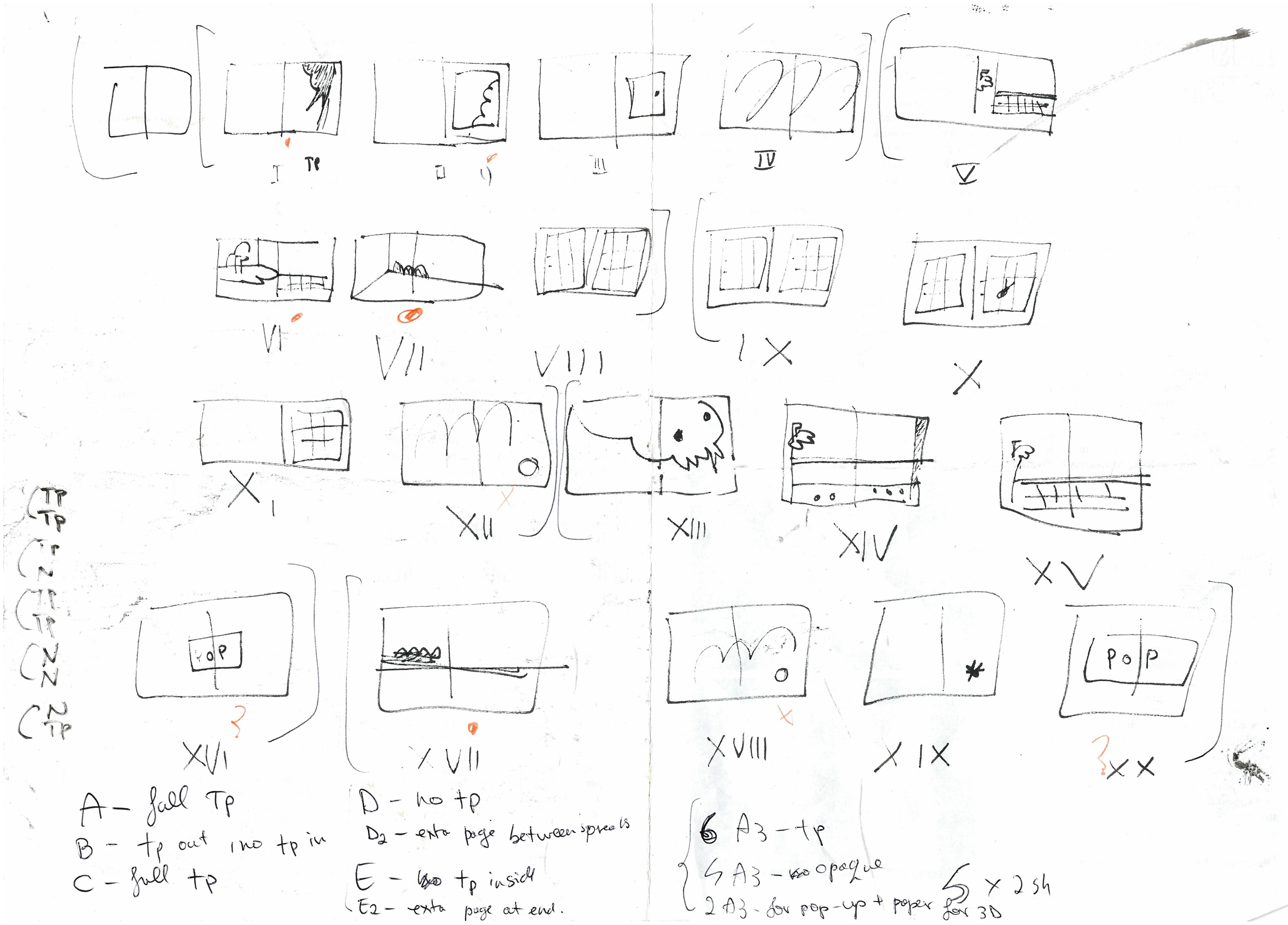
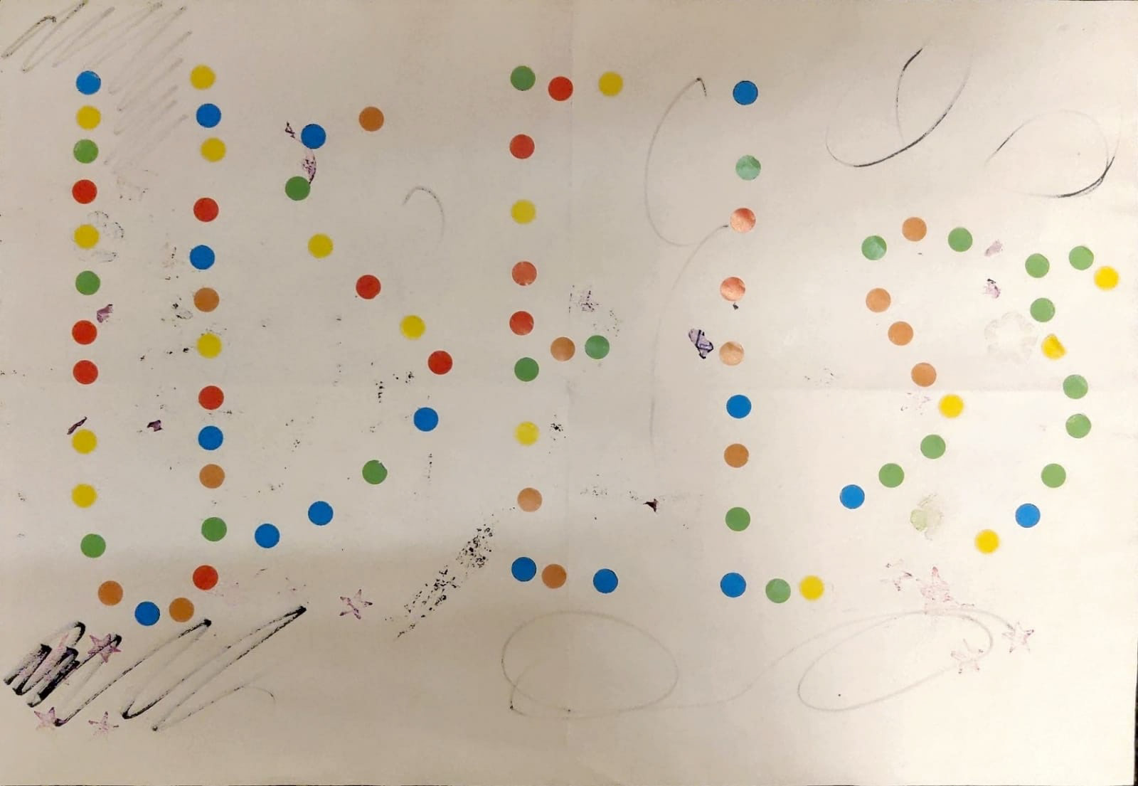
planning - note that TP refers to tracing paper, and N to non-tracing paper