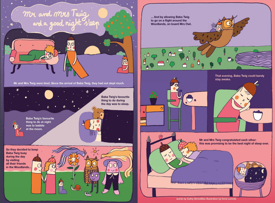
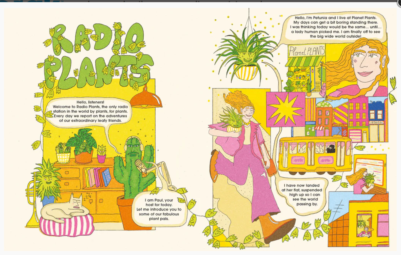
'Studio Anorak is an independent kids publishing house established in 2006 by Cathy Olmedillas. It publishes Anorak Magazine and DOT four times a year. Launched in 2006, it pioneered a new aesthetic and concept in children's magazine publishing.
Anorak Magazine, the ‘happy mag for kids’ is aimed at boys and girls aged between 6 and 12 years old. DOT is aimed at pre-schoolers. Both titles are unisex and sold all around the world online, in kids boutiques, museum shops and newsagents.
Studio Anorak is proud to produce printed magazines that last and on REAL (recycled) paper with REAL (vegetable) ink. It makes them smell nice and it is at the heart of our commitment to provide kids with a calm, immersive, fun piece of culture.
Unlike magazines of today, neither publications are throw-away titles. Just like much loved children’s magazines and annuals of the past they are designed to be collected, kept, handed down and revisited.
Studio Anorak's main philosophy is to encourage children to tap into their imagination, use their creativity to learn and is here to amplify their voices. It has at the core of its offering a passion for words and images that challenge and stimulate. And silly jokes too.
First launched in 2006 by a Mum frustrated by the lack of good kids magazines available on the market, Anorak - the Happy Mag for Kids - is aimed at children (boys AND girls) aged 6+ and is sold worldwide on the newsstand, in kids boutiques, museum shops and bookshops.
Published four times a year, every issue has a theme to inspire and encourage kids to tap into their natural creativity and learn while having fun. Every edition has plenty of beautifully illustrated stories, games and activities to keep your little ones' creative cells buzzing!
Anorak is proud to be printed on recycling paper and using vegetable ink. Our magazines do not come with pointless plastic toys on their covers.'

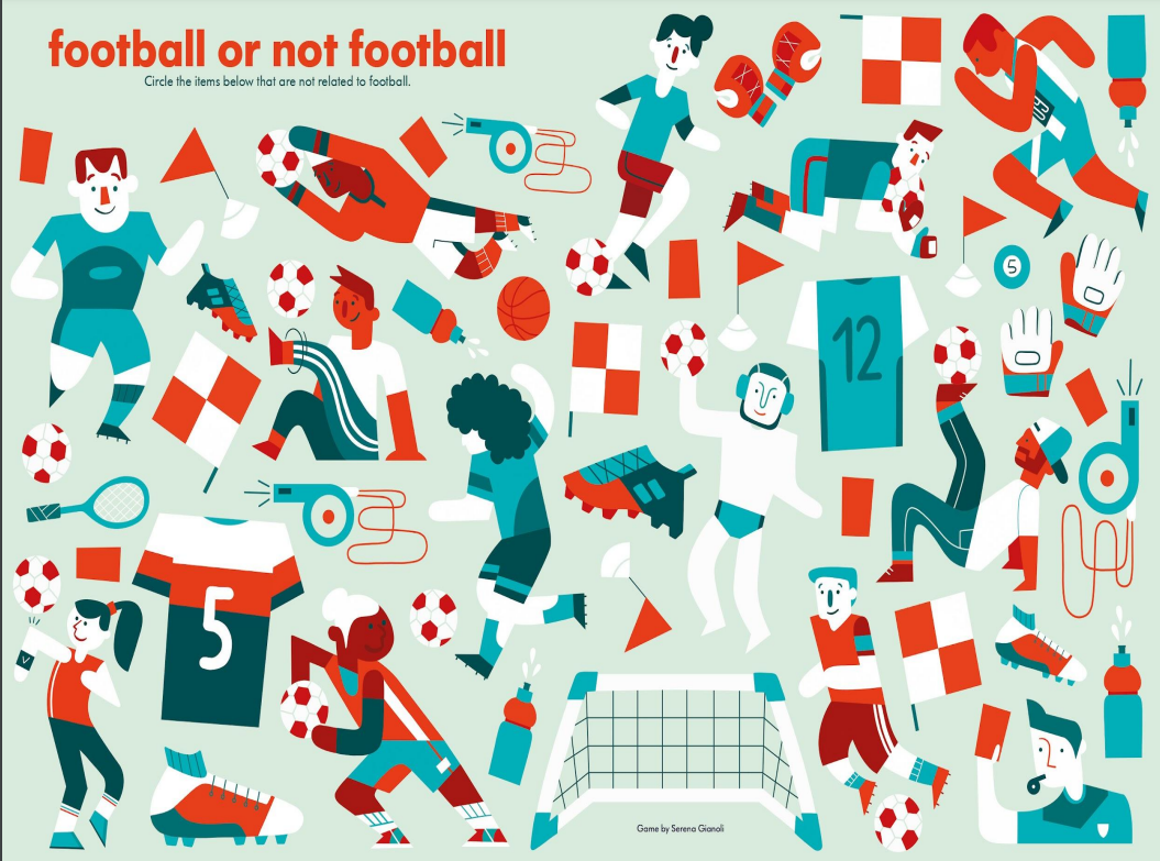
Looking at the magazines and at the briefing presentation, most of the stories and games in the magazine are quite simple, with a very clear and straightforward concept, but are still very detailed and entertaining to look at for longer periods.
I would primarily like to create a game for this brief since it seems like an interesting challenge and I haven't had the chance to explore that type of media yet.
If I were to do a story I would make a wordless one since I think that makes children look at it for longer because they need to figure out what is happening just from the images, instead of reading it which might only take them a few minutes.
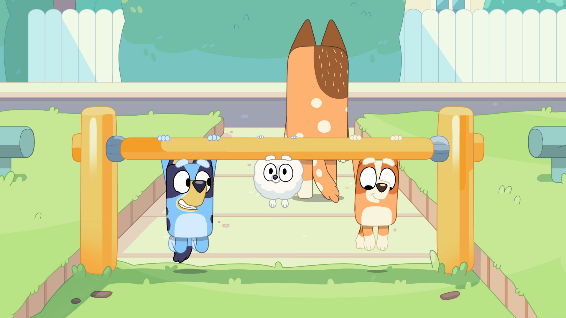
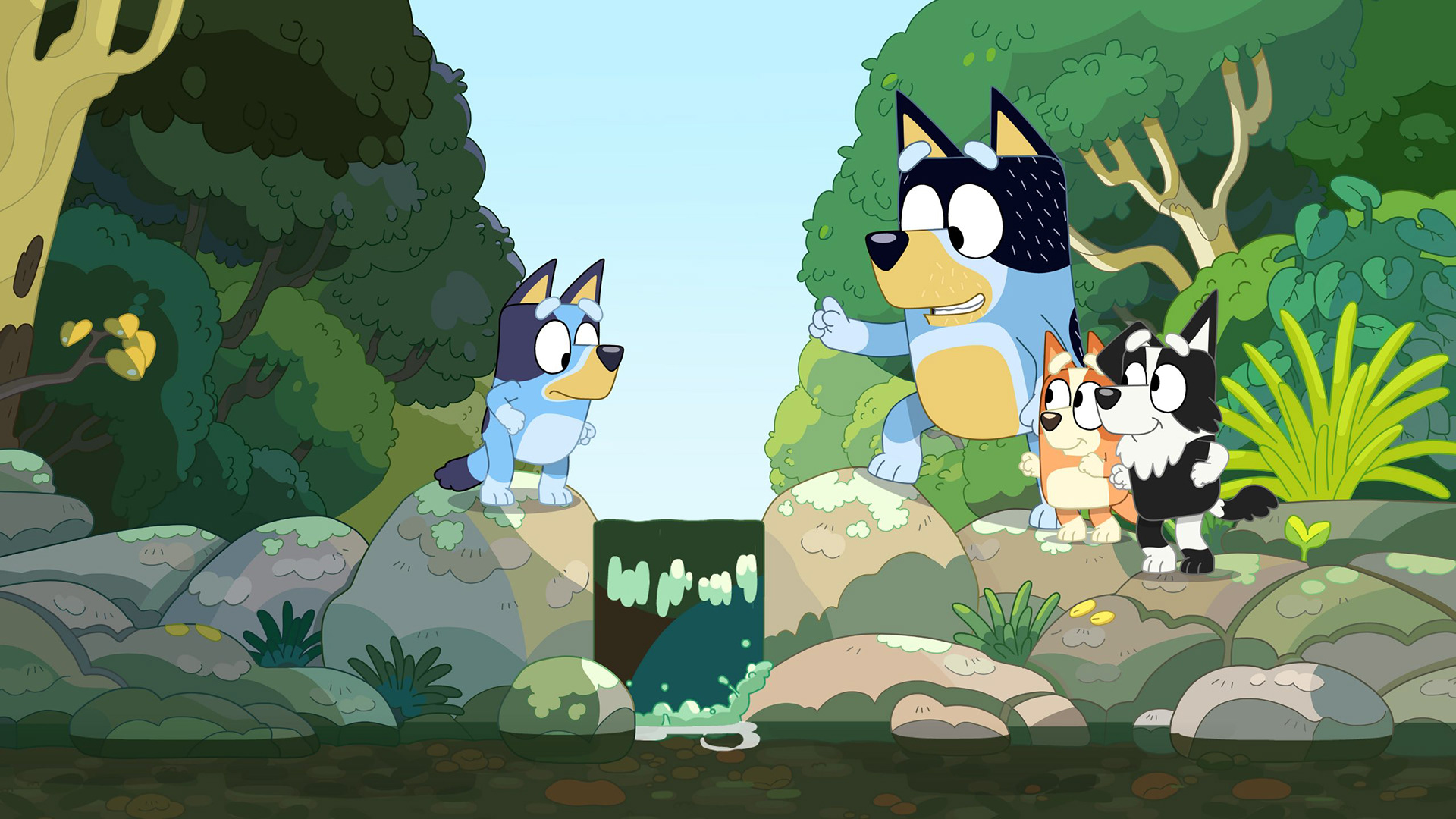

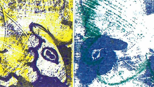
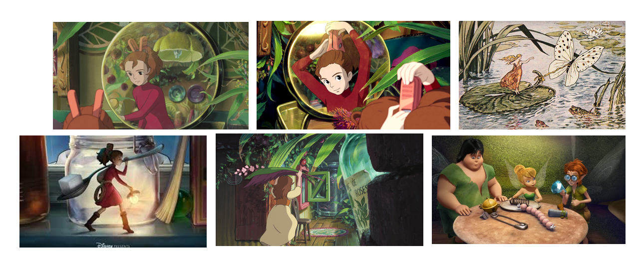
One of the places I looked at for inspiration was the TV show Bluey. I think it's a great example of children's media where some deeper themes are sometimes addressed, while remaining appropriate and fun for children to watch. It's a good example of media that is appropriate for quite a wide age group since younger children can appreciate it for the fun colours and for being fast-paced, while older, more mentally developed kids can be entertained by the plot while also understanding some of the more difficult themes.
I feel like this is a relevant thing to look at since Anorak also has quite a big age gap, being recommended for children up to 11.
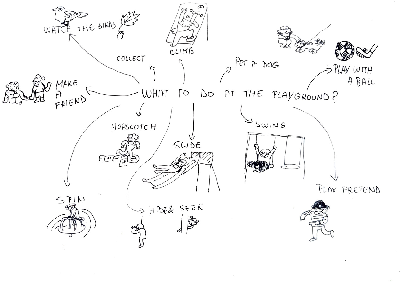
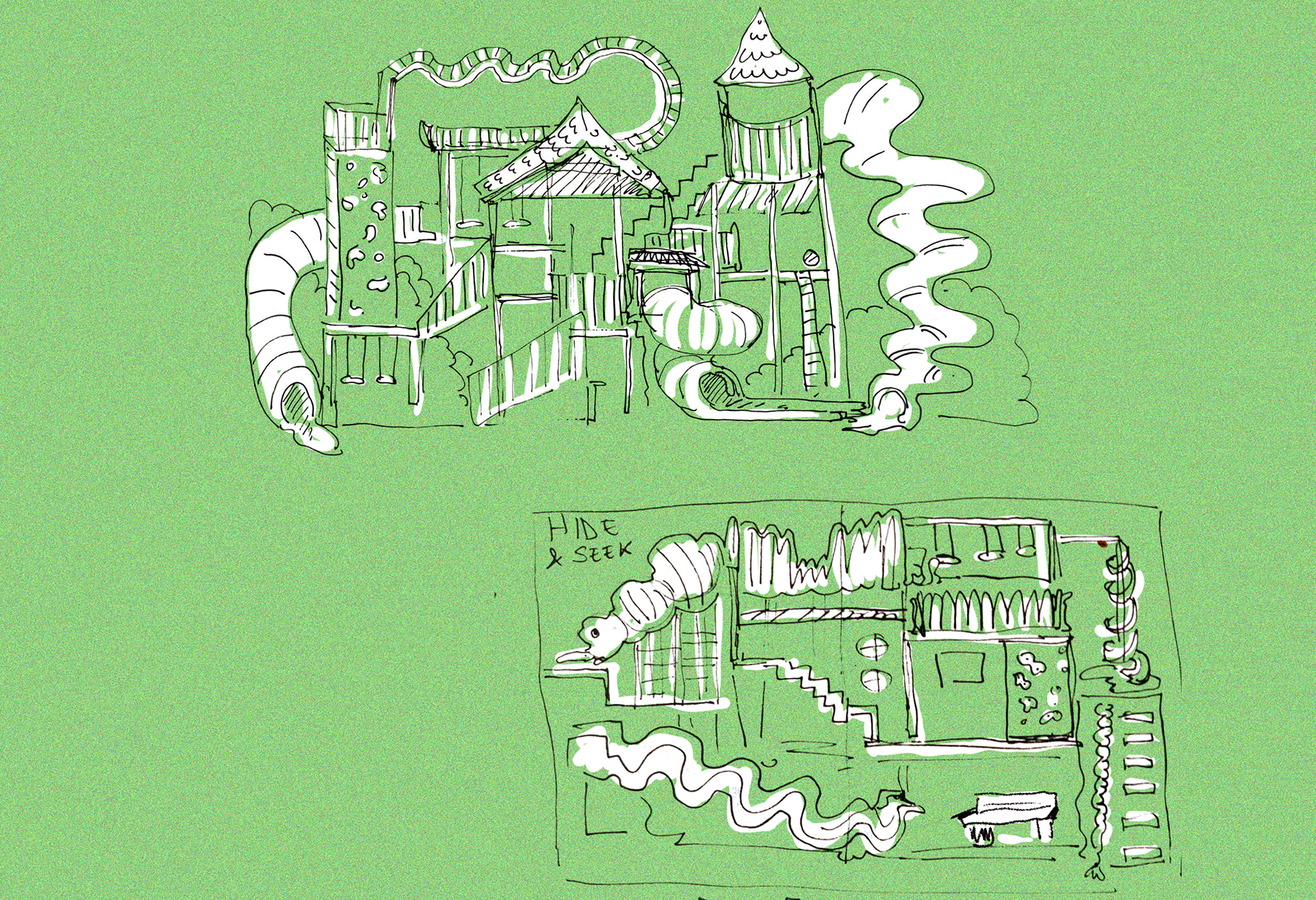
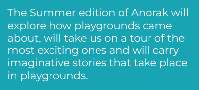
I started by making a list of playground activities.
HIDE & SEEK
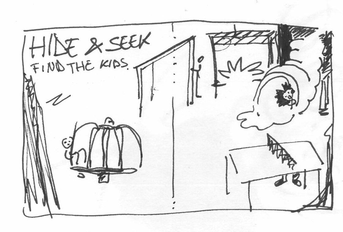
My initial idea was to create a game, since that is something I've not had the opportunity to try before. However, I found it difficult to think of a game which is interesting enough to entertain a child up to 11y.
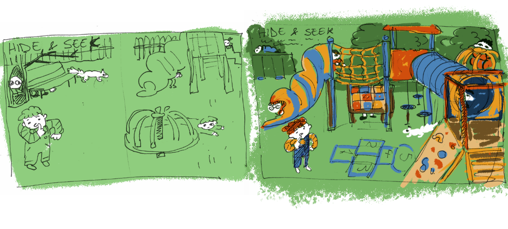
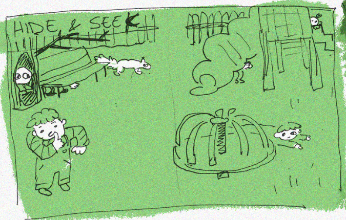
I tried doing a game of hide and seek, where the reader has to find all the kids in the picture.
My initial sketches are quite simple for someone of the required age range, so if I go with this idea I would have to take it further and make it way more complex to make it more challenging.
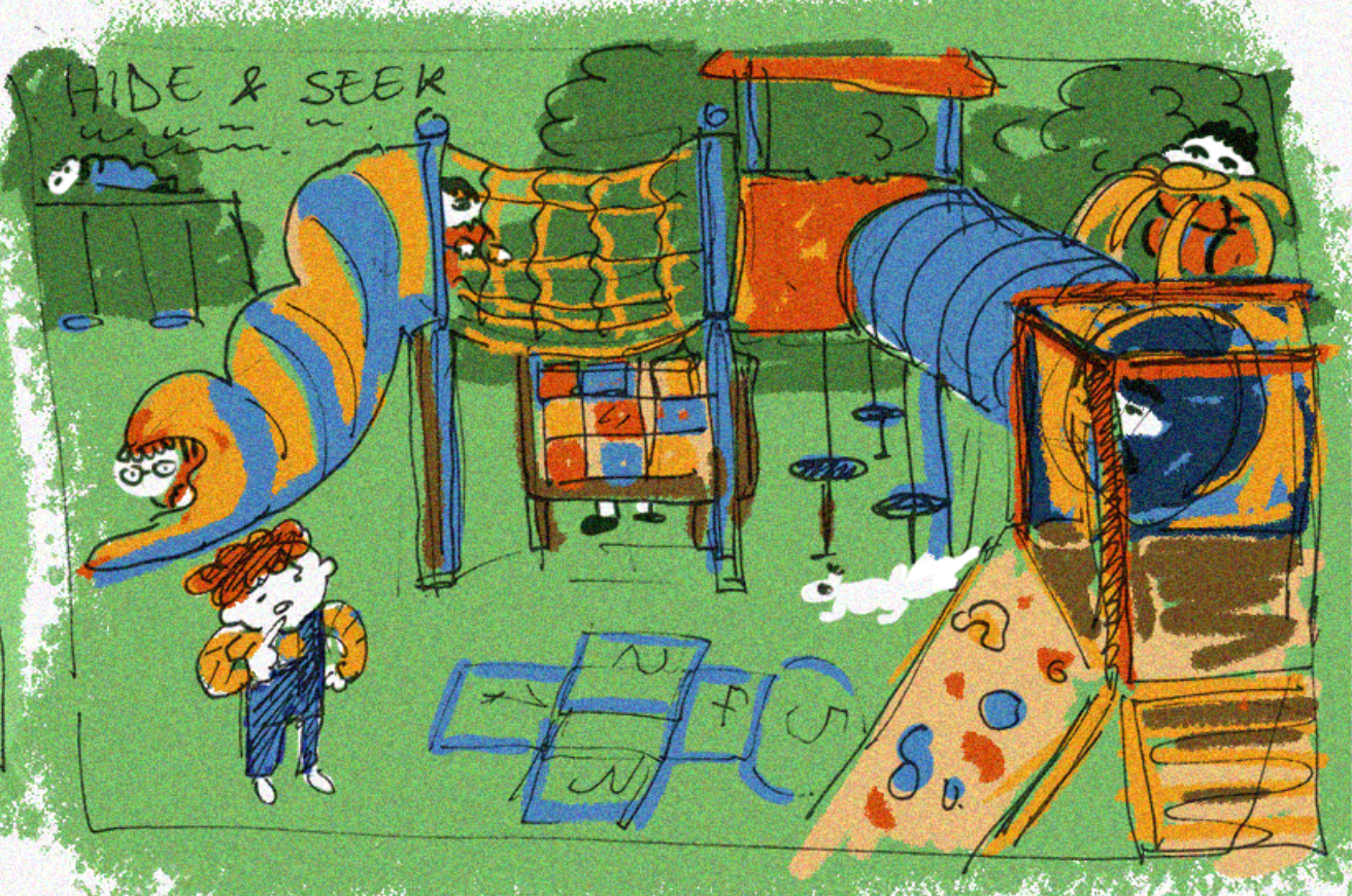
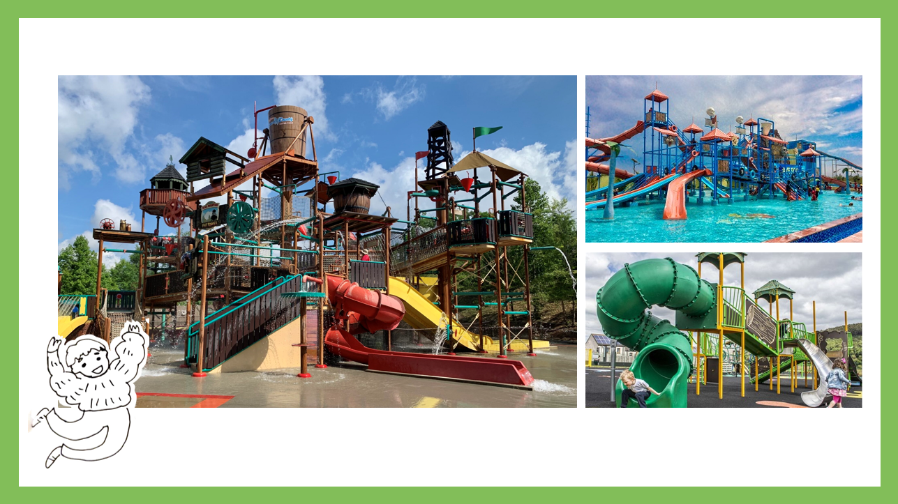
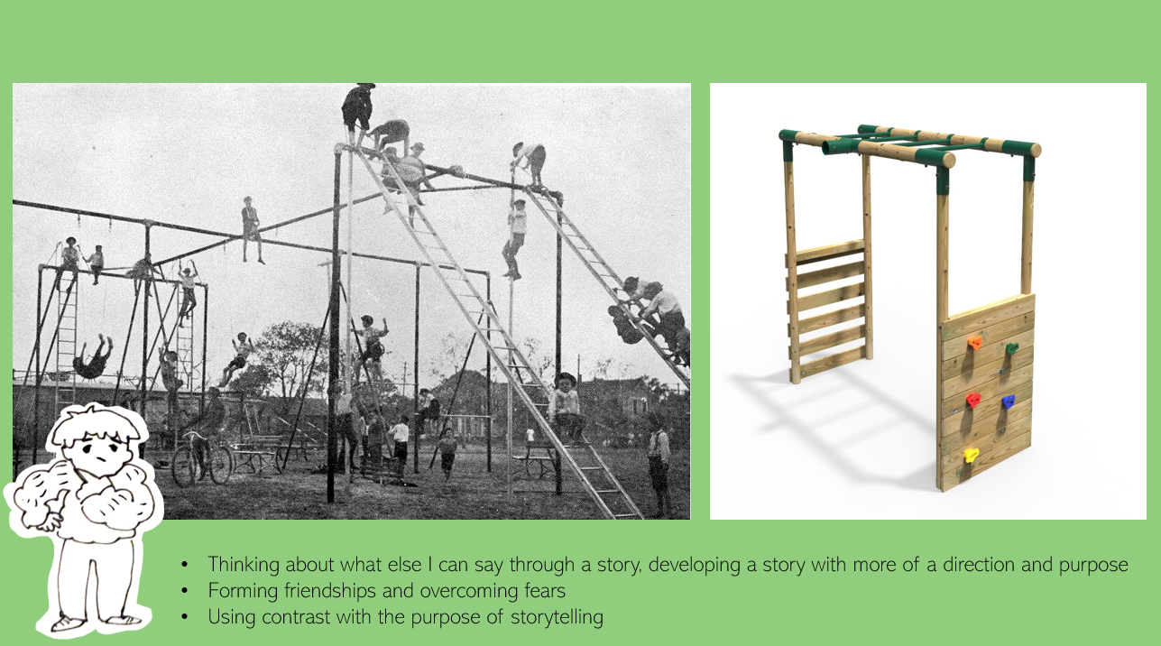
I wanted to show an example of a more compact playing structure as opposed to a normal playground, to raise the difficulty of the game.
I took inspiration from water park structures since they utilise space in a more compact way and tend to have multiple levels.
Cathy said that she likes this idea, but that it would be more suitable for their "Dot" magazine. She mentioned that if I want to go with this I can, but I would need to make it way more complex to make it fulfilling for 6 to 12-year-olds. She also mentioned that she prefers stories, so I would much rather go with that.
Indoor Playground
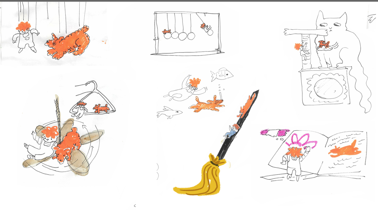
Here, I wanted to explore what can be a playground so I began telling a story about a character who makes his own playground inside of his home when he is unable to go outside.
To make it a bit more interesting than just a DIY playground, I decided to make the characters magically shrink and use the object in their household as a playground replacement.
I think this could have been a fun idea for a story since I believe that most children (especially when bored) have contemplated a life when they become very tiny and they can explore the world around them in a different light, especially since this is a concept that is explored in many stories such as the fairy tale 'Thumbelina'.
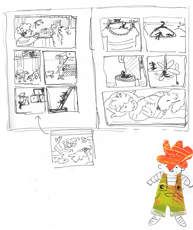
I looked back at the brief and noticed this part of which made me decide to scrap this idea.
Although I thought it could be interesting to explore the idea of an alternative playground, the brief specifically states that they are looking for stories that happen inside playgrounds, which made me feel like this idea is not relevant enough.
I decided to think more about stories which can unfold in a real life playground.
Pirate Ship
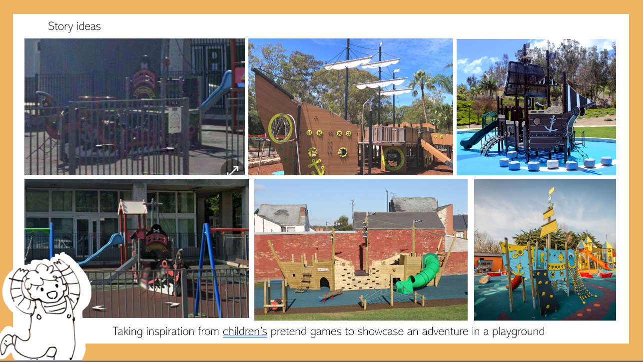
I wanted to start exploring the act of 'playing pretend'. I used a pirate ship since it is a common structure found in playgrounds that encourages the kids to play in imaginative ways.
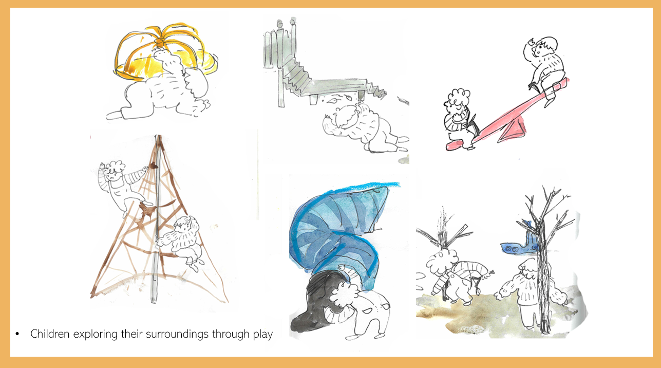
Looking for 'treasure' around the park is can encourage children to explore their surroundings through playing as well as to form new friendships as they embark on an adventure together.
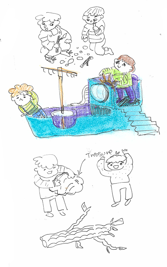
I did not go with this idea since I feel like it is quite boring so I decided to instead explore more ways in which children's imagination can influence the way they interact with a playground.
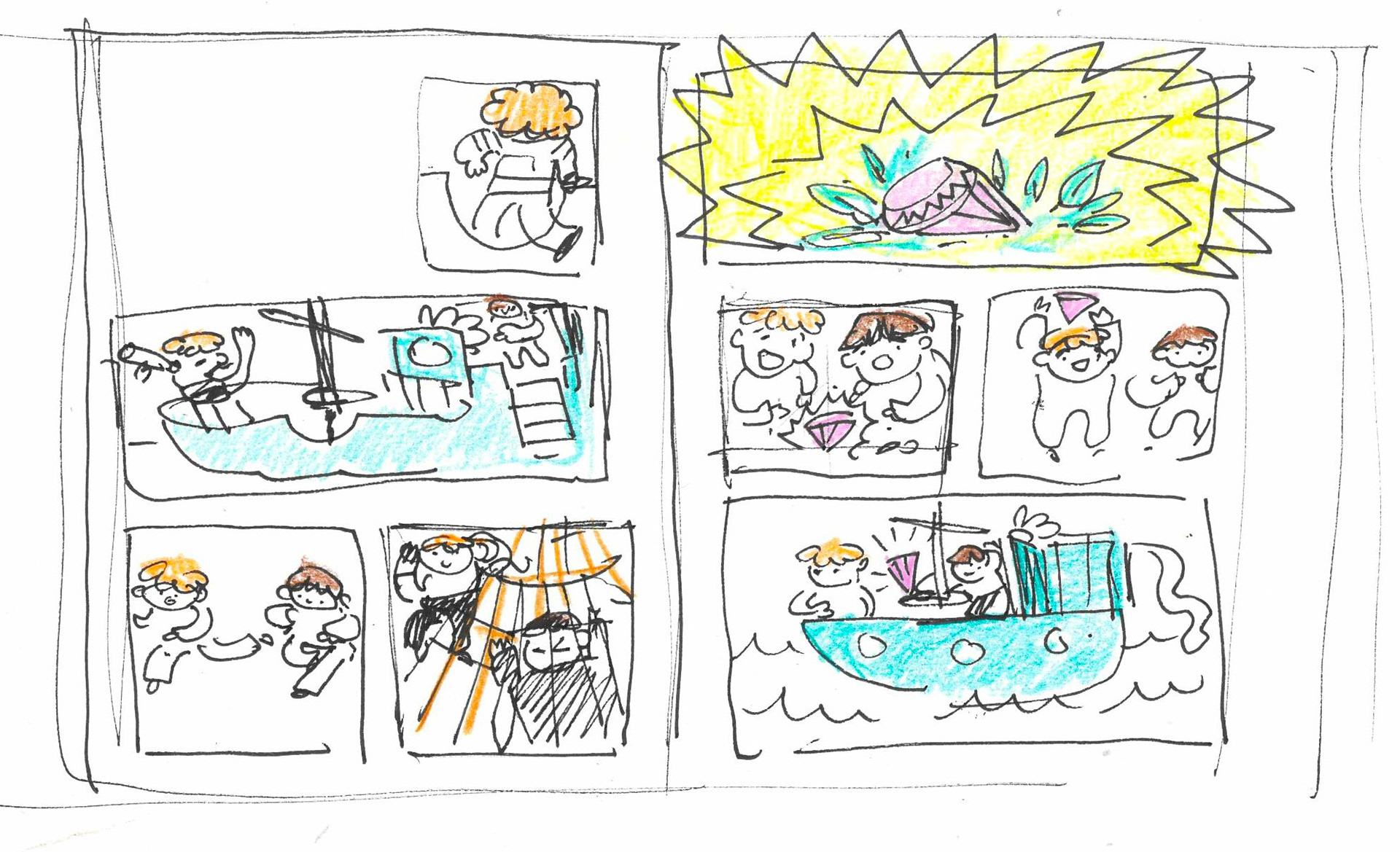
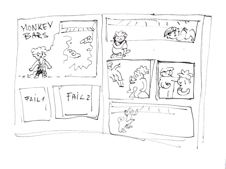
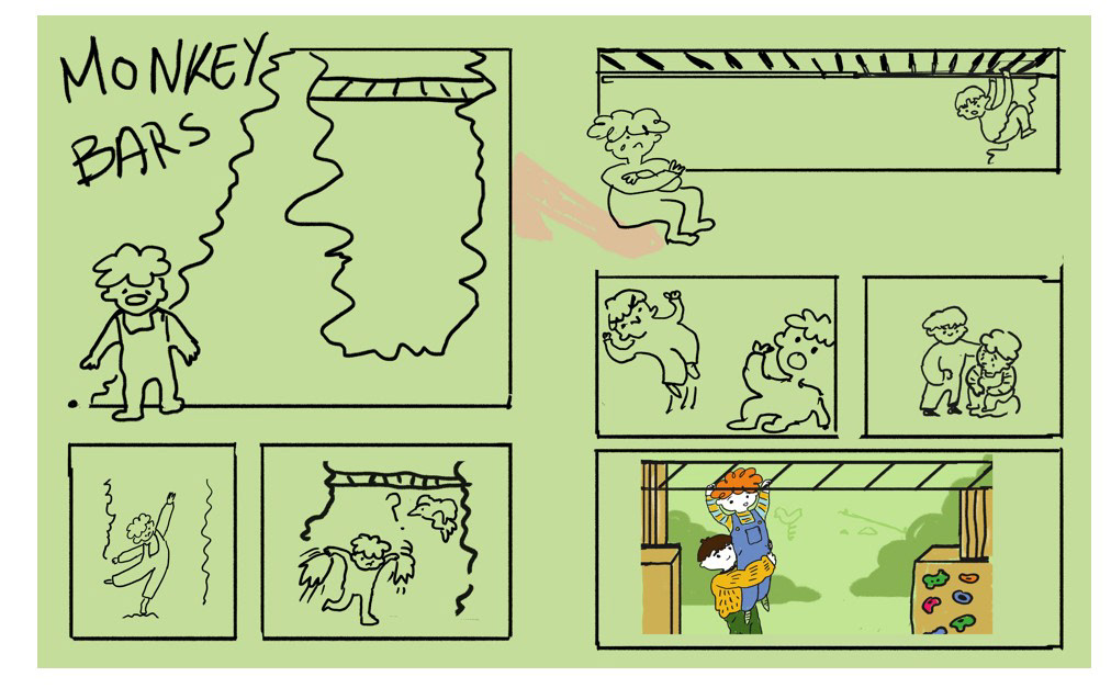
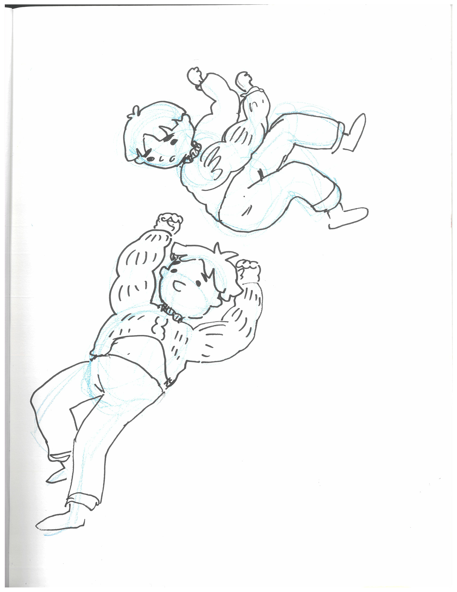
Monkey Bars
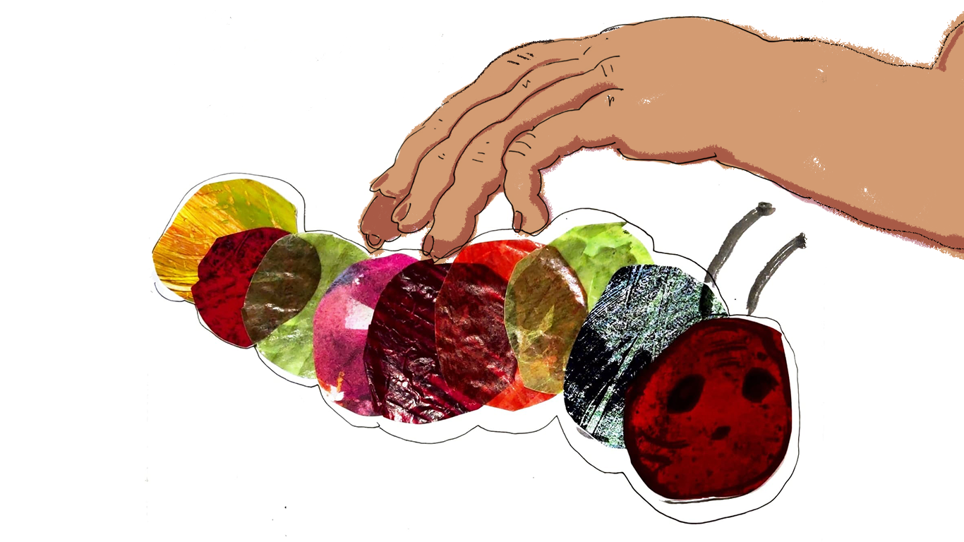
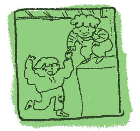
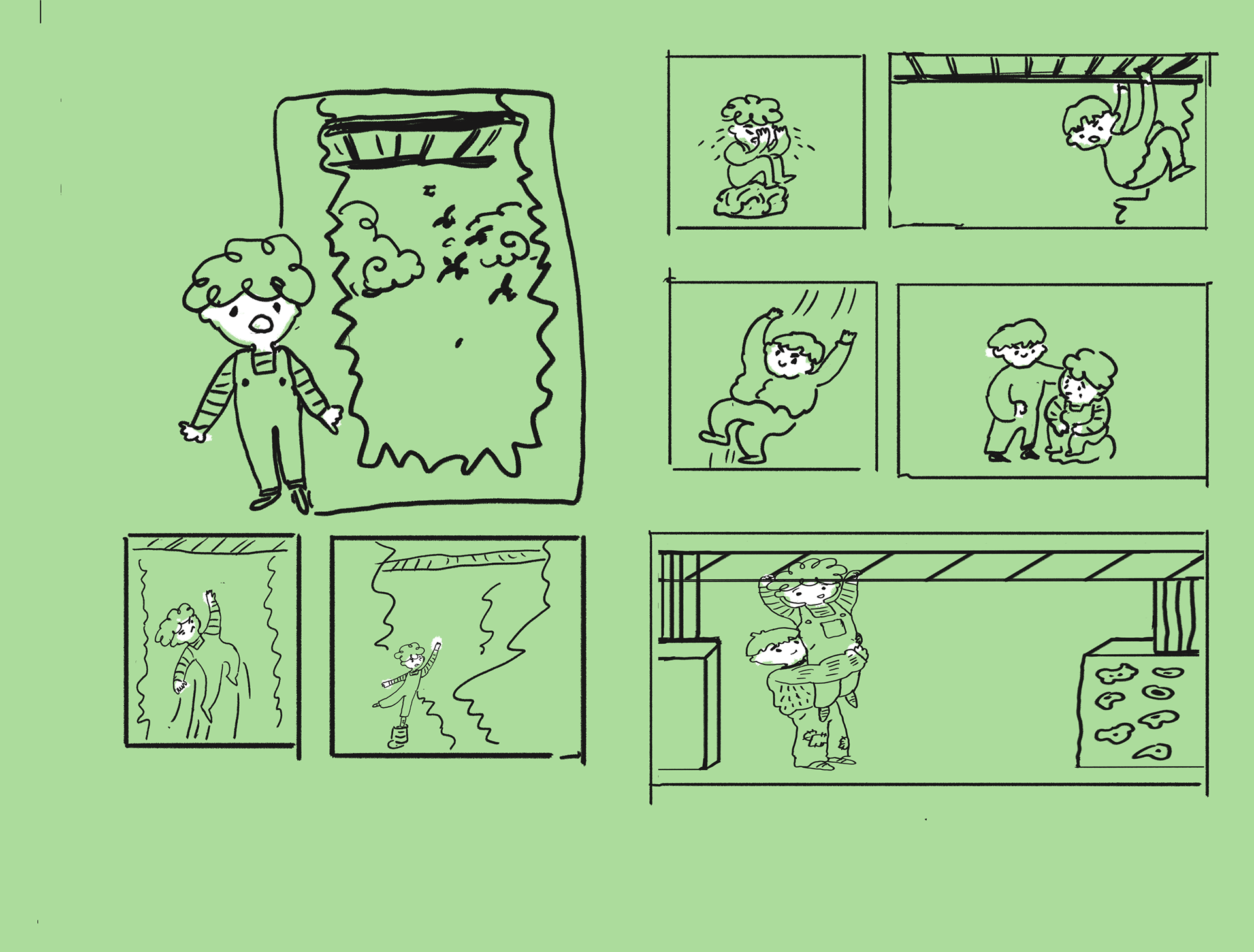
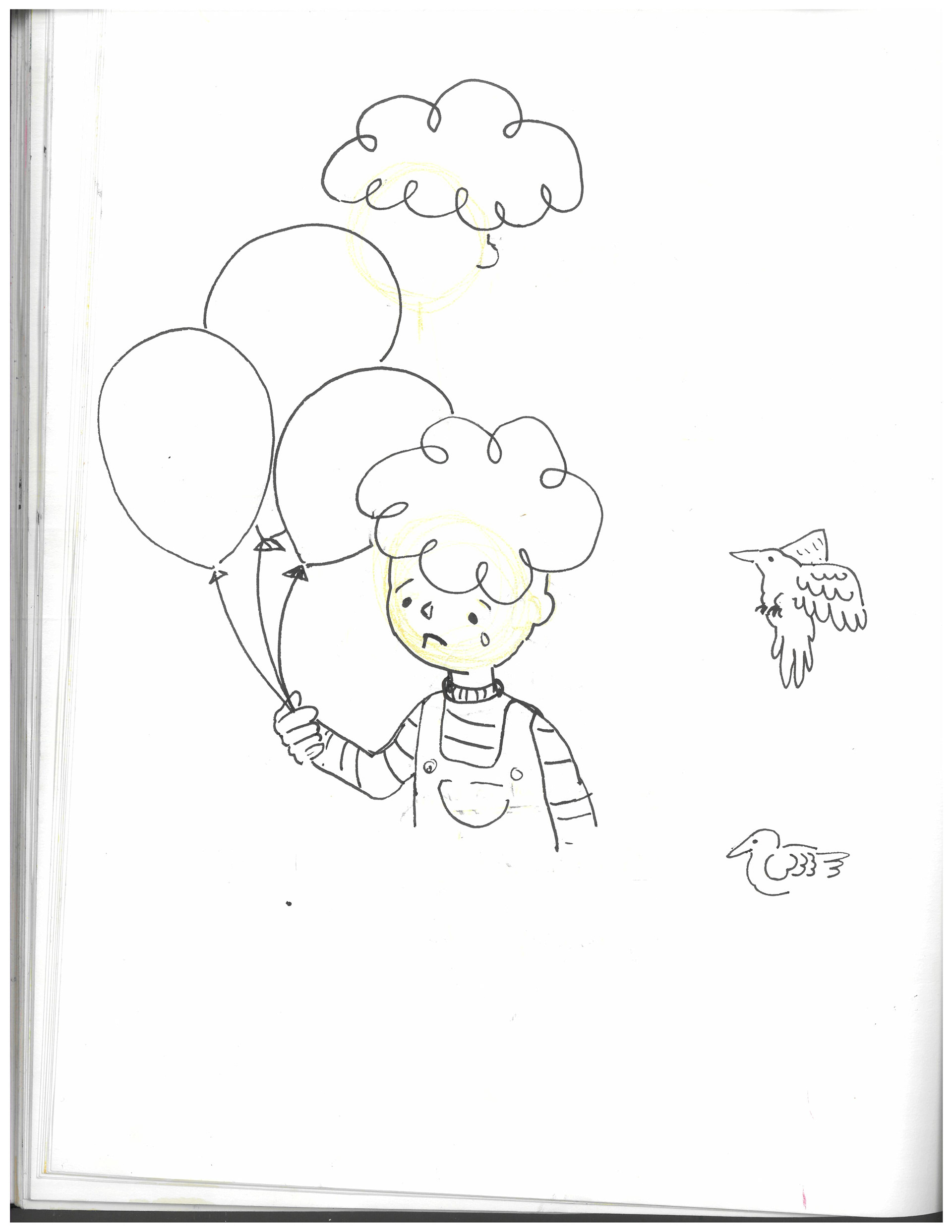
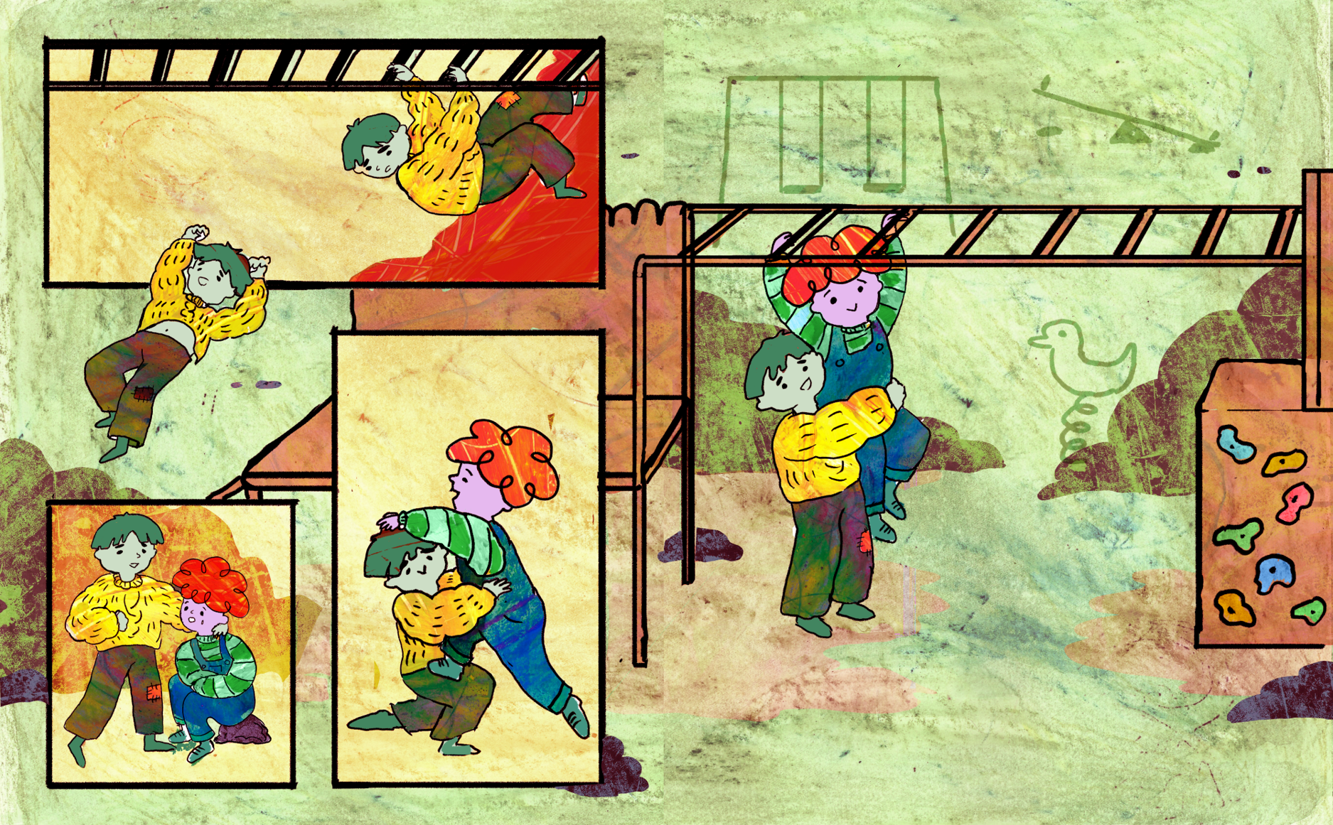
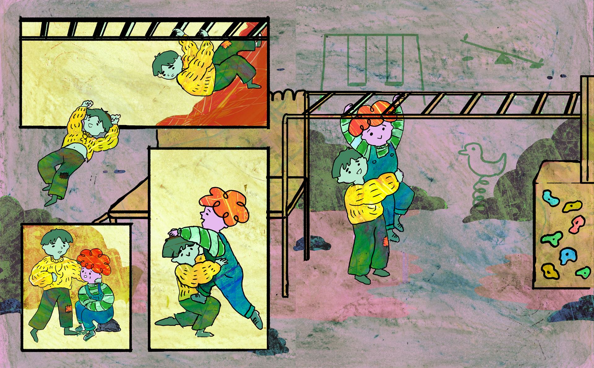
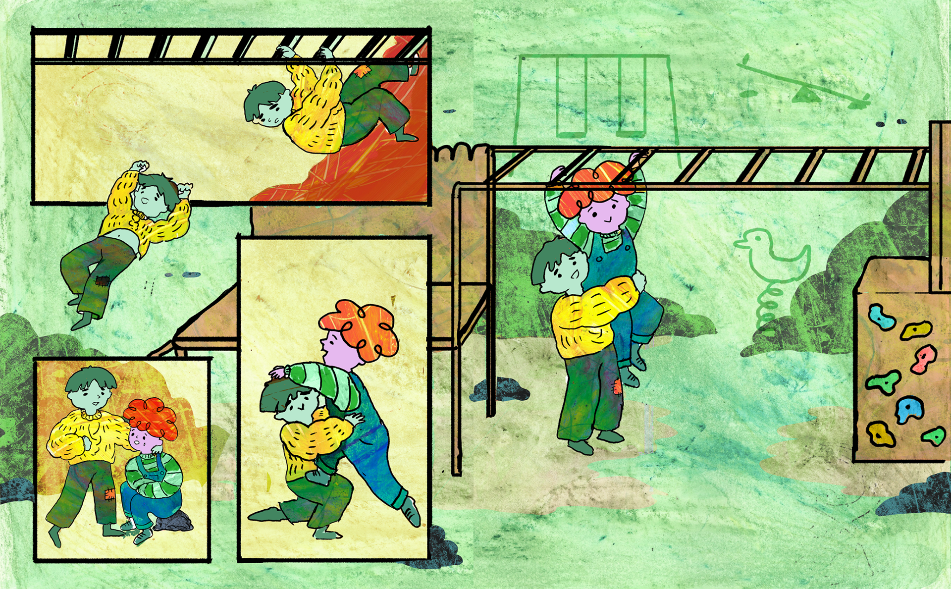
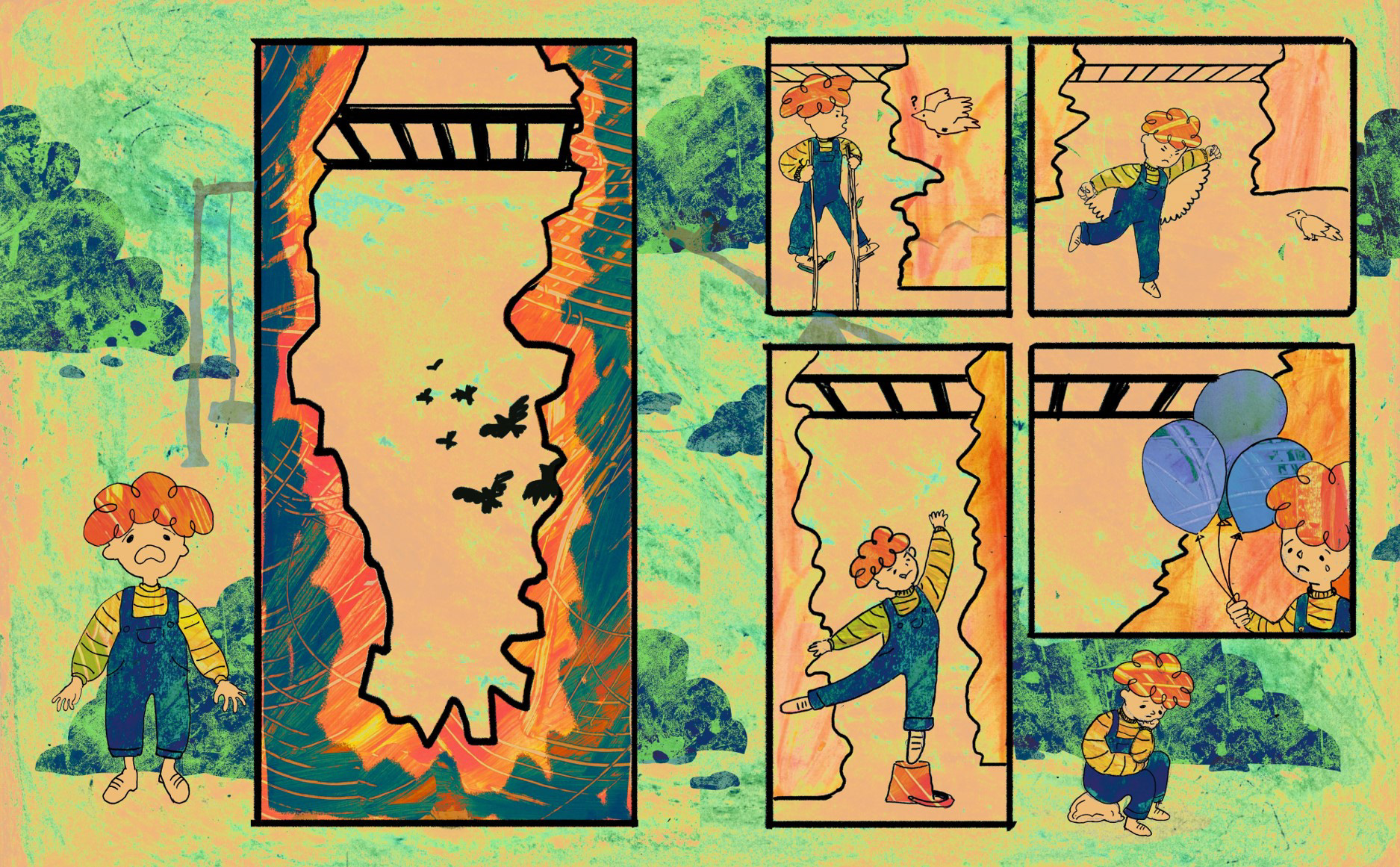
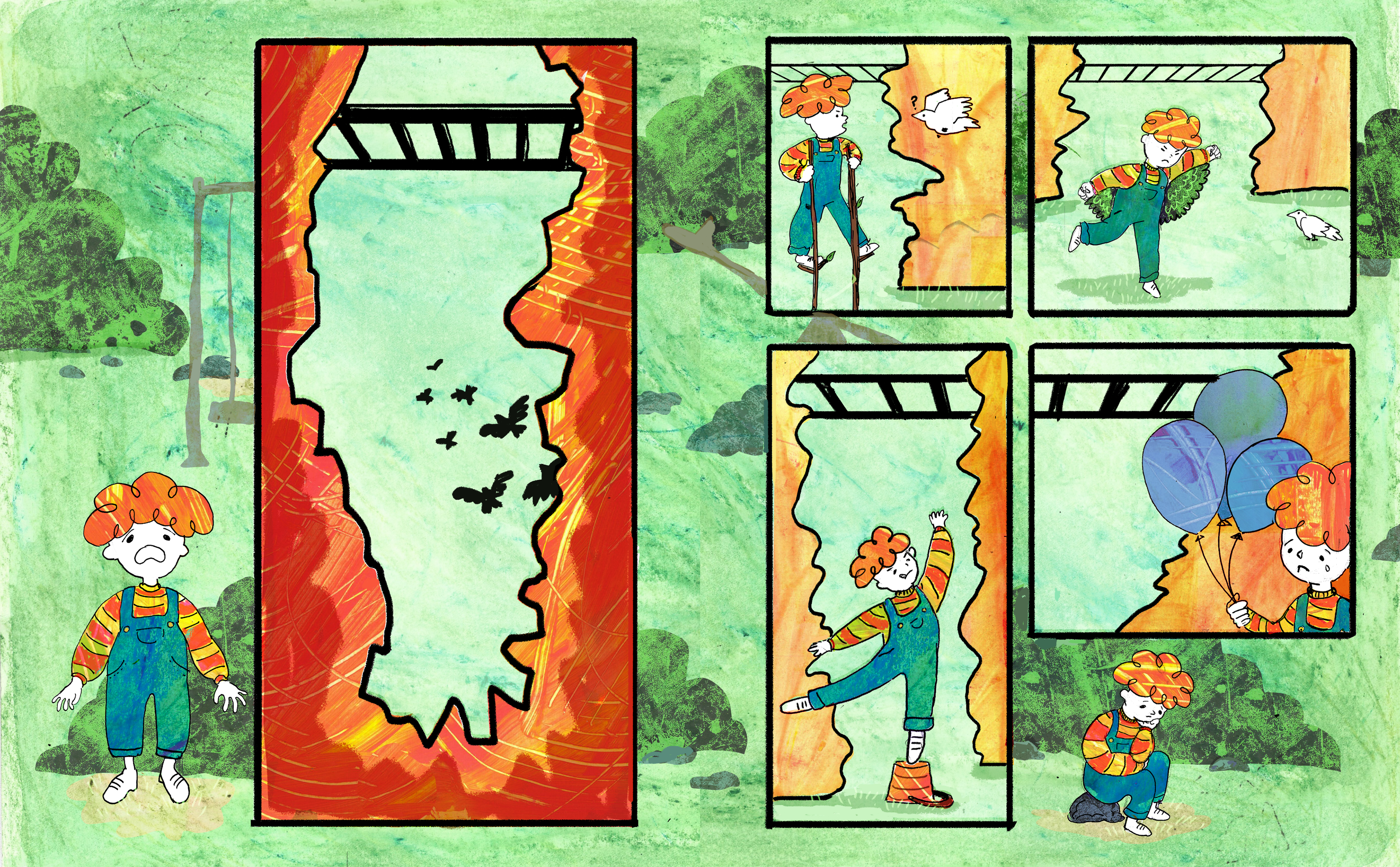
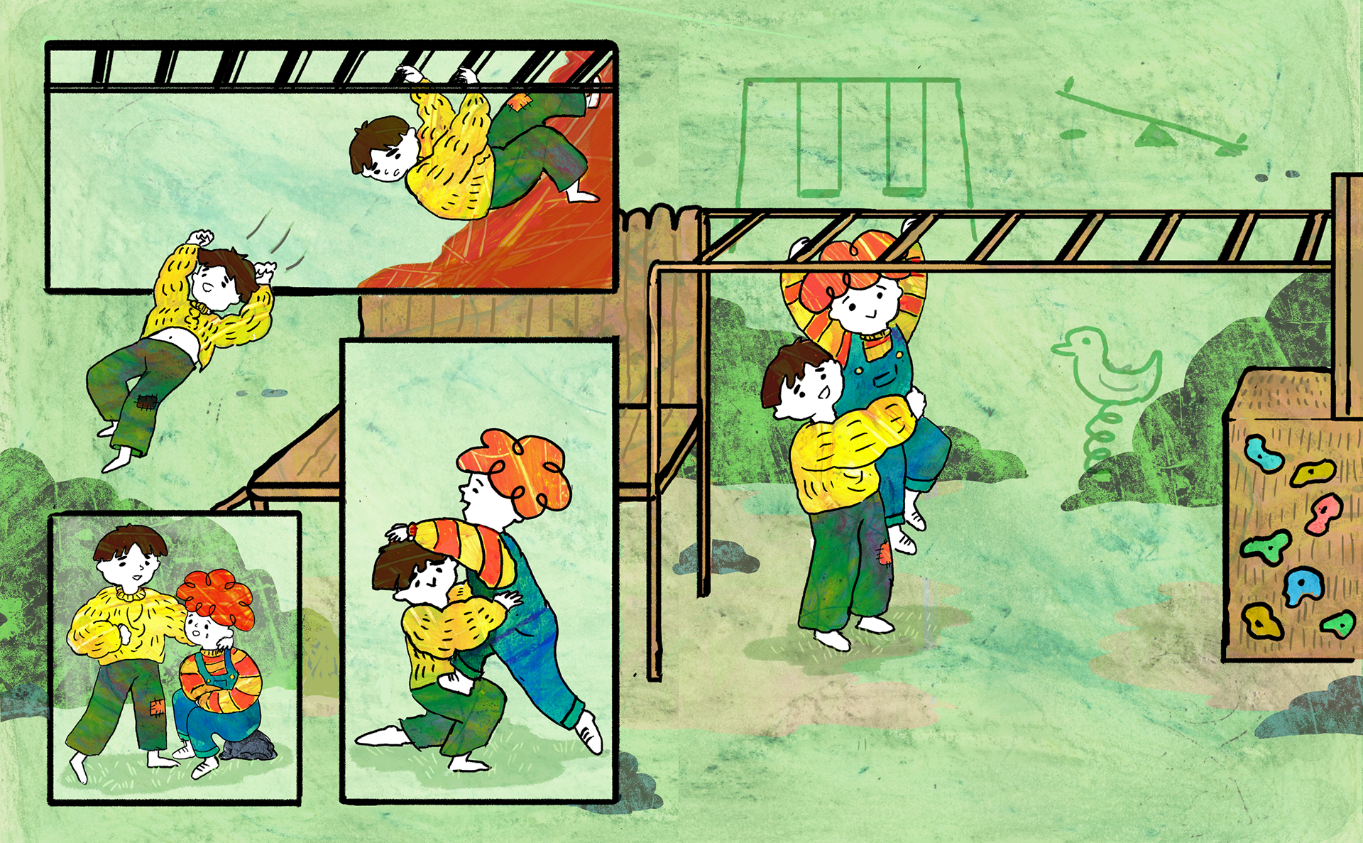
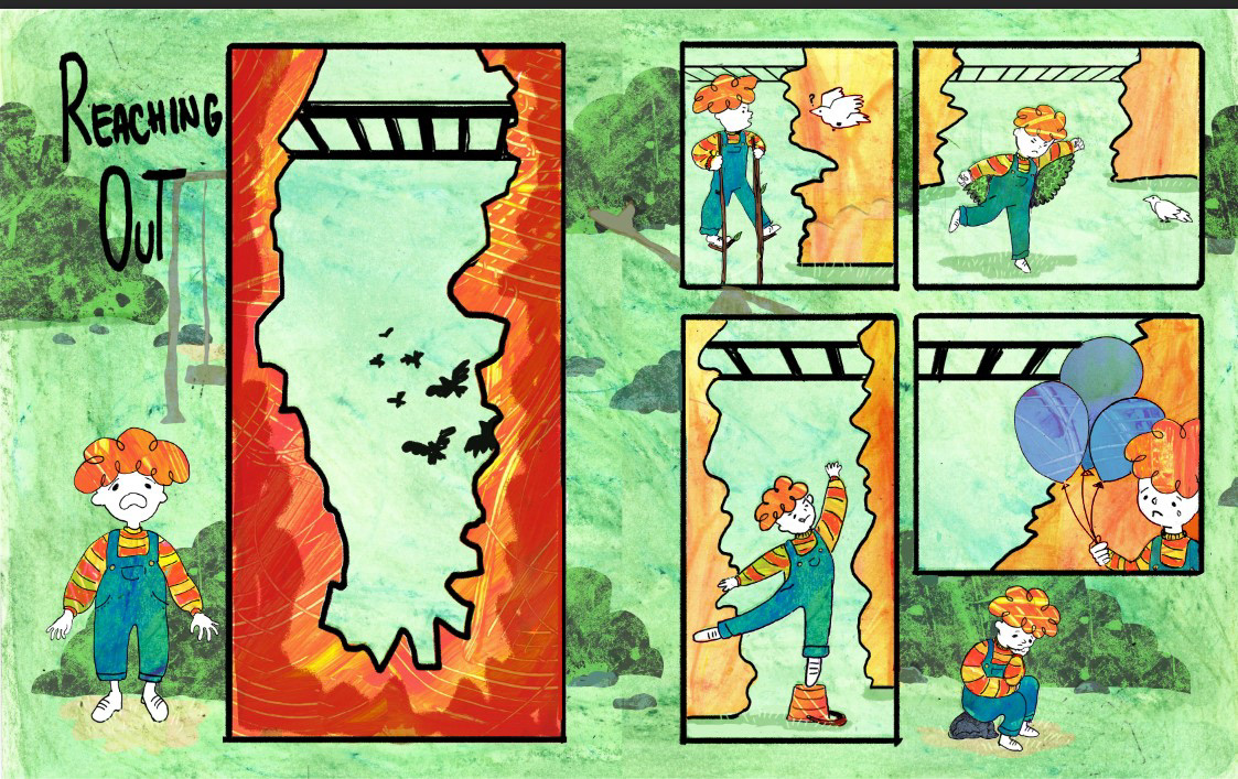
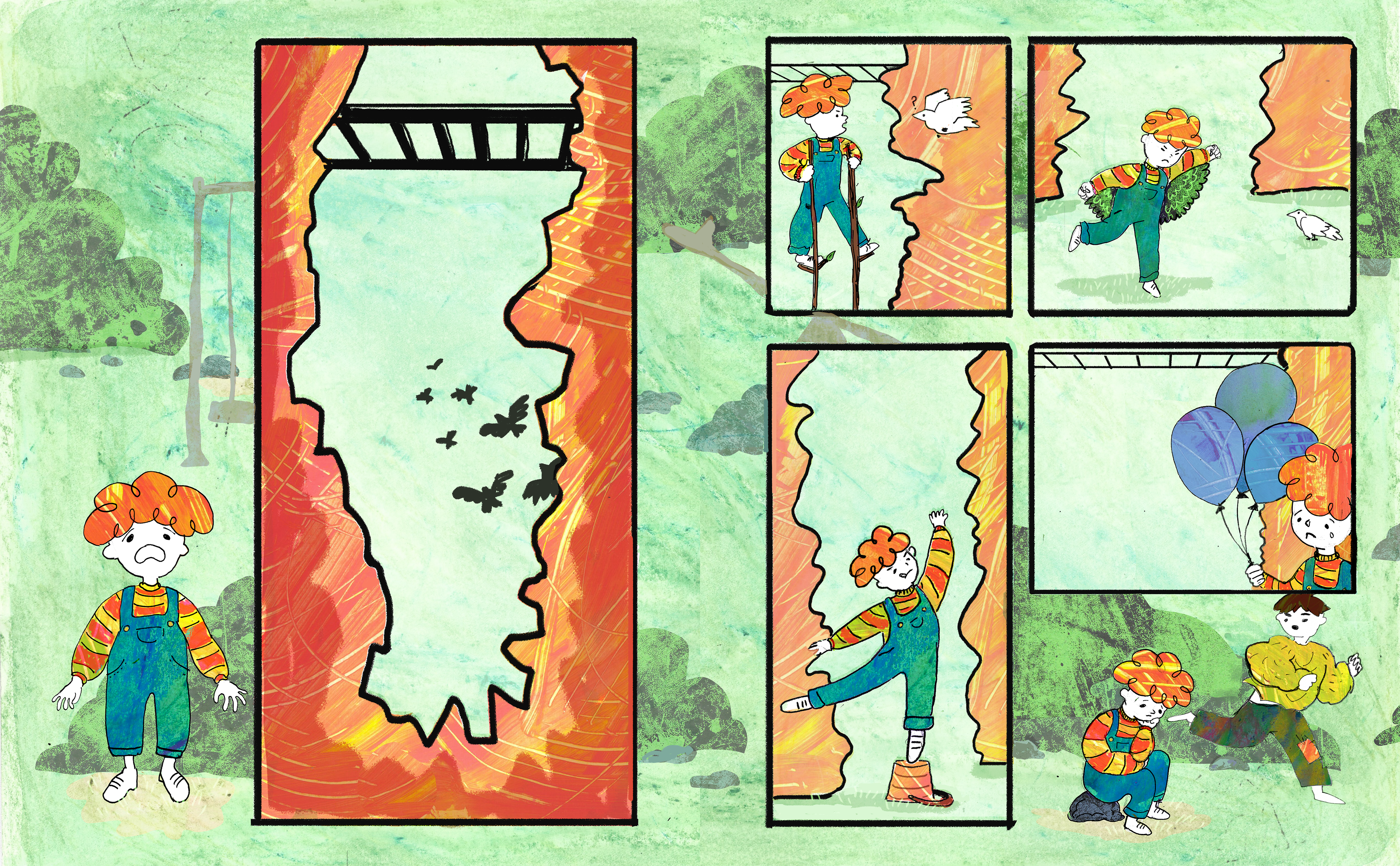
My idea for the monkey bar story was to teach children that it’s ok to be uncertain and show an example of friendship where the children help one another reach new limits.
I wanted to create a story which has more layers to it. A playground is a space where children are allowed to be independent for the first time so I wanted to create a story which portrays the challenges that come with that, while also showing a child that can overcome his fears through friendship and collaboration. They are also one of the best places for children to start building strong connections by themselves, outside of family, and build social skills so I tried showing two characters that are able to build a connection while playing.
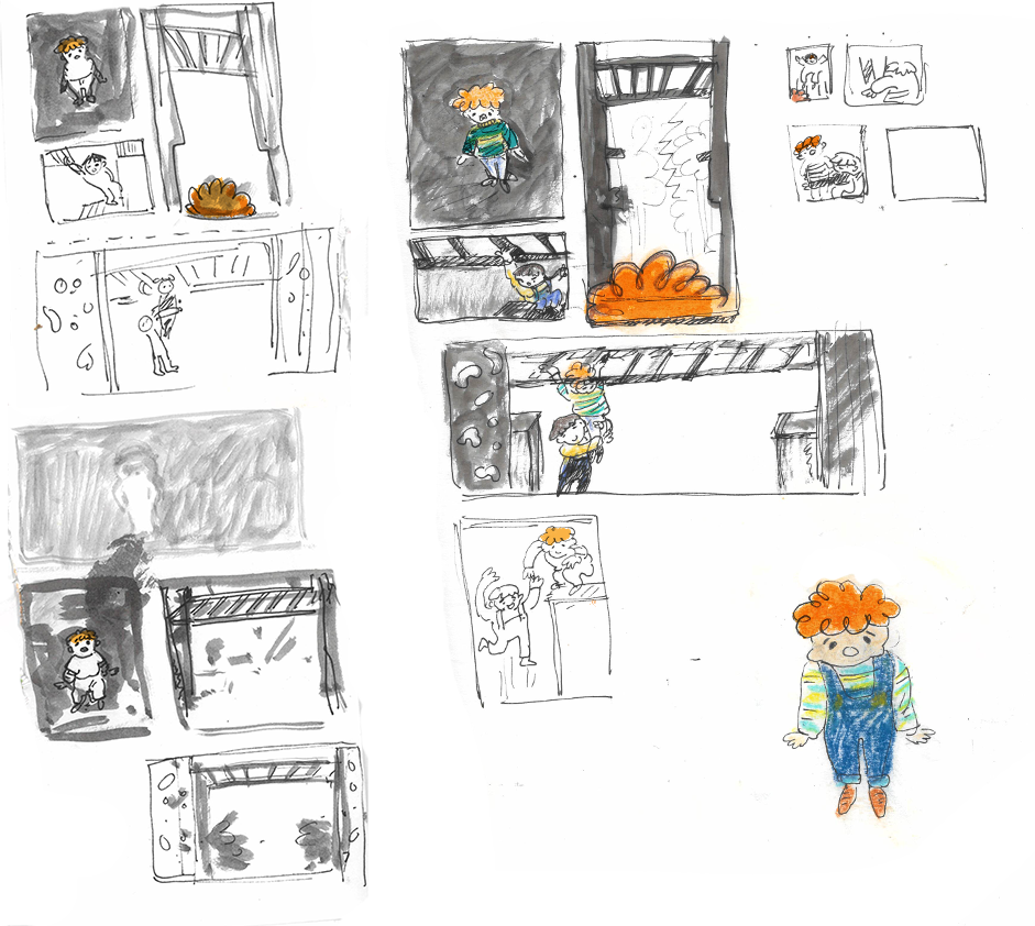
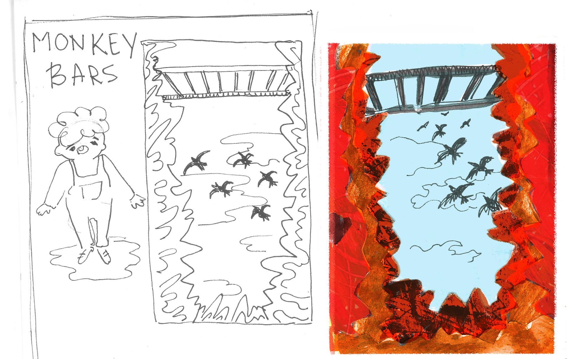
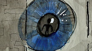
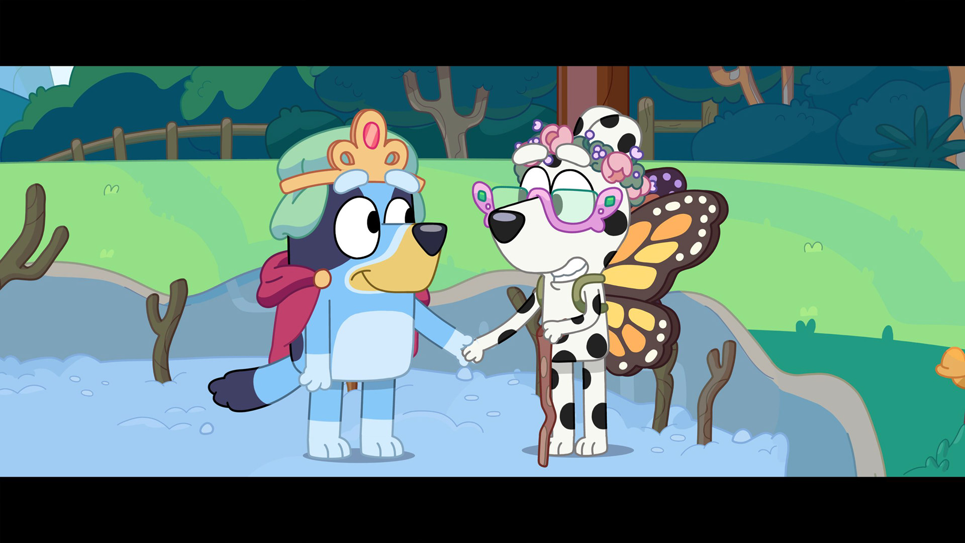
Here I tried taking the idea further to emphasise the character’s feelings in this situation by exagerating what they see and bringing in elements of imagination and playing pretend from the pirate ship idea from earlier.
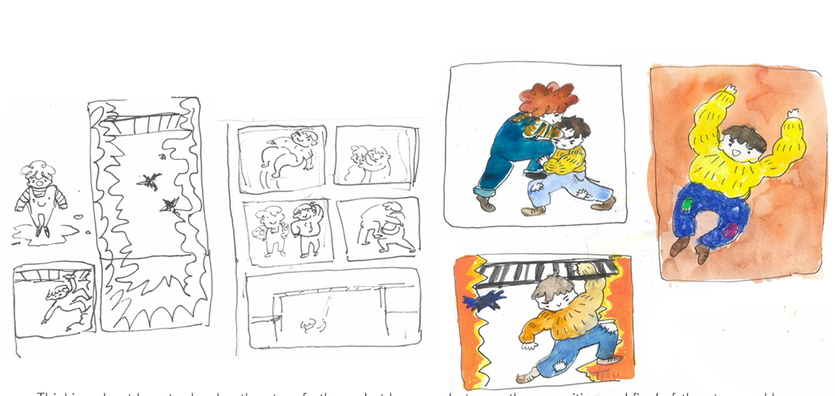
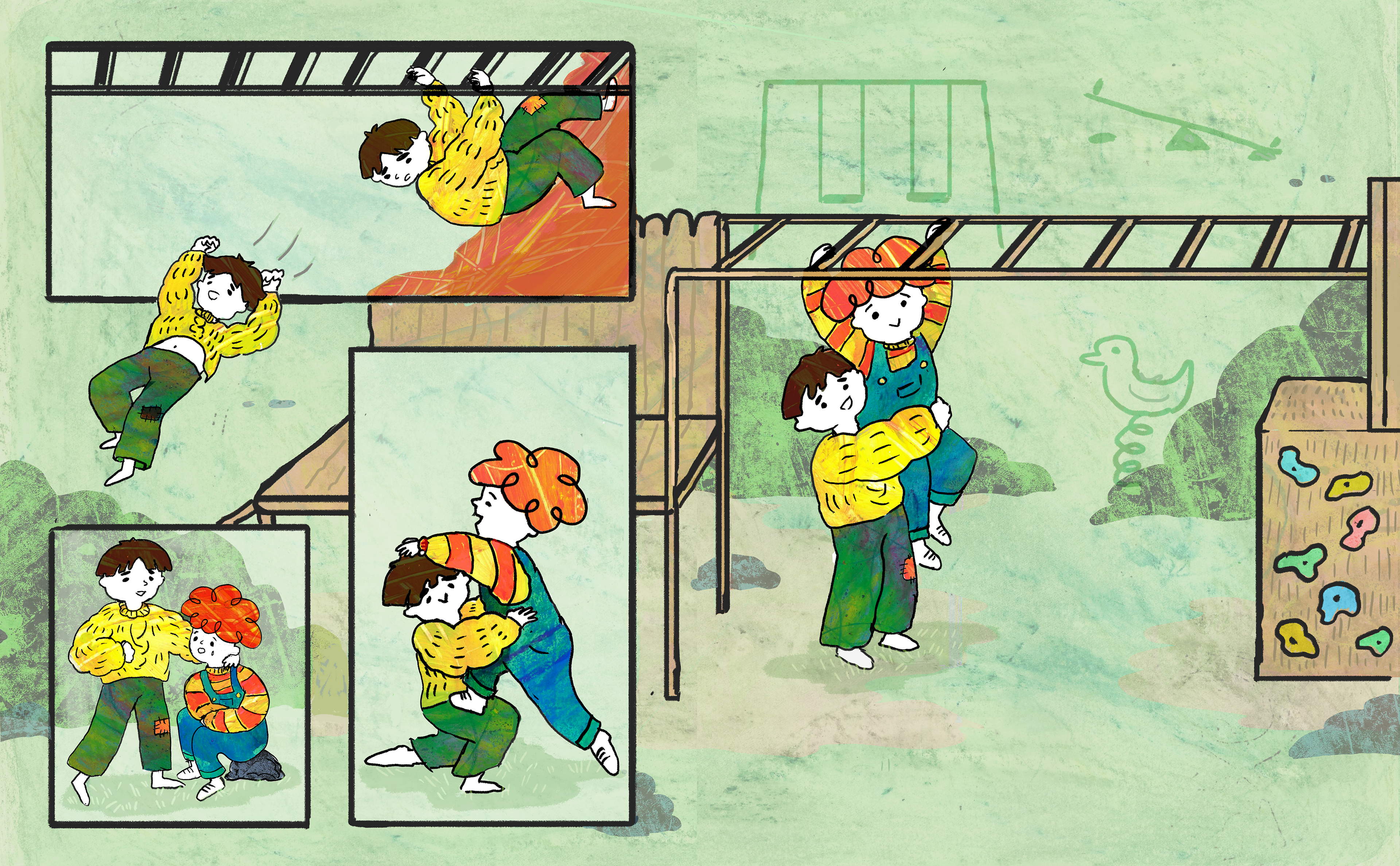
The monkey bar story was Cathy's favourite idea from what I presented.
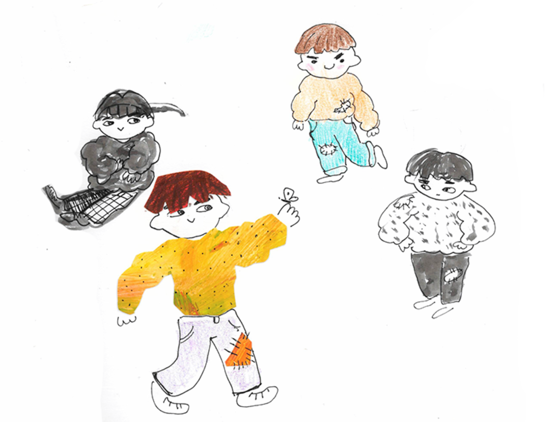
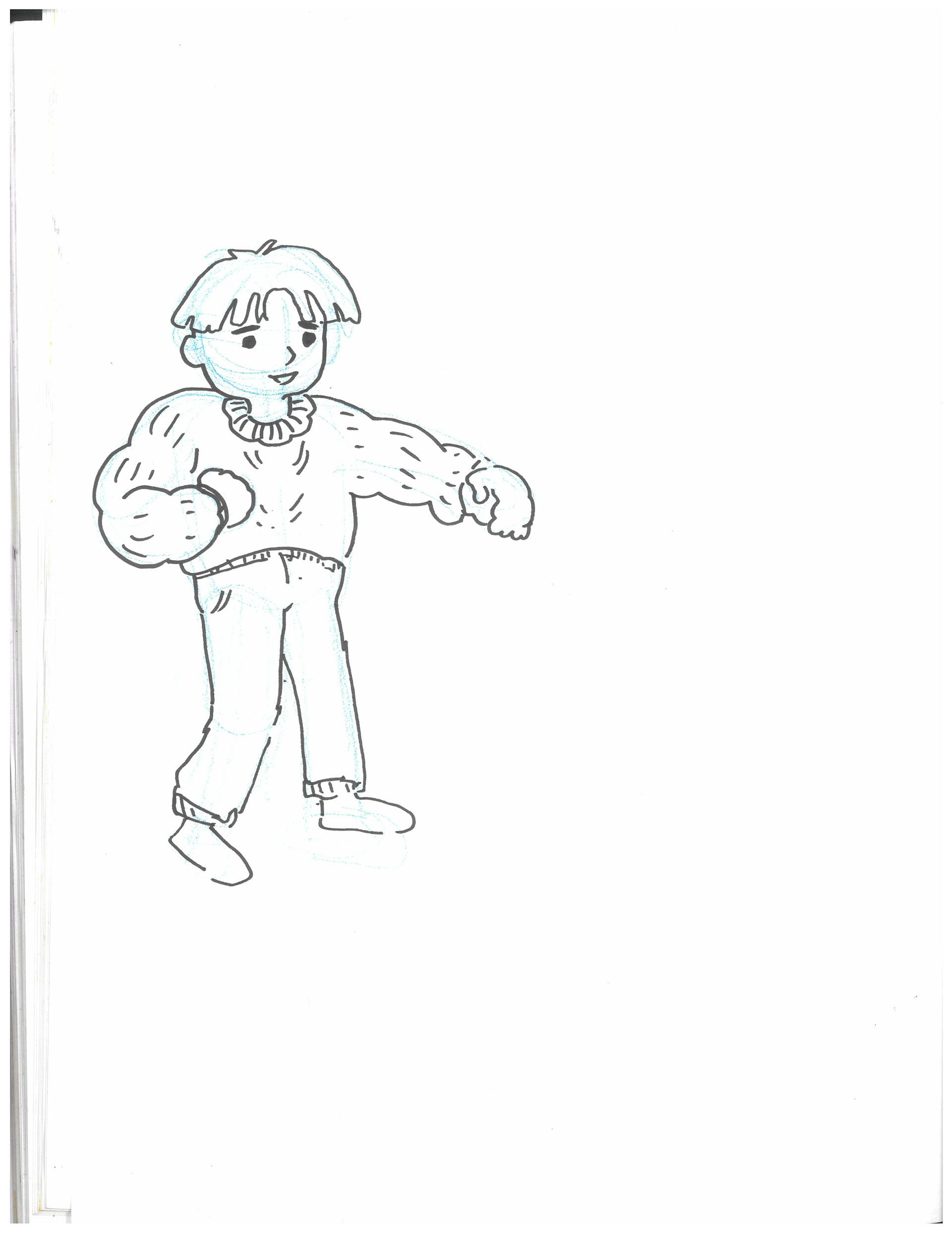
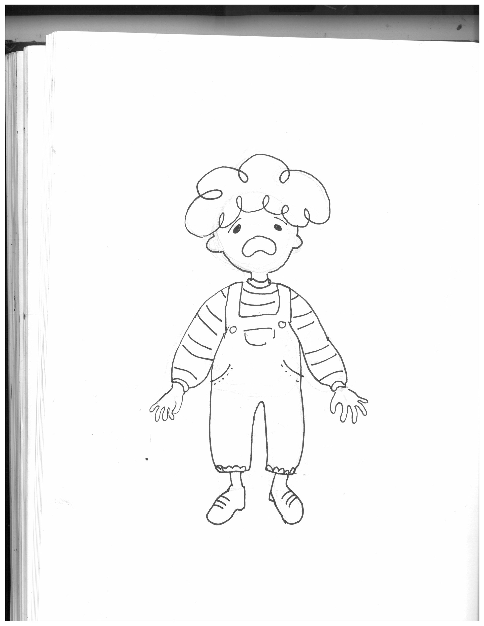
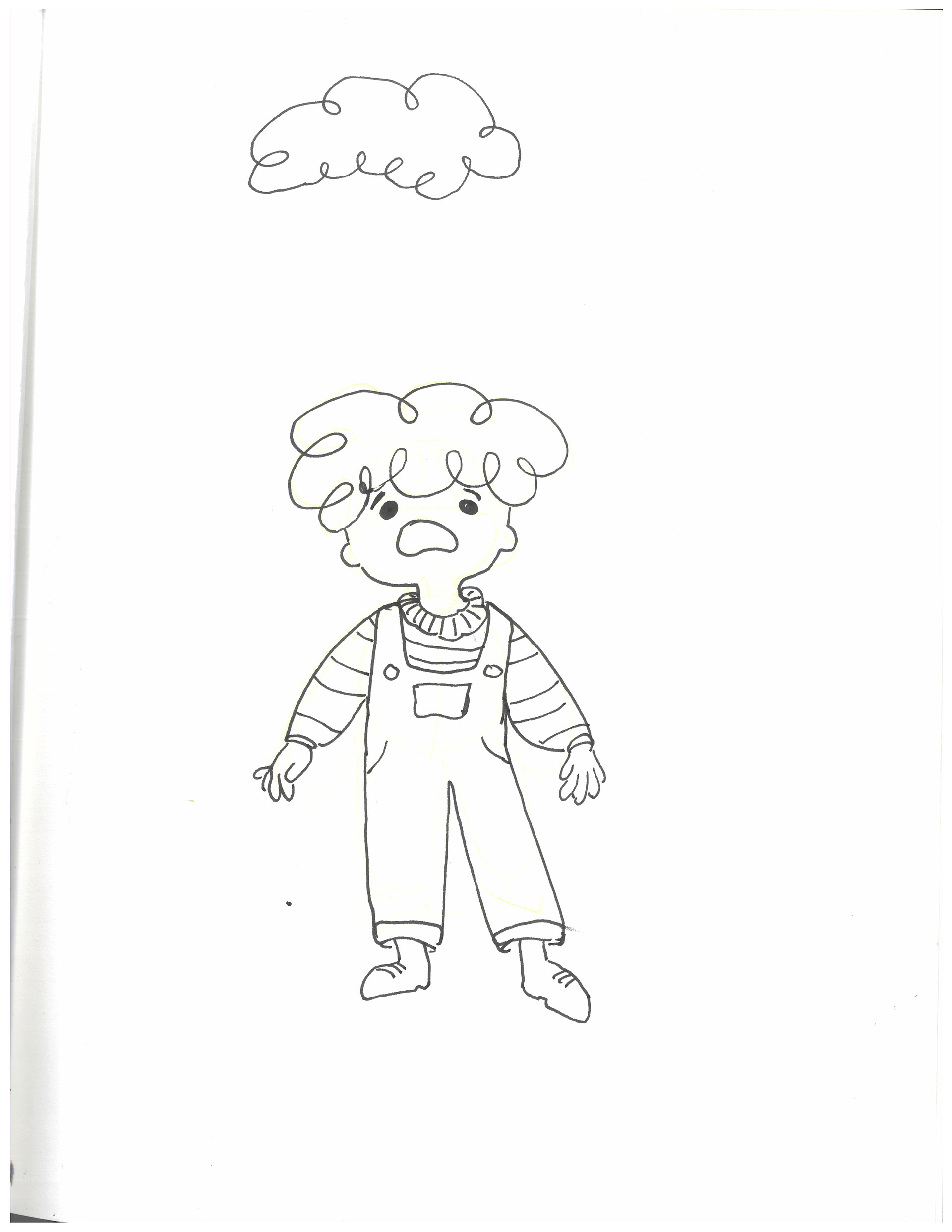
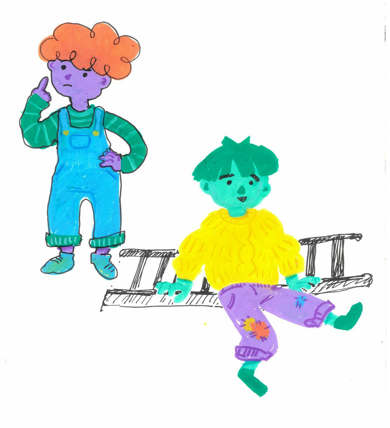
Some of the feedback she offered was that the children look to young, and they should be older considering the target age of the magazine, so I shoul elongate their proportions.
She likes the extra layer of having the child imagine the monkey bars to be scarier than they really are, but she would like me to add more of these layers to the story. She also mentioned that the child should try and fail to climb the bars multiple times before managing to do it. Also, I should focus more on portraying problem-solving and imagination.
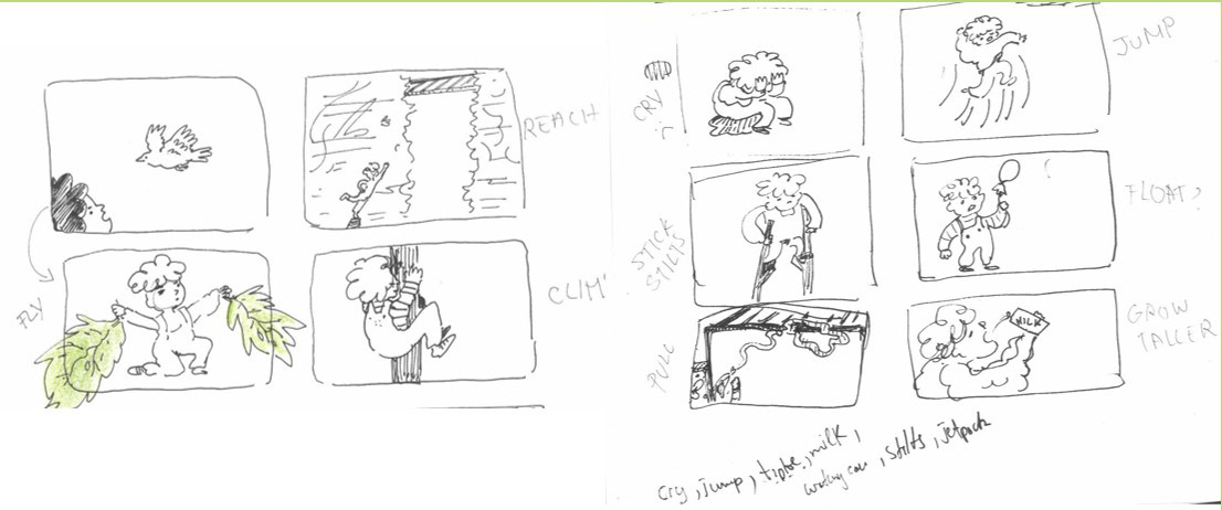
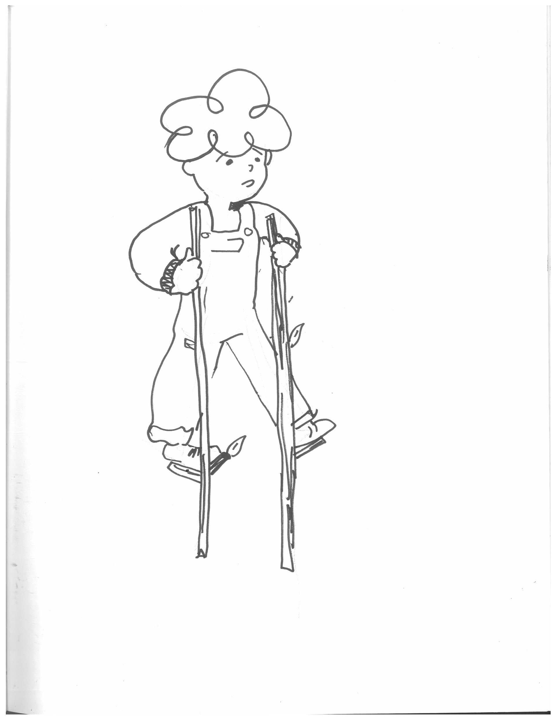
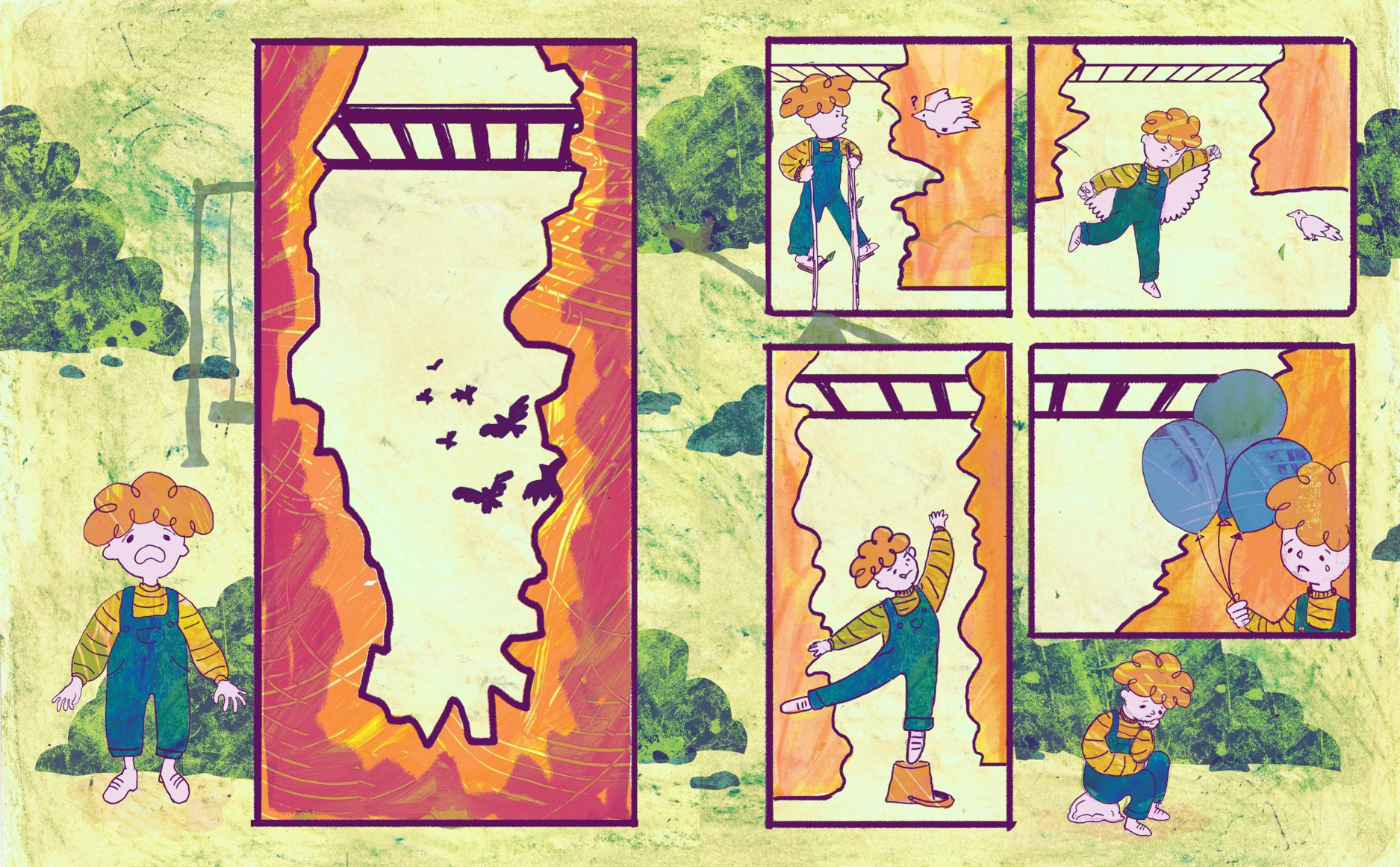
I started doing that by making a list of ways in which a child might try to creatively solve the problem of not reaching the monkey bars. To keep the story light-hearted and fun I tried to focus on more absurd methods of doing so like flying or floating up with a balloon rather than more realistic ones like climbing it.
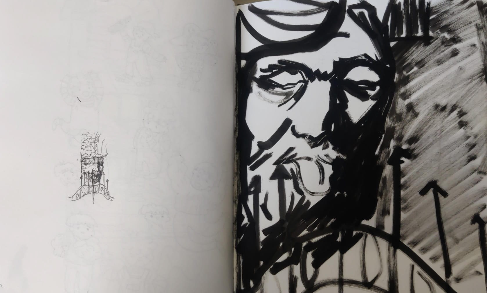
I really enjoyed this session. I find life drawing to be quite relaxing and it felt good to step out of a project for a moment and to do some unrelated work before coming back, since getting locked into a project and not creating anything else outside of it makes me feel burned out and decreases the quality of my work. At this point, I was struggling with the layout for Anorak, so having a simple composition exercise was really helpful. I often just thumbnail and try to figure out the layout by trial and error, which tends to take very long, so being reminded of a type of basic composition felt useful.
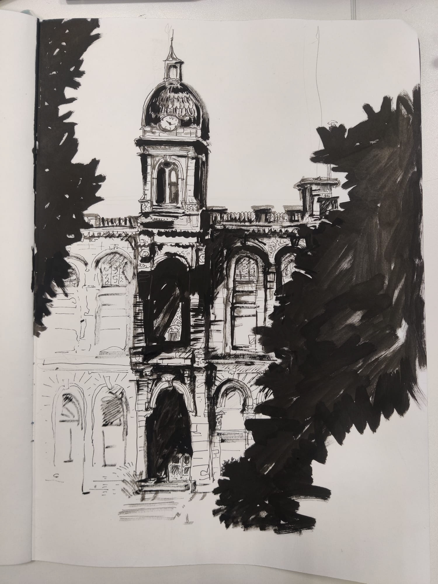
When drawing this, I wanted to make it look more dramatic than the reference picture, so I tried using the trees to frame it to make it more mysterious looking, kind of like the viewer is looking at it through some folliage.
This workshop felt refreshing so , in the future, whenever I feel really tired or burned out, I might try to take a break to observe the world around me and do some life drawing.
Figuring out the layout
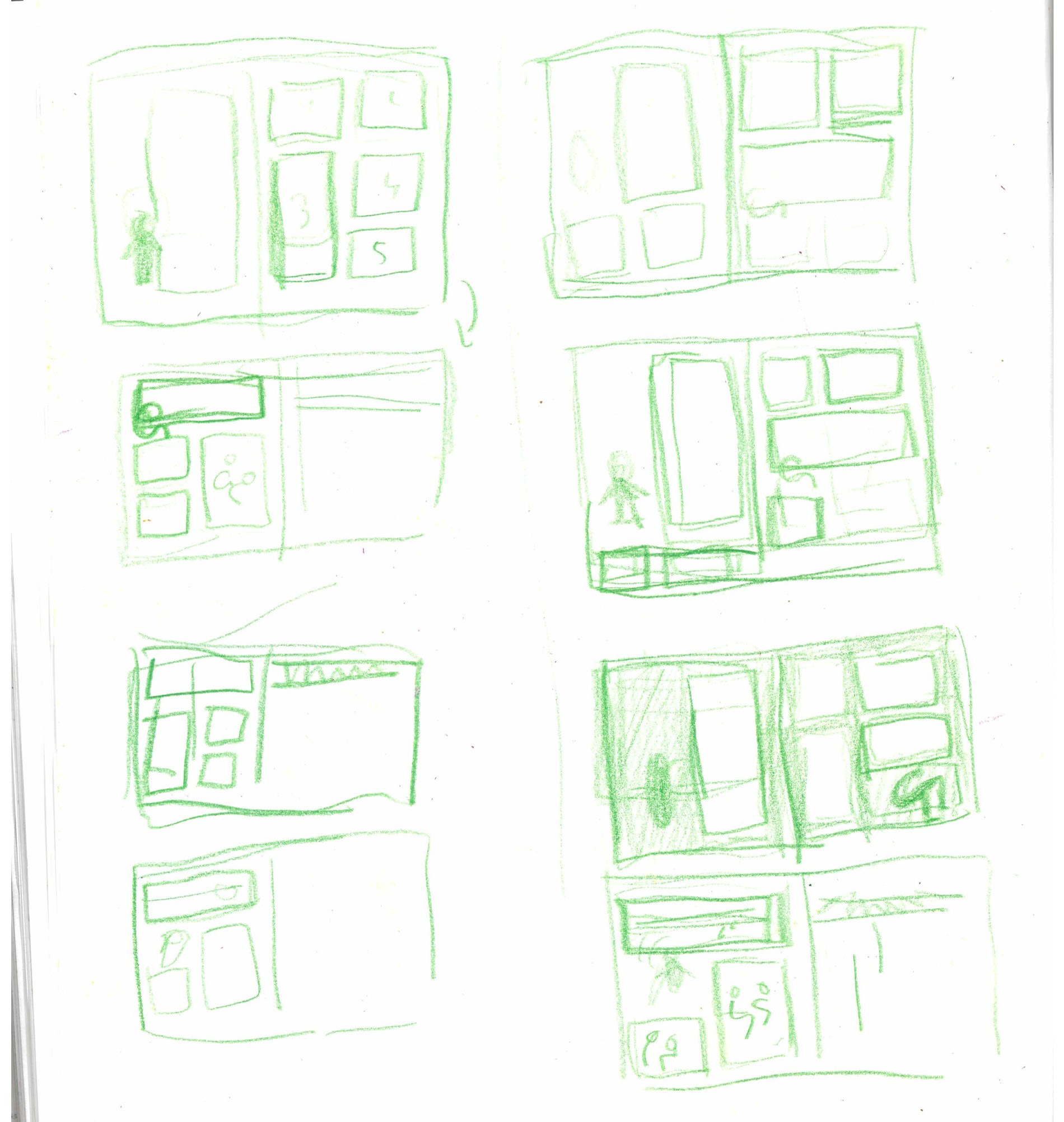
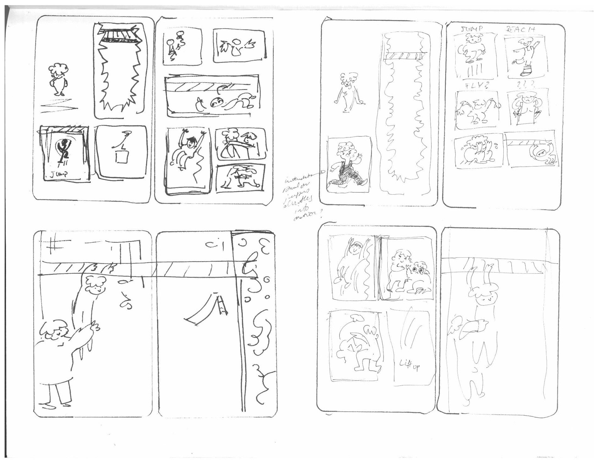
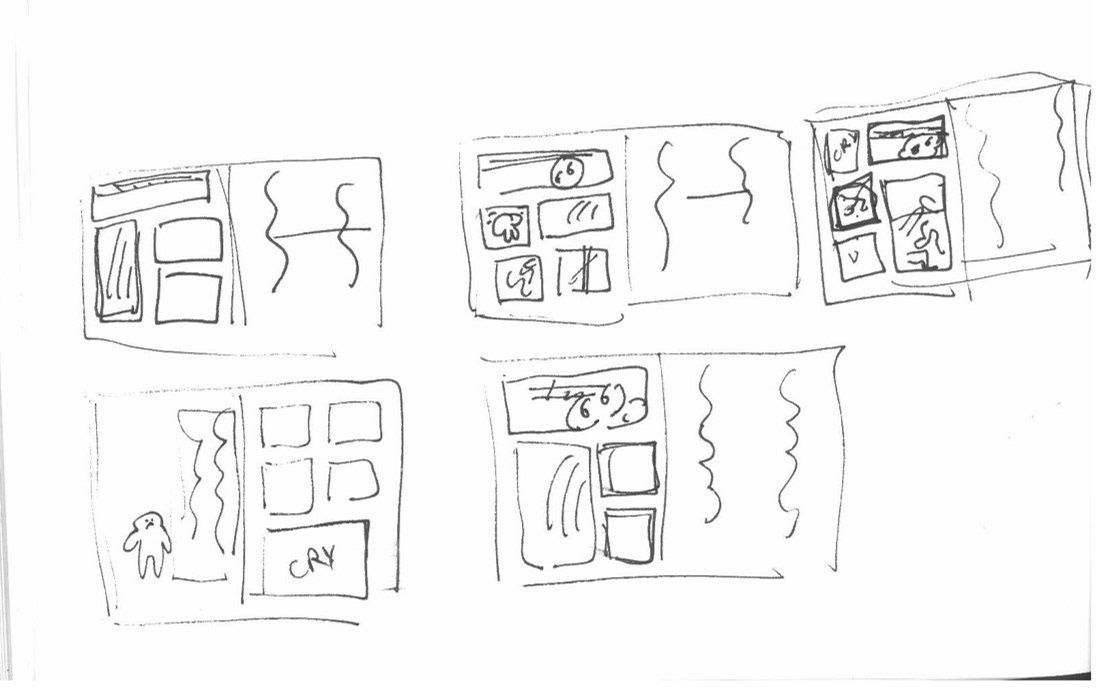
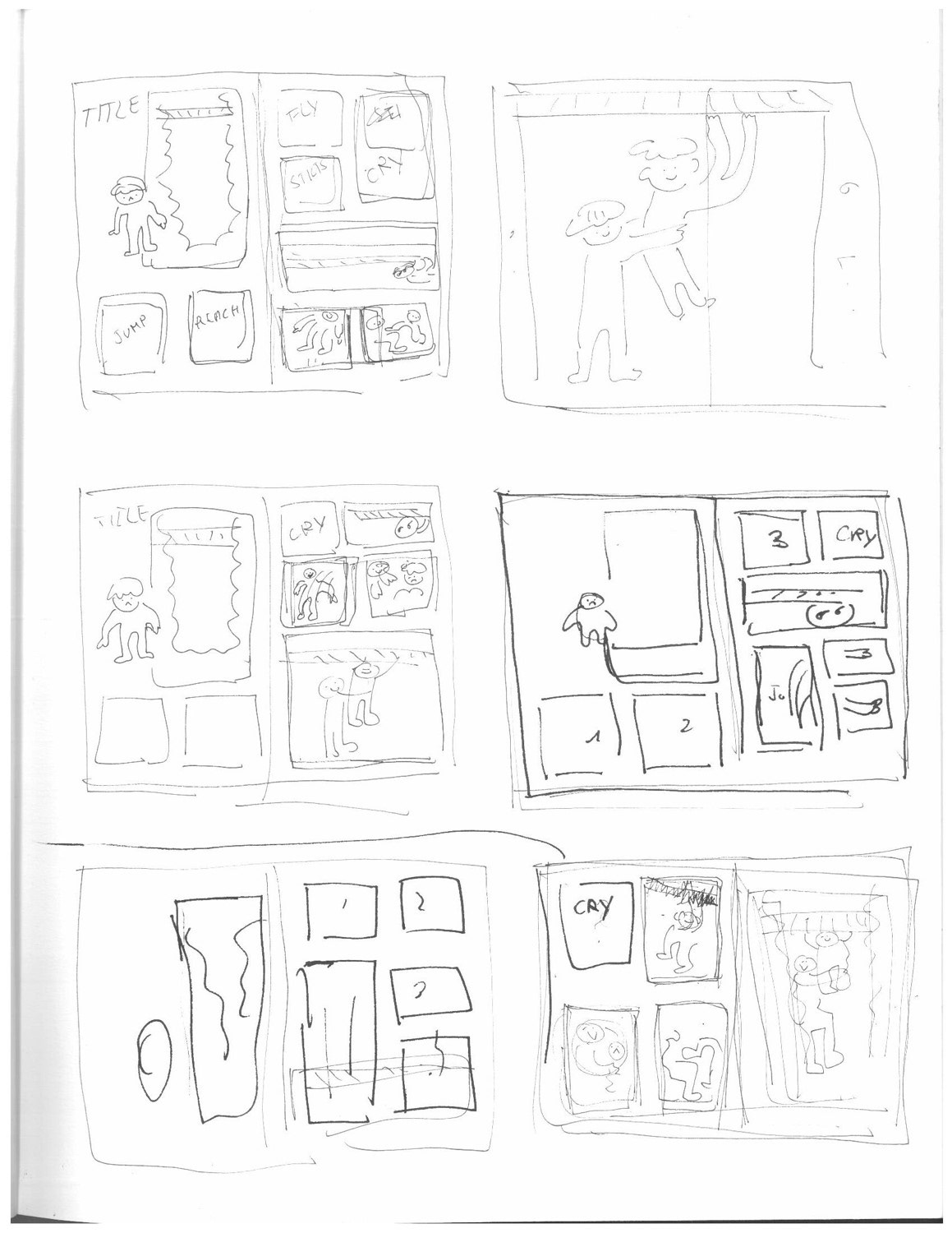

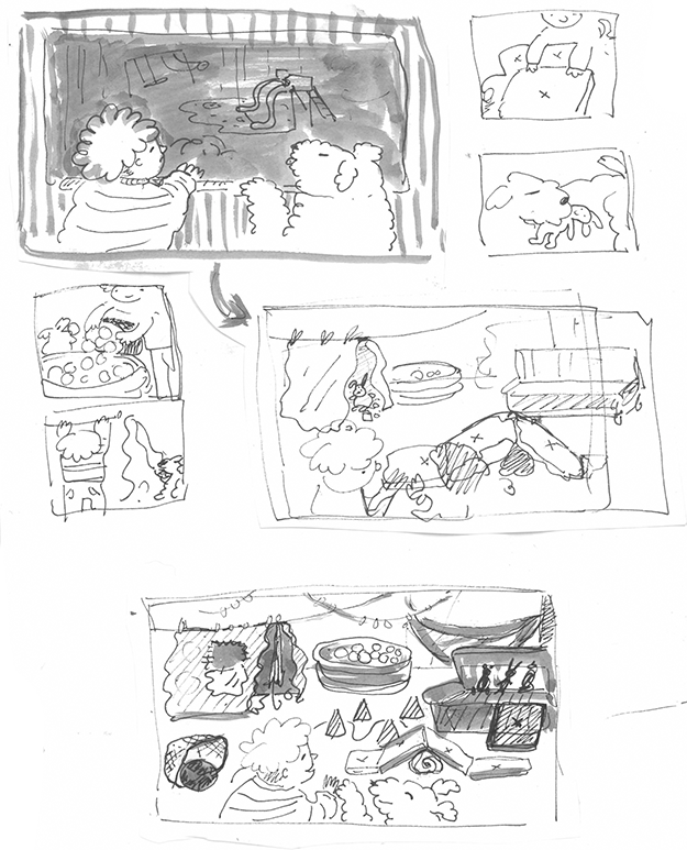
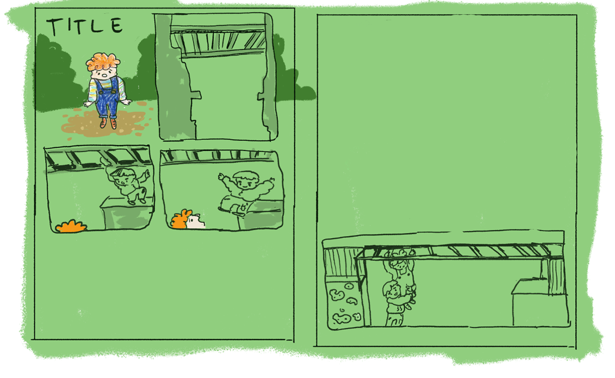
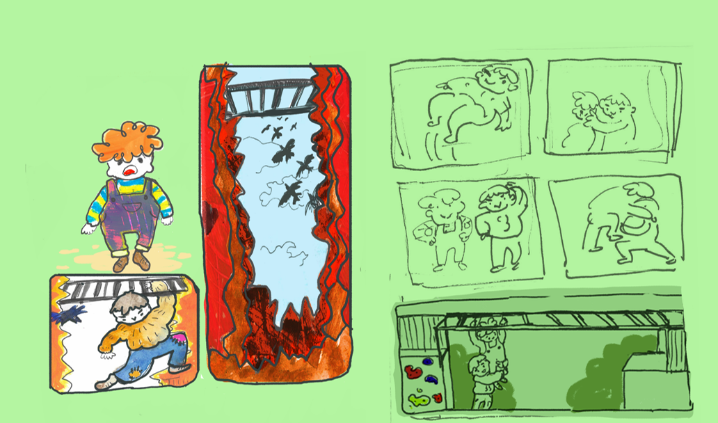
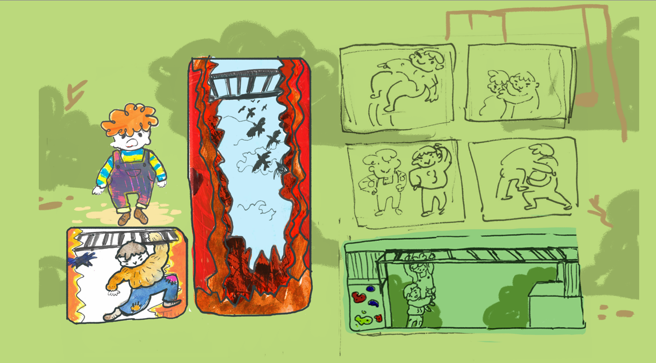
I started out by making some quick sketches to think about the overall composition.

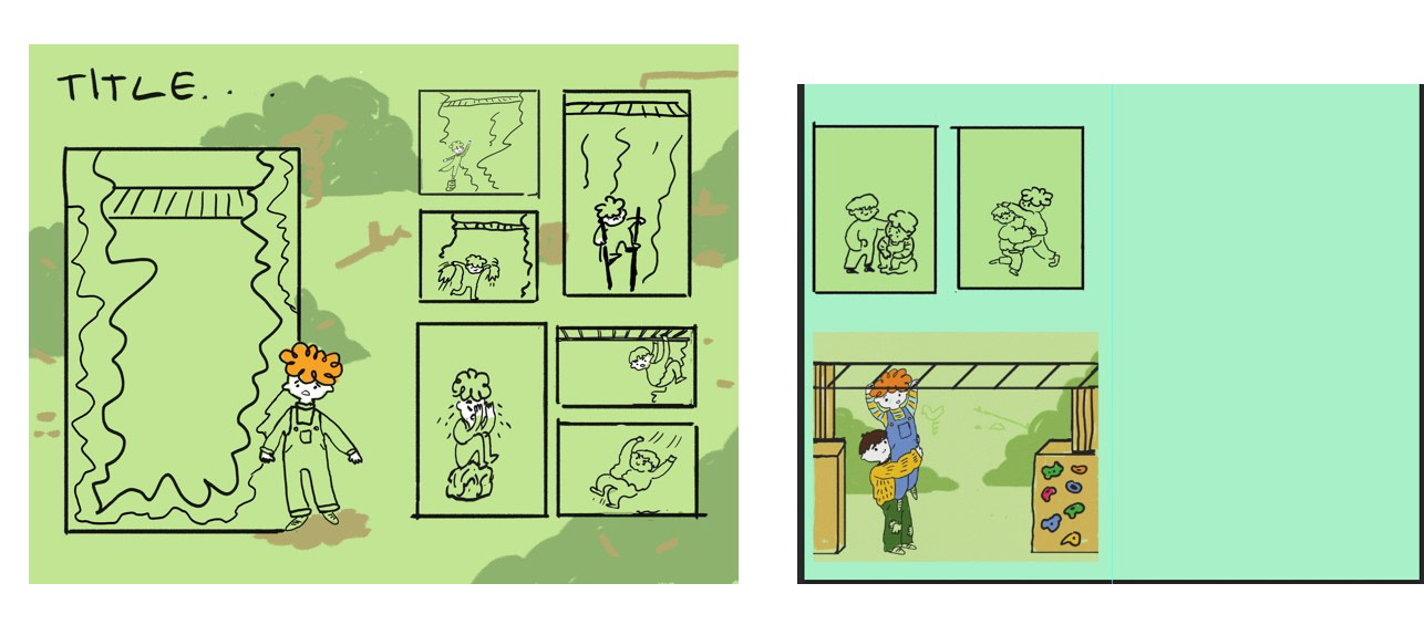
Since I did not plan on using words to tell the story, I wanted to make sure that everything flowed well so I spend about a week to figure out the layout.
At first, I wanted to stick to just 2 pages, but there was not enough space to develop the story.
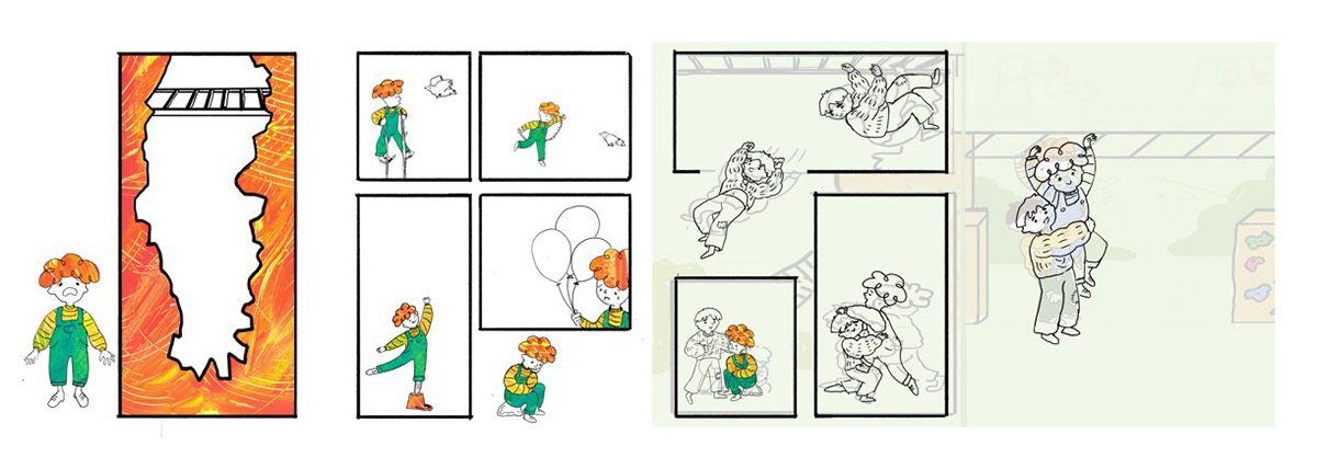
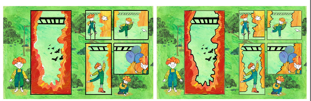
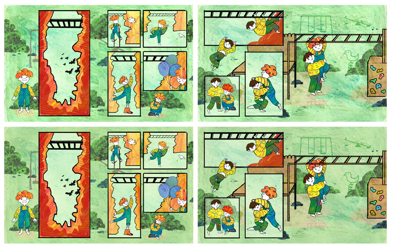
When doing a 4-page story, the flipping of the page reveals the plot twist of the story which I liked but having a whole double-page spread of the final reveal makes everything else feel too cramped since removing parts of the action made the story jump from place to place, so I decided to stick to just one page for it.
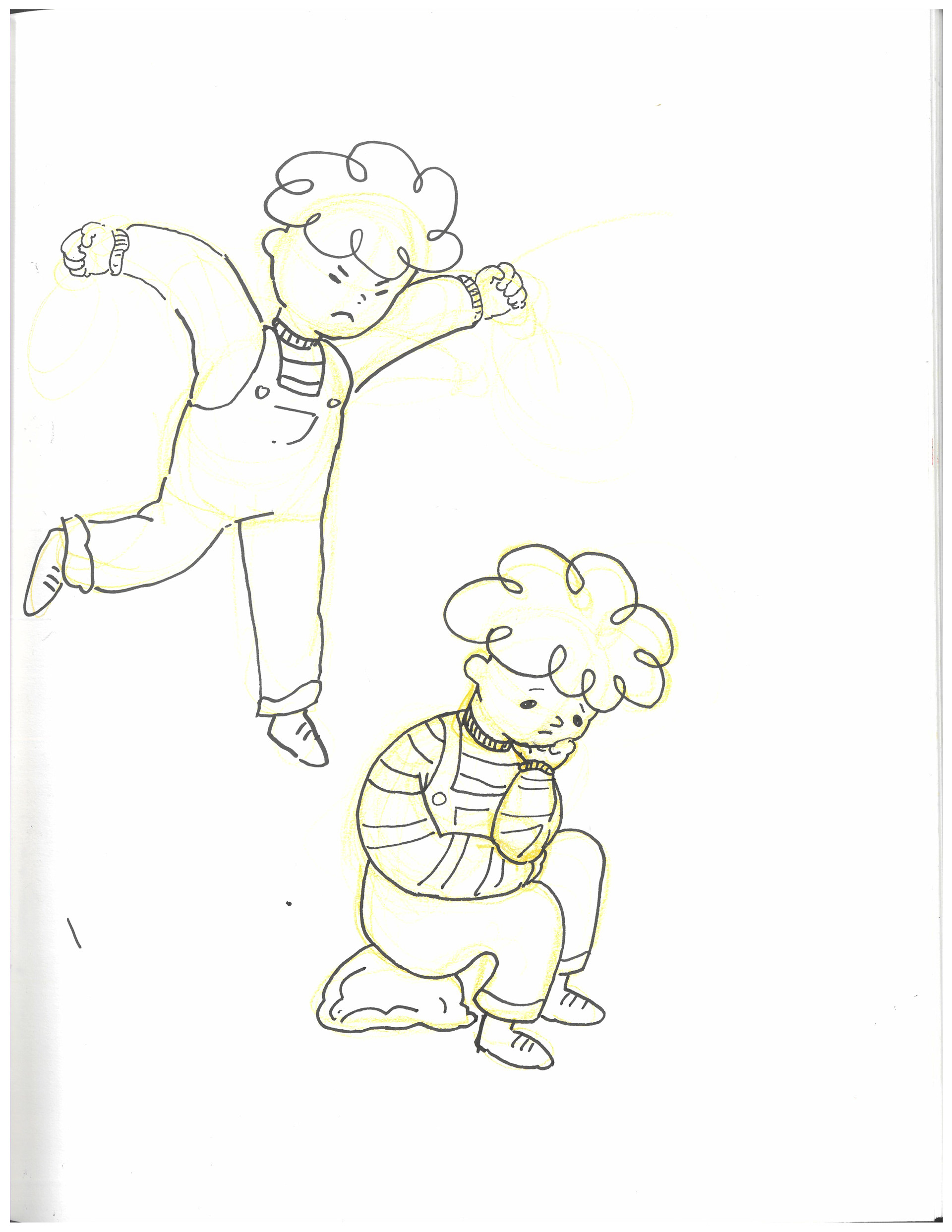
While developing the layout sketches I realised a few things that I feel are needed for the final outcome to flow nicely such as the child having to fail at least 3 times before succeeding to make the conclusion more satisfying and to make it seem like he is actually trying.
Also, in the second part of the story, I found that the stages: seeing the main character > jumping off > meeting > helping him up; need to all be included since when I tried removing any of them it changed the pacing and made it seem like the characters are jumping from place to place.
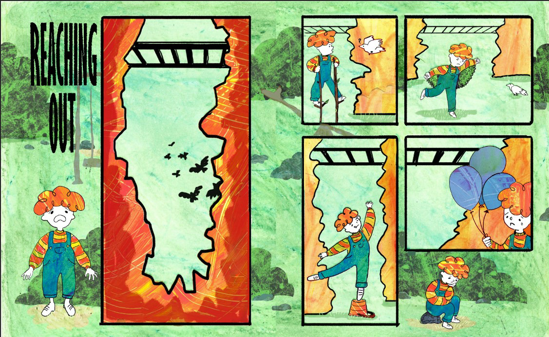
I also want the background to showcase the park instead of being plain to emphasise that the main character is only imagining the cliff.
I was really struggling with fitting everything that I wanted in the story without making it feel to busy so I decided to put some of the characters outside of the panels for a more dynamic look.
Although I am happy with the final sketch I think I could've managed my time more efficiently to further explore the layout. Instead, I focused too much on something that I had already realised wasn't really working ( having a whole spread for the final reveal). Moreover, I believe that this part took me too long to do as it lasted for a whole week, and I should've used a faster method to finalise the layout.
Another thing that I often struggle with that also came about here is my lack of 'written' planning before jumping to sketches and thumbnails. Usually thumbnailing is one of the first things that I do to be able to see what works but that often makes me use my time inefficiently. If I had taken more time to think about what I wanted to be included in the story and a rough idea of the flow, I wouldn't have had to spend so long trying out different layouts.
In the future I will try to spend more time planning before going into drawing since although, for this project, I had way more time that I needed, this will not always be the case; and not planning enough before starting to draft the outcome created way more work for me which made me feel burned out and tired of the project.
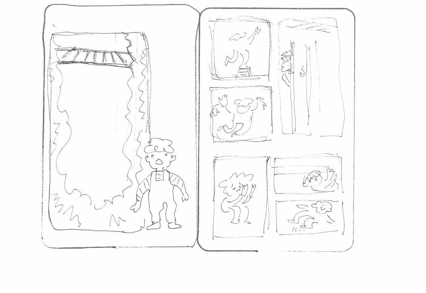
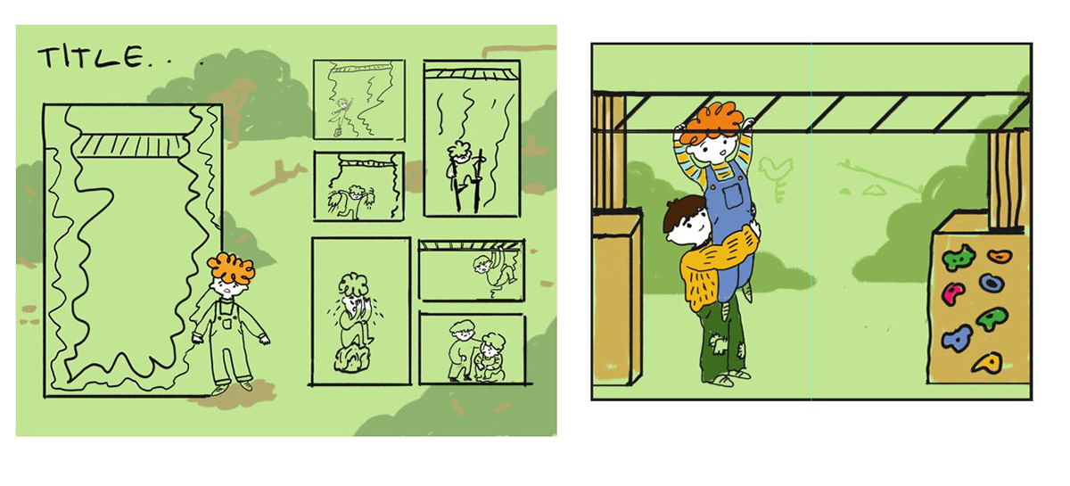
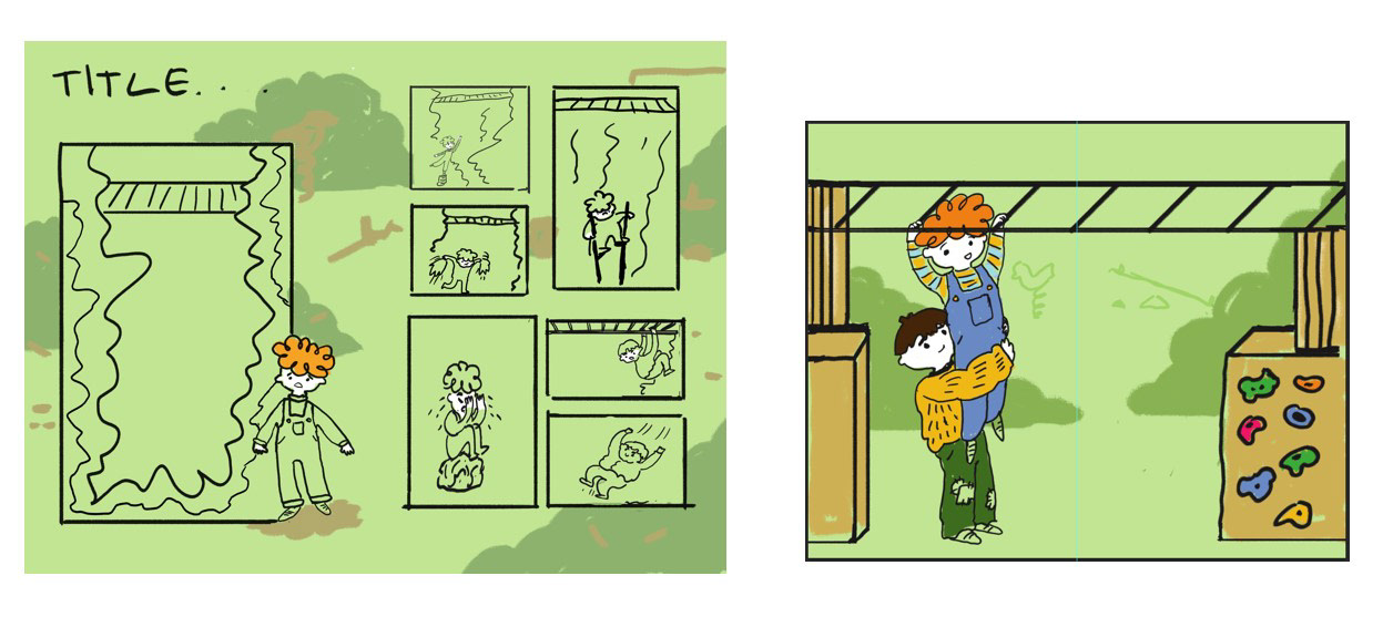
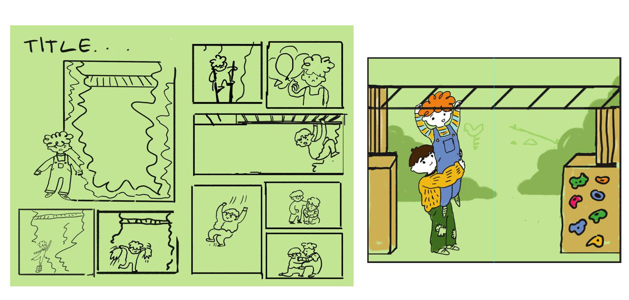
This is the version I came up with after fixing all the issues.
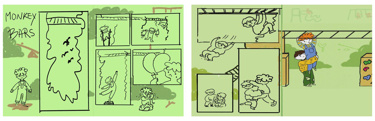
DEVELOPING THE FINAL OUTCOME
While working on my panel sketches I realised that I really dislike the flat and fully digital look.
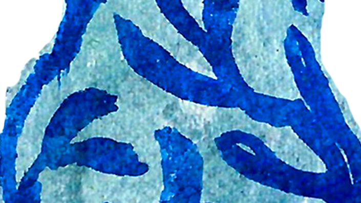
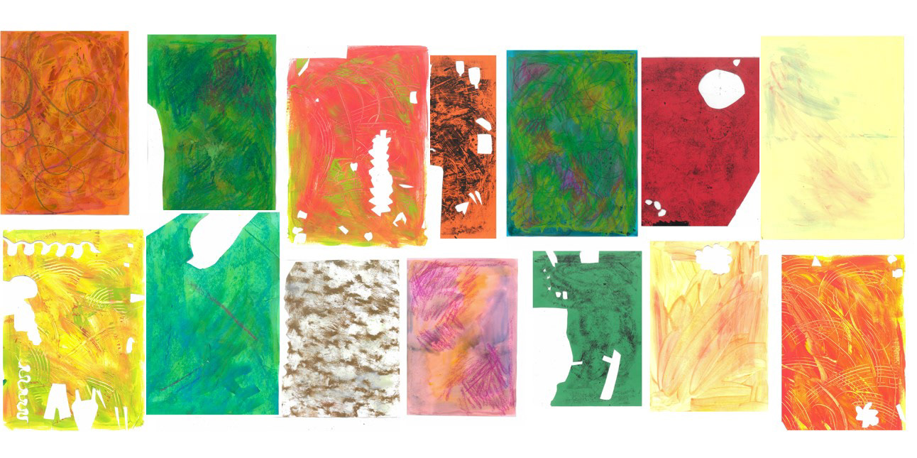
I Decided to add some texture in my final piece, so I started making some different textures to collage together for my final piece.
I wanted them to be as diverse as possible to get a better contrast in the final piece so I used a variety of techniques and media such as mono printing, scraping paint and rubbing pastels over different textured surfaces.
I also decided to sketch the characters out in pen and scan them in since I feel like they sometimes tend to be overly stiff when I draw them digitally. Unfortunately, I think they still ended up being quite stiff compared to what I would have liked.

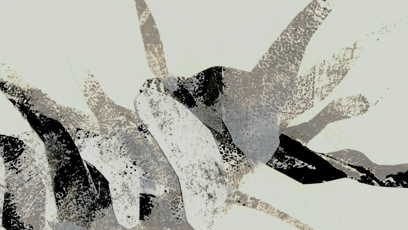
I started to add the textures in the image. I wanted to keep some white areas so as to not make the image overly busy, and also because using white in the illustrations seems to be a staple of the Anorak magazine.
I did not really like the look of it at this point since it still felt quite flat and uninteresting so I decided to experiment with some different versions.
I tried doing a version with a plain background, one with fewer lines and one with different colour lines.
In the beginning, I really wanted to try out a version that had no lines at all except for really minor details, but I ended up merging my layers at some point to make editing it easier, so that was no longer a possibility.
In the future, I will make sure to always make a copy before making any drastic changes so that this does not happen again.
Here, I also added more pops of bright colour which made the image more lively and I also changed the colour of the panels' background so it doesn't compete as much with the foreground colours.
I test printed the images and they were way brighter than I thought they would be, so I lowered the saturation and made it a bit cooler since I felt that a cooler green would make the background feel like it is further away from the foreground and it also lets the orange shine.
After this, since I thought that the background was still too overpowering, I also lowered the texture's opacity.
Although I think the images look better than before, I am still not satisfied with the way they look right now, but I cannot exactly pinpoint why.
I decided to experiment more with the colours to see what works, as well as to put in the final presentation to so that I have a variety of versions to show Cathy, in case she prefers a more muted or more colourful illustration.
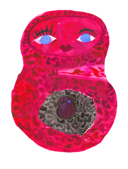
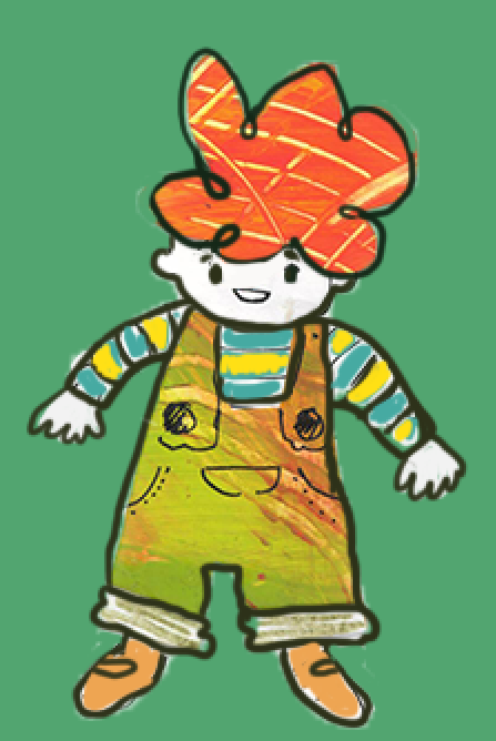
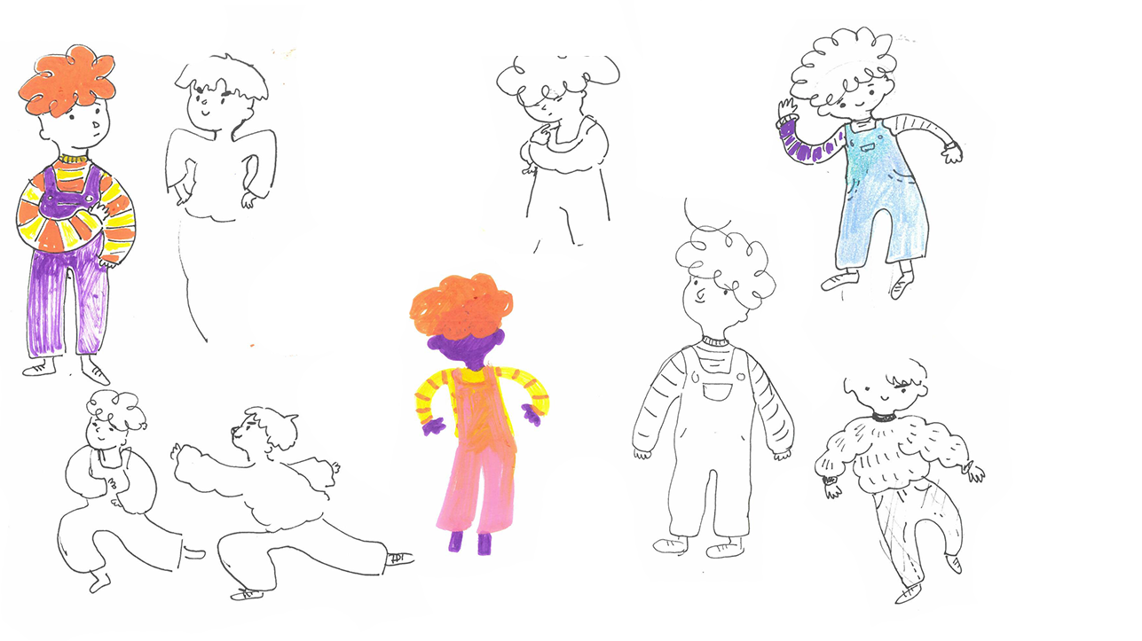
I decided to look back at this sketch I previously made while designing the characters, which was also favoured in the peer assessment. I found that this is a good place to start since in this iteration they are fuly coloured instead of using white which could help make the final outcome more cohesive.
Initially, I just tried changing the colour scheme of the characters, but the purple of the main character felt too out of place while the green tones of the other blended in too much. I stared tweaking the colours to create some different iterations that make my piece have a different atmosphere.

I still prefer the original but I ended up putting some of the re-colours in the final pitch so that I show Cathy some variety.

I'm not happy with my final piece but I still could not exactly pinpoint what feels wrong.
One of the problems I considered is that it feels a bit barren and lacks detail, especially compared to some of the other Anorak illustrations, but, adding more details might made it feel to busy because of the addition of the textures,so I decided to not do it.
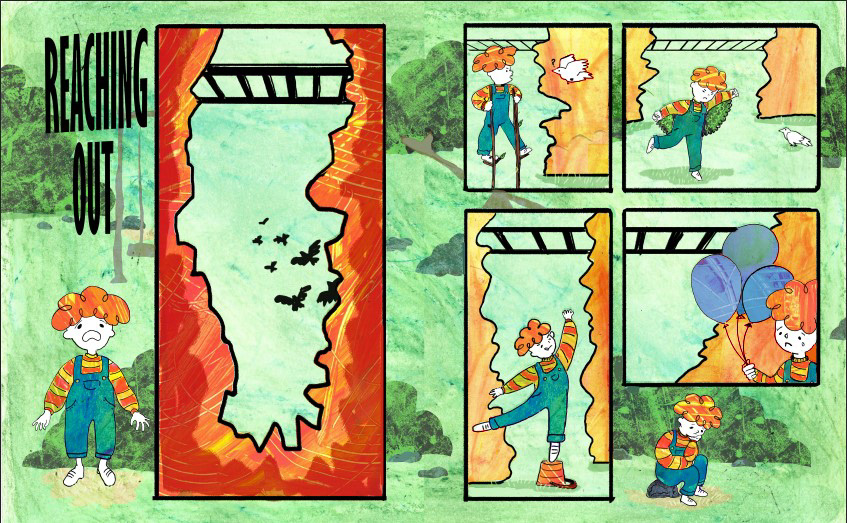
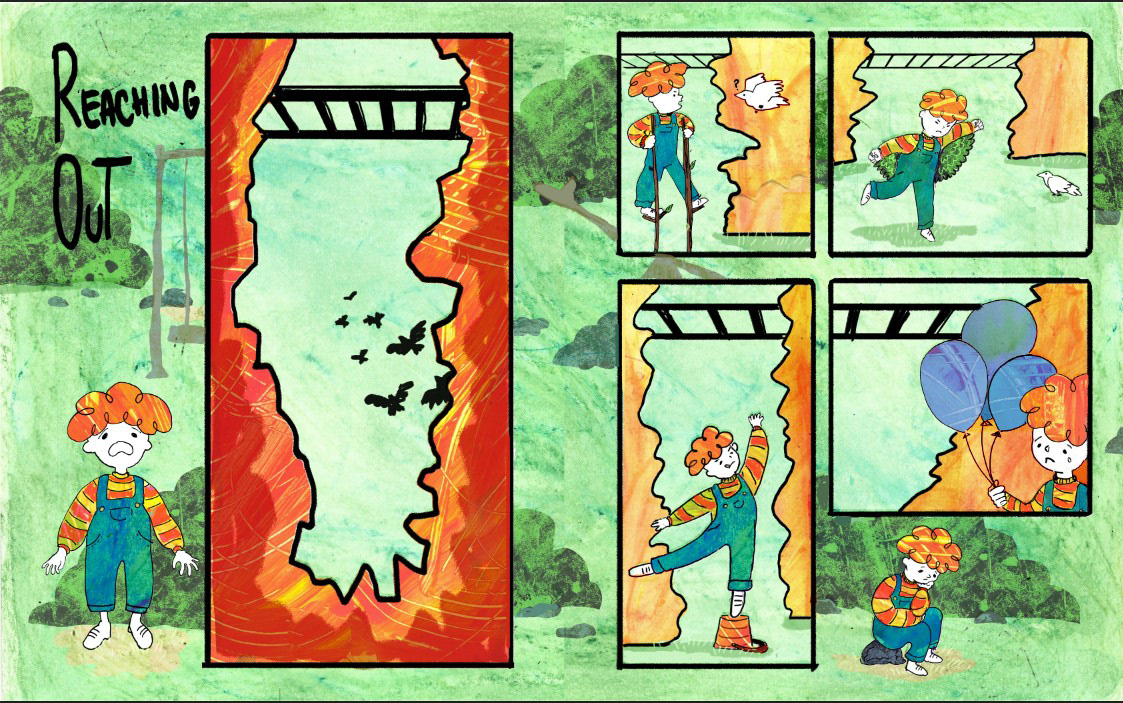
After receiving some more advice, I changed the textures from the cliffs in the first spread to all match. I initially made some of the cliffs a different colour and texture to show that they are in the background, while the child is in the foreground, and so it does not clash with the main character's hair, but it did not really achieve that anyway. Making the texture the same throughout gave tghe image a more consistent feel.
I also made some other small changes like removing some of the ladders since they seemed too close to the ground which ruined the dramatic effect. Removing/ making some ladders smaller also had the effect of removing some of the harsh black lines.
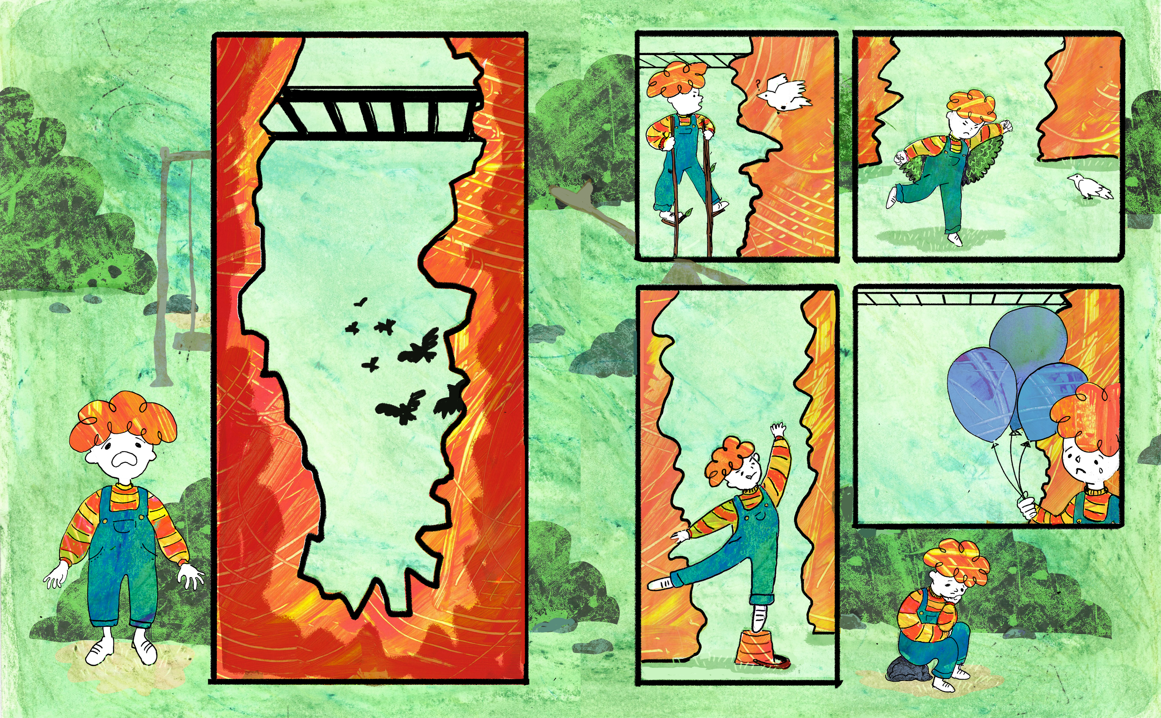
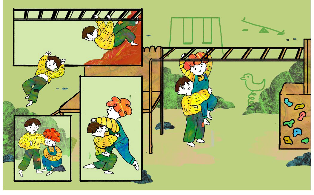
I ended up submitting this as my final outcome.
I feel like I learned a lot over the course of this project and it ended up being a very fulfilling experience, although I am not fully satisfied with the outcome.
Some things that I think turned out good are the layout, which makes the story flow exactly how I wanted, and the story itself, as well as how it is told, since I feel like after thoroughly thinking about the theme and audience I was able to come up with a fitting story. In the past, I struggled with having a simple and clear concept, as well as with telling a story in a straightforward manner that can be easily understood, so, I was happy about being able to improve on that.
I was also able to ask multiple people to look at it to see if the story makes sense to someone who does not already know what it is about, which went well.
Another thing that went well was the media and material exploration, as I enjoyed testing the combination of analogue and digital media.
Some negatives in this project were brought on by my lack of planning. As I previously mentioned in the layout explorations stage, I think I started visually exploring too fast, and I should've taken longer to just think about everything that needs to be included. Not doing that forced me to do a pretty big amount of sketches that didn't even end up helping me towards creating my final outcome, and, in turn, made me feel tired of the project earlier than usual.
This negatively affects some aspects of the final piece which has some parts that are not developed enough since I was feeling quite burned out at that particular stage, such as the characters which ended up being overly stiff, especially compared to some of my original sketches. I noticed since first drawing them that the character's movements are not as expressive as they could be, but instead of redoing them or exploring a different mode of drawing them ( such as the potato print experiments I initially made), I chose to leave them like that and rely on digitally editing them to make them more dynamic (which did not really happen).
Another way in which not spending enough time on the planning affected my outcome is how barren it feels. In the initial stages, I didn't think much about certain aspects of the illustrations', such as the backgrounds.
While the simplicity of the background makes the action the focus, it also makes the world where the story takes place quite empty and not very expansive( the universe is empty with only 2 kids and some monkey bars in it).
This could have been remedied with just some more planning for the backgrounds, at least for the final reveal. If I were to redo this I would add more elements, at least to the final page, where I could've planned the composition in a better way to leave space for more playground equipment and some more background characters to make the world feel bigger and also create a bigger contrast between the scary imagination of the kid and the reality of the park which is happy and lively.
Adding more elements could have also been an opportunity to develop a more interesting colour scheme since I feel like the current one is a bit boring.
Overall, I learned a lot during this project, not just technical skills, but also gained more insights into working on a commissioned project and receiving feedback and instructions from a client and acting on them. I also think I got a bit better at learning how to create an outcome that is appropriate for a certain audience and at understanding the brief and the material/ client I am doing work for ( in this case a children's magazine).
In the future, I will keep in mind everything I learned here, especially how much I learned about interpreting a theme/topic/brief since this is something that Cathy seems particularly strict about. Moreover, since most of the biggest problems I've had this year were due to my initial planning being extensive enough, I've realised that this is something that I need to improve on.
Finding a title
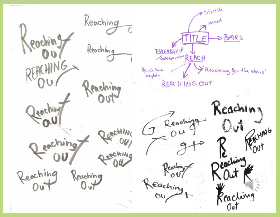
I also needed a title for the story. I chose to go with 'Reaching Out' since it can refer to both the physical act of reaching towards something, as well as reaching out for help.
At the end of the brief, I had some extra time to work on it, so, although this is not a mandatory part of the project, I also decided to do some experiments with typography, since the space is quite narrow so I wanted to show some examples of how it could fit.
I also considered squishing the hill to make more space for the title but I decided against it since I think the narrow and long look is what makes it scary and contrasts with the height of the child, and the title is a less important element. I am waiting for Cathy's feedback to see if she also believes I made the right call by not changing it.
I ended up not using most of it in the final presentation since I didn't really like how it turned out, and I decided to stop working on it for now since it's not a mandatory part of the project.
I am not very experienced with typography so in the future I plan to look at more typography and to start experimenting with it more since I feel like it can be a great storytelling tool when used creatively.

Final edits and feedback
Since I wanted to try my best to treat this brief as a real commissioning client, I wanted to do my best to make all the edits that Cathy wanted, to get the full real commissioned brief experience.
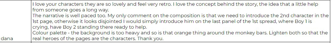
I already knew that the second piece of feedback is something that I might receive, since I also thought that the background colours were quite strong.
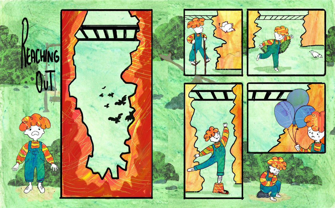
I understand where she is coming from with the first edit she requested, but I am not exactly sure how to change that without redoing too much. I'm also unsure how to add the second character in, since he would need to be on the ground, but in the second spread he is introduced from high up.
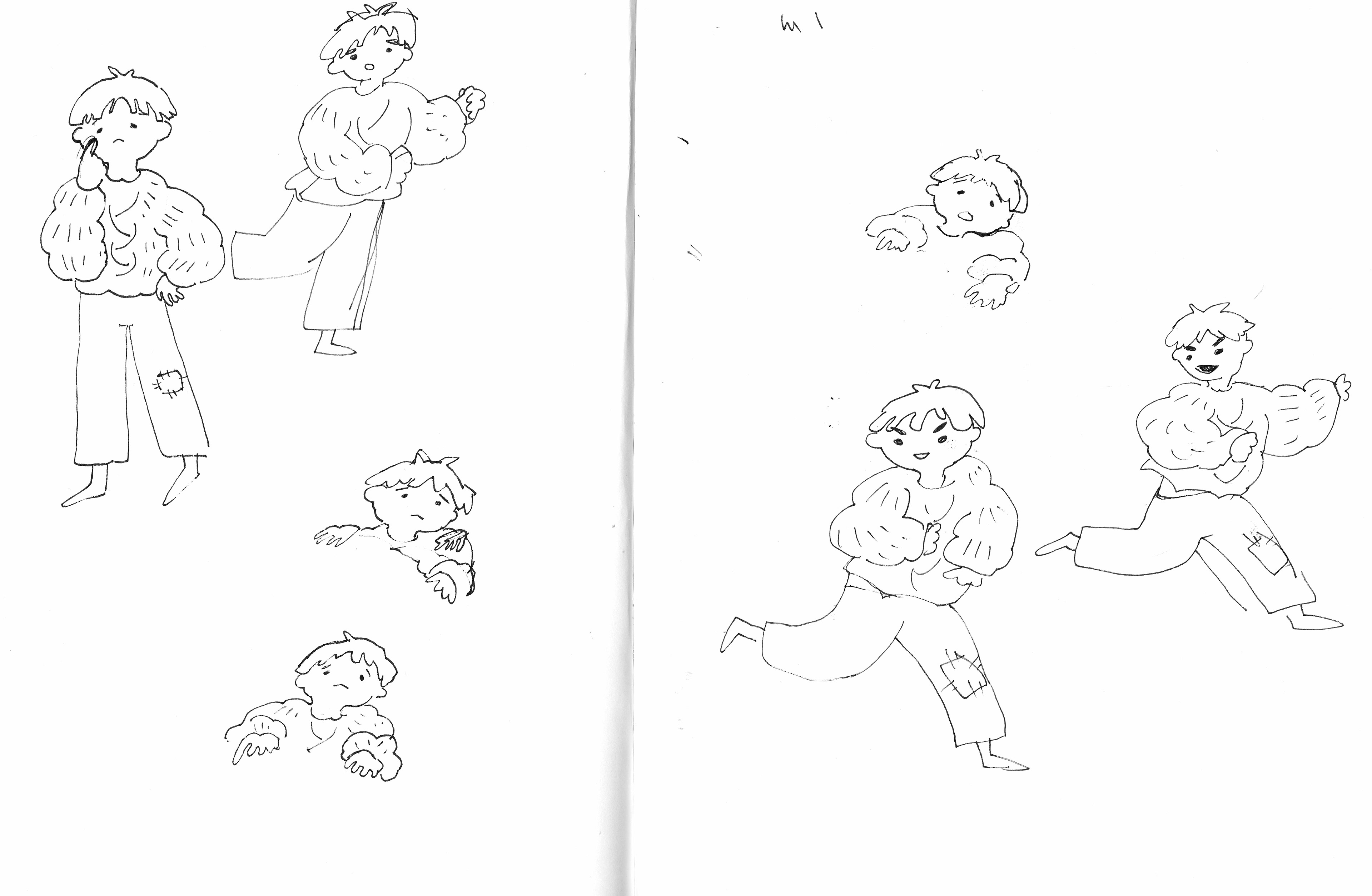
I didn't really know what tod do so I started sketching the second character in different stances, to see how I could introduce him. In the end I settled for a combination of a more dynamic pose since he's supposed to be climbing the monkey bars in the next few seconds, while also having a concerned or curious look about boy1 standing on the ground since in Cathy's feedback she states that boy2 should be there 'ready to help'
Although I still need to make some small edits before submitting, I think the pages will mostly stay like this.
I hate how the second character looks in the first spread, and I really do not want him to be there. Moreover, I feel like no matter how I would have placed him in, it would not make sense because he is so high up in the next panel. How did he get there??? Why would he not just help boy1 the first time he meets?
Before this I have not minded taking critique and making edits in my work, so this made me get more of an experience with hanging things that I would not like too. Up until now, I mostly enjoyed this brief, as I thought that working with a client and being given instructions was more enjoyable than just deciding everything on my own. If I were to look at this experience in a positive light, I would say that it's good that I got to practice with changing something I do not want to, since, realistically, in a future professional environment I will not be able to do everything as I want.