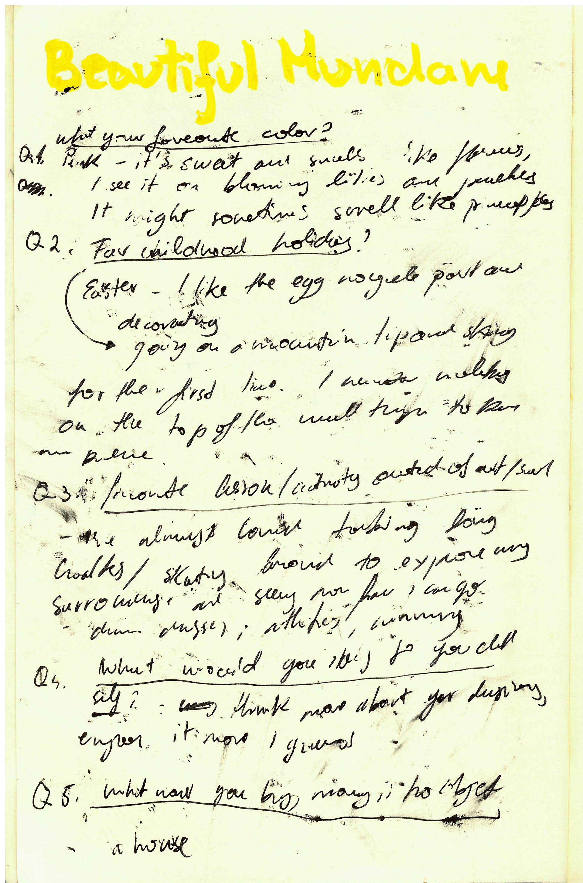
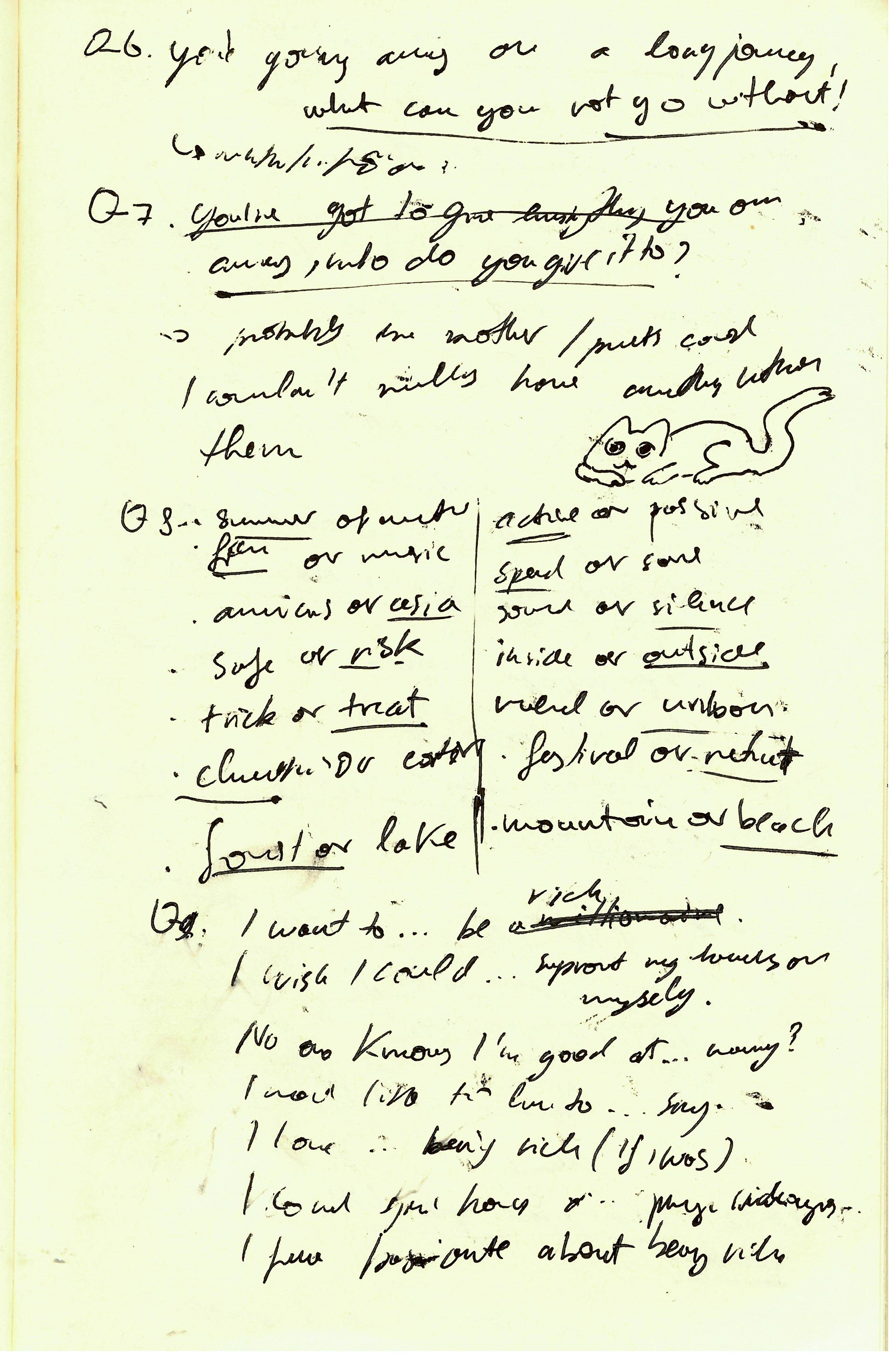
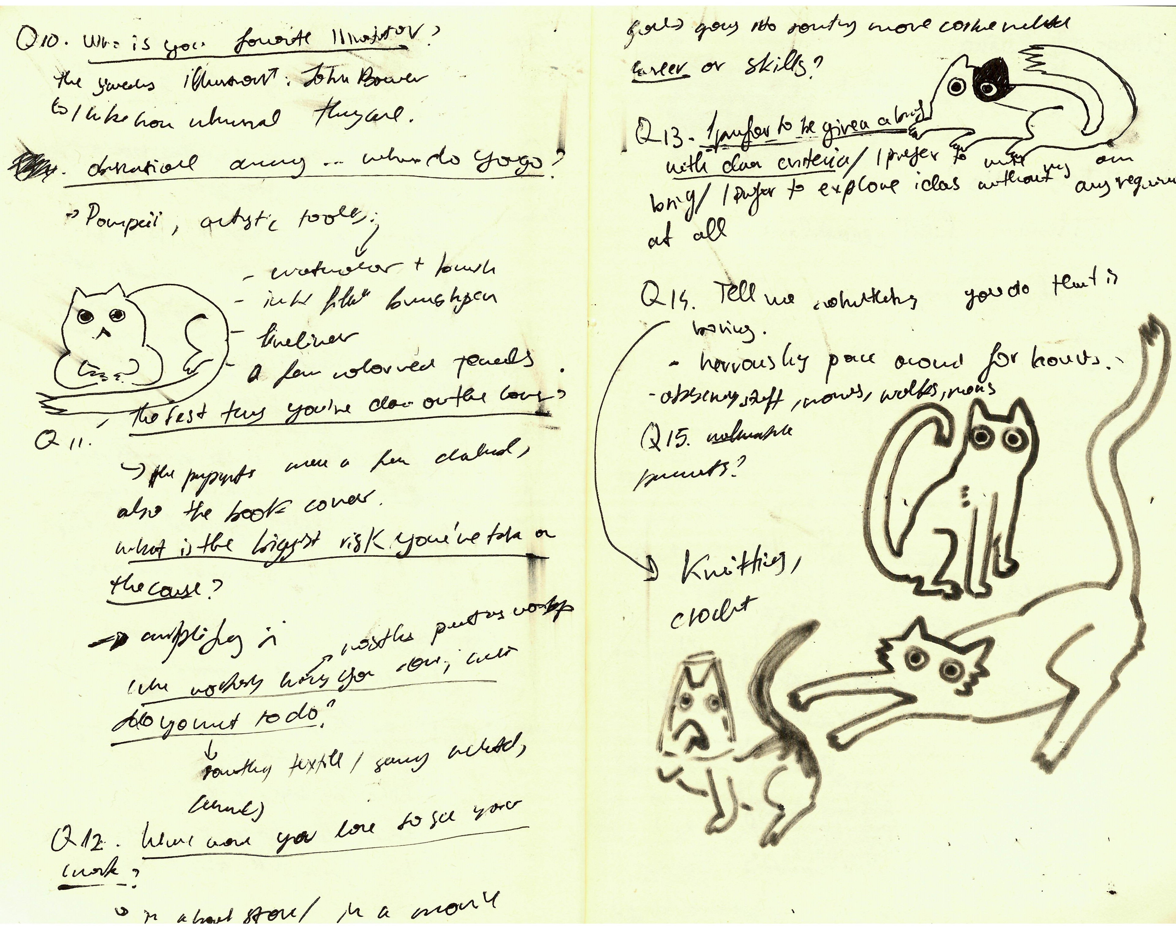
BEAUTIFUL MUNDANE
QUESTIONS
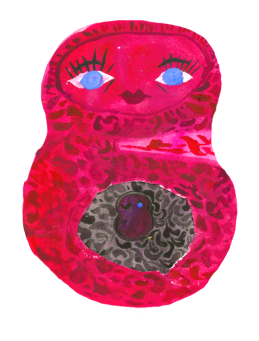
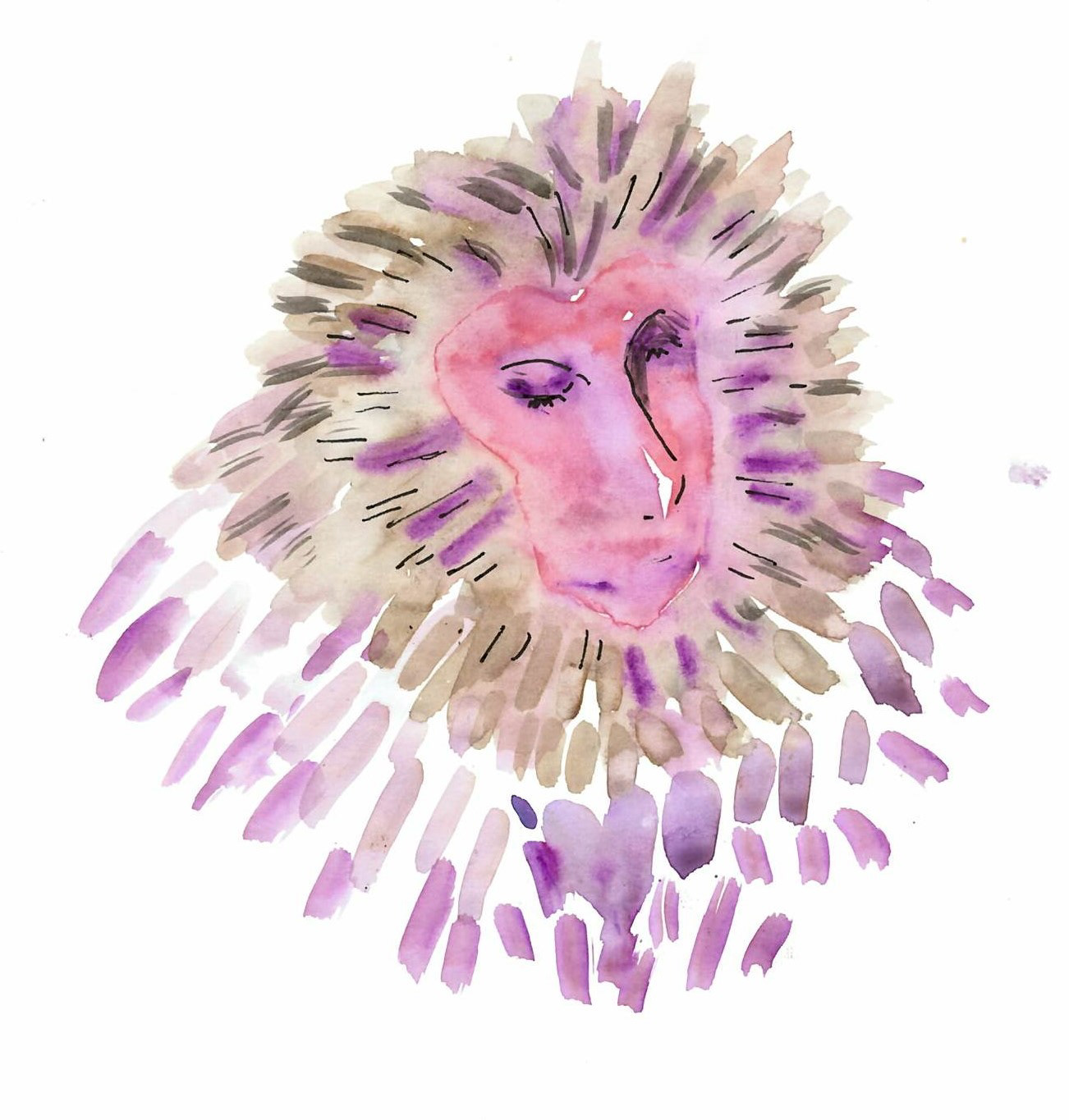
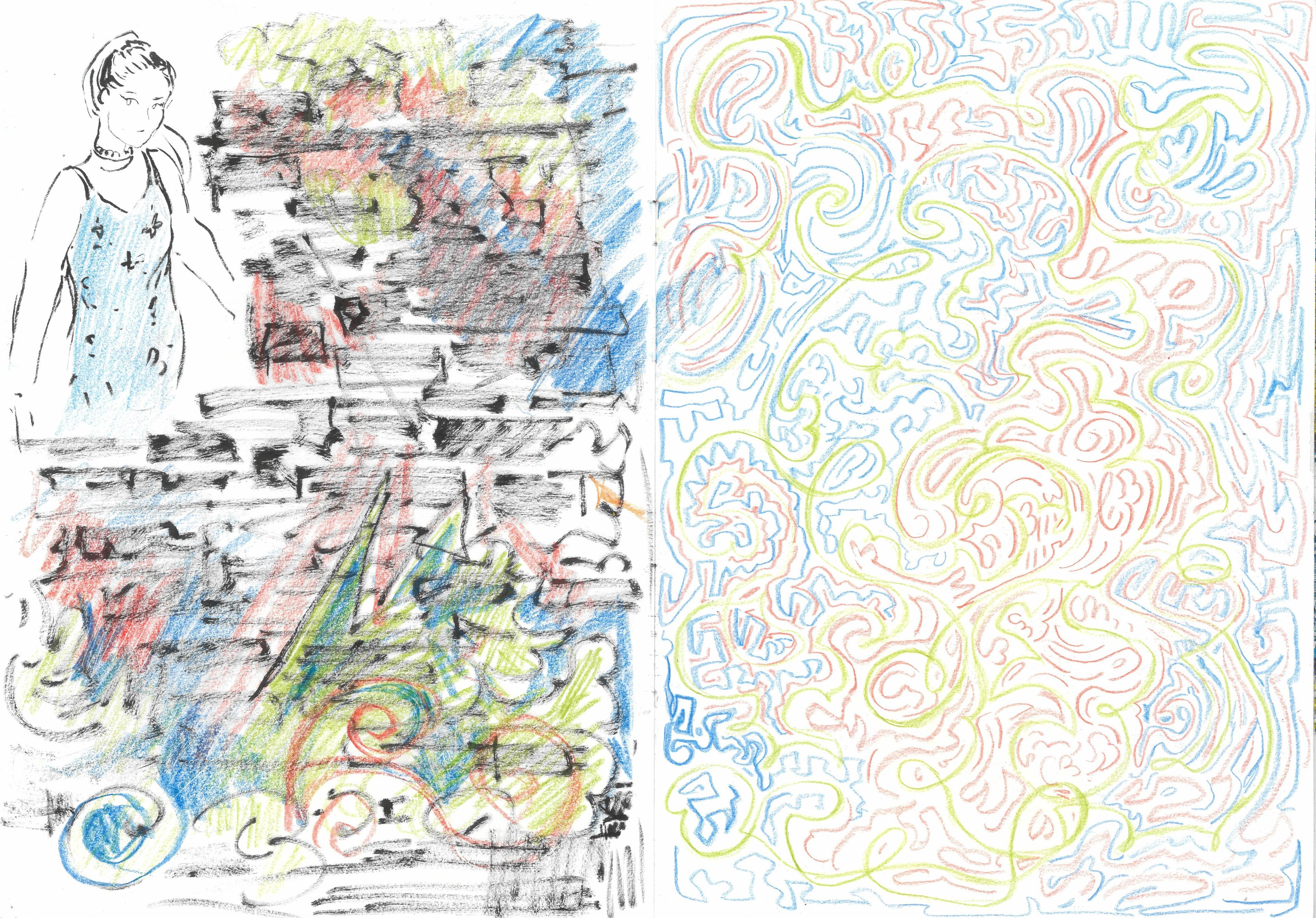
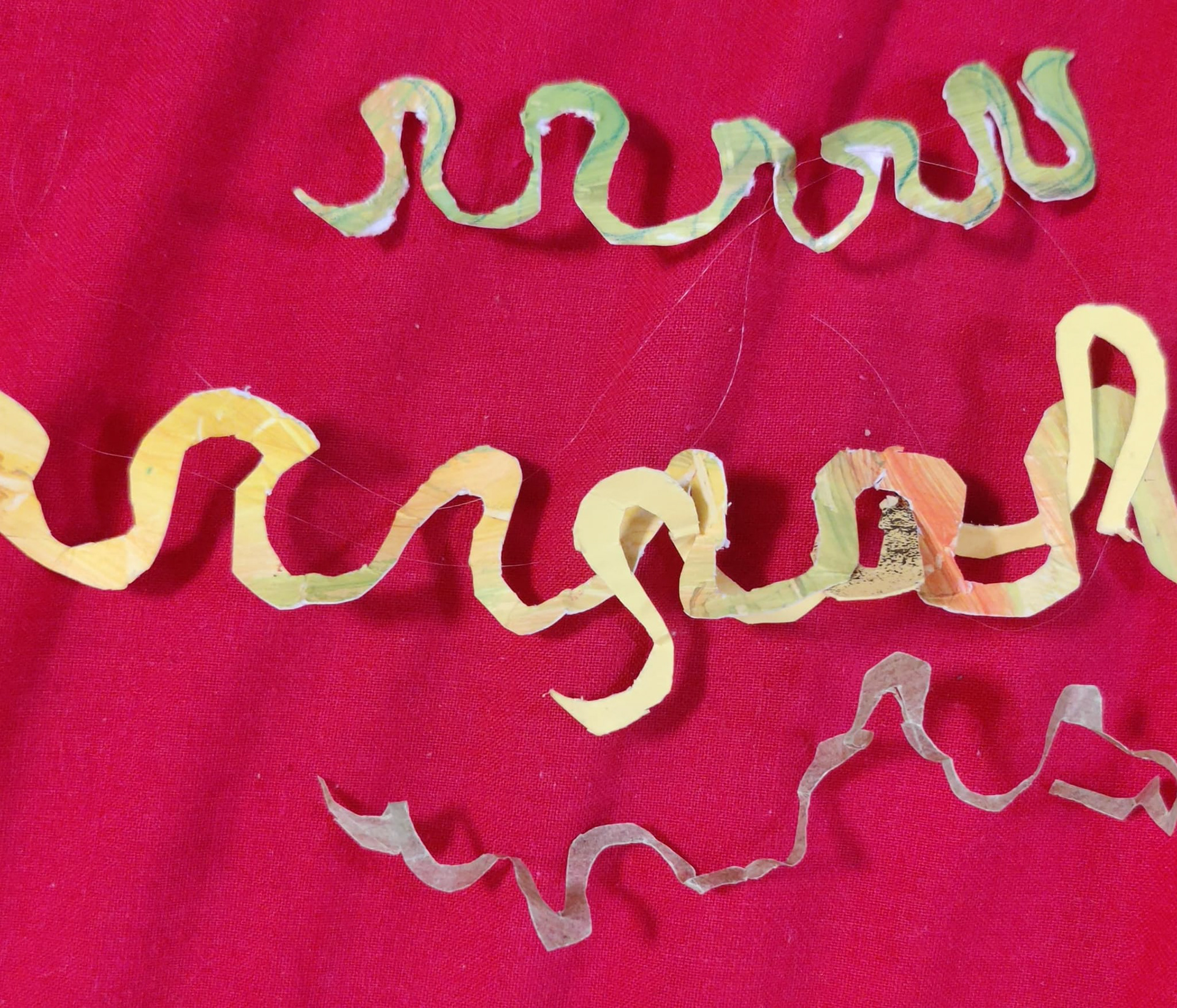
For the beautiful mundane task, the first thing I thought to do was to continue working on my graffiti task, now without the constraints of the song.
My goal here was to experiment with some different ways to represent graffiti without using any spray paint.
Although the squiggles were quite fun to do, I didn't like any of them, so I decided to do something else for now.
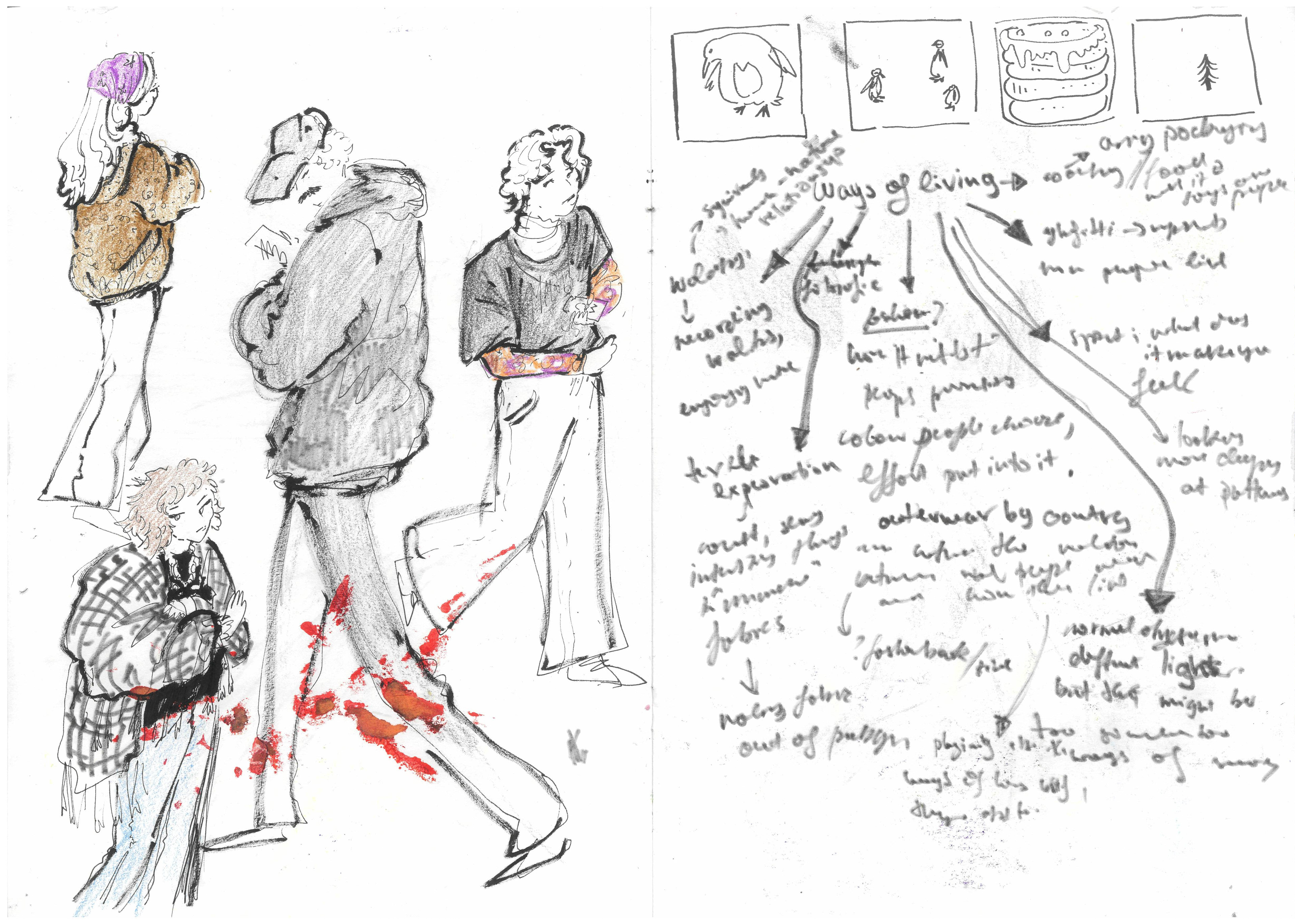
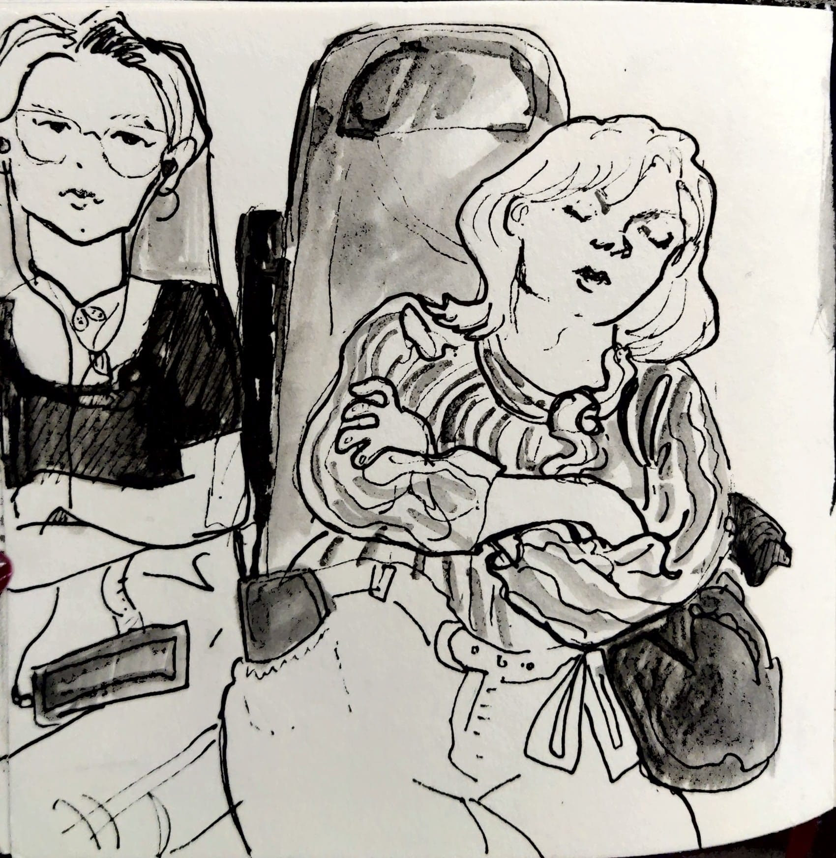
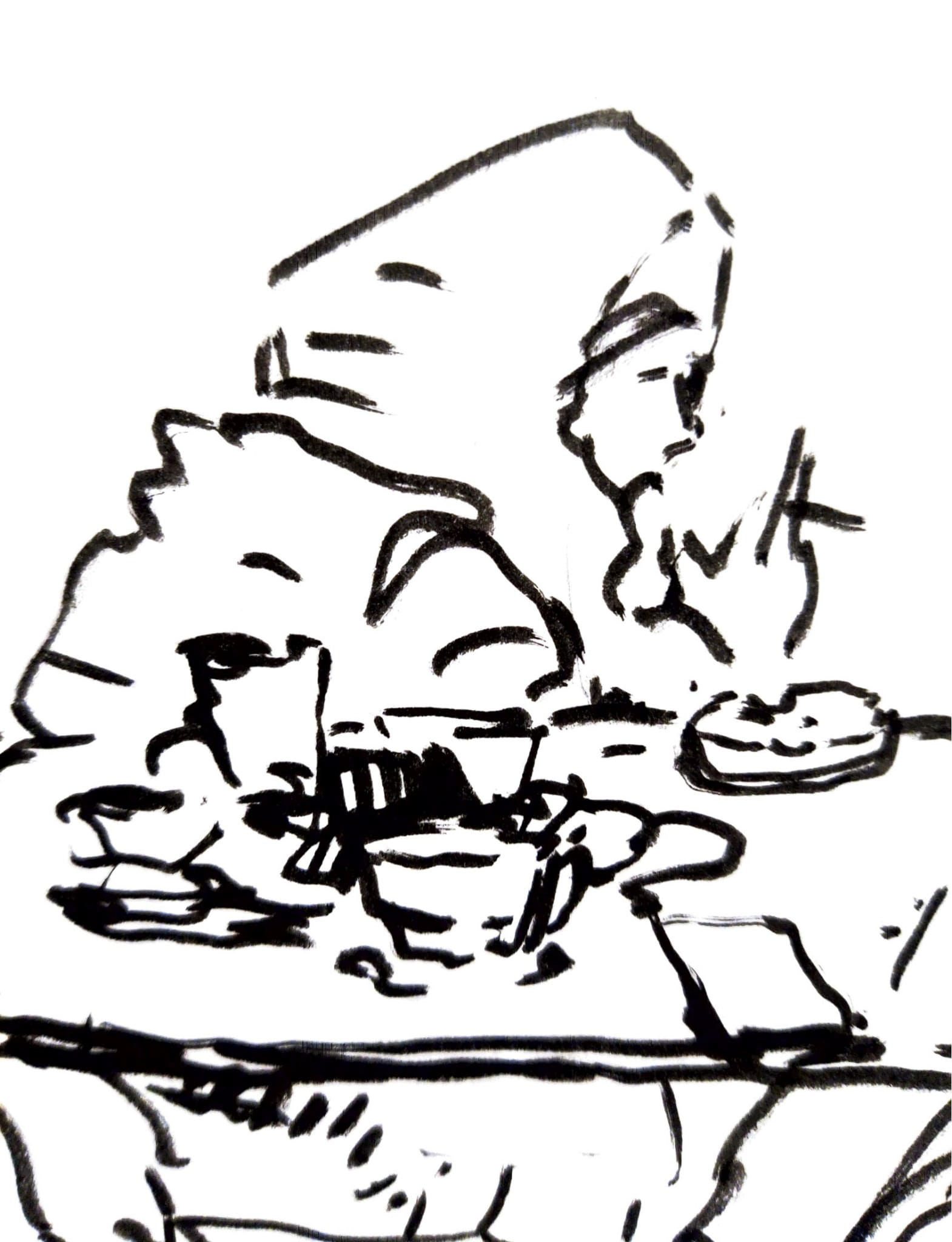
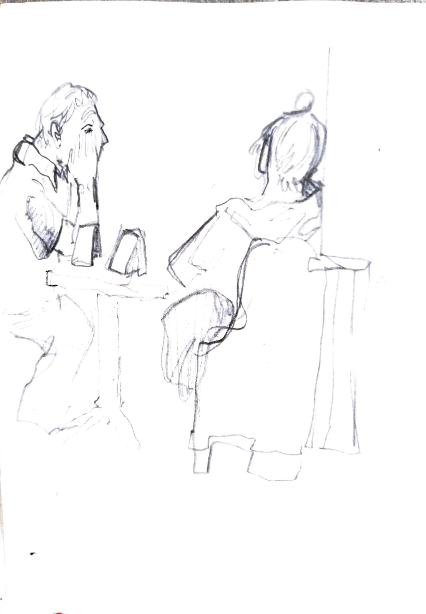
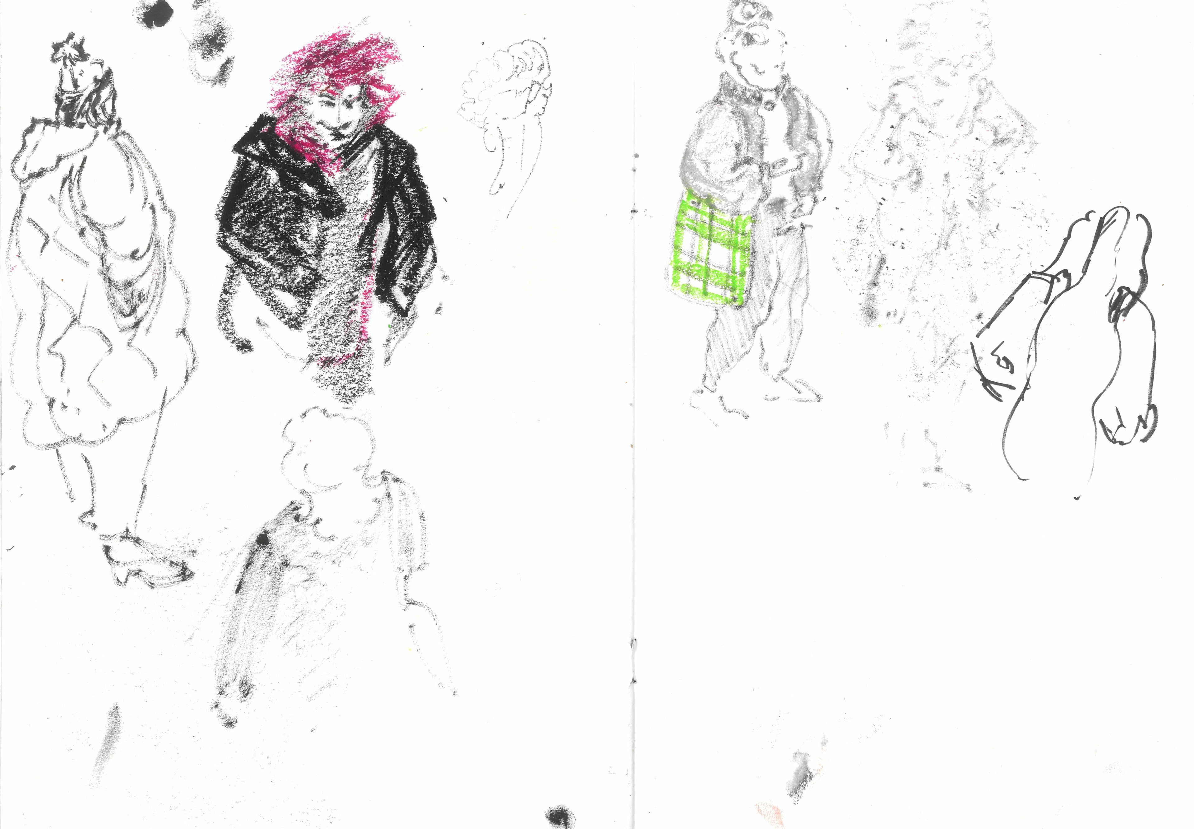
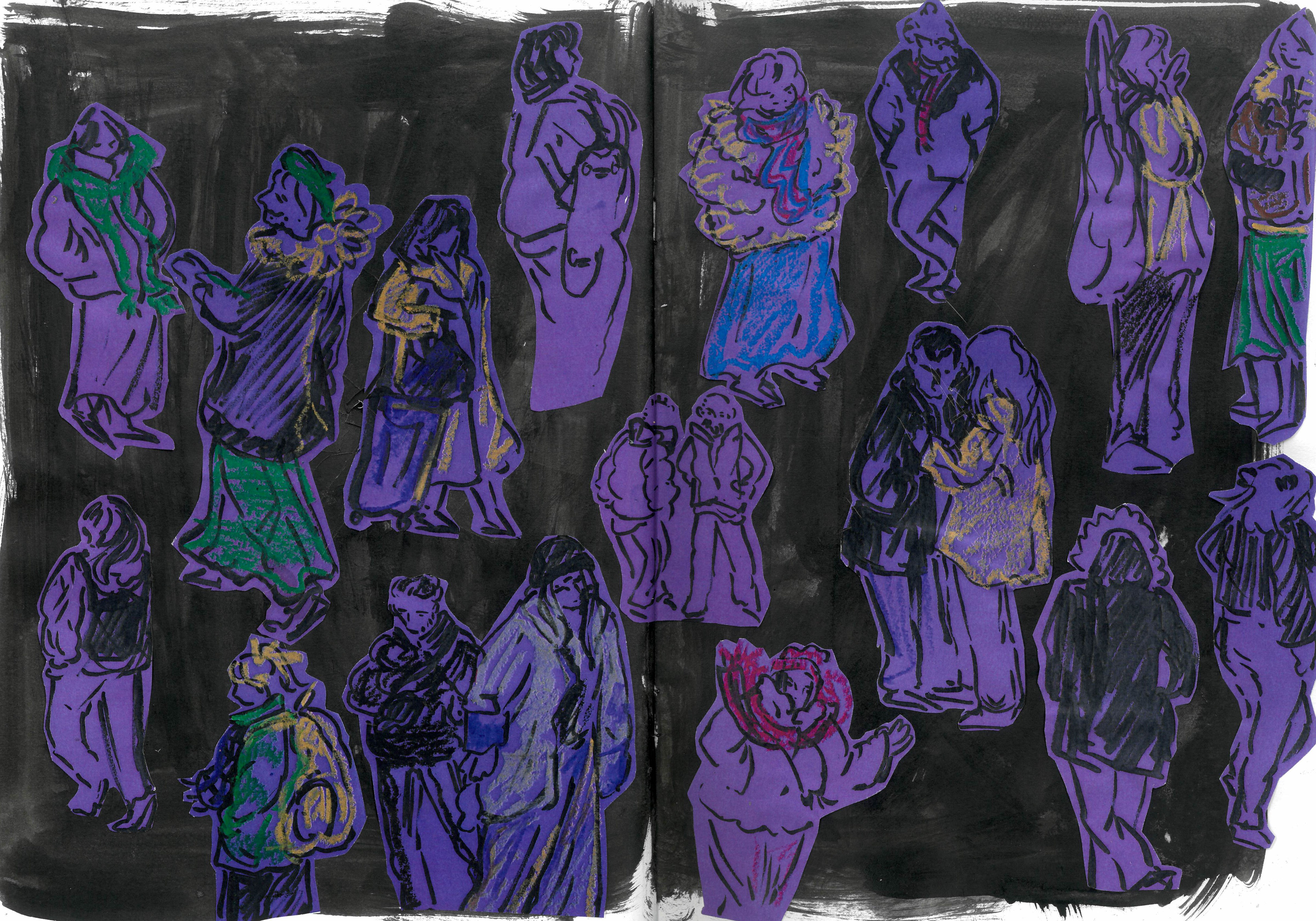
Something that I became interested in while on the winter break was looking at people's clothes. This was prompted by my traveling home and looking at what other people were wearing and trying to guess where they might be going based on their clothes.
While everyday clothes are quite mundane, they can tell a lot about how a person is doing and what they are planning to do with their day.
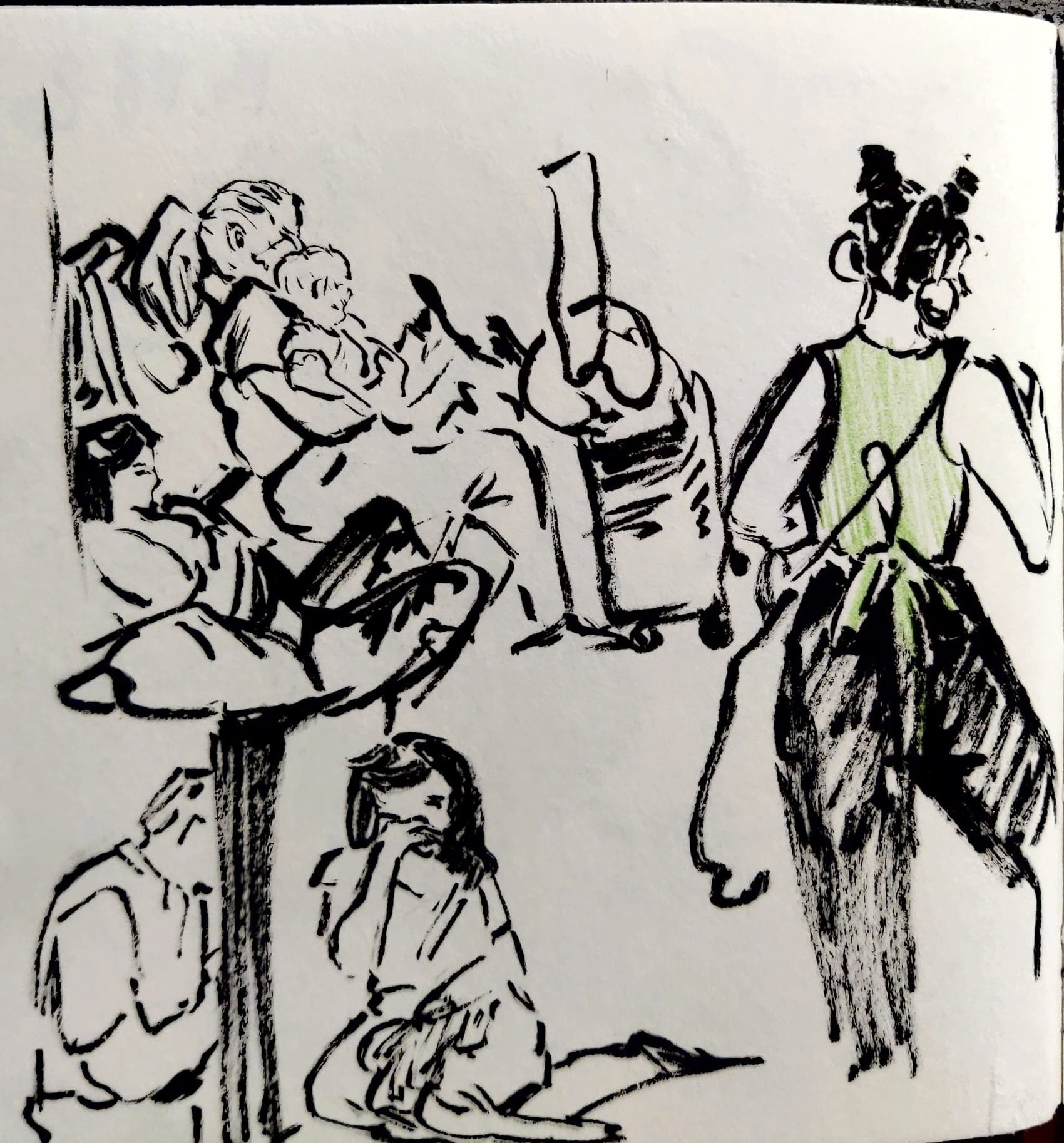
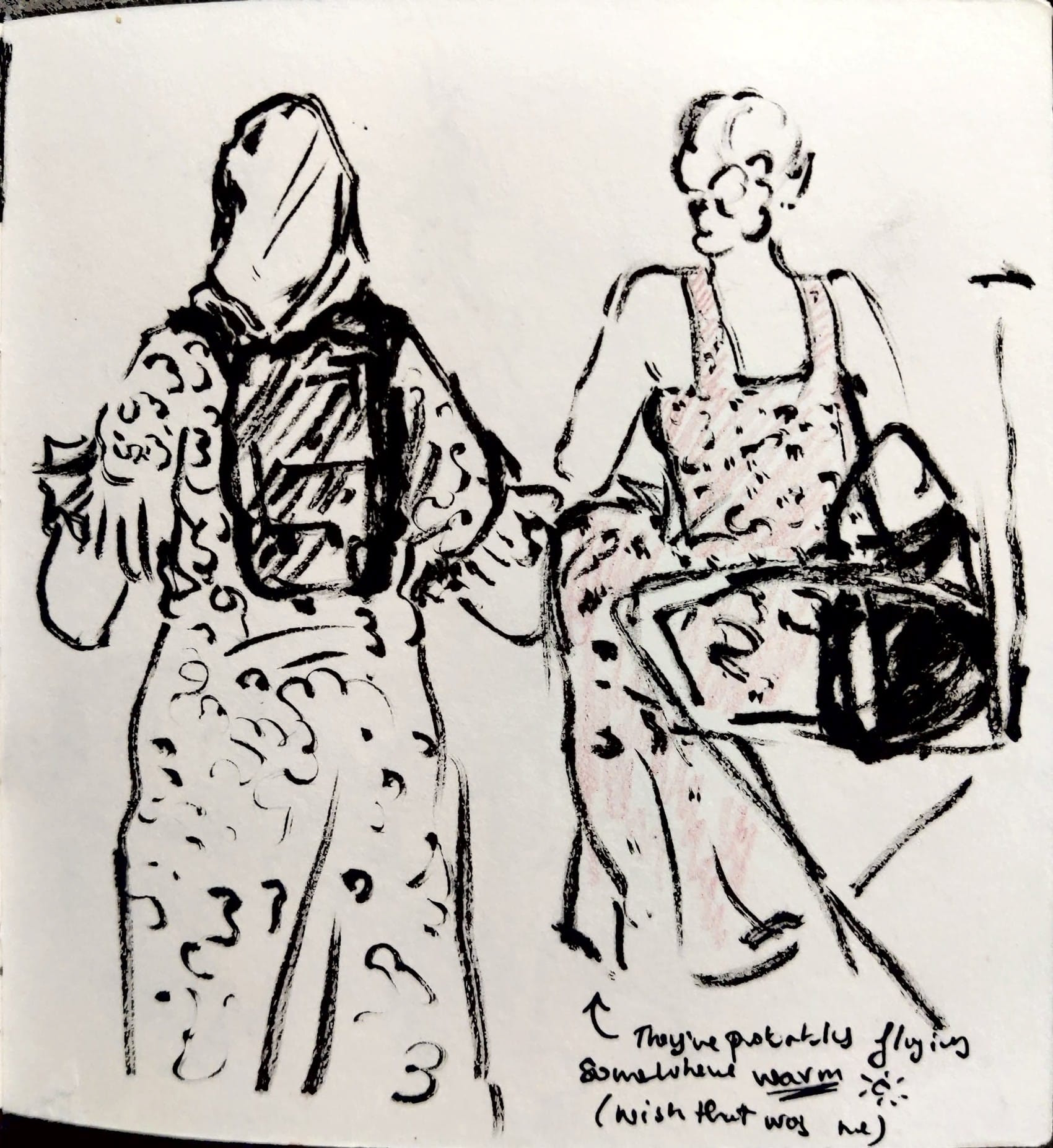
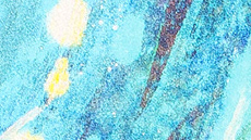
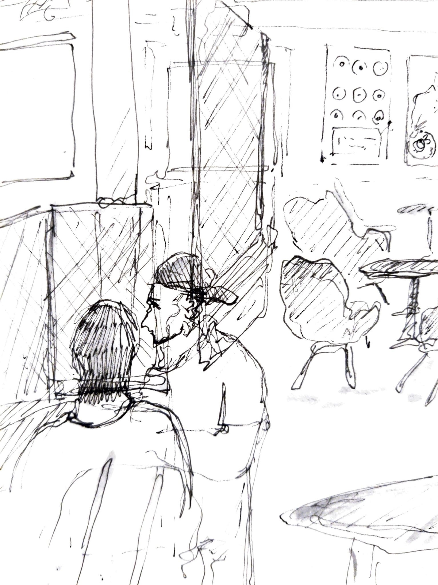
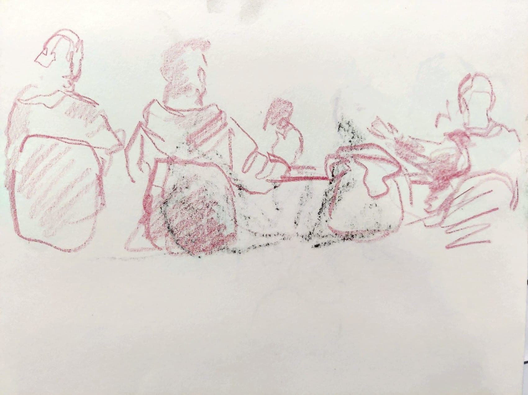
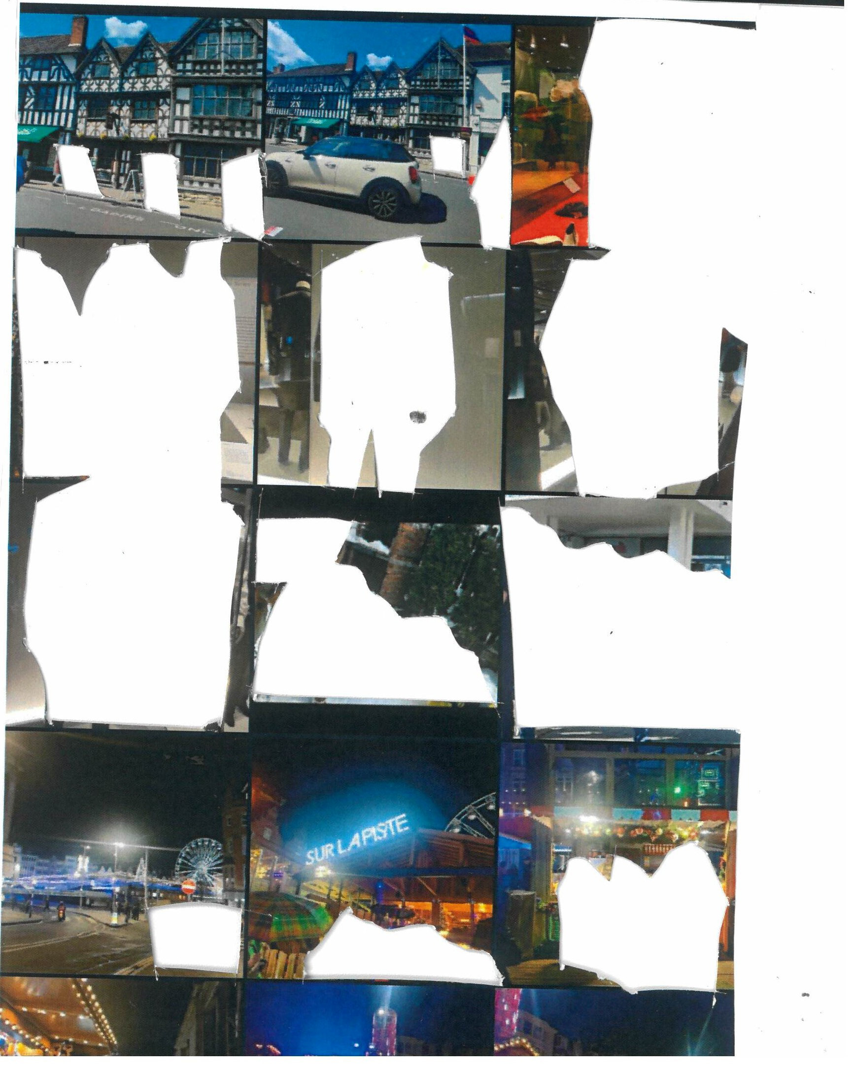
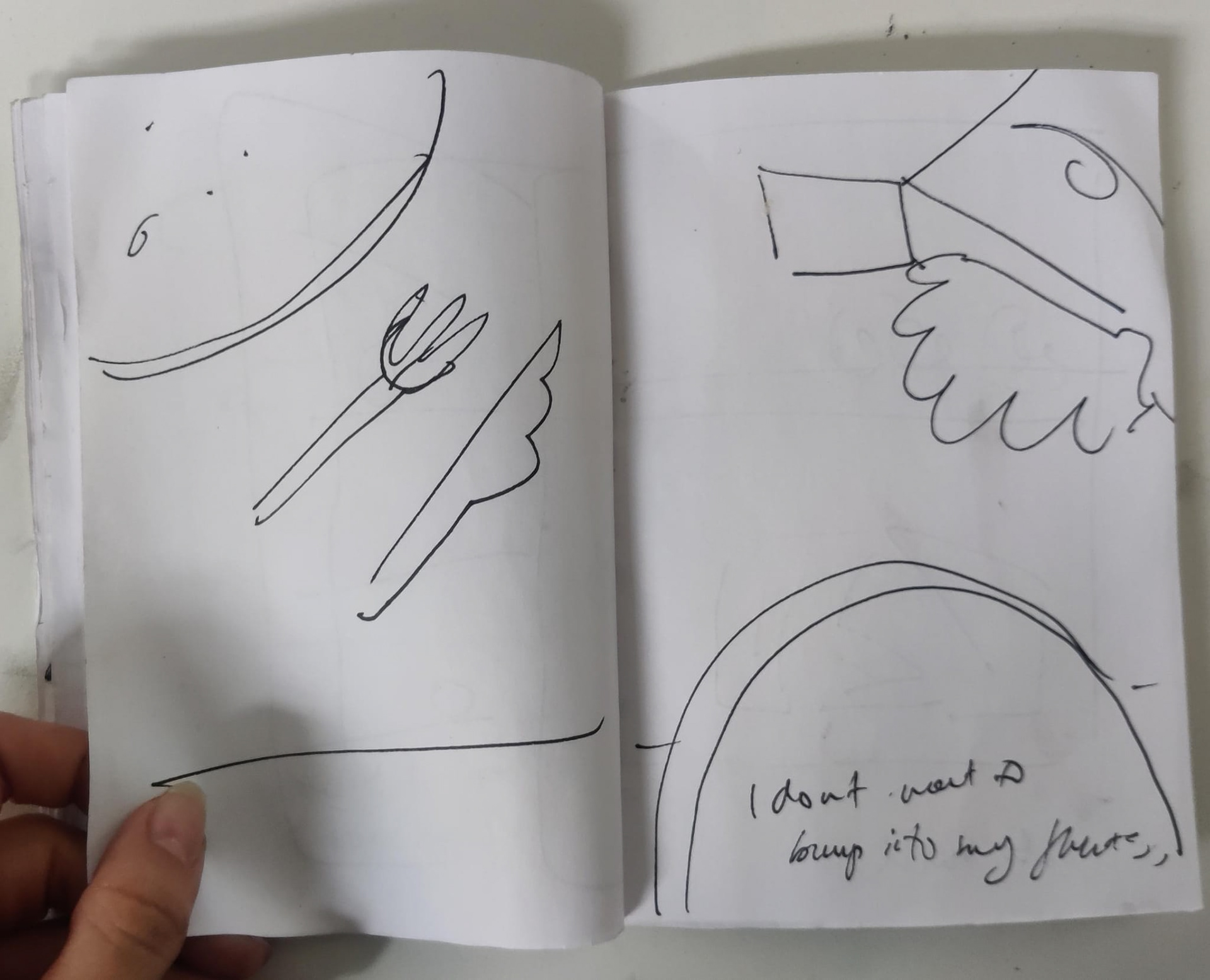
sketches from flight back
I was planning to do a series of life drawings to be able to explore clothing but that ended up being more challenging than I thought since people are either walking too fast to properly capture what they are wearing or they are sitting down, obscuring their outfits.
I enjoyed the few drawings that I made and I still want to work on exploring clothing so I am planning to continue doing this task.


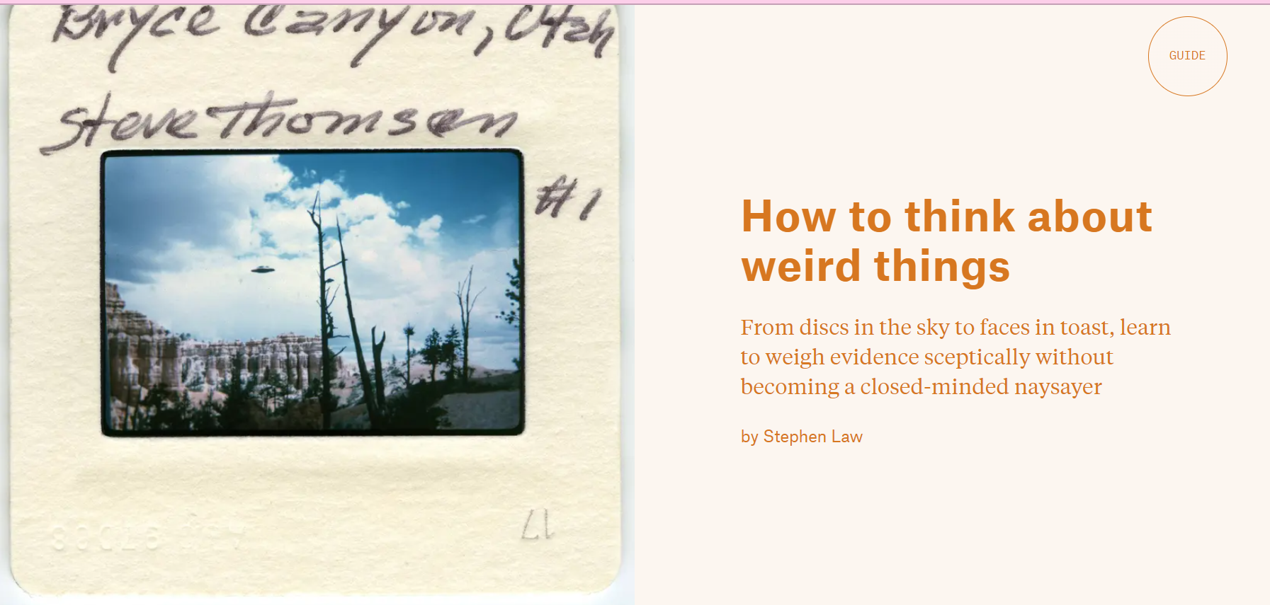
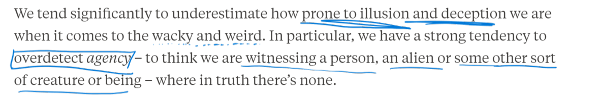
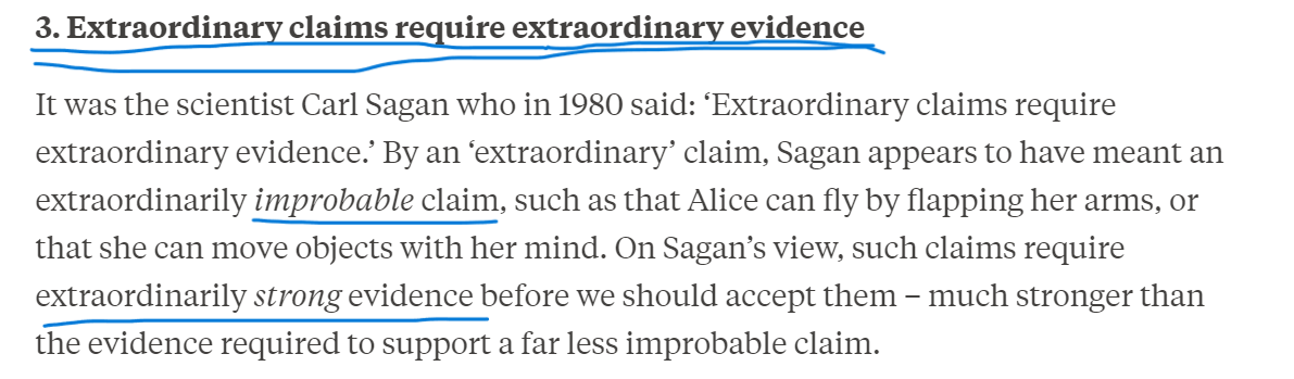
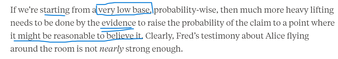
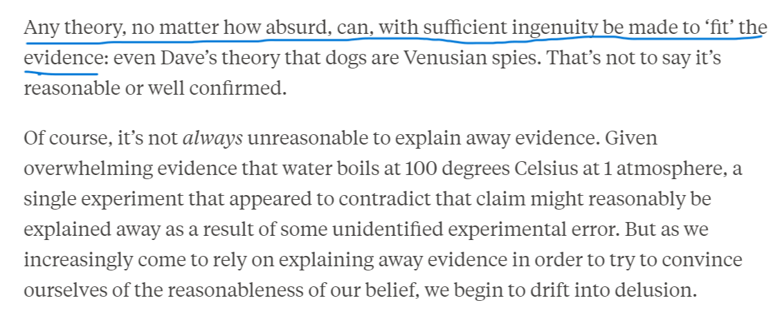
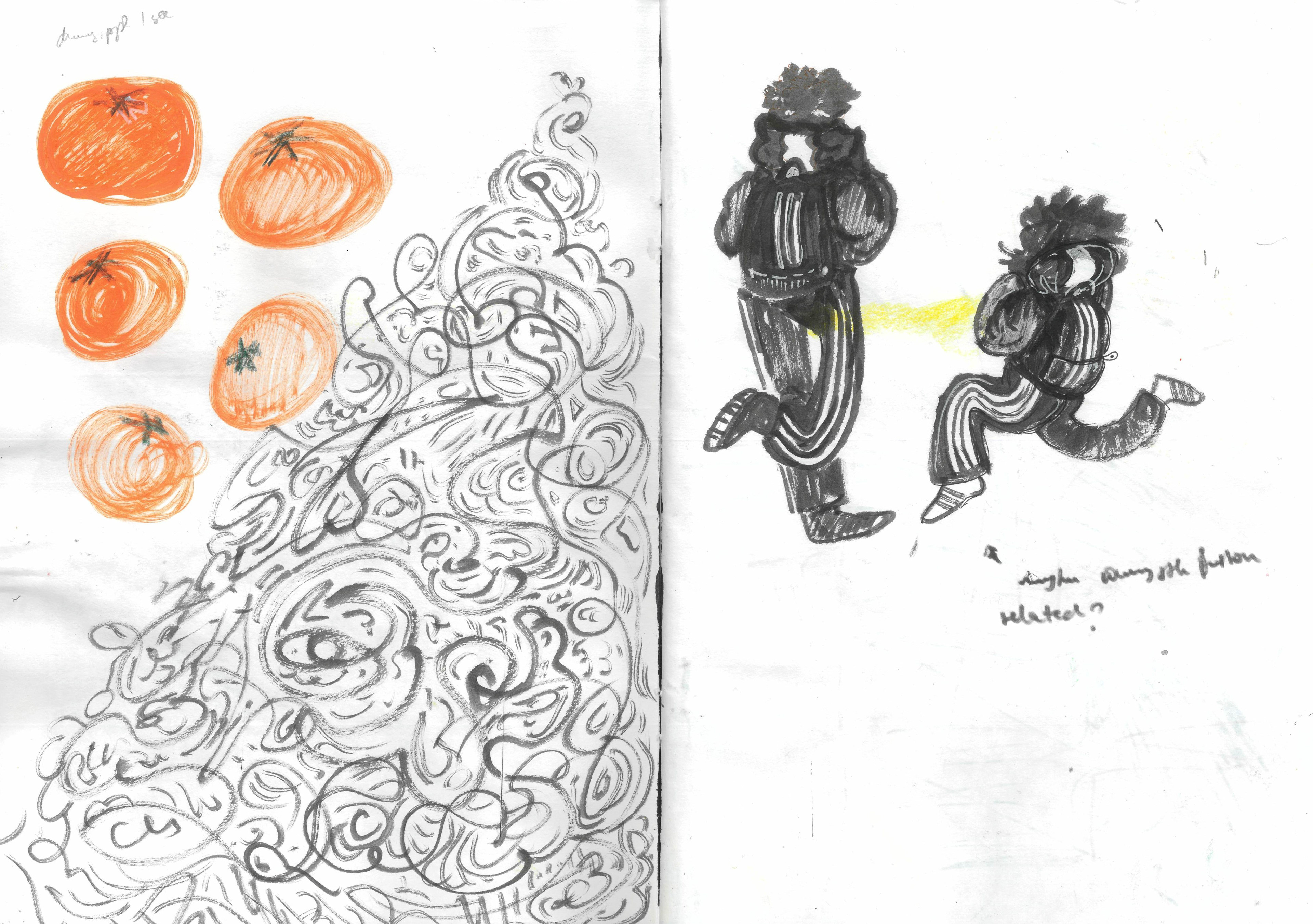
Stephen Law talks about why humans may encounter 'weird' things and why this can have grave consequences.
I enjoyed reading this article as I feel like it made me more conscious of how I look and interpret the world around me (at least momentarily)
It mostly made me think of when I was younger and I used to get scared by the silhouettes of furniture in the dark since the shapes looked like monsters; or how cars look like they have human faces; or the rotten boot in front of my house that looks like a dead cat when I forget my gasses.
I think becoming more aware of how we tend to look for patterns or recognizable things in our daily lives can be helpful when trying to get better at visual communication.
Looking at more examples of wild stories people came up with when faced with a seemingly unexplainable event could be an interesting thing to do in the future that could help me better understand how an audience tends to interpret something.
In response to this article, I wanted to try out going a day without my glasses to document all the mundane things that turn into weird sights I can find, but I decided that it might be dangerous in the current weather conditions so I will have to come back to this at a later date.
ARCHIVE
RITUALS

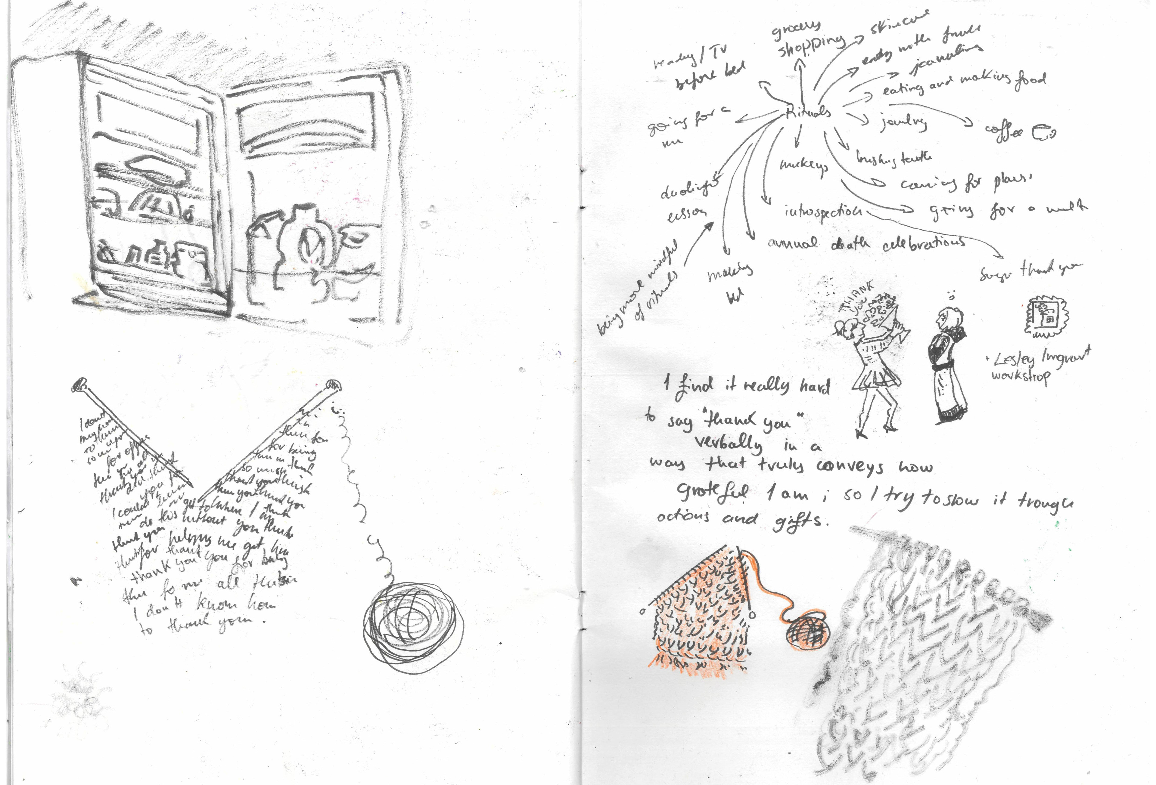
I wanted to attempt to create a thank you card for this task.
I am not very good at expressing my thoughts or knowing what to say, especially when I need to show appreciation, but I would rather show it through my actions or some kind of gifts.
Because of this, I thought about creating a thank you card inspired by knitting, since giving away something I hand-made with someone specific in mind is one of the ways that I like to show appreciation.
Moreover, my work in the past few years has been heavily inspired by textiles, since the reason that I started doing collage so much is because I used to do a lot of sample collages for my fashion and costume design work in the past, and it was something that I also wanted to incorporate in my illustration work. That is why I thought that having something textile-inspired that could serve as a thank-you card or even a business card would be a good fit.
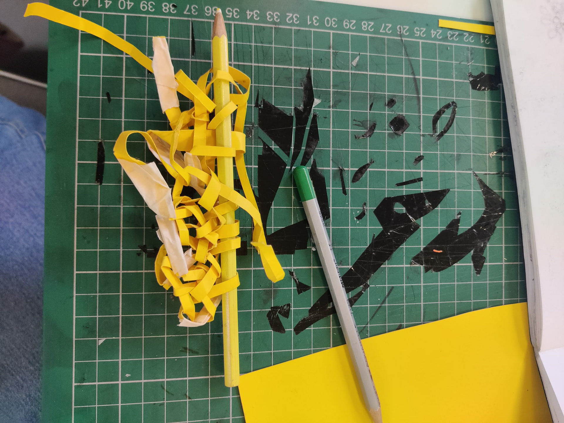
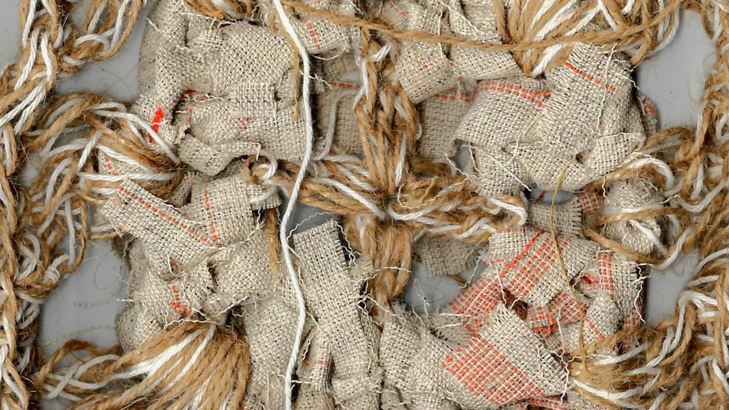
I still wanted to have the card be made of paper so the first thing I tried was to knit with paper strips which did not really work out.
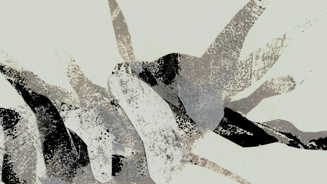
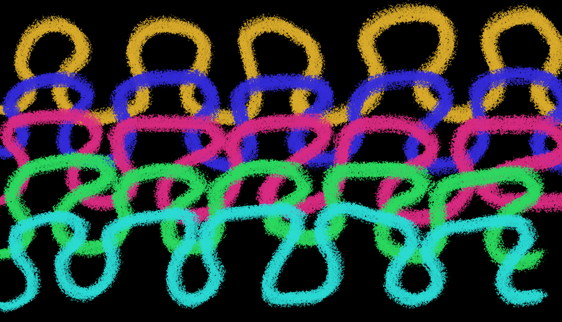
My next move was to look at the way the loops on a knitted piece intertwine with each other and to try to cut them out.
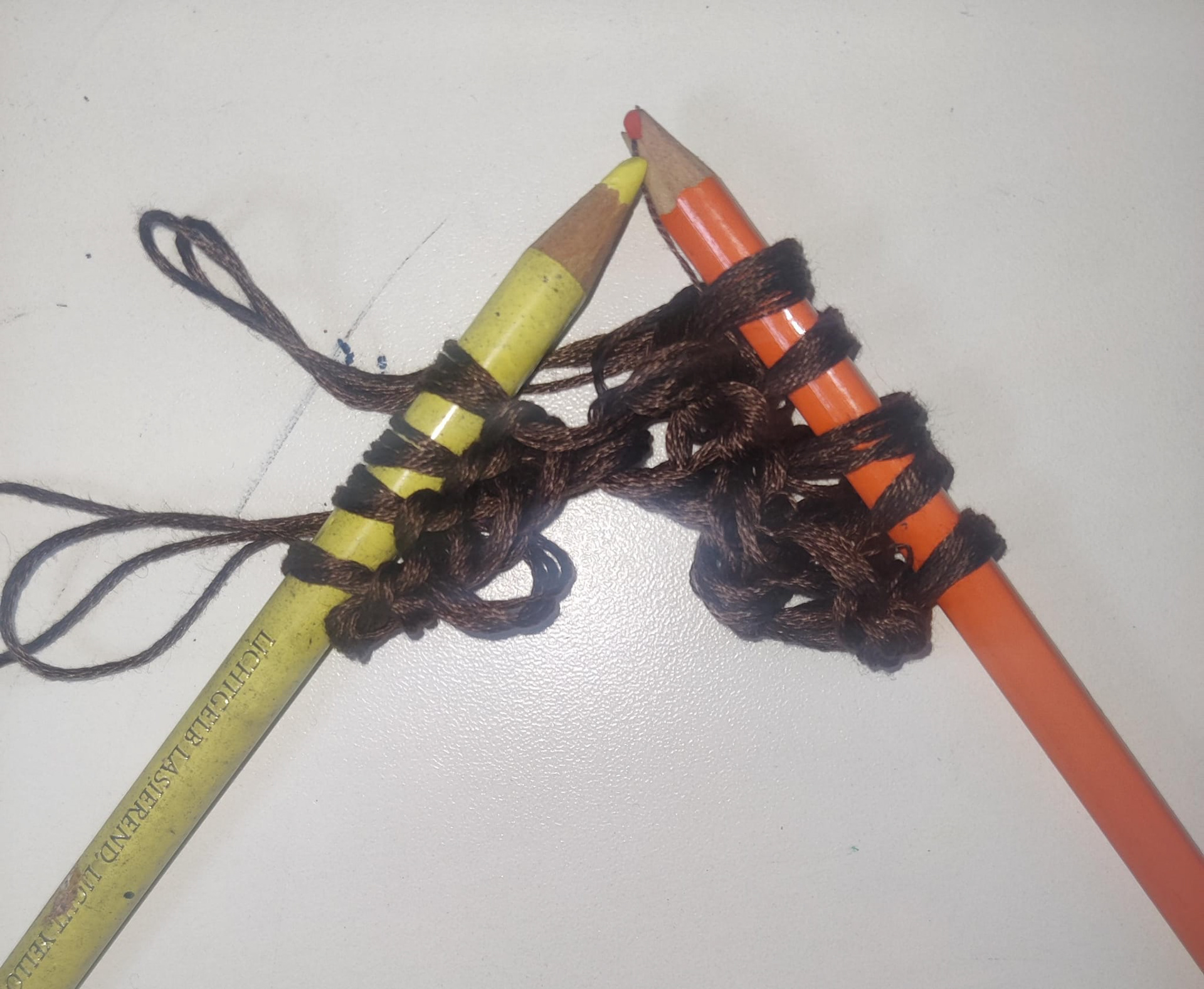
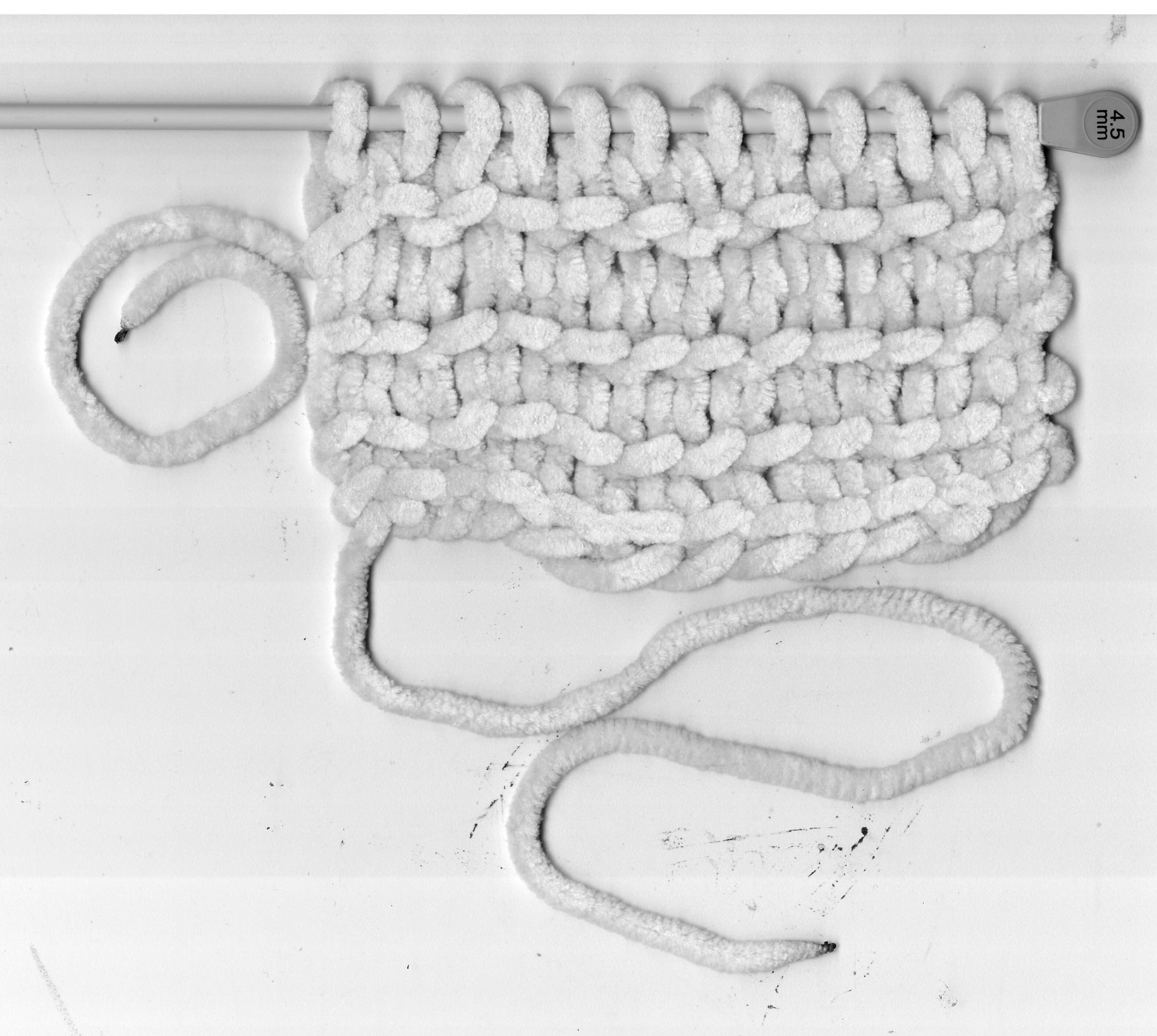
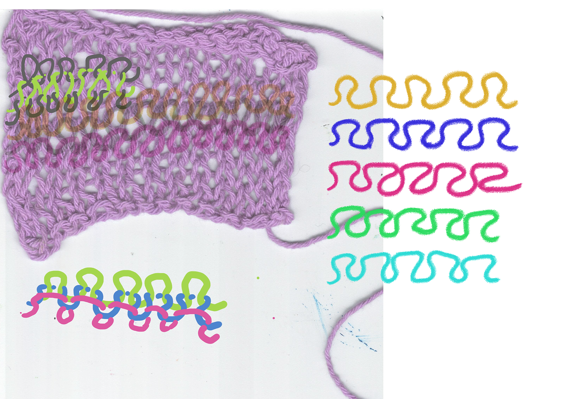
the loops in photoshop and then tried printing and then cutting them out of paper to intertwine them back together. I initially used a chunkier wool but it was too hard to see the loops.
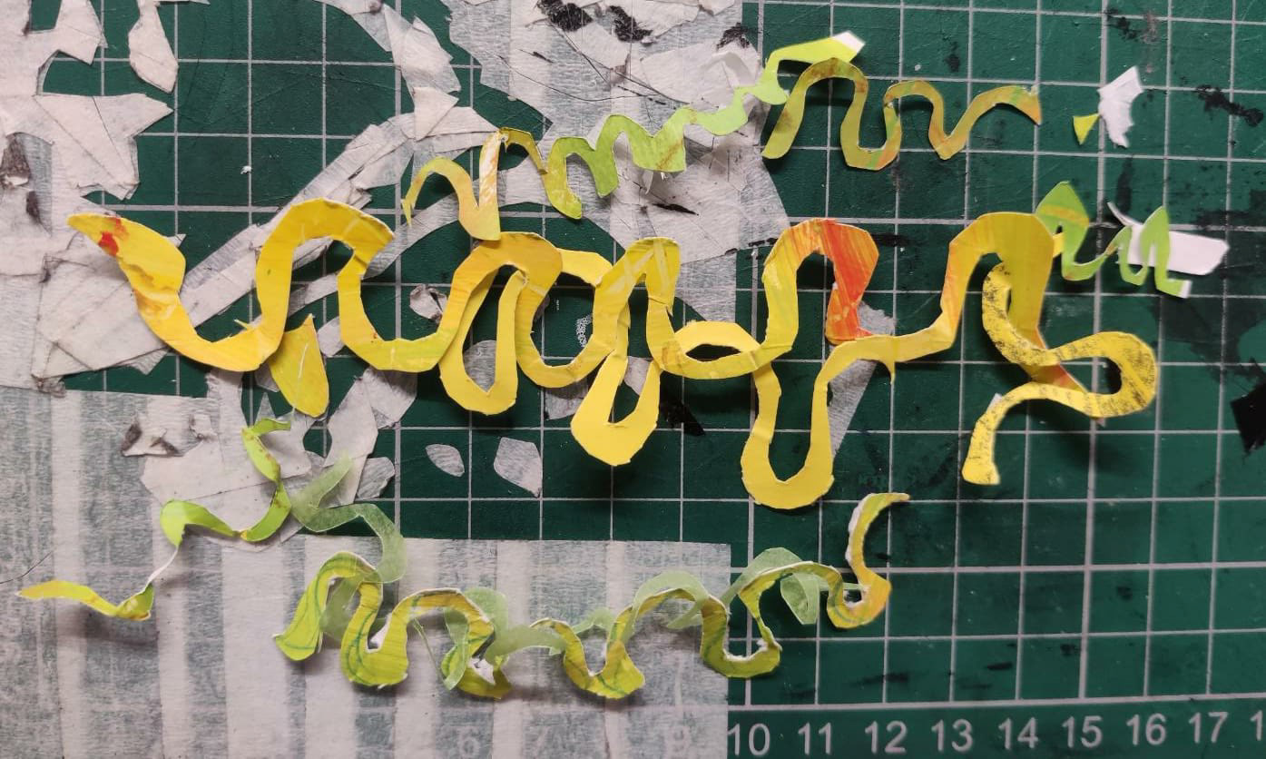
This approach also mostly failed since it was difficult to cut the paper into the exact shape that would be able to entertwine with itself, especially since paper is quite fragile so it kept breaking while I was working with it.
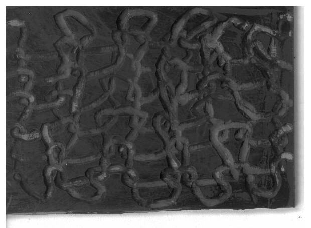
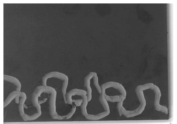
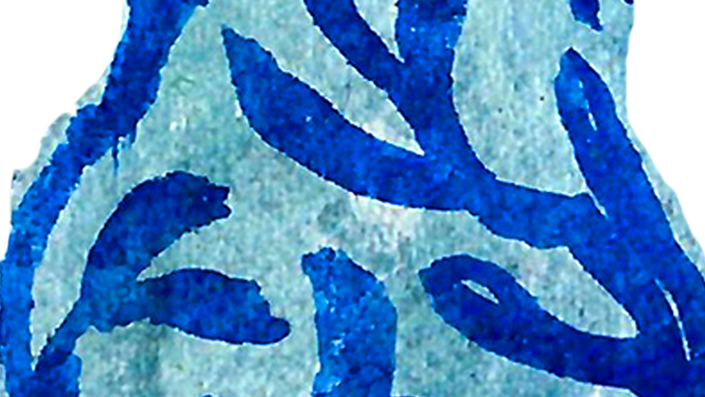
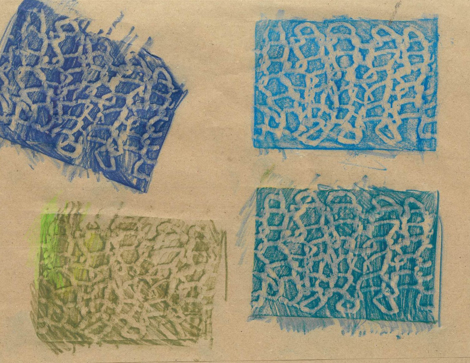
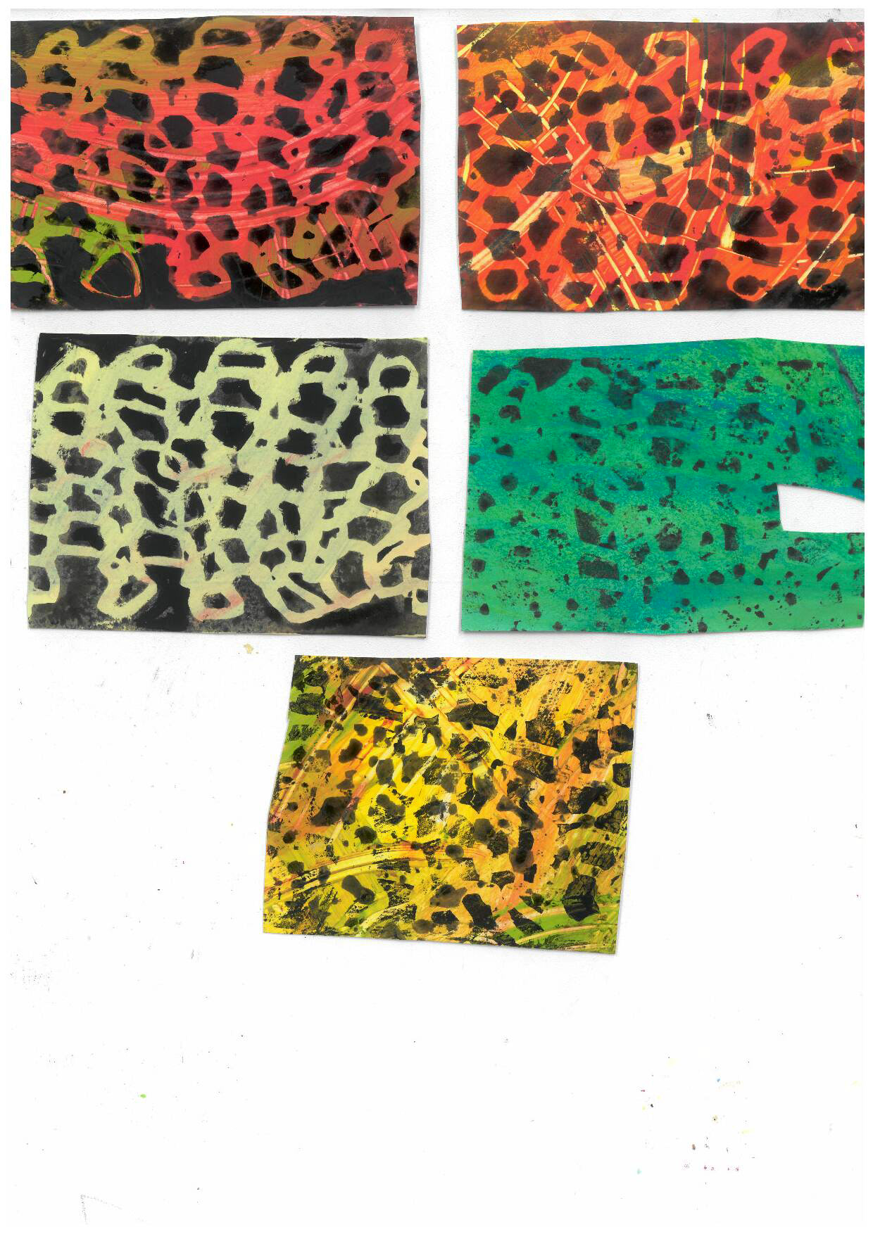
I still did not want to give up on this, so I decided to try carving into some lino.
I used the carving to do some rubbings and stamp it on some coloured paper, but they ended up looking more like scales than knitting. The lino block ended up looking more like a knit than the prints because of the dents I made overlapping with each other. This made me think that if I wanted to continue this, I should try to explore more 3D ways of creating, since the flat look is not really working out for me.
This task was quite late into the brief, and it was also around the time that I looked back at my work and I realised that I kept starting stuff in the workshops, but then never went back to look at them or develop them any further, and I always seemed to have a reason to not continue them. So, for the 'thank you card' task, I decided that I should try to work on it for a longer time, and to try different approaches to see how I can successfully convey my gratitude. Even if I was not able to come up with a way to do it in the end, since one of the outcomes were able to fully convey what I wanted, I am still happy with the experimentation that I got to do. I feel like if I was more focused on experimenting throughout during this brief I would have enjoyed it more.
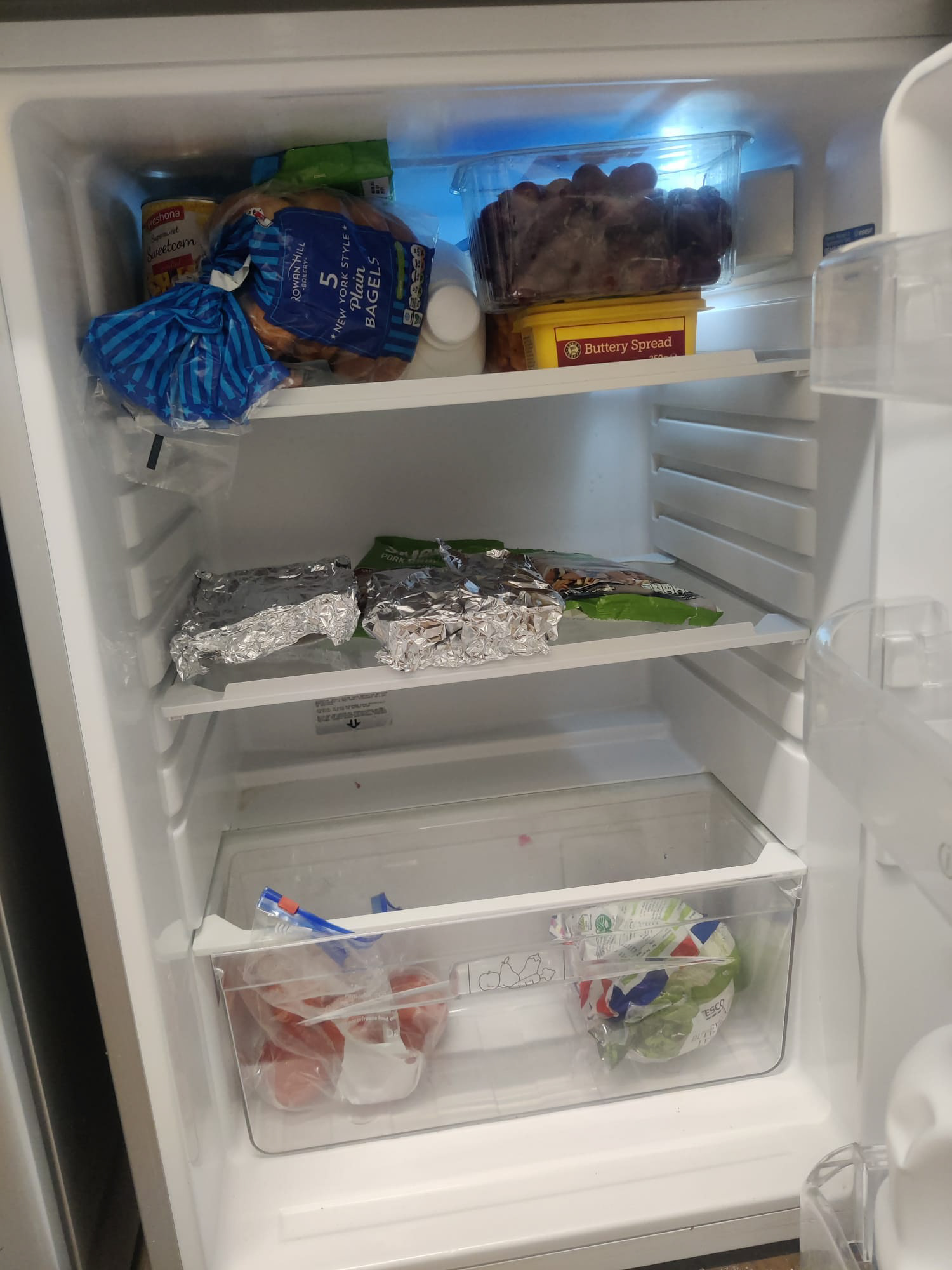
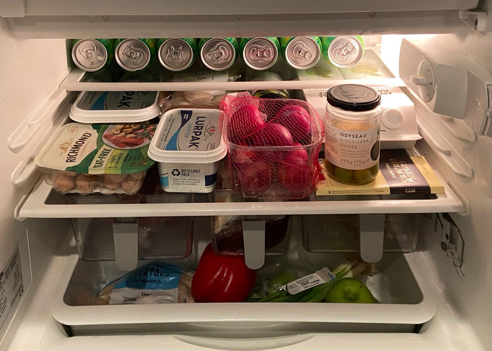
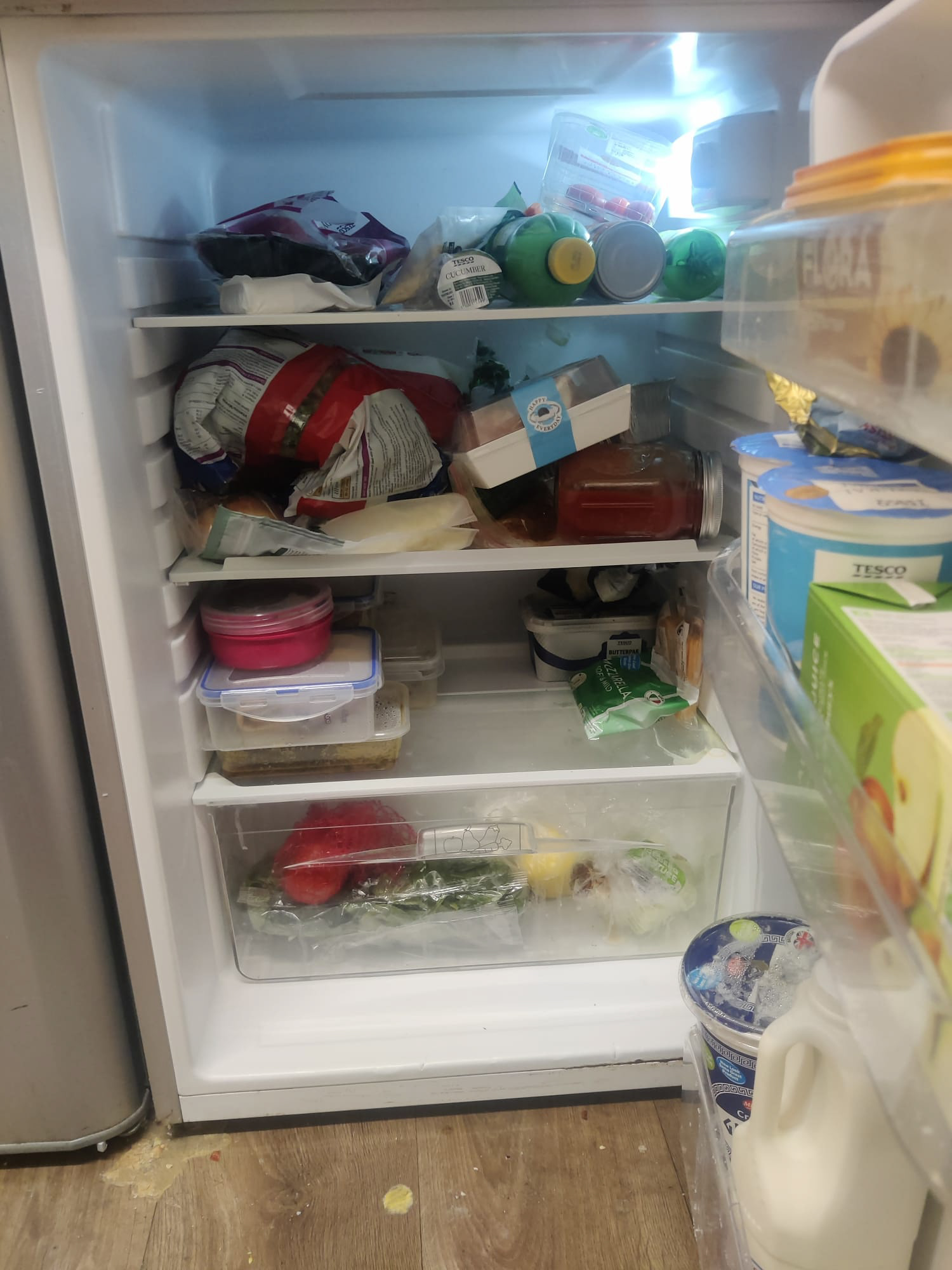
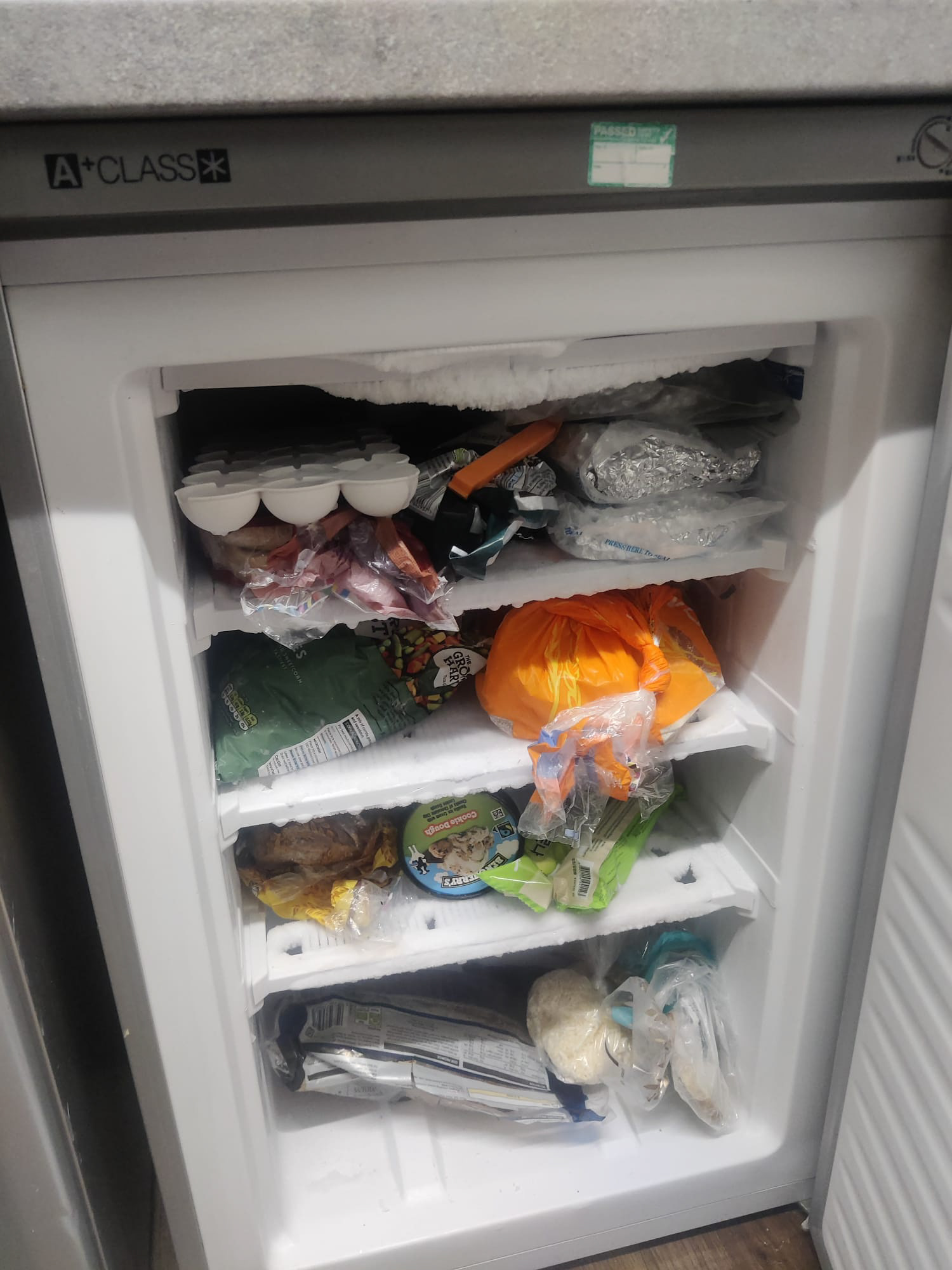
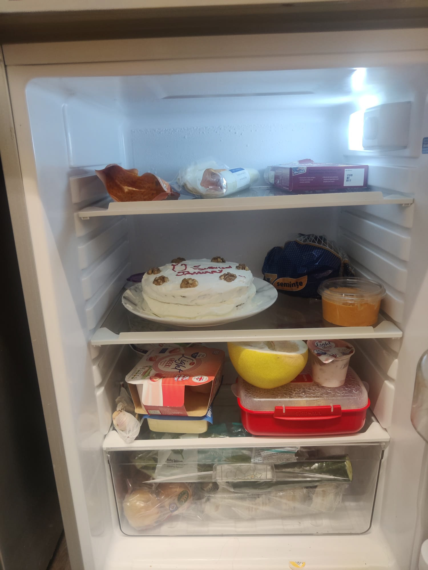
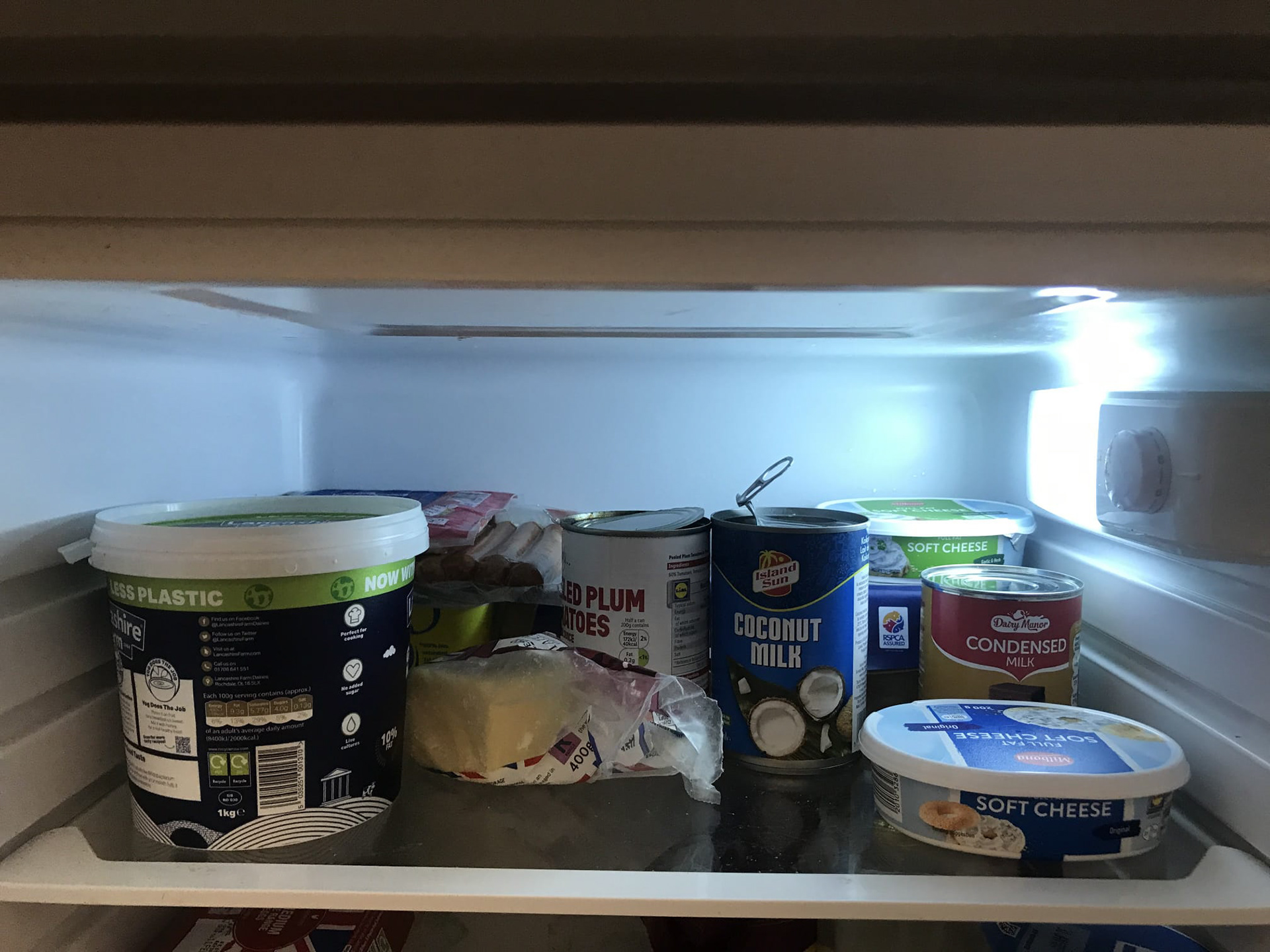
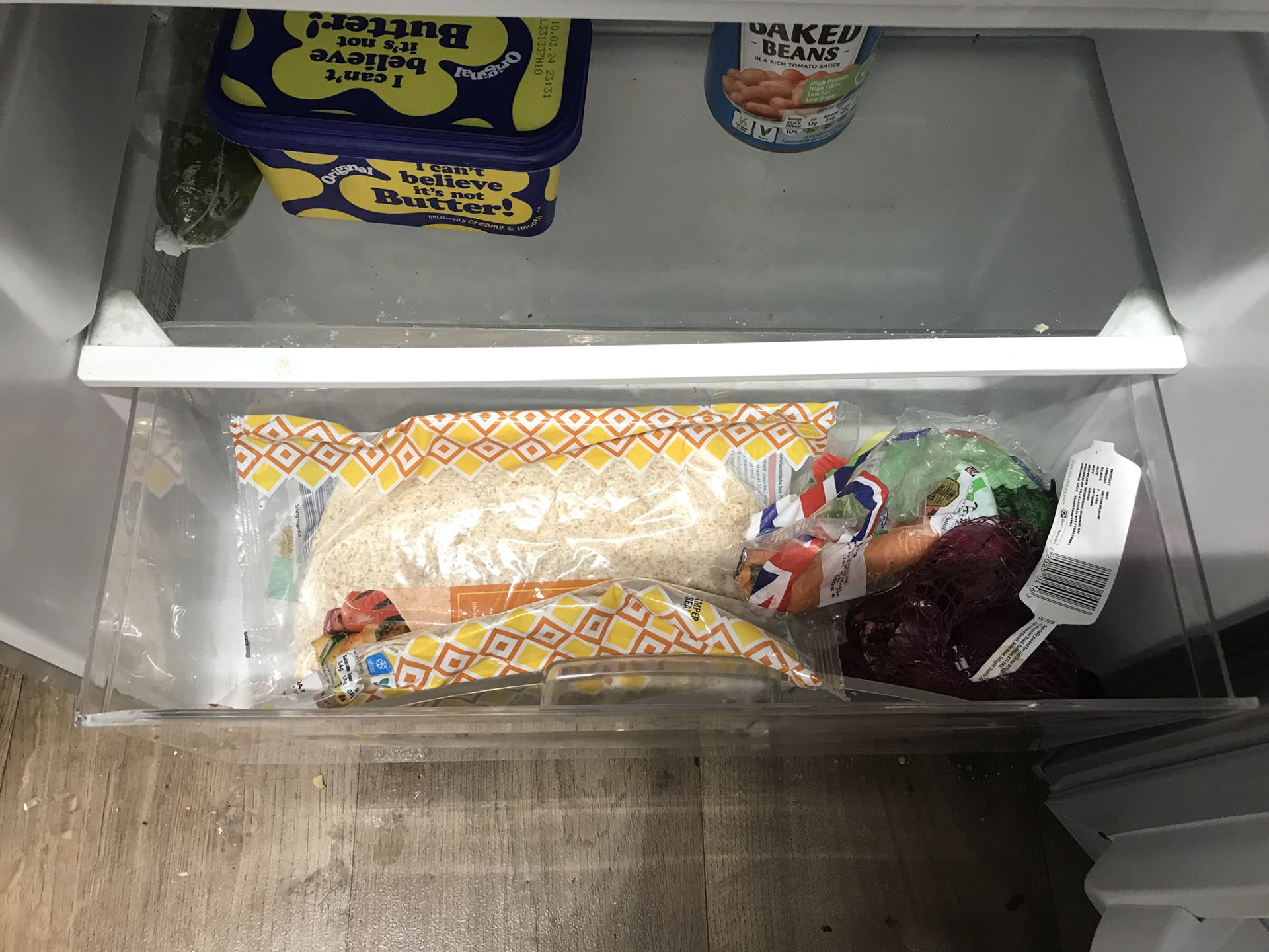
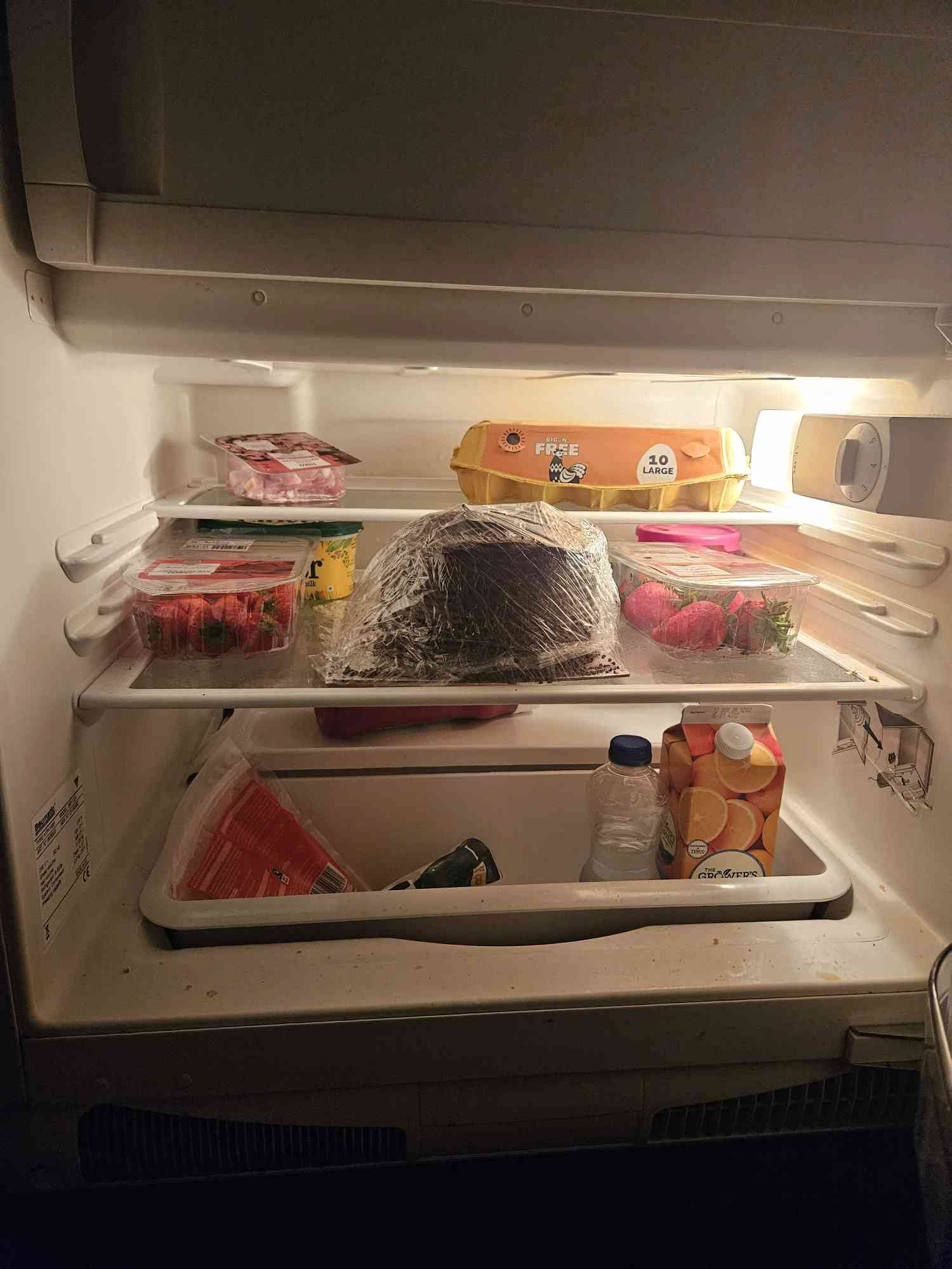
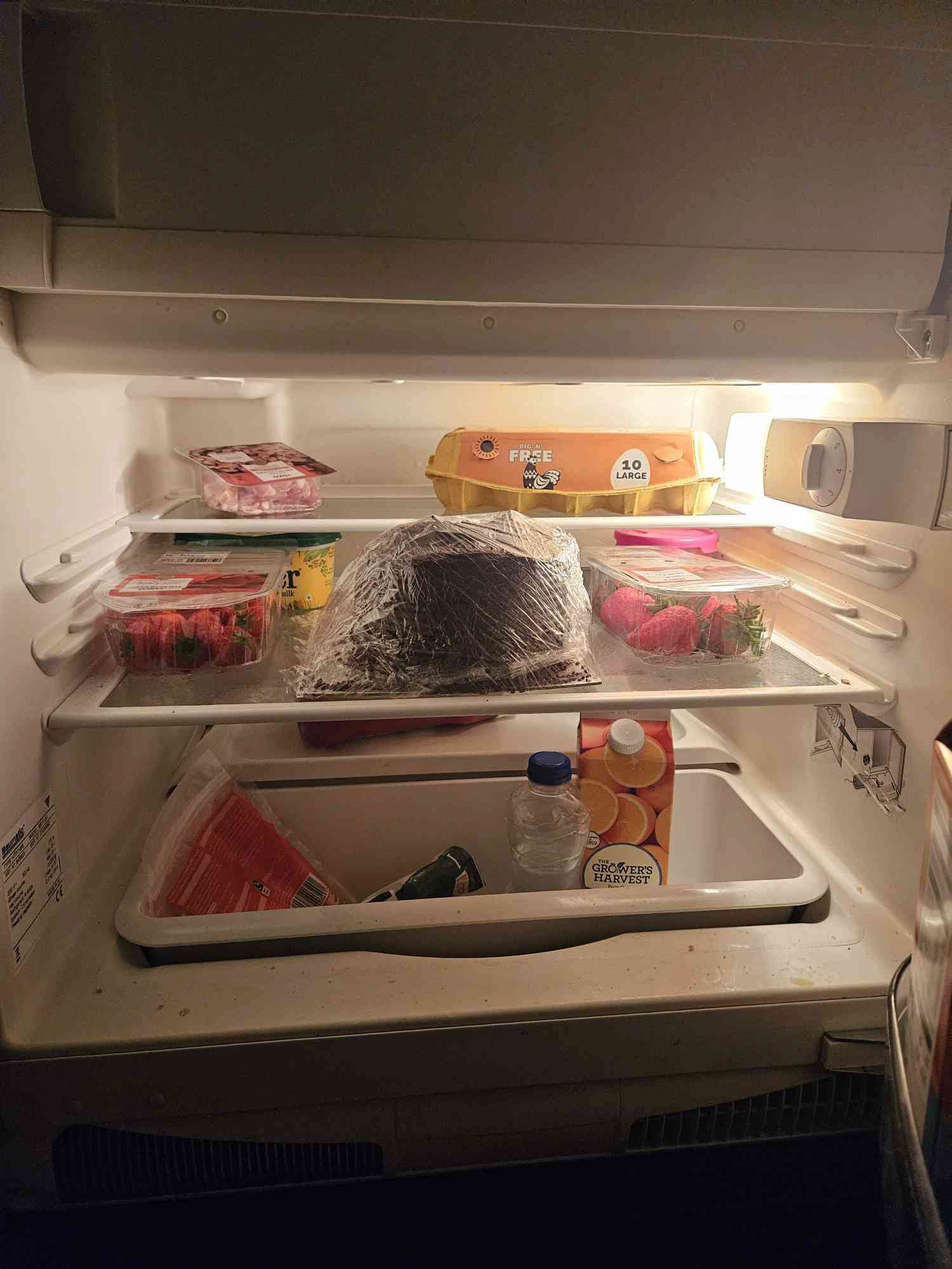
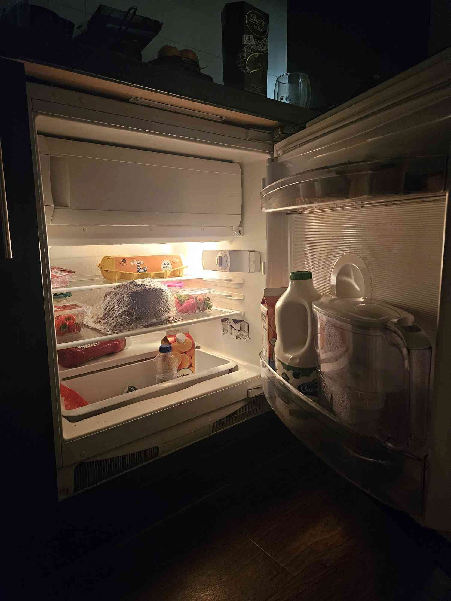
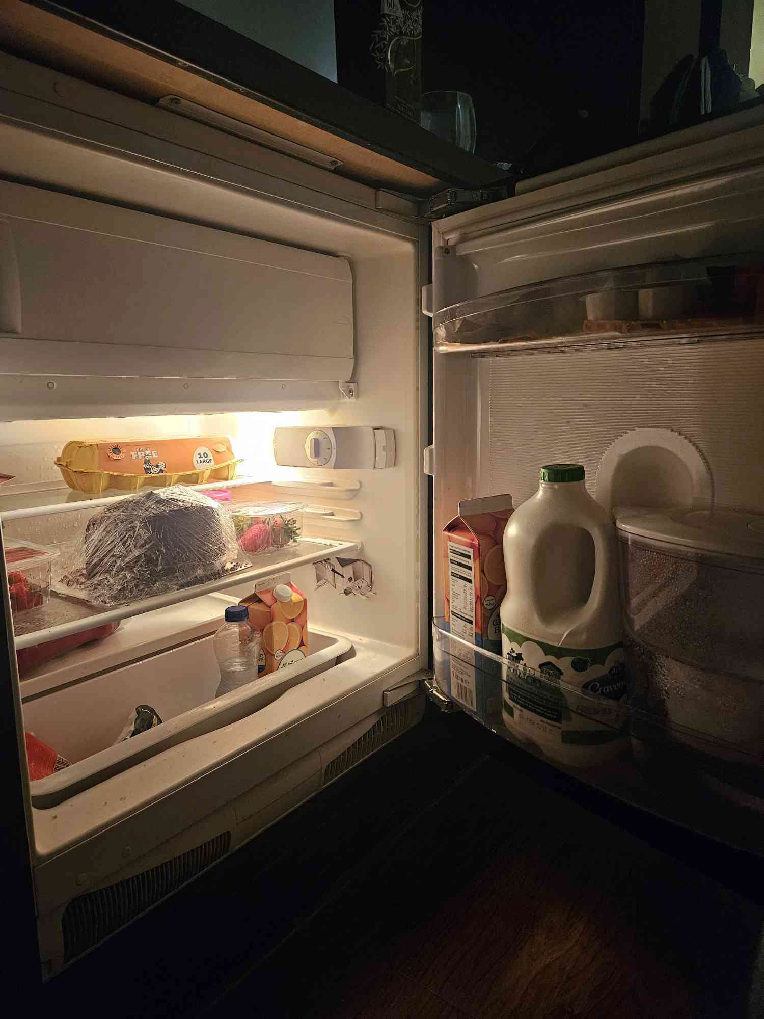
FRIDGES!
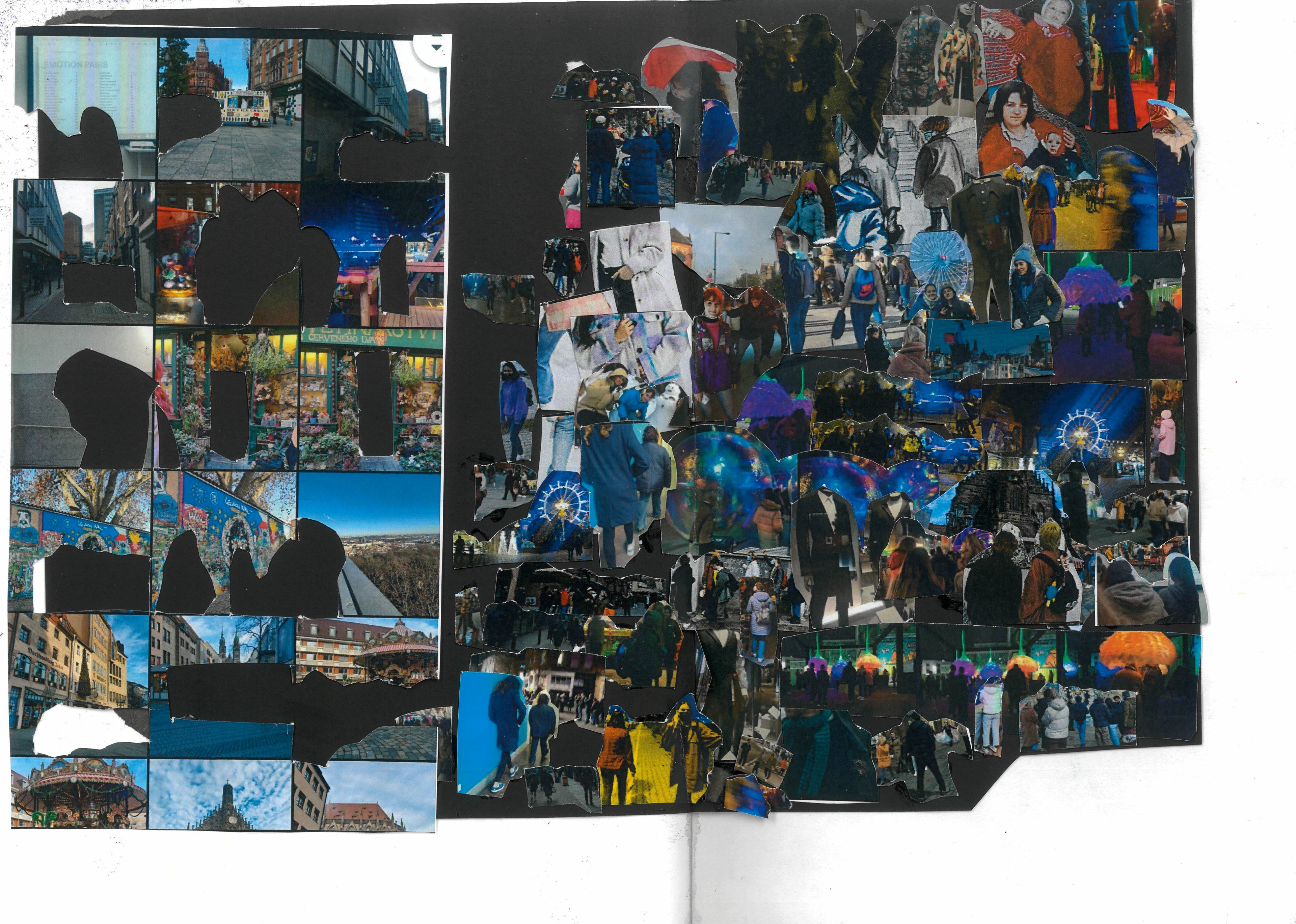
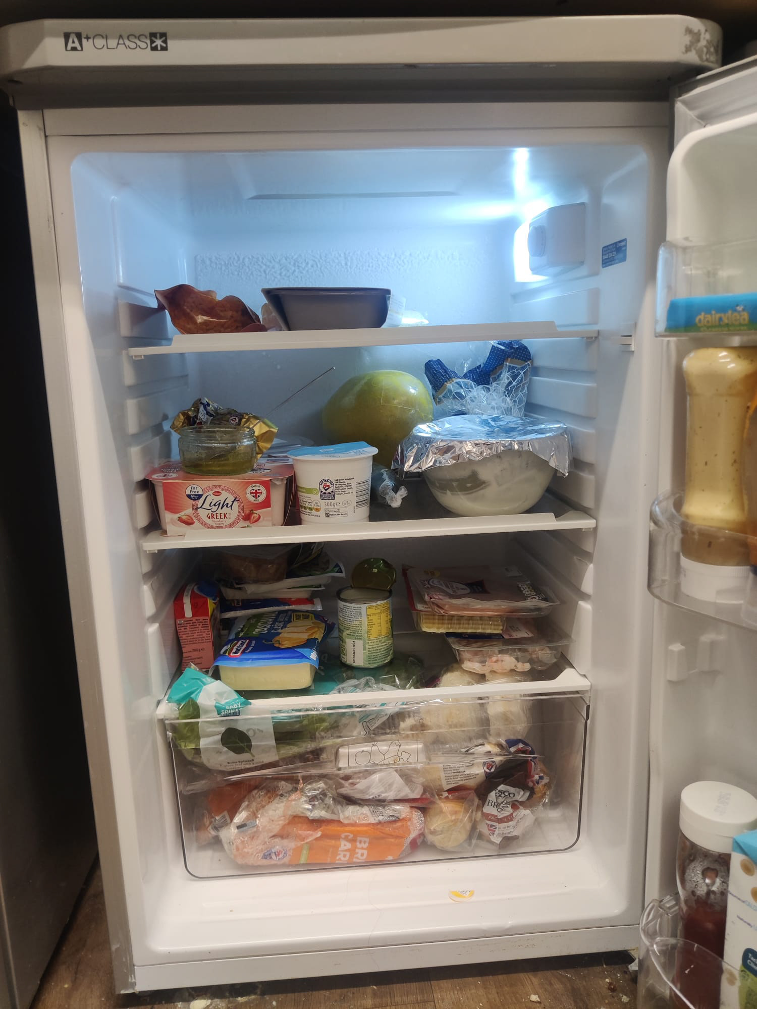
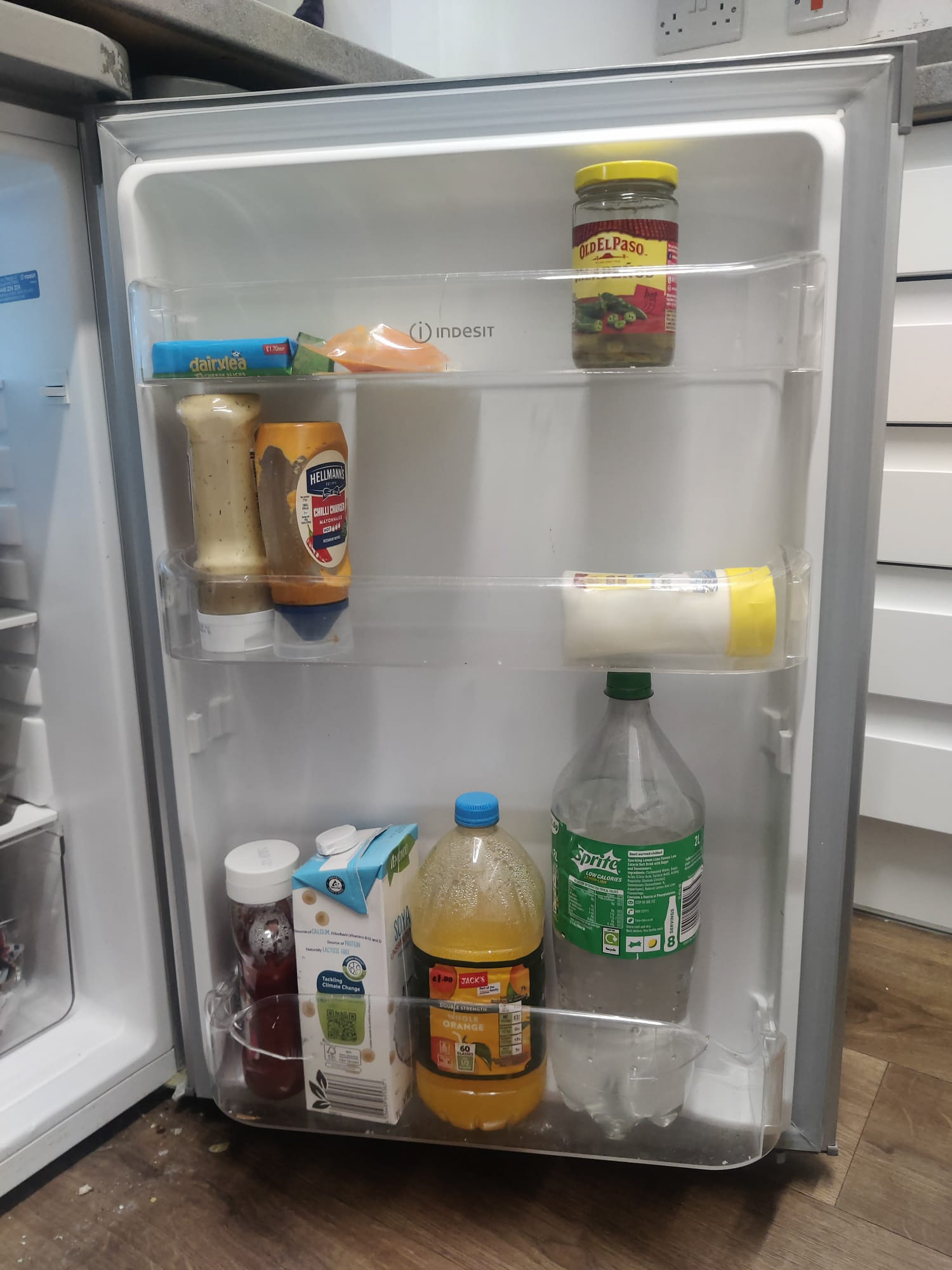
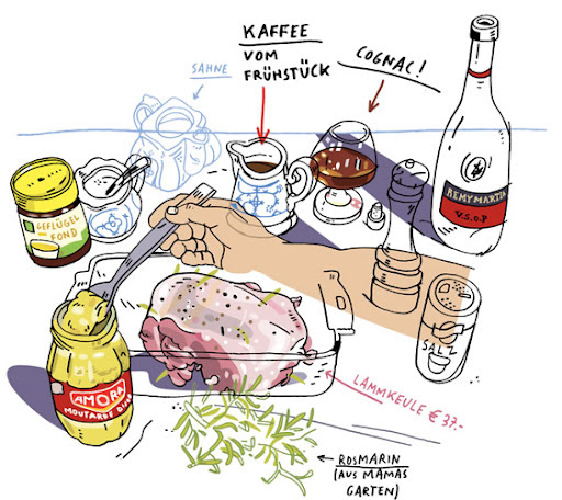
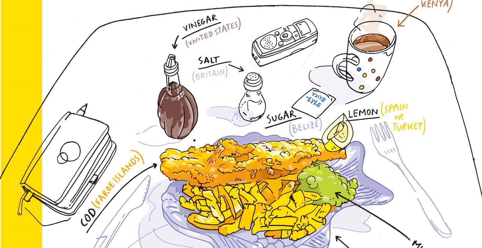
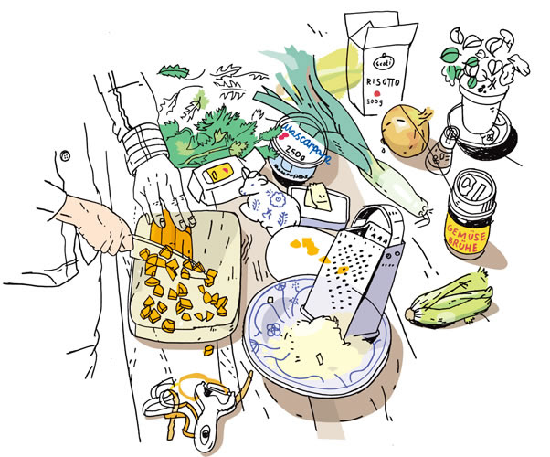
After Pat's workshop, I was inspired to collect more images to build more of an archive.
I wanted to think of something that could encapsulate different ways of living. Moreover, I was also inspired by The HKBU collaboration since one of the things we did was send each other images of objects that were similar, but that we see on a day-to-day basis in our very different lifestyles.


'Moreover, an estimated three
million individuals are thought to be at risk of malnutrition in the UK. We examine: the discourse
of food aid and the demonisation of those living in poverty, the scale of malnutrition, and the
experiences of food bank users by drawing on survey data and case studies. Substantial numbers
of people were constrained in their food choices, whilst food bank users had concerns about the
social stigma of food aid. It is questionable whether the present policy approach is economically
and politically efficient given the impact on people’s health and well-being' (Gallegos, D., Ramsey, R., & Ong, K. W. (2014). Food insecurity: is it an issue among tertiary students? Higher Education, 67(5), 497–510. http://www.jstor.org/stable/43648671)
Initially, when thinking about what I want to say with this book, I started looking at articles about food insecurity, specifically amongst students and the struggles they face while trying to provide food for themselves, but I ended up not doing that and going with something simpler since I had limited time to work on this and approaching a heavier topic would require more time.
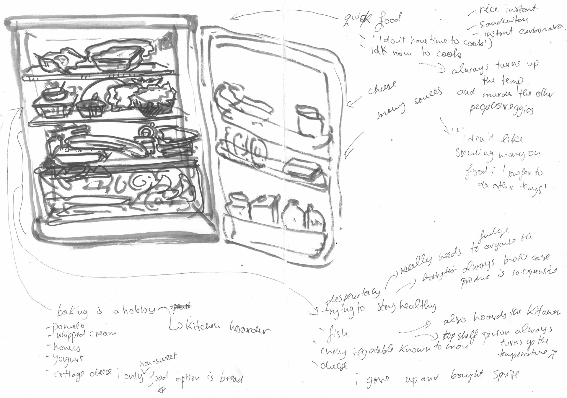
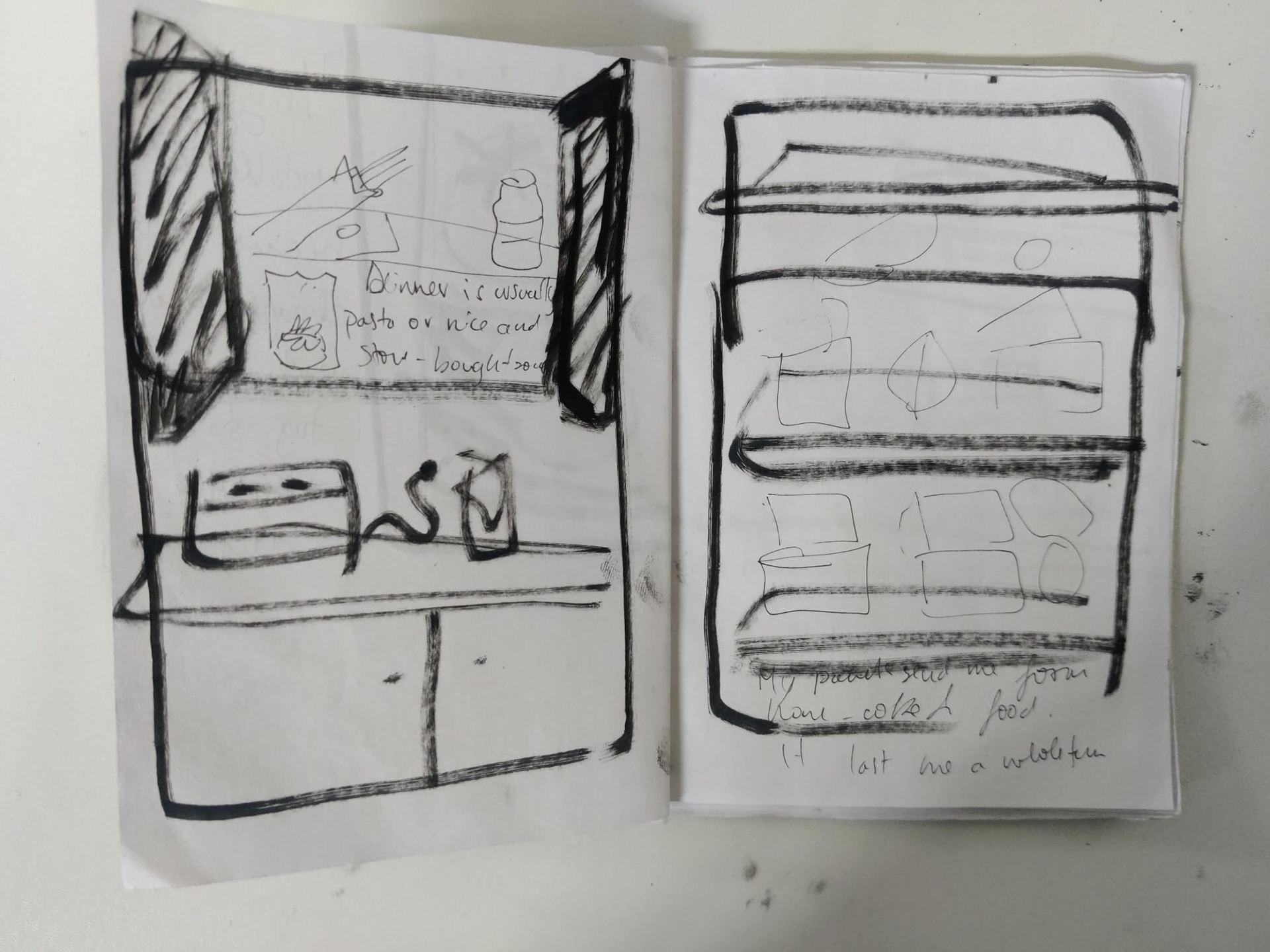
I decided to go a different route and instead talk to people about their habits and try to document them through a fridge zine.
I was mostly inspired by the contrast in our fridge. Since I share a fridge with my flatmates I can see whatever they buy. I find cooking enjoyable, but he hates it, which you can also see by looking at all his microwave meals. Even though we all have fridges and food they are all different and they reflect a small part of our lives, and they can say a lot about a person.
I was intrigued by this topic while collecting the images, as I found it interesting to see how what everyone has in their fridge reflects their habits. For example, my flatmate has 4 different types of mayo but no other food item, which makes me ask myself a lot of questions about what type of person he is.
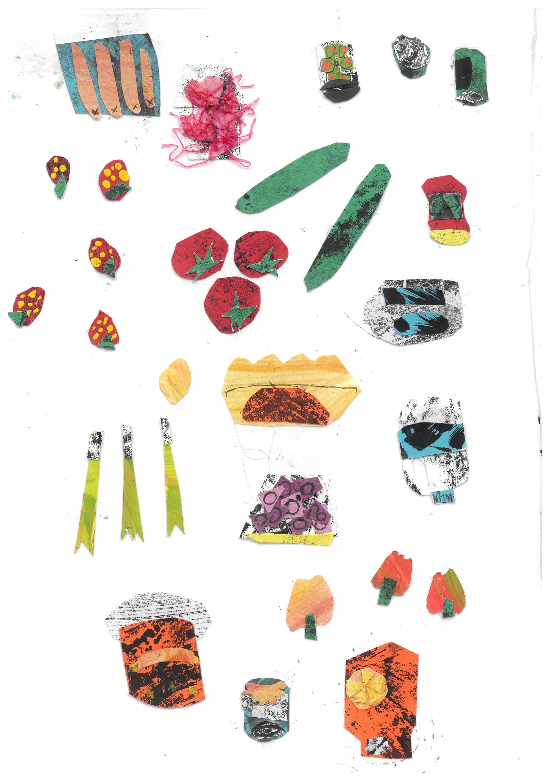

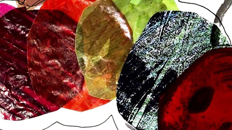
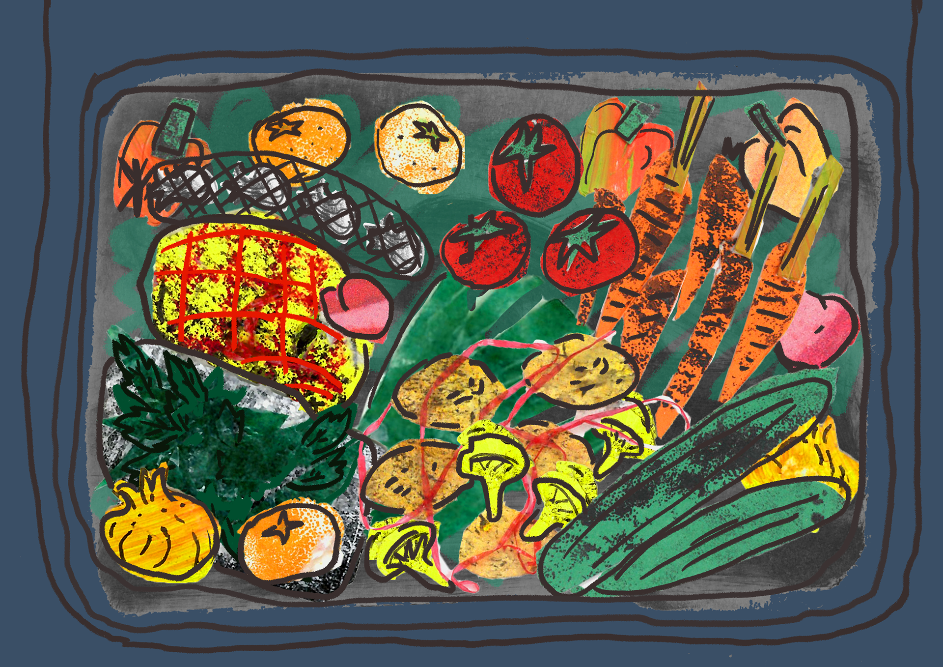
I planned to use collages to create mini-items that people have in their fridges since I wanted to have some overlapping textures.
My first attempt turned out way too busy and it was hard to see what was happening because of how overcrowded it was. To combat this I was suggested to try integrating digital elements into my work to be able to make it clearer.
Olivier Kugler
One of the illustrators work I was introduced to during this project was Olivier Kugler, and I particularly looked at his reportage work, since my fridge task originally started as a series of observations.
I like how detailed his work is, while also not feeling to overwhelming or busy. I think one of the issues with my 'Amplify' book was that it felt like there was too much going on and all the elements were competing with each other. In comparison, Kugler's work showcases a very clear hierarchy of what is most important in his pictures, by using limited accents of colour, and not adding any unnecessary details to background elements.
Moreover, I tend to avoid typography or any text in general, so I plan to start looking at more illustrators who include it in their work to become more informed in this aspect of illustration.
Eric Carle
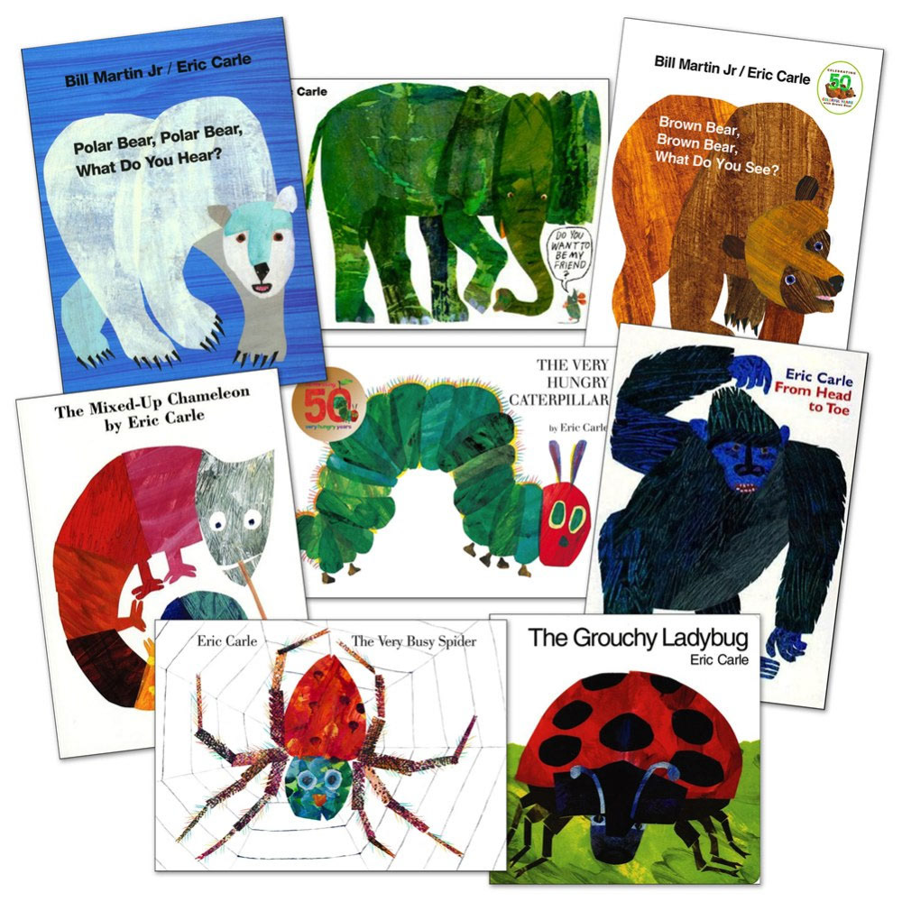
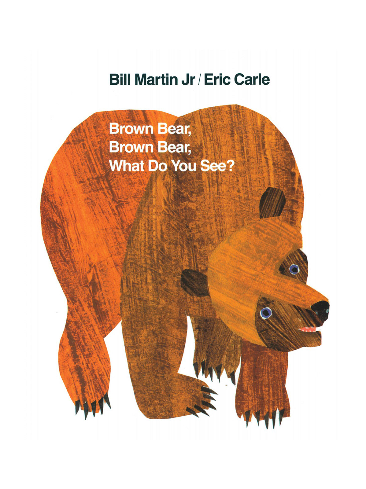
I also looked through Eric Carle's work since I was interested in doing collage. My collages tend to be overwhelming a lot of the times, such as the first fridge one I tried, so I enjoyed looking at his work which felt very fresh and airy because of the simple and clear shapes he uses juxtaposed on plain white backgrounds.
While looking through his work, I also discovered that he uses tissue paper in his collages, to create more interesting layering. This is something that I have not really considered doing but that I would like to try.
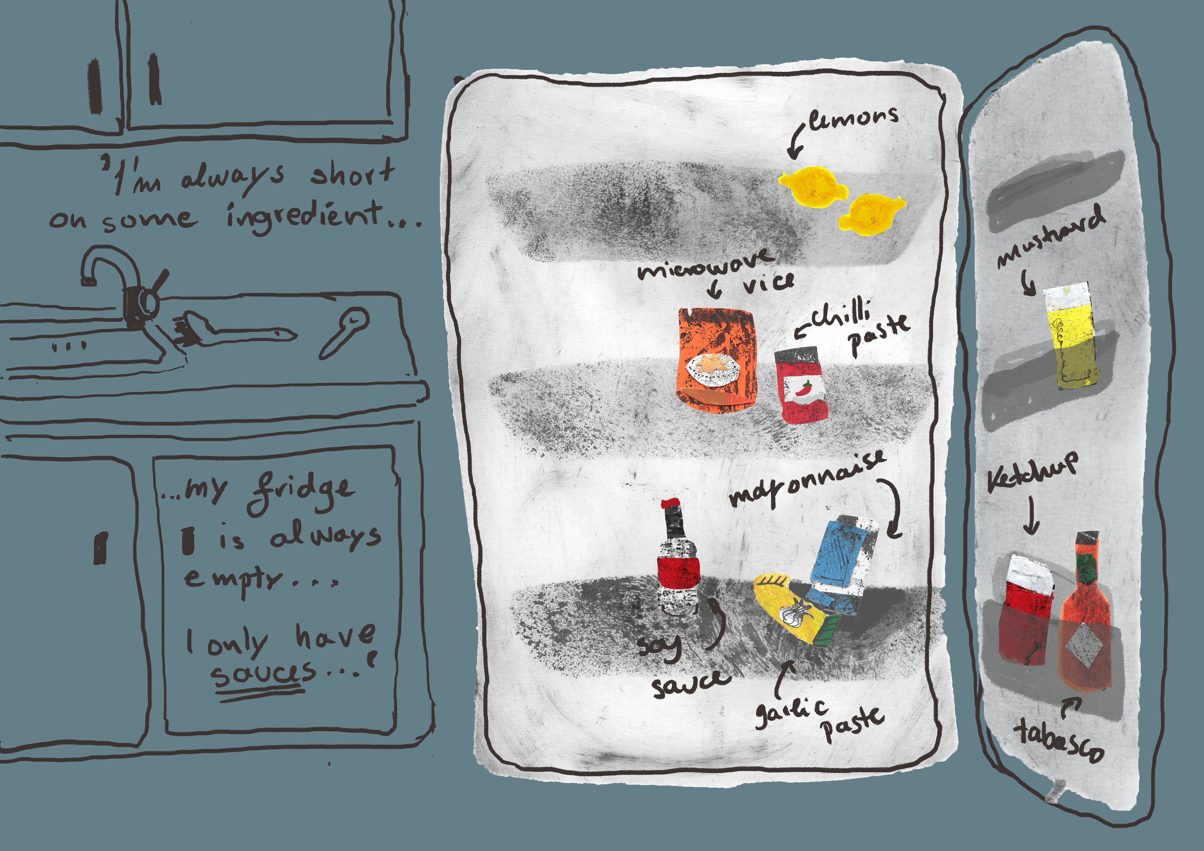
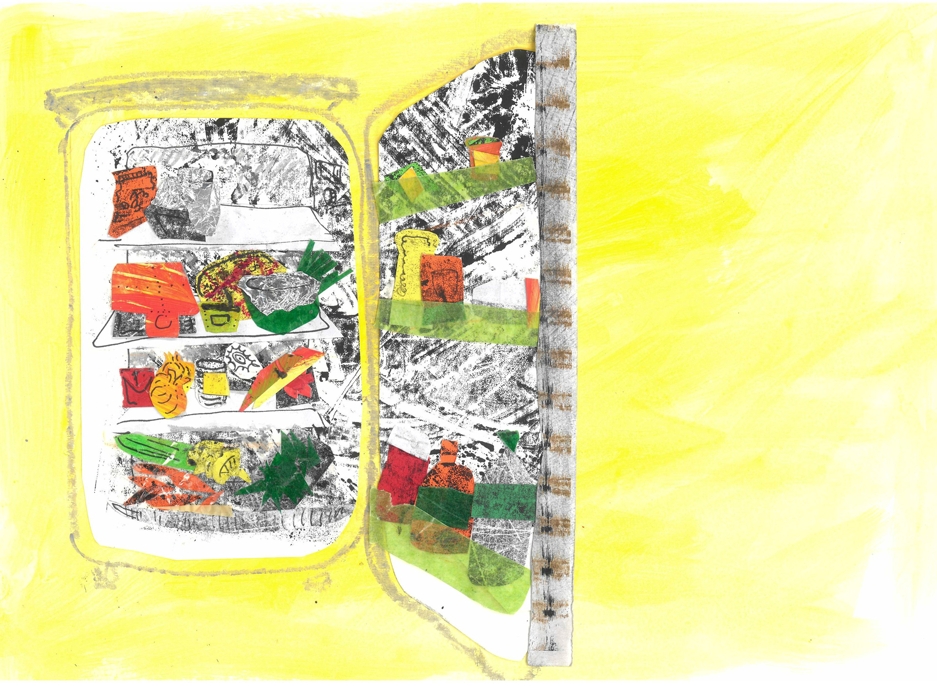
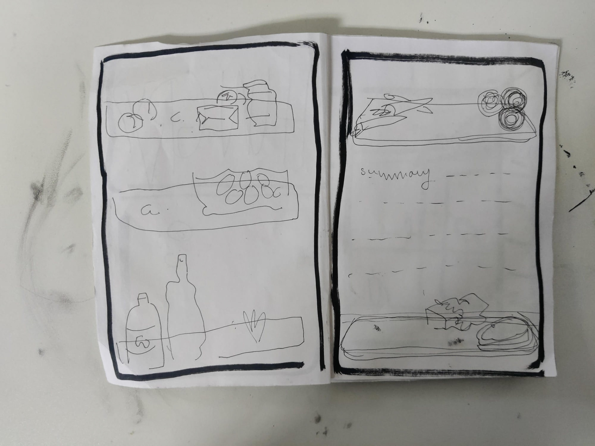
This is what I came up with, and also the last thing I did for 'Ways of living' for a while.
I was happier with them than the first page but still thought I could work on it more. Something I was not happy with was the abundance of text, I do not think that pointing out every item was needed, since I wanted to focus more on what the full fridge set-up says about someone, rather than each individual item.
I liked the contrast that the collage paper provided over the plain background, but I thought that, in this case, it was too jarring. The colours are also at fault for the overly harsh contrast, since the collage bits are too right while the rest is way more soft. What mainly caused this was me scanning my work in two different places and not checking to see if everything was the same, which led to some of the things being too bright compared to everything else, which I was only able to notice after test-printing them.
Although some stuff went wrong, these pages provided a good opportunity for me to try out doing collage digitally, which I hadn't really tried before. Although I wasn't fully satisfied with them I was able to use what I learned here in the next brief. Since Anorak mostly uses digital illustrations, I used the knowledge gained here and built on it to be able to create some more polished digital collages.
One of the issues I had across 'Ways of Living' was that I kept making a single different thing for each workshop and then never coming back to build on them. Therefore, for the fridges, I tried to spend more time trying different things to see where it goes. The 2 pages I made ended up influencing my work for the rest of the year, which I did not expect. It also made me wonder what I could've achieved with some of the other things I started doing during this brief if I had taken more time to reflect and evaluate each one and figure out how to implement everything I'd done in future work.
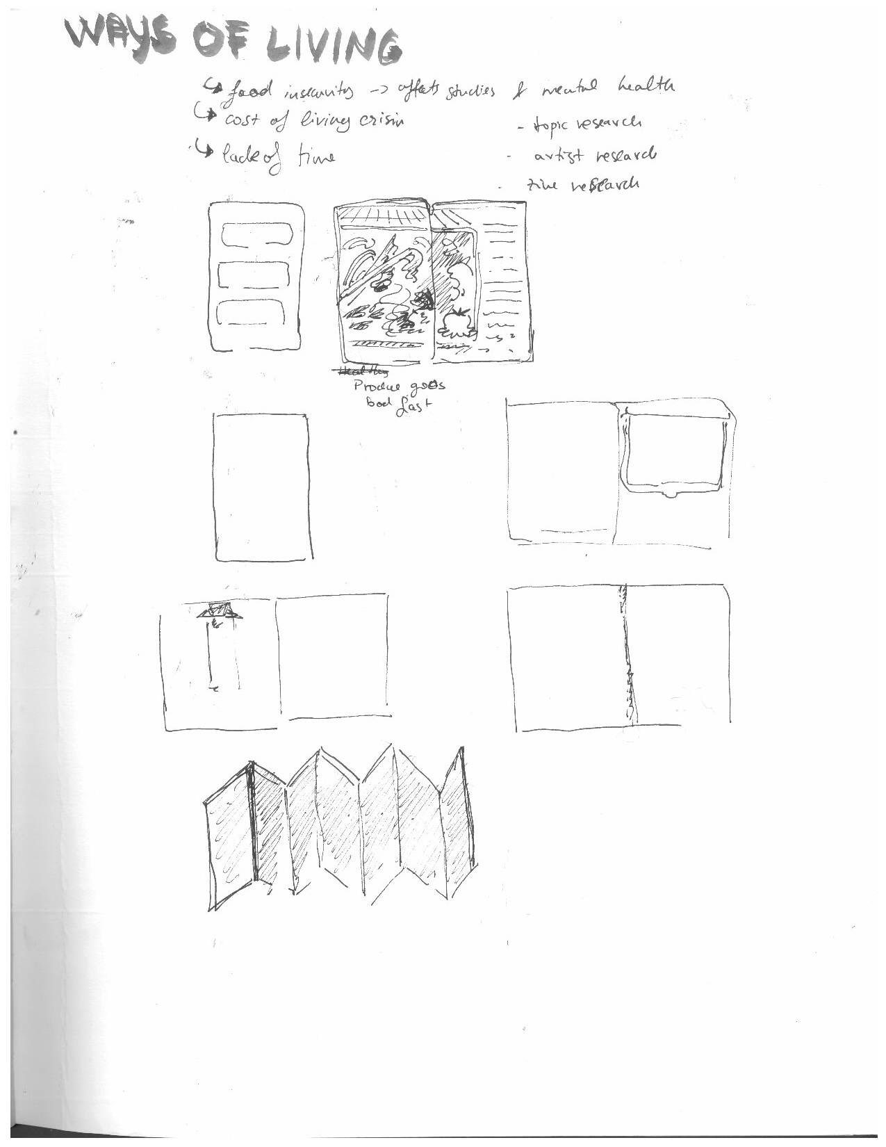
Coming back to 'Ways of living'
We did not need to have a final outcome for this project, I still wanted to have a conclusion for this project since I feel like I went through so much other stuff throughout it, and I was not able to ever fully focus on it.
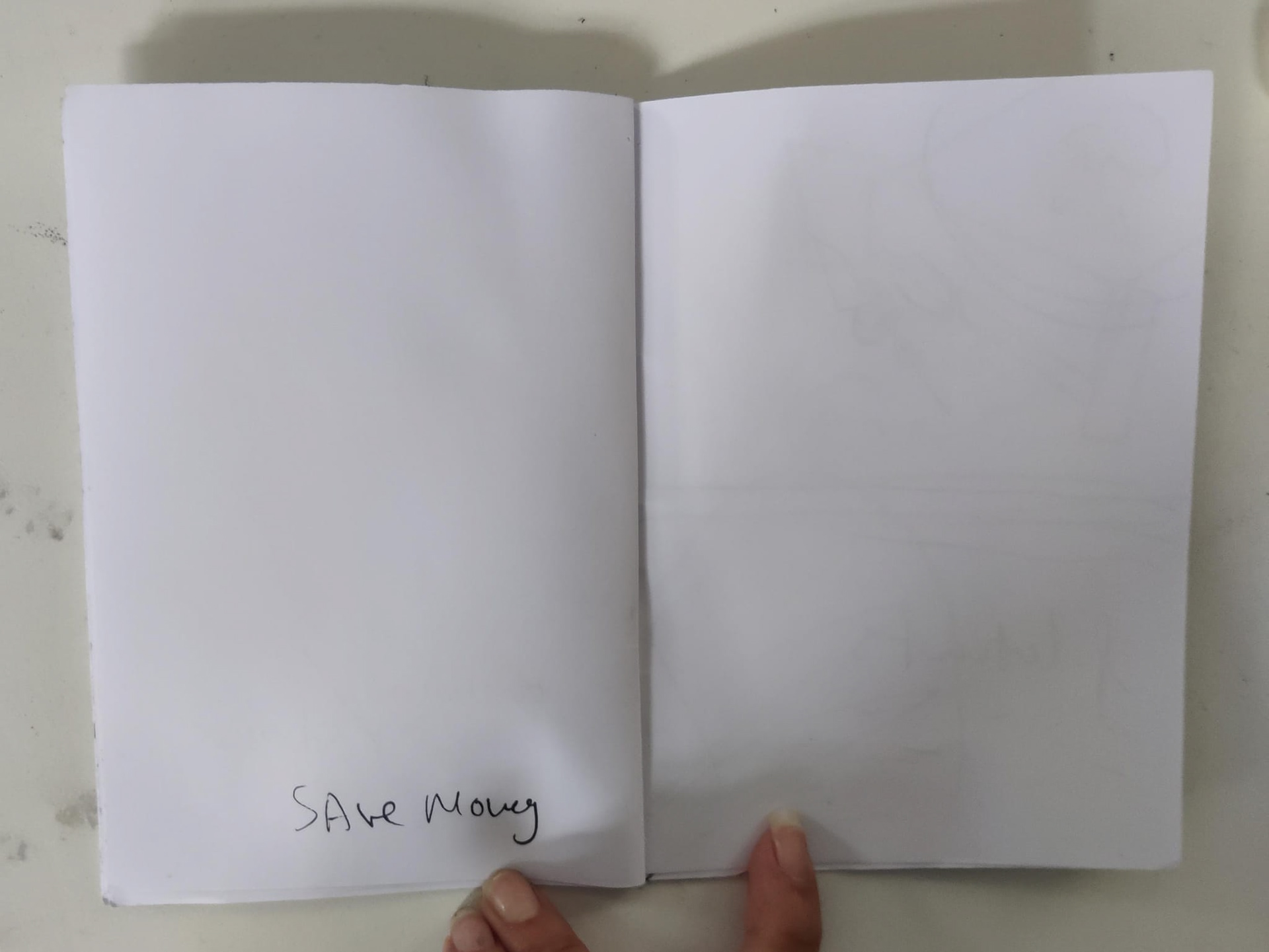
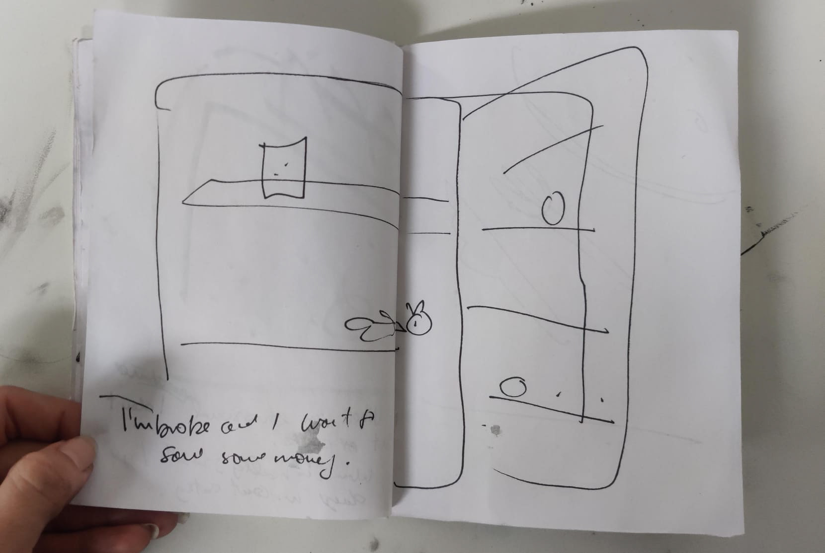
I decided to try and see if I could finish the Fridge book that I had previously thought about doing.
I wanted to create something that feels very human, and that shows off a glimpse of people's lives by looking through a fridge.
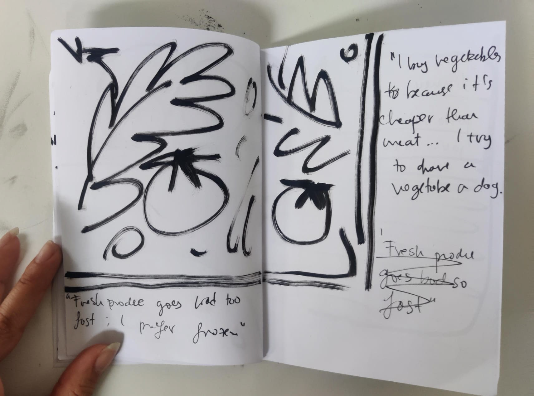
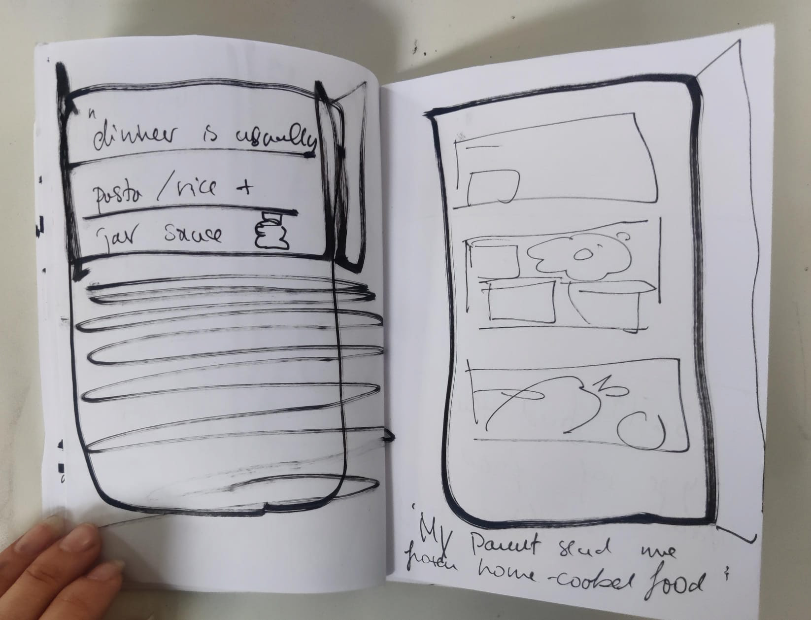
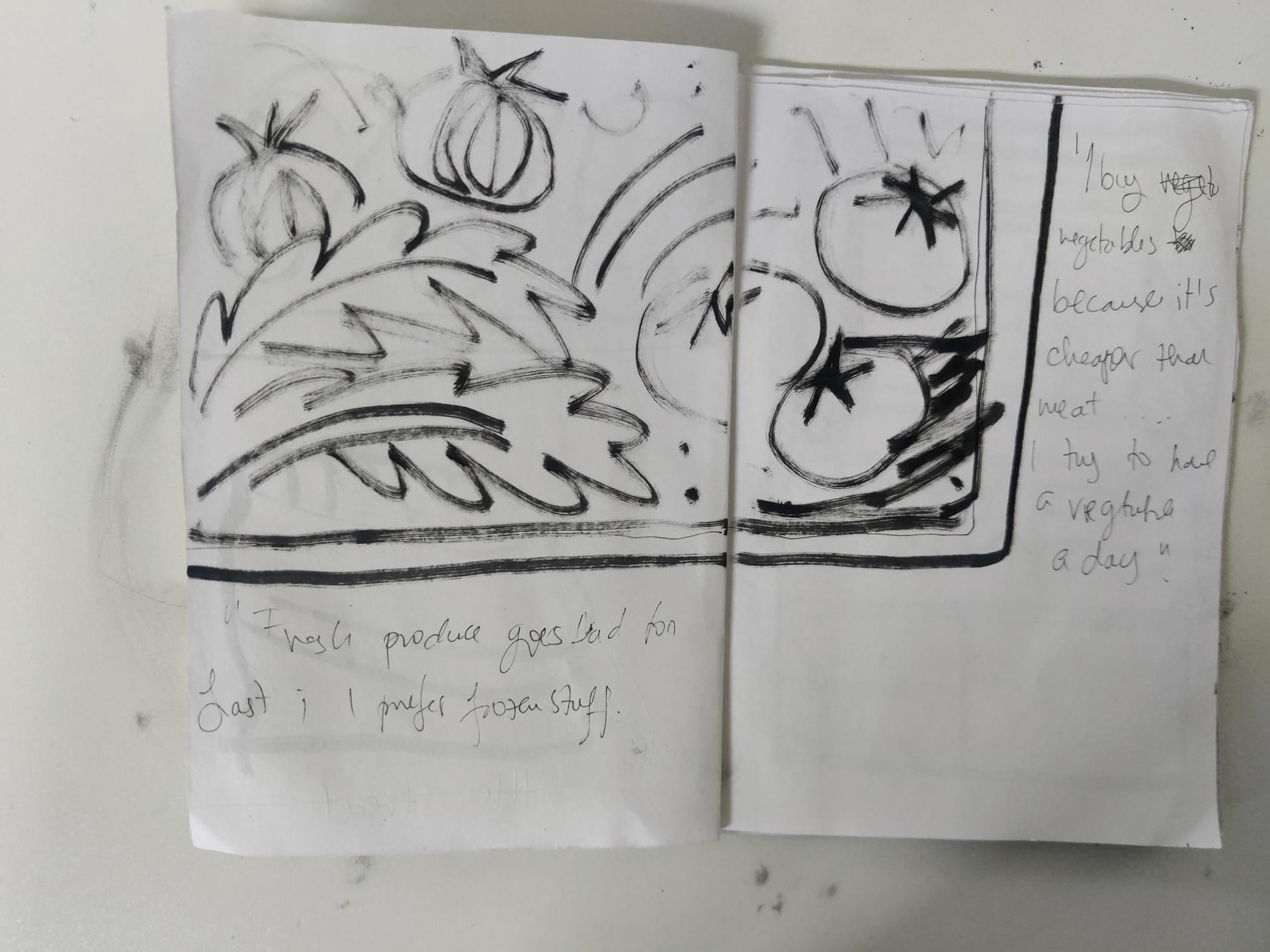
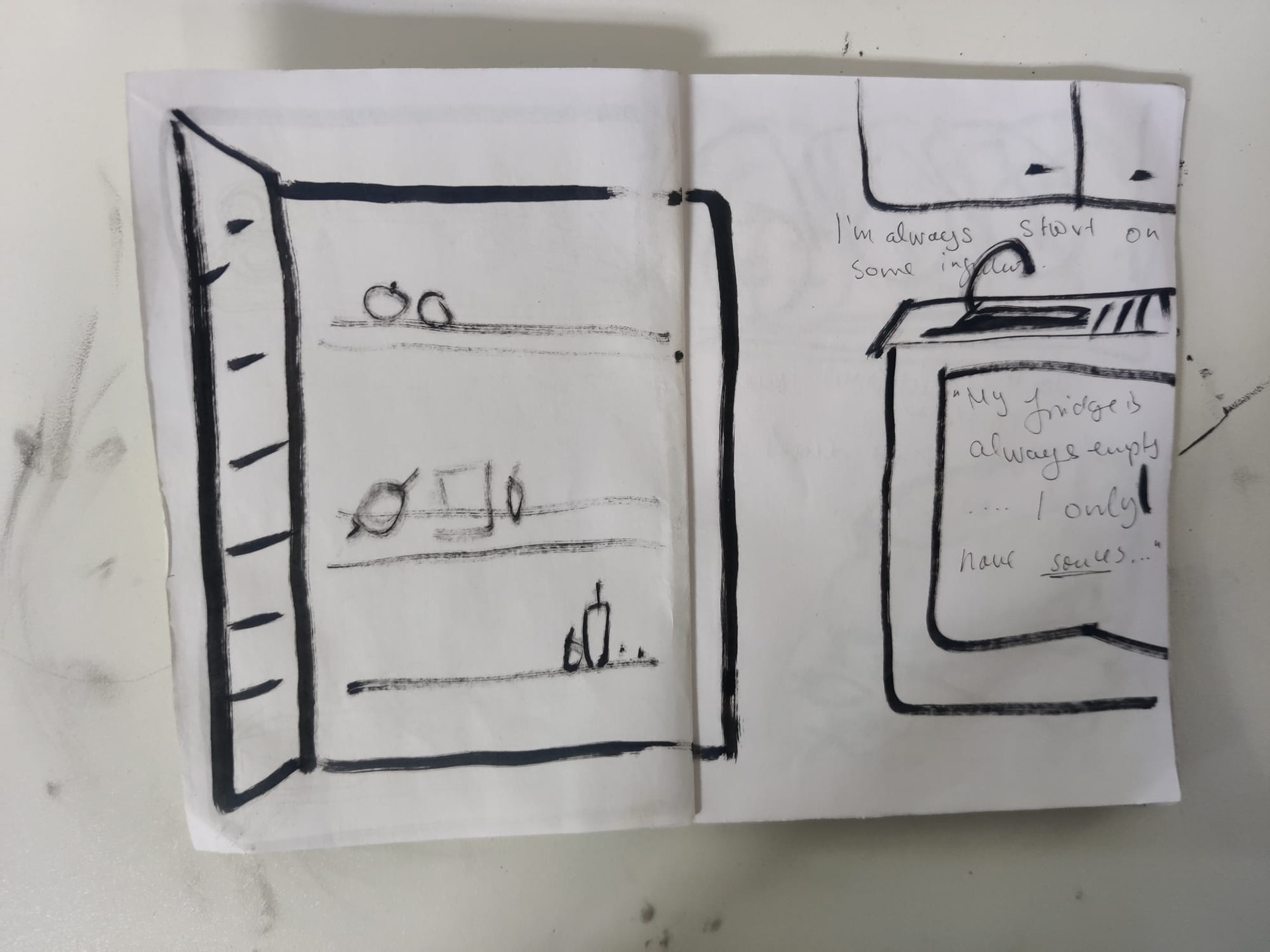
I collected statements and stories from people I know, about their food-related habits, which I then combined, adapted and shortened into small quotes to put in.
I tried not to give myself too much time to do this so it does feel quite rushed, but despite this, the process of making it was much smoother than the one in the beginning of the year ( for Amplify). I made 2 quick rough books to be able to figure out the general layout of the book and what page I wanted each statement to be attached to.
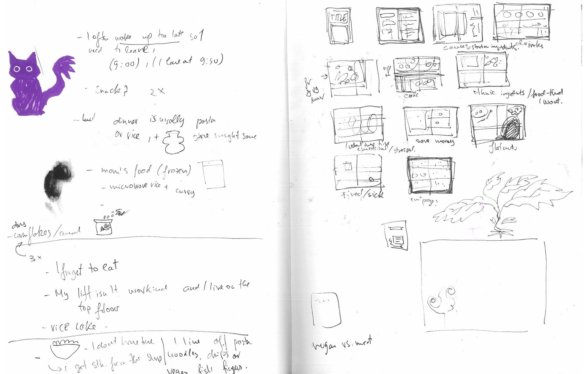
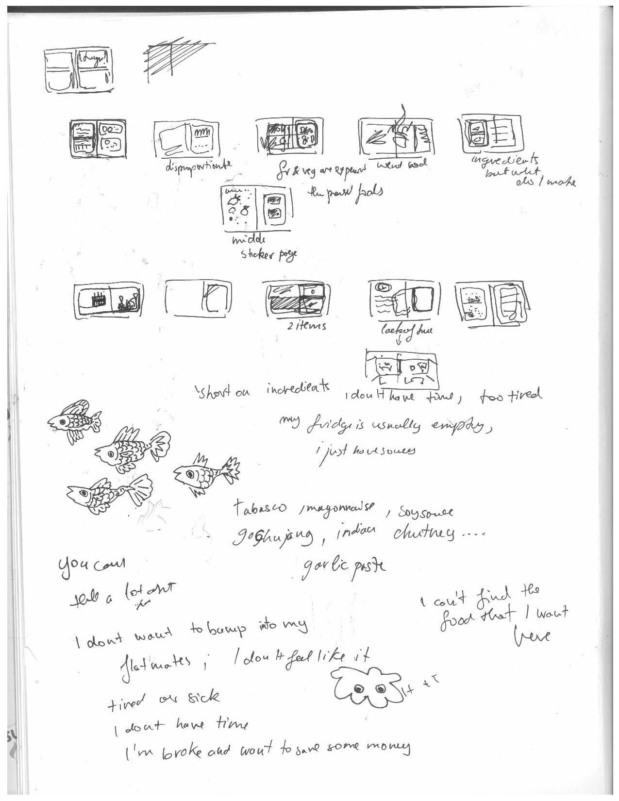
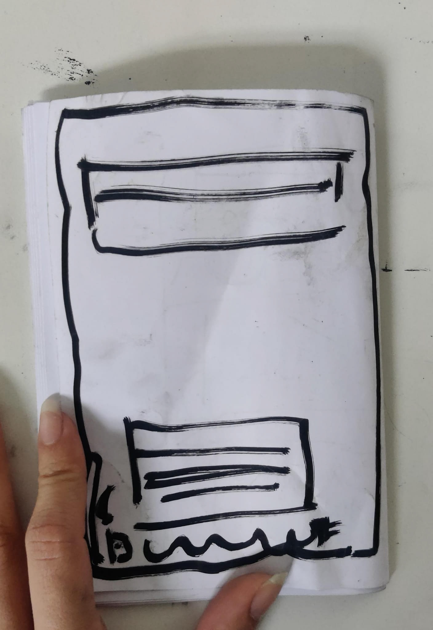
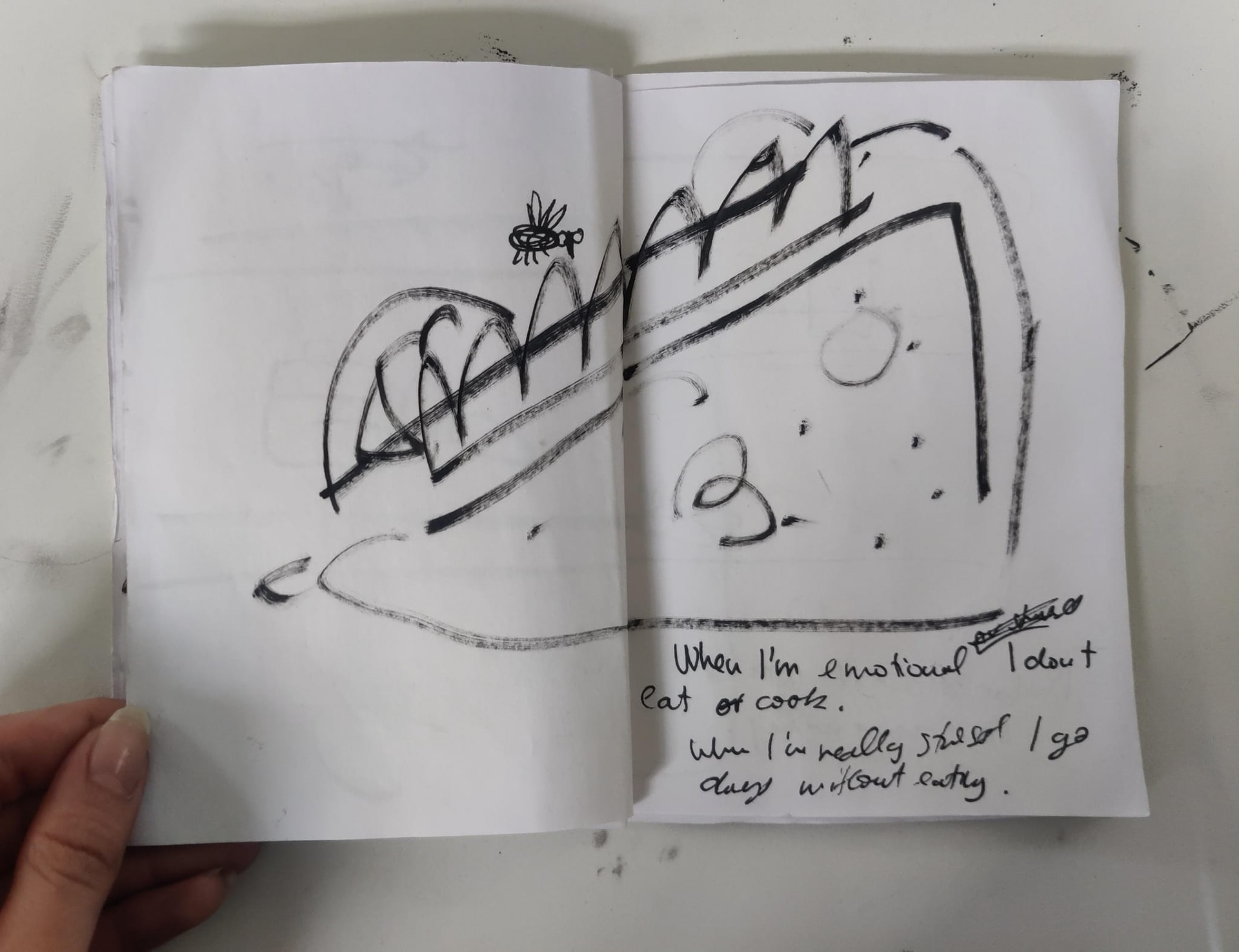
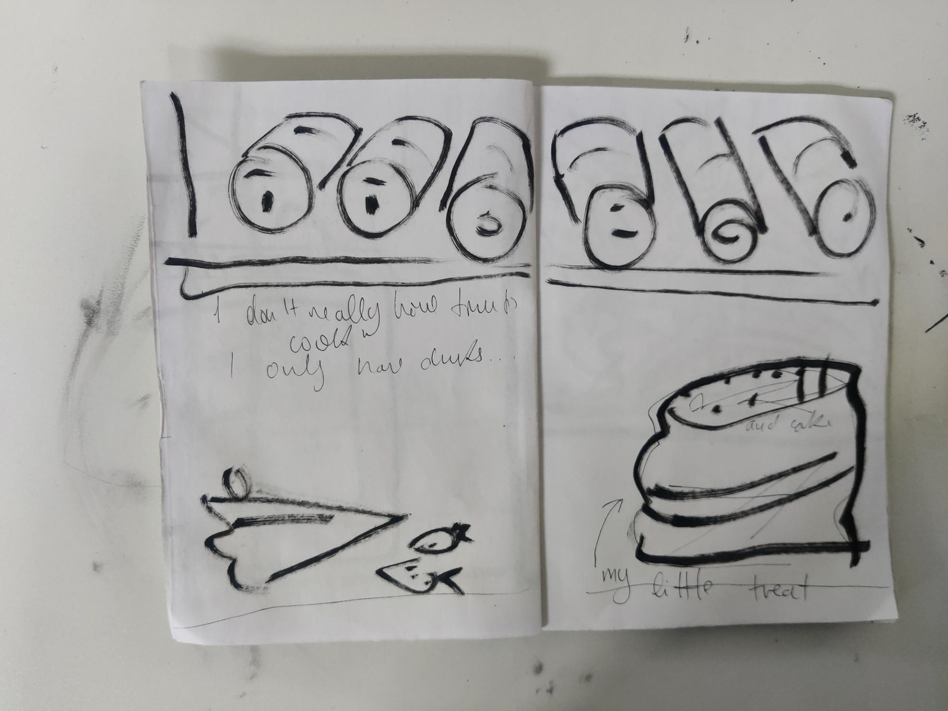
First Rough
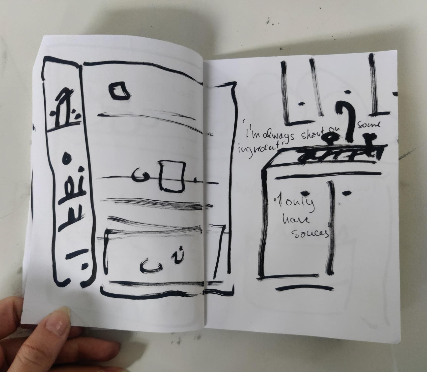


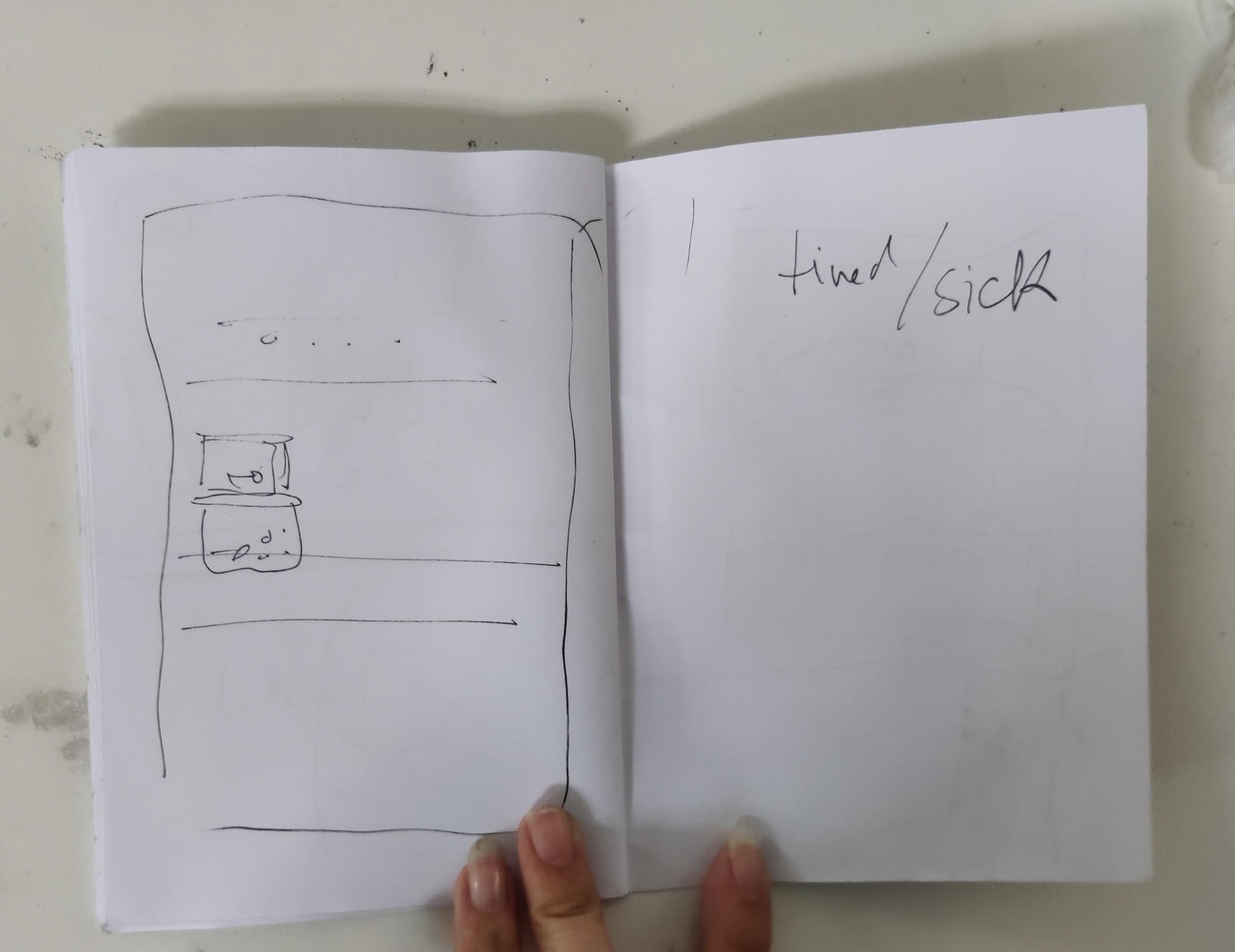
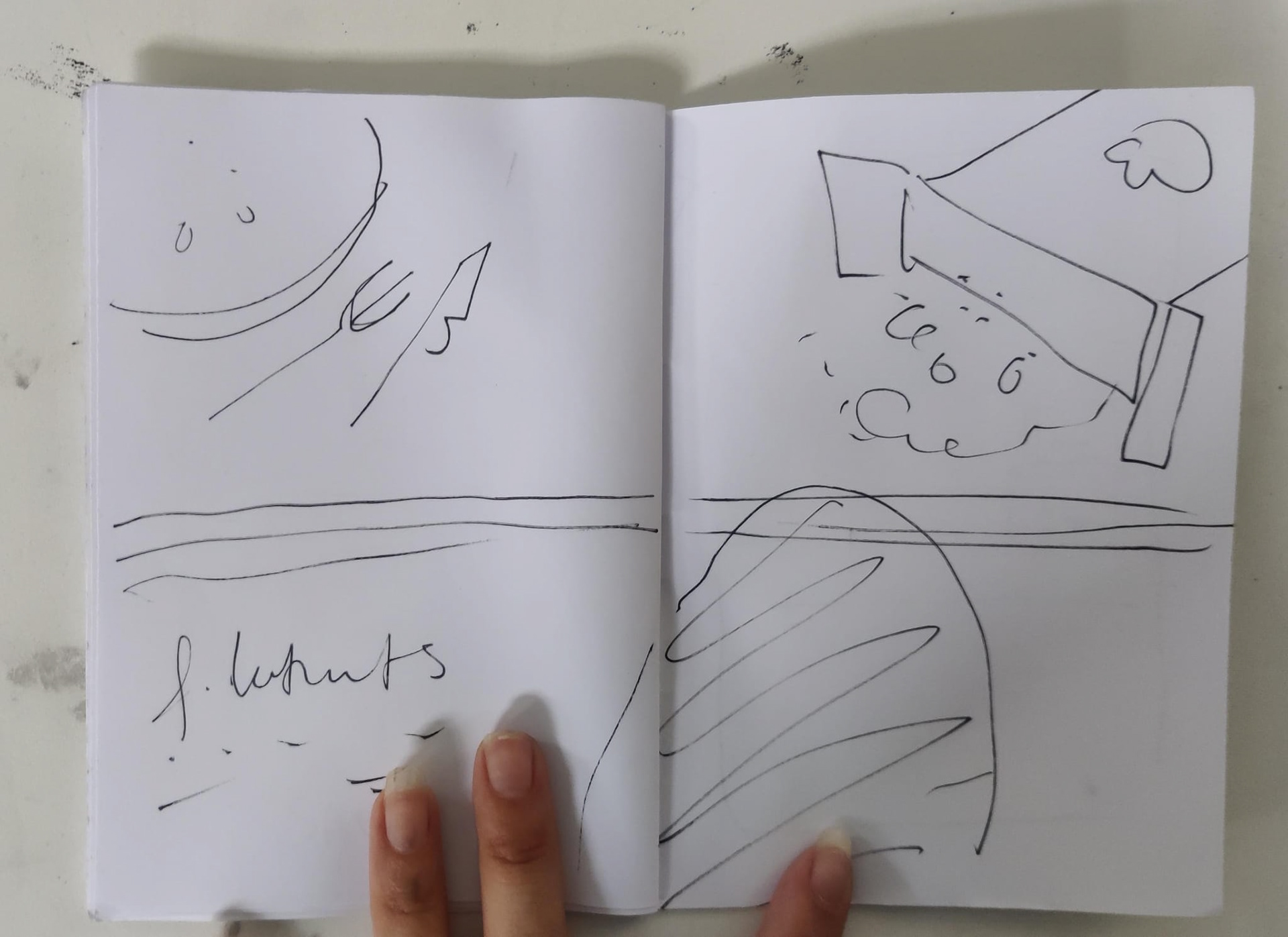
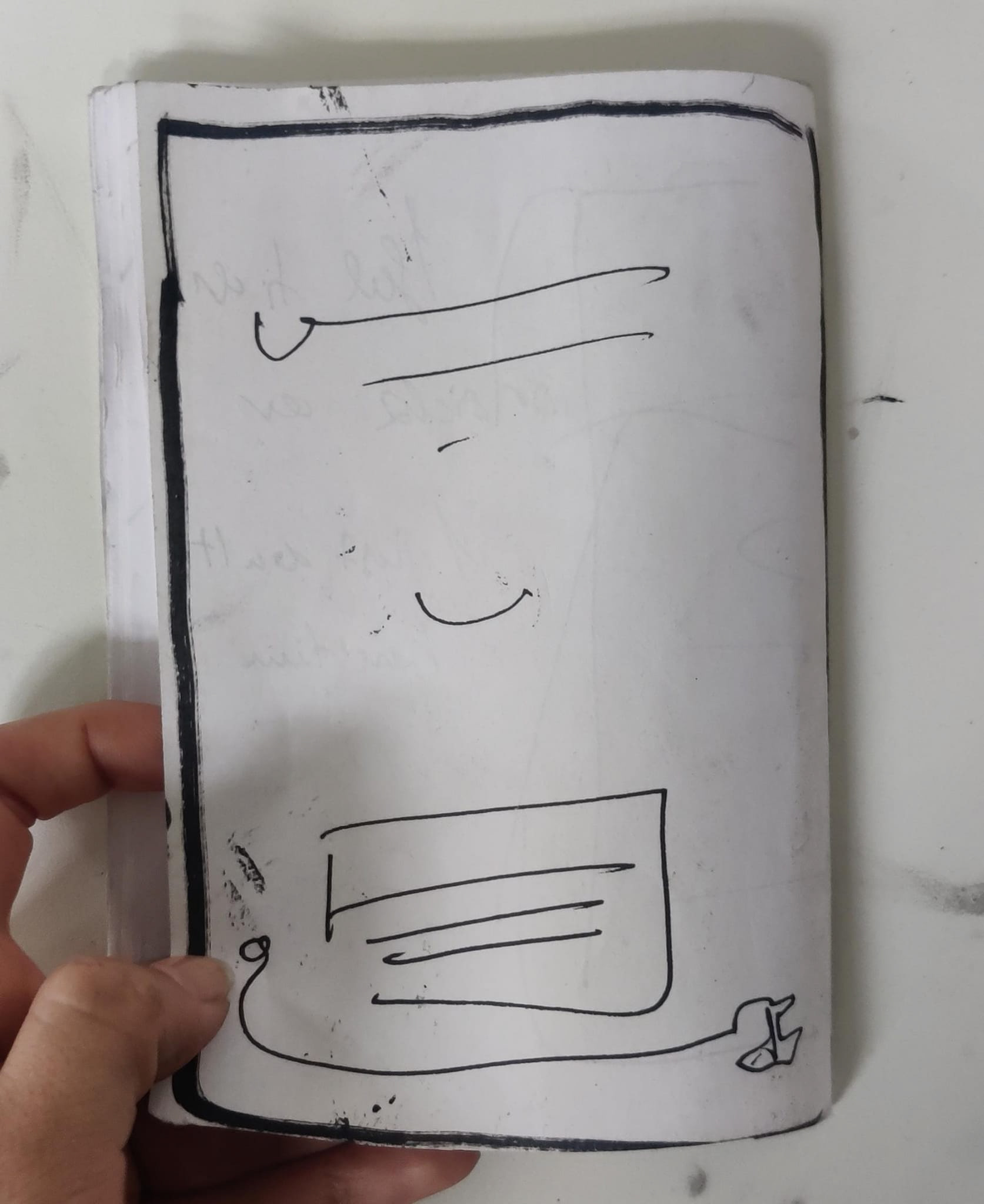
Second rough
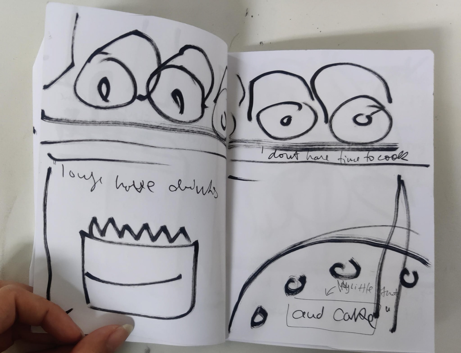
In the second rough, I started thinking more about the order of the pages. Since it's not a story I had more freedom during this part.
Since some of the statements I got from people were quite depressing I decided to put those at the end and I also went for more sombre imagery, such as using a dark and plain background with a sad, lonely and empty fridge in the middle.
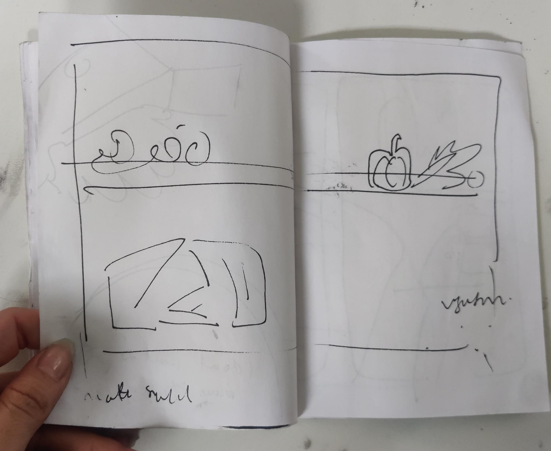
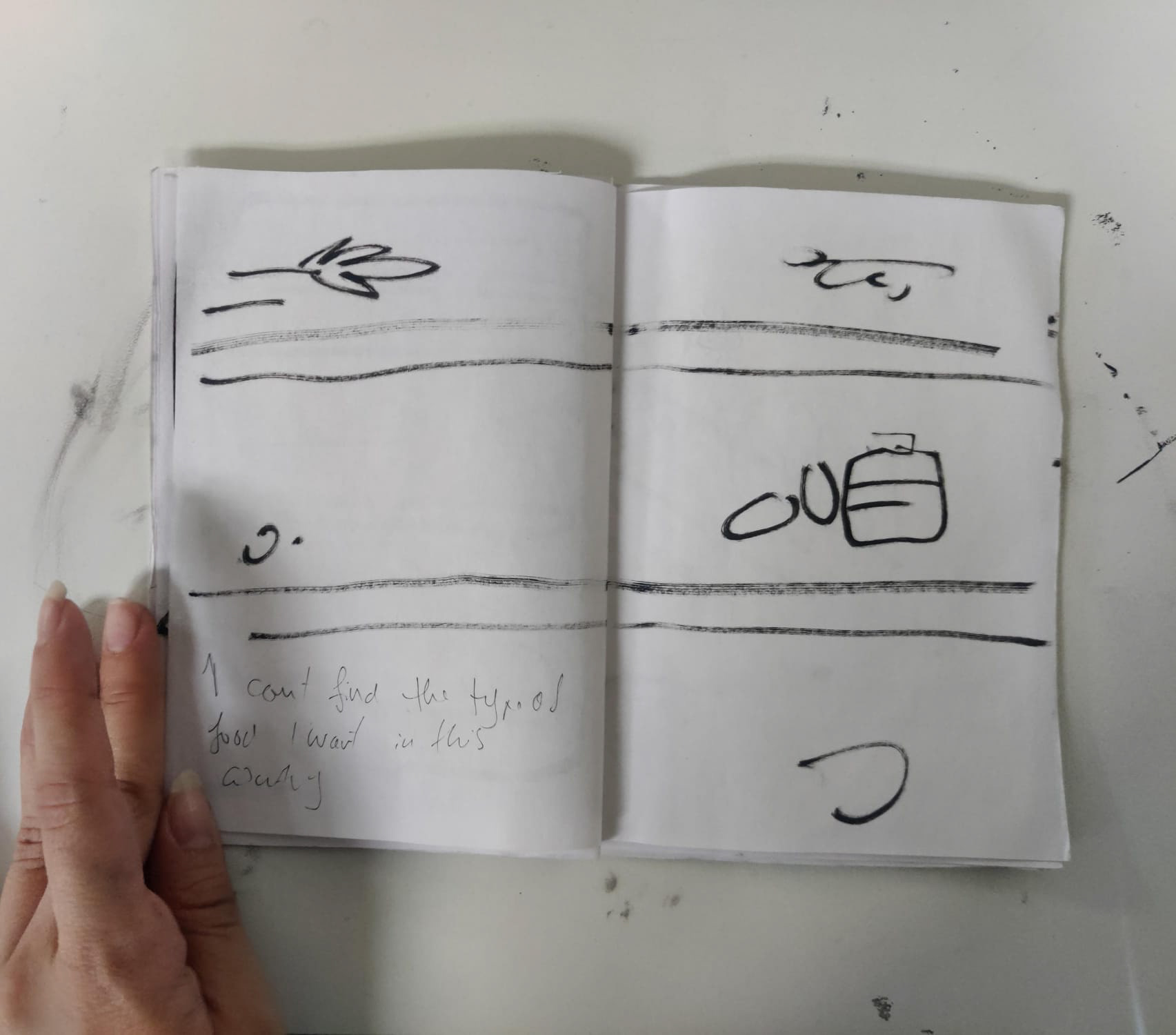
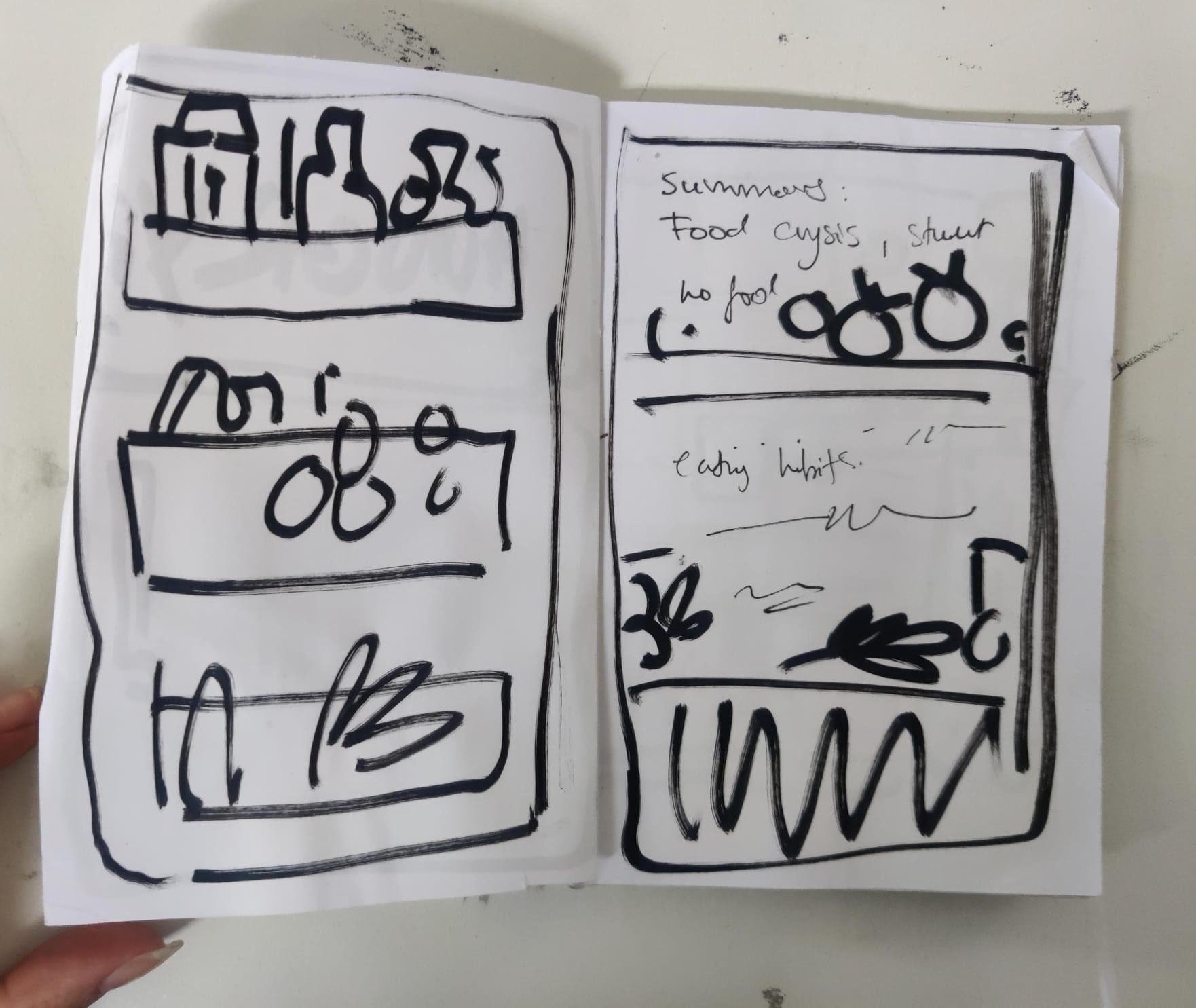
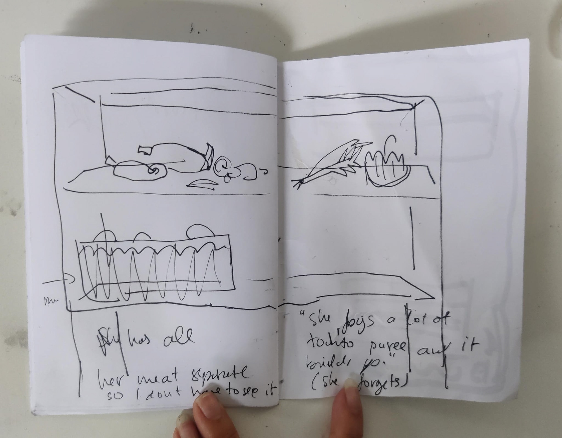
The final book is mostly stencilling and collage.
For the final book, I wanted to still use collage, since I already had all the mini items which had not been used for anything. I also wanted to do some more stencilling, since it was one of my favourite workshops of the year. I also tried to implement the collage elements in a different way than Anorak, since I felt that there was still a lot of room to explore this medium. In the live brief, I mainly used collage as a means to add more colour and texture to the work, and make it look less flat. In this book, the collage elements are meant to stand out, so I also kept the background shades of grey to emphasise this.
The colour pallete is also something new for me, since I often avoid working with so much grey, unless it's in a completely black-and-white illustration. The reason I chose to do this is because this year I've been struggling a lot with overwhelming colour palletes, having had this issue to some degree in Anorak, Amplify, and the maternity brief. Therefore, I took this opportunity to try to force myself to only work with limited pops of colour. I used varying amounts of colourful items based on the tone of the statements.
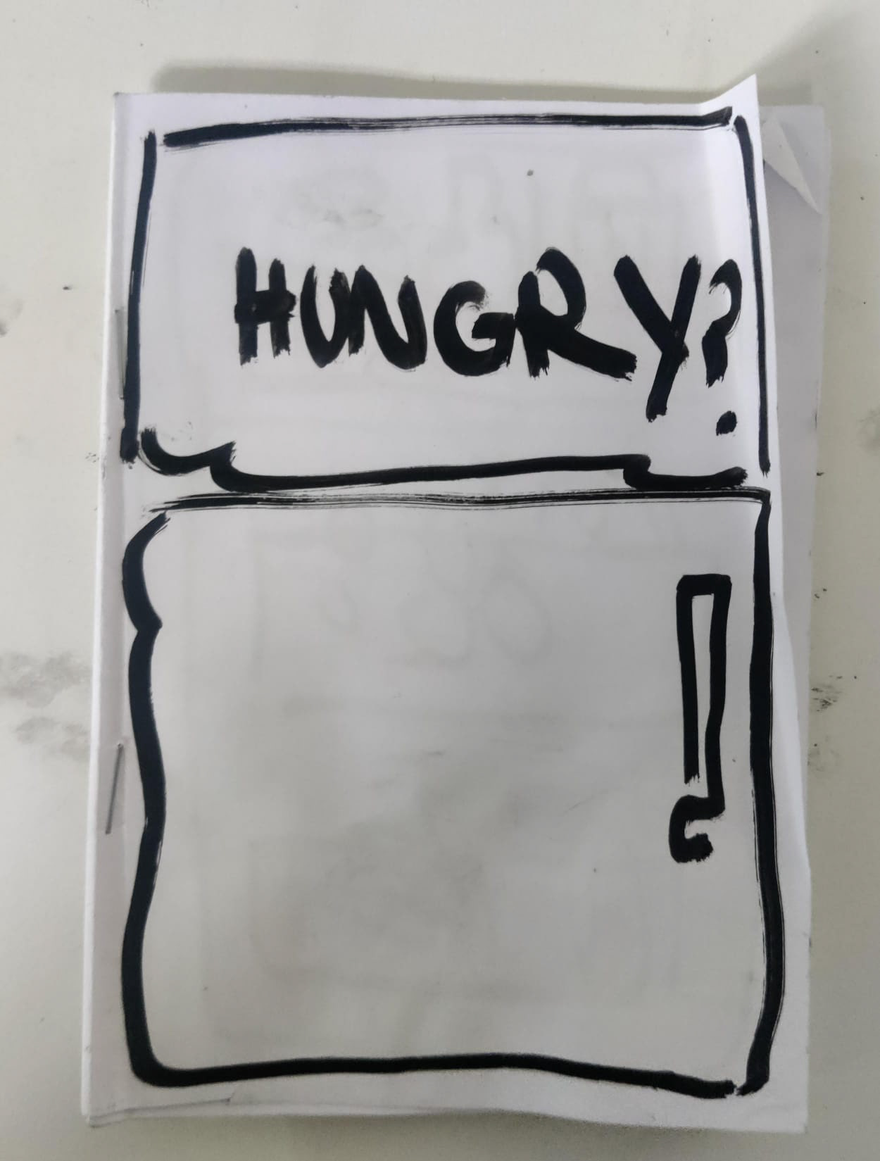
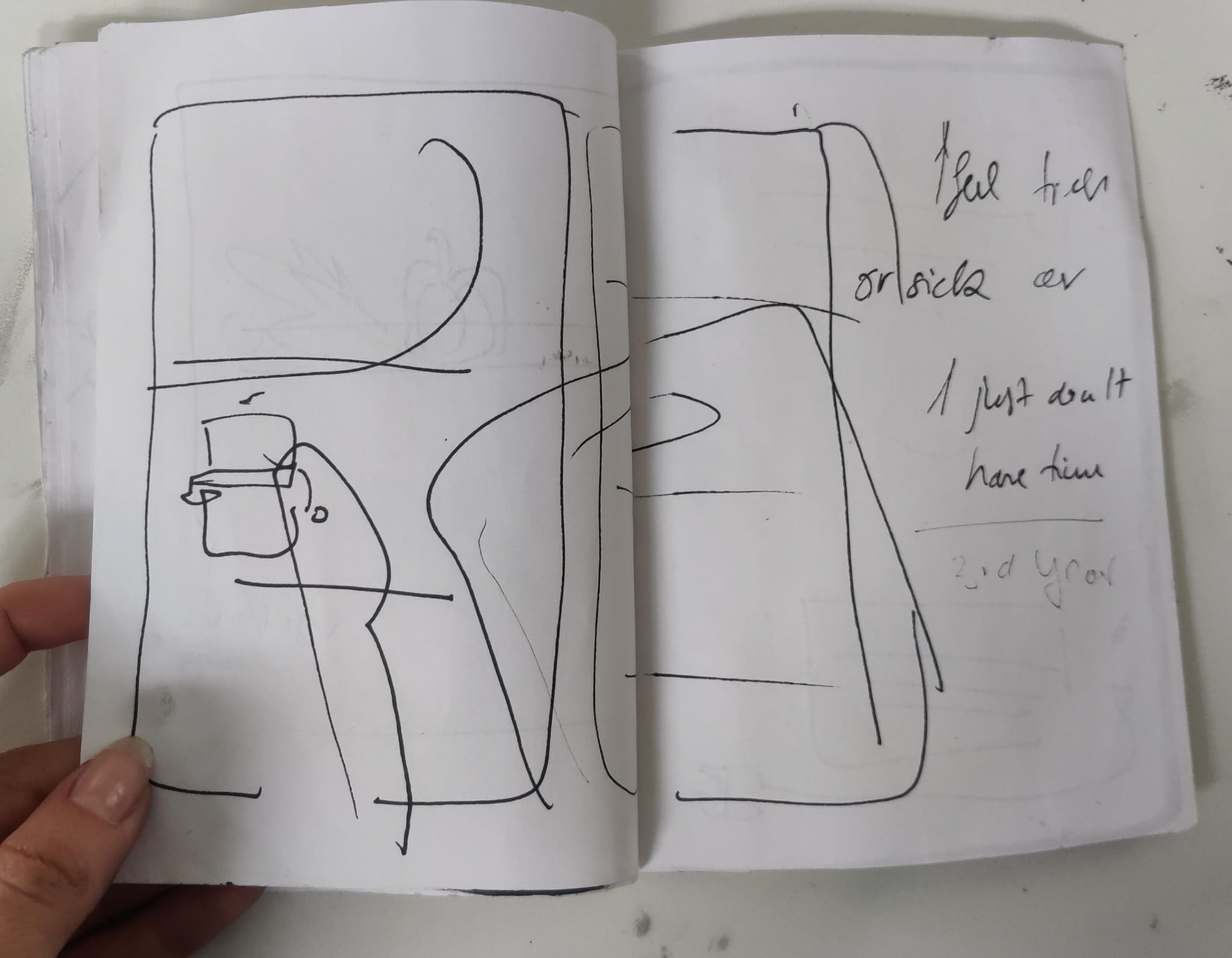
I test-printed the book so that I could adjust the colours accordingly and add the quotes in. I couldn't find a font I liked since everything felt too jarring in comparison to the hand-made and rough feel of the book, so I just did it in my handwriting, which made it less legible.
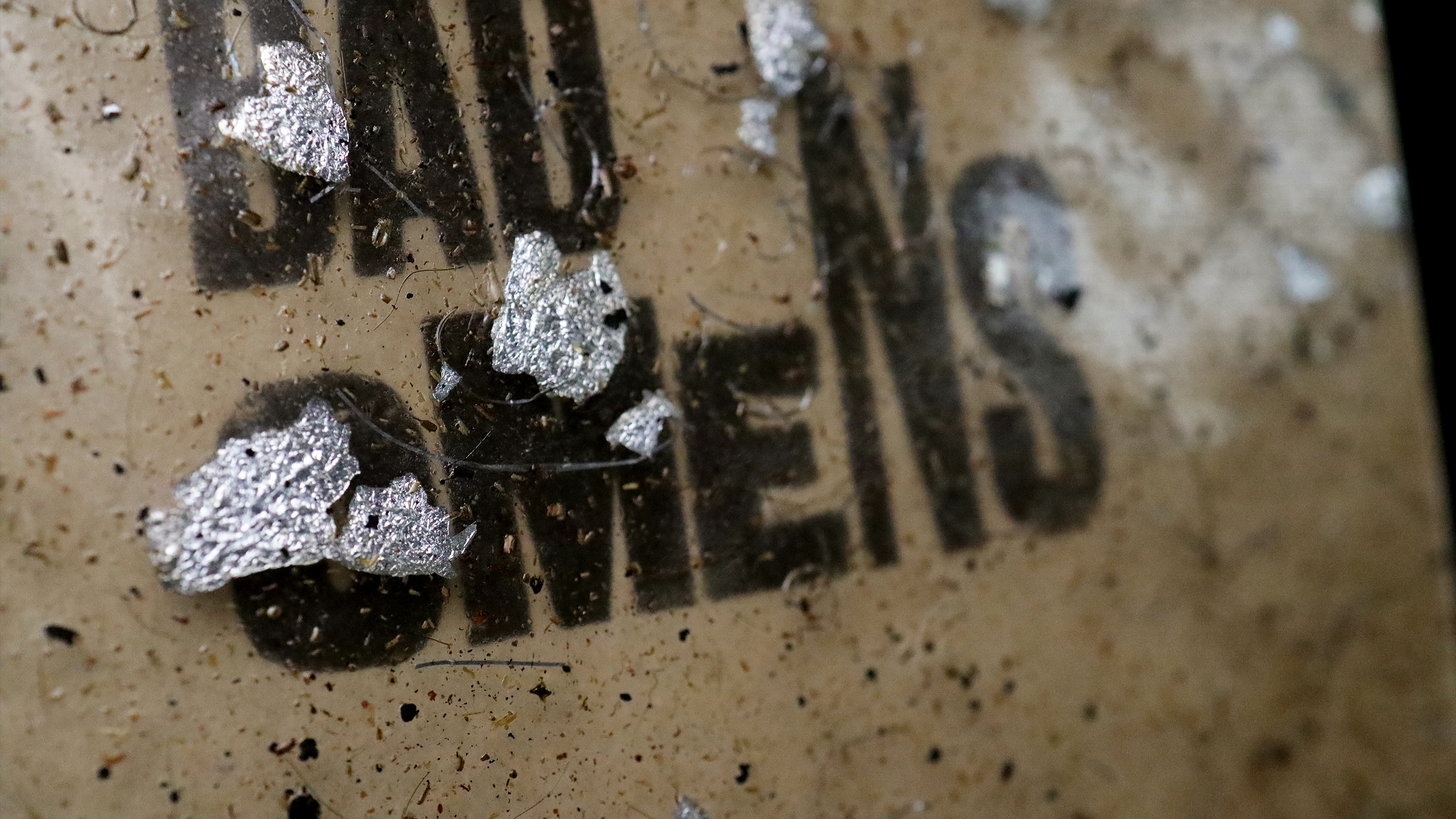
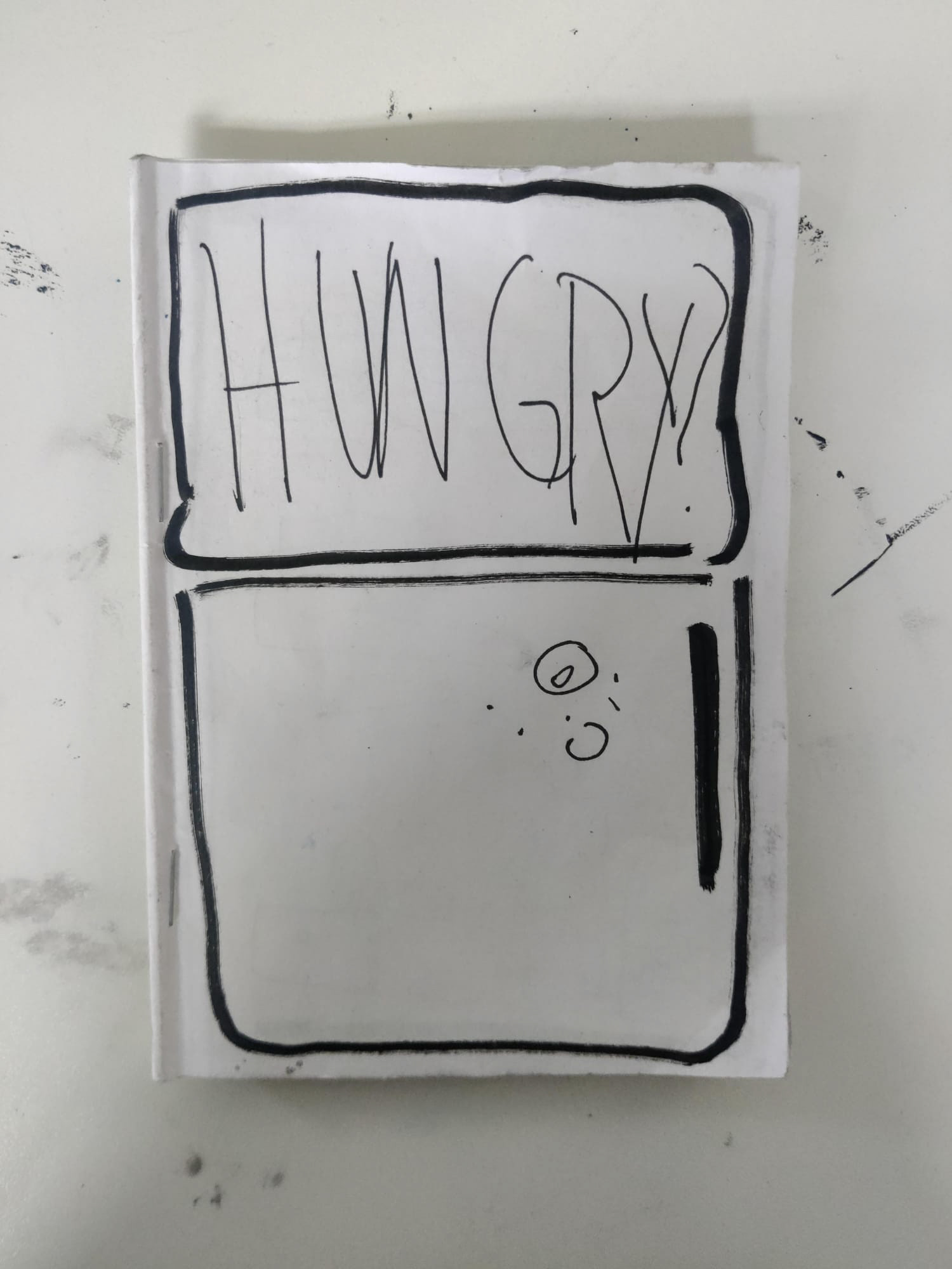
I was worried about the 'R' in my title being read as an 'A', so I asked people around me for their opinion, and everyone said that it reads as 'Hungry', which is what I want. But, looking back at the images, I think I should have relied on my own opinion since I still feel like the 'R' looks like an 'A'. Now that the images are smaller I feel like it looks too much like an 'A'.
I also meant to write out a blurb to put on the first page, but I did not get around to it, so the space looks quite awkward.
Final book


In the end, although it does feel quite rushed ( because it was) I am happy I got to end the year on this note. I feel like the most valuable experience in making this is how smoothly the process went. That makes me feel like I have come a long way, since, oftentimes, I tend to create a lot of unnecessary problems for myself by not knowing when to keep it simple, or not thinking about what I want to show from the beginning. I am also happy that I got to squeeze in another exploration of collage that is slightly different from the other ones.