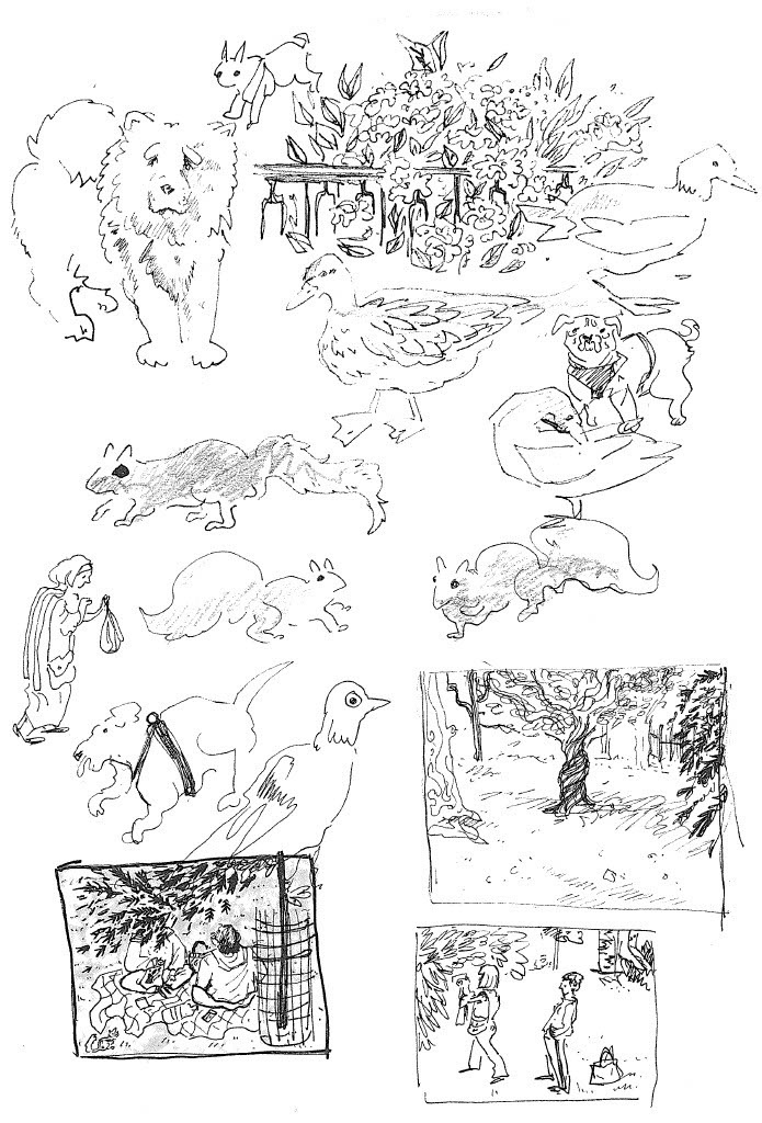
When we just got the brief I didn't fully understand it, so I started by just sketching stuff around the studio to try and get an idea of what I should be doing.
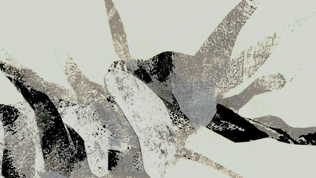
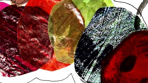
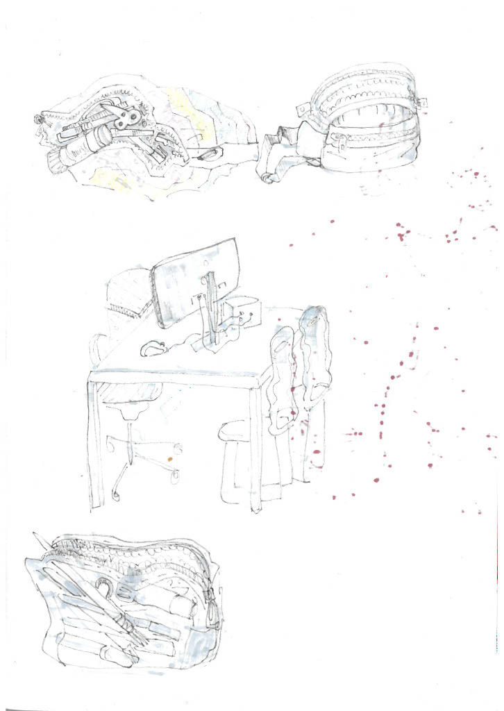
Last year I really enjoyed playing around with collage so I wanted to integrate that into this project as I feel like the objects used can add a different meaning to the image.
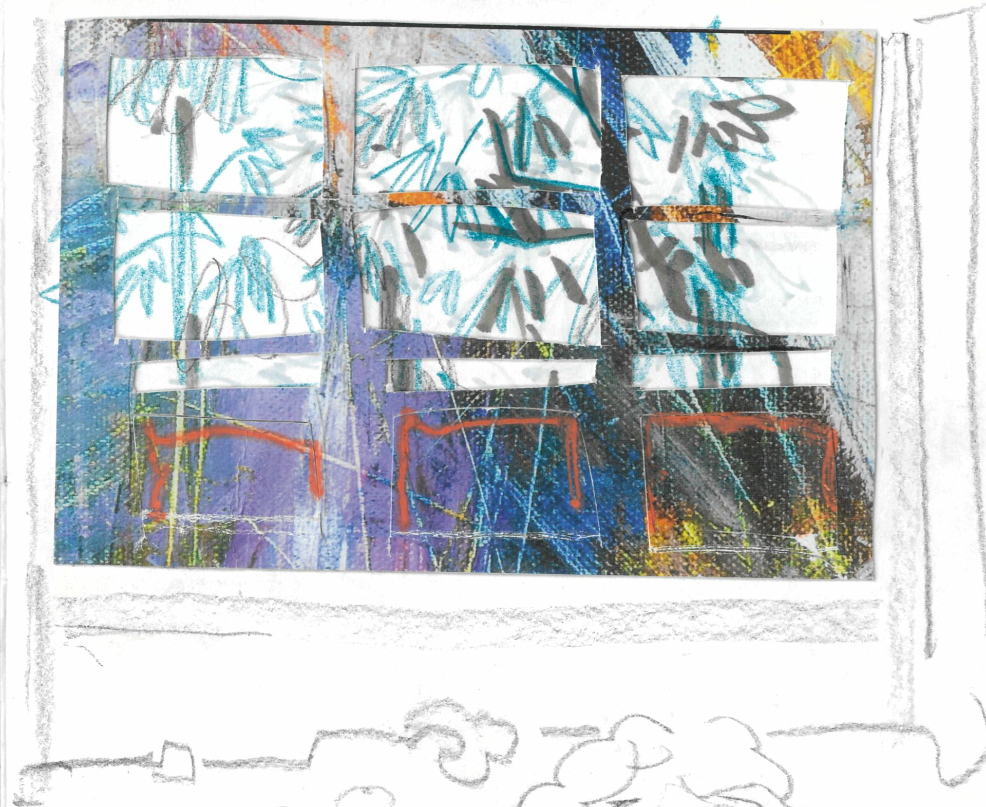
For the collages down below I used leaflets I found around the university to make the window in front of me and I added my course mates behind the window panels as a surprise as I've been wanting to try including some pop-up/interactive elements in my illustrations
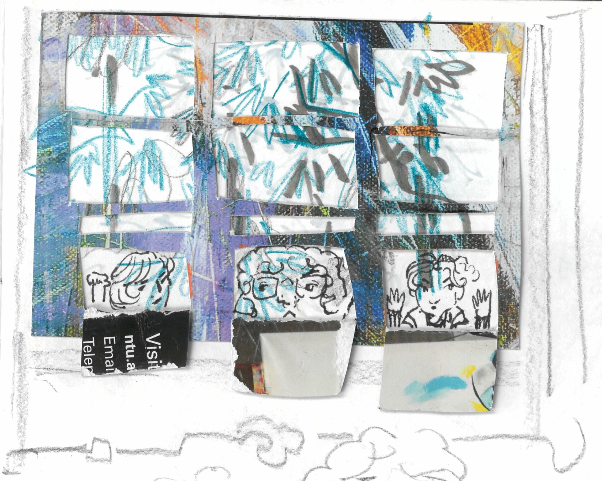
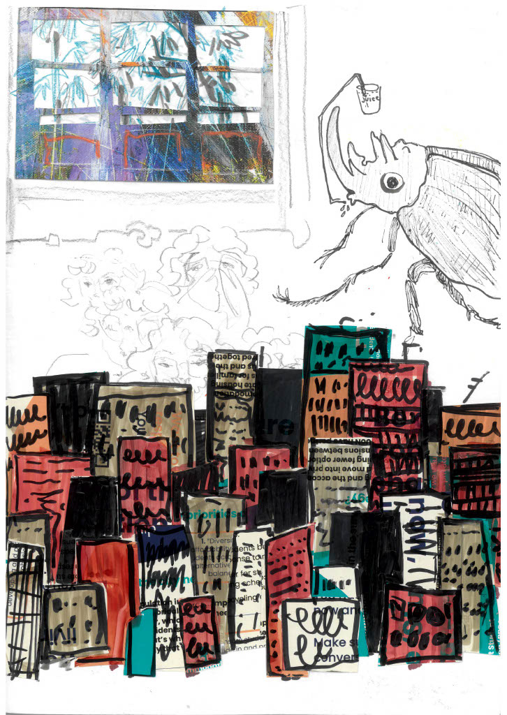
For this other collage I tried using the Uni leaflets to make something that doesn't necessarily relate to their origin.
In this instance, I attempted to make a simple blocky landscape.
If I were to do something similar again or to create a more polished illustration I would probably attempt to make the contents of the leaflets more readable and think of a way to emphasize the contrast between the origin of the leaflets and the image itself.
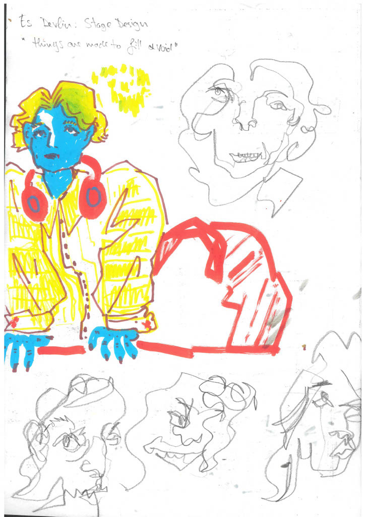
Next, I did some blind drawings of people and tried turning them into characters.
It was quite fun but I still don't really understand the brief.
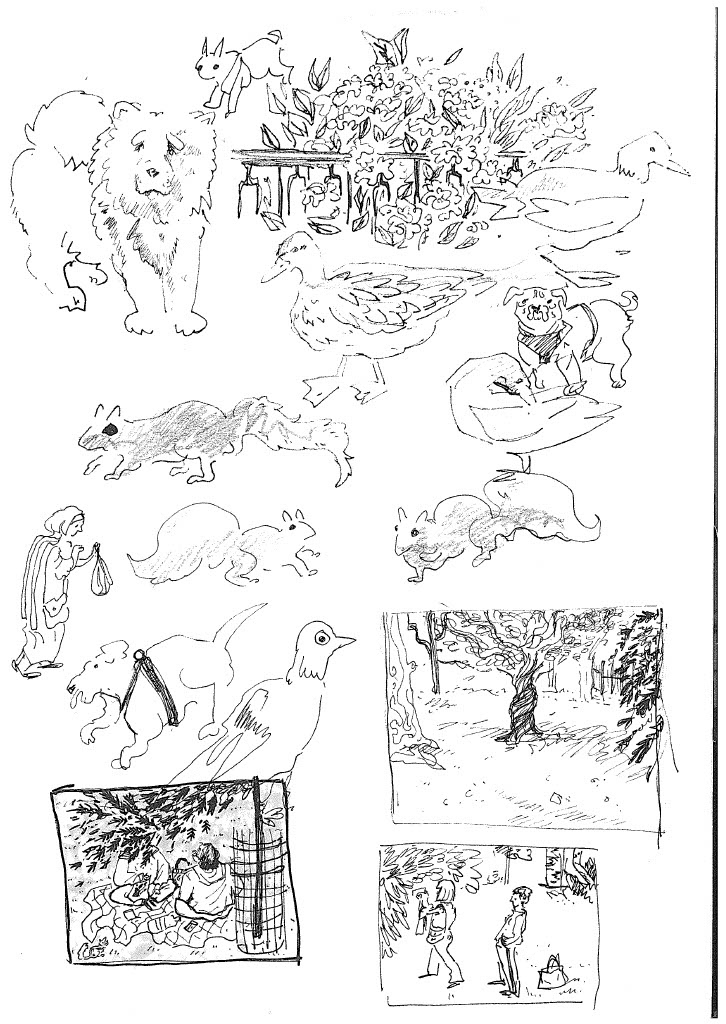
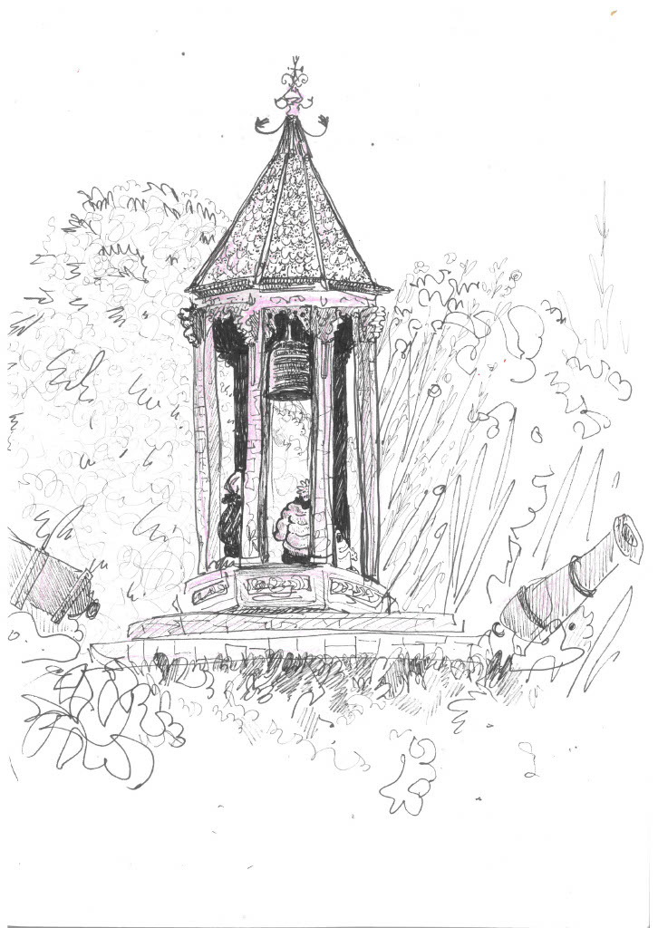
The brief, "Seeing and looking", makes me think of life drawing so I tried to search for something more interesting to draw at the park.
I was going to turn people I saw as I was walking by into recurring characters to create a story but I kept forgetting to keep their appearances the same.
In the future I'd like to do this again but with more focus on character consistency.
"Adults and children sometimes have boards in their bedrooms or living-rooms on which they pin pieces of paper: letters, snapshots, reproductions of paintings, newspaper cuttings, original drawings, postcards. On each board all the images belong to the same language and all are more or less equal within it, because they have been chosen in a highly personal way to match and express the experience of the room’s inhabitant. " Berger, John (2008). "Ways of Seeing"
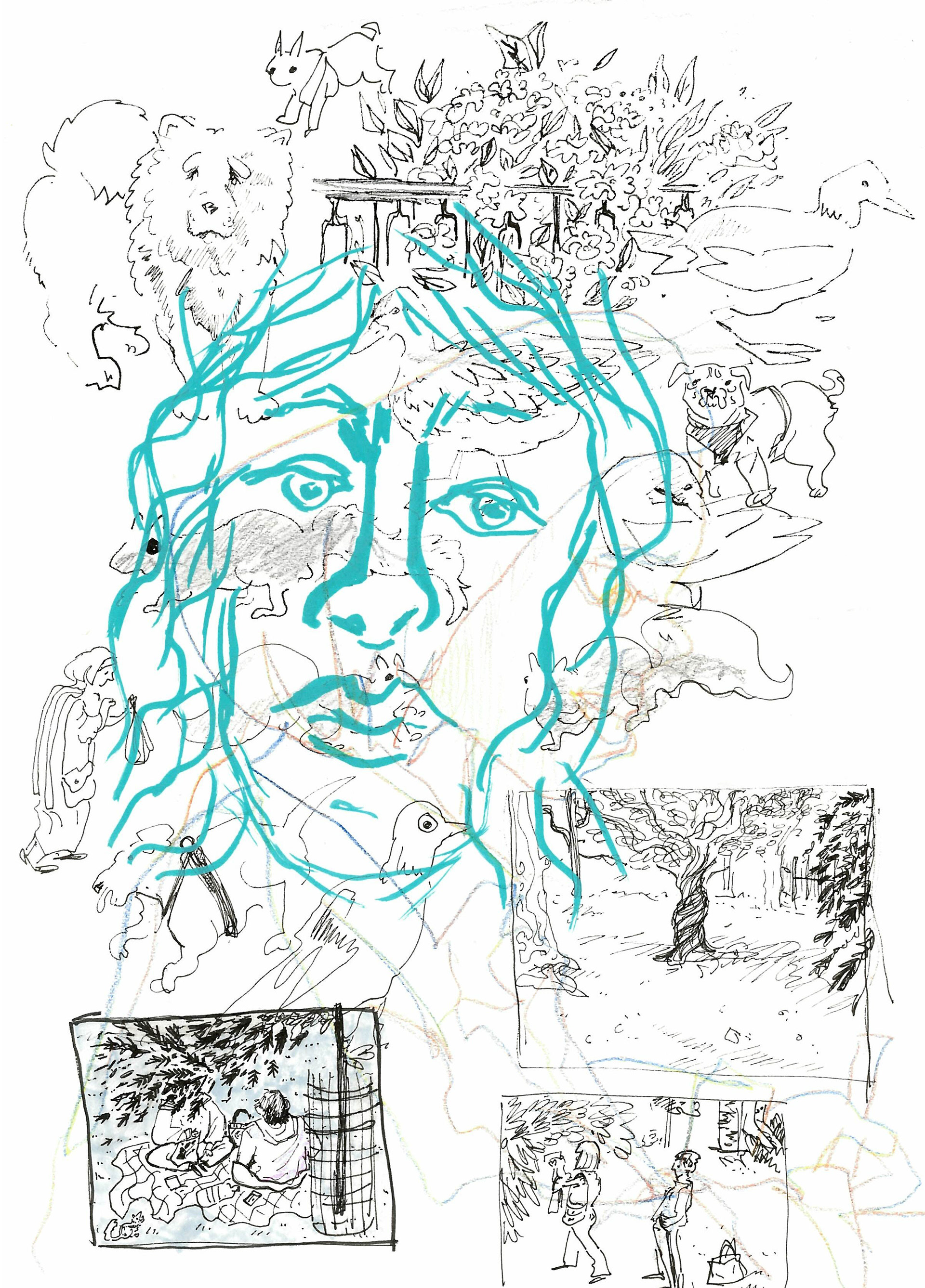
One of the biggest things that can influence the way we interpret an image is what is around it. Doing those sketches I was thinking about how we look at a crowded ensemble of images. I tried looking at the board by choosing one image to be the focal point of my vision or look at it has a whole object instead of fragmented images.
While I am used to analysing the technical aspects of the image (composition, colours, structures), I tend to not look into the meaning and how each element affects how the image is read as much.
During this brief, I want to start analysing the meaning of images on a deeper level as well as think more about what can influence the way interpret images.
When presented with the task, my first instinct was to try rearranging some of the photos into some sort of story.
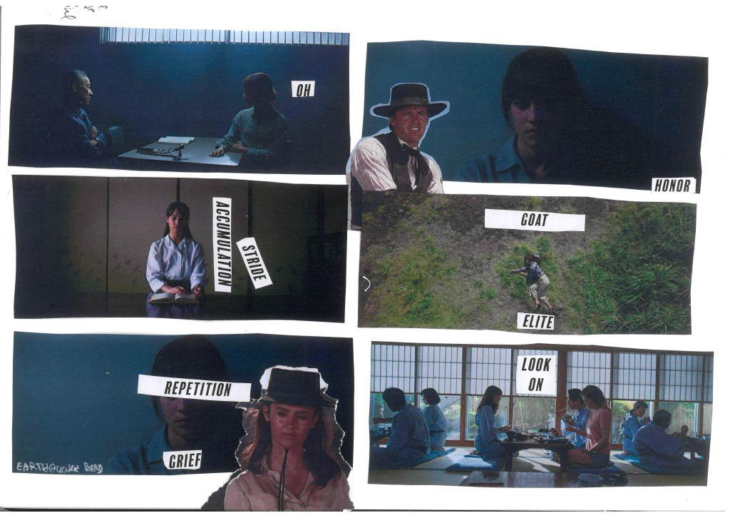
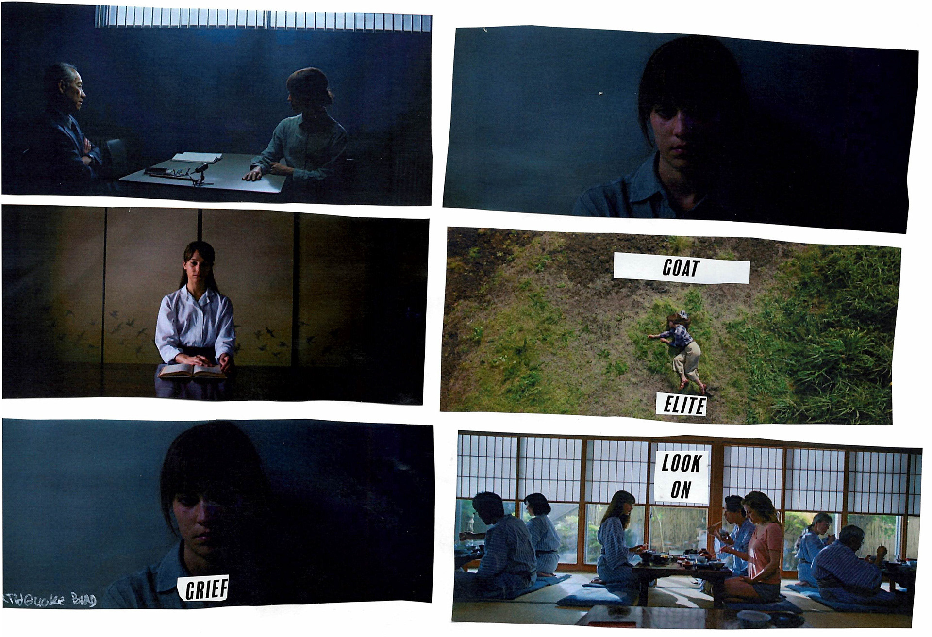
I work with collage quite often but I tend to create my own elements by cutting paper, so it was really challenging for me to try making something out of fully-fledged compositions that are quite striking on their own. Moreover, I tend to avoid using words in my work mainly because I find it hard not to make things too literal. Moreover, applying text over images I create tends to make me uncomfortable.
Since this project was already really challenging for me I decided to completely go out of my comfort zone and try to create images that are on the simpler side, focusing on maintaining the original screencaps' atmosphere.
I didn't really know what to do so I tried doing something ironic in the "GOAT ELITE" image. Also, at one point I added the cowboys thinking that they could be some sort of inner entities that can guide the main character through the story, but that isn't really evident in the final image, and it's also quite distracting. If I were to go back to this I would probably remove them.
My favourite image from the selection above is the "ACCUMULATION, STRIDE" one since I feel it's the only one that is successful in conveying something. In my mind, the character is at her breaking point, her feelings and problems are accumulating. "ACCUMULATION" matches her own posture and is vertical, the letters falling into place like water accumulating in a glass. "STRIDE" is diagonal, breaking off the other word; it's time to take action. Also. looking at the text as just another visual element helped me overcome the difficulties of working with words.
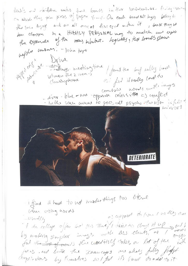
My second attempt went a bit better. I ripped the paper instead of cutting to match the vibe of the word "DETERIORATE".
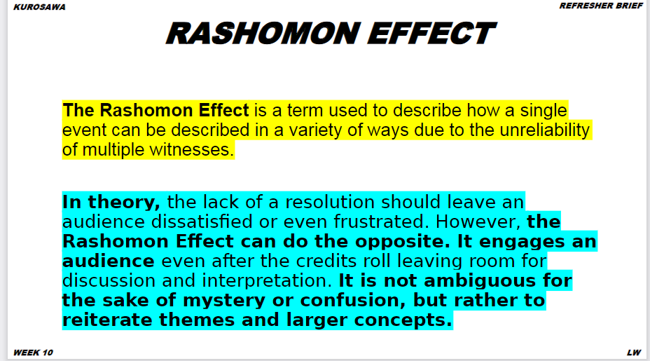
I wanted to specifically lean into the Rashomon effect and have an image that is more vague and can be read in a bunch of different ways.
Overall while this was really challenging, it was interesting to do so many things that I would have never done on my own. Working with limited elements forced me into trying to create simpler, cleaner illustrations which is something I've been meaning to get better at since my work can get quite cluttered and overworked.
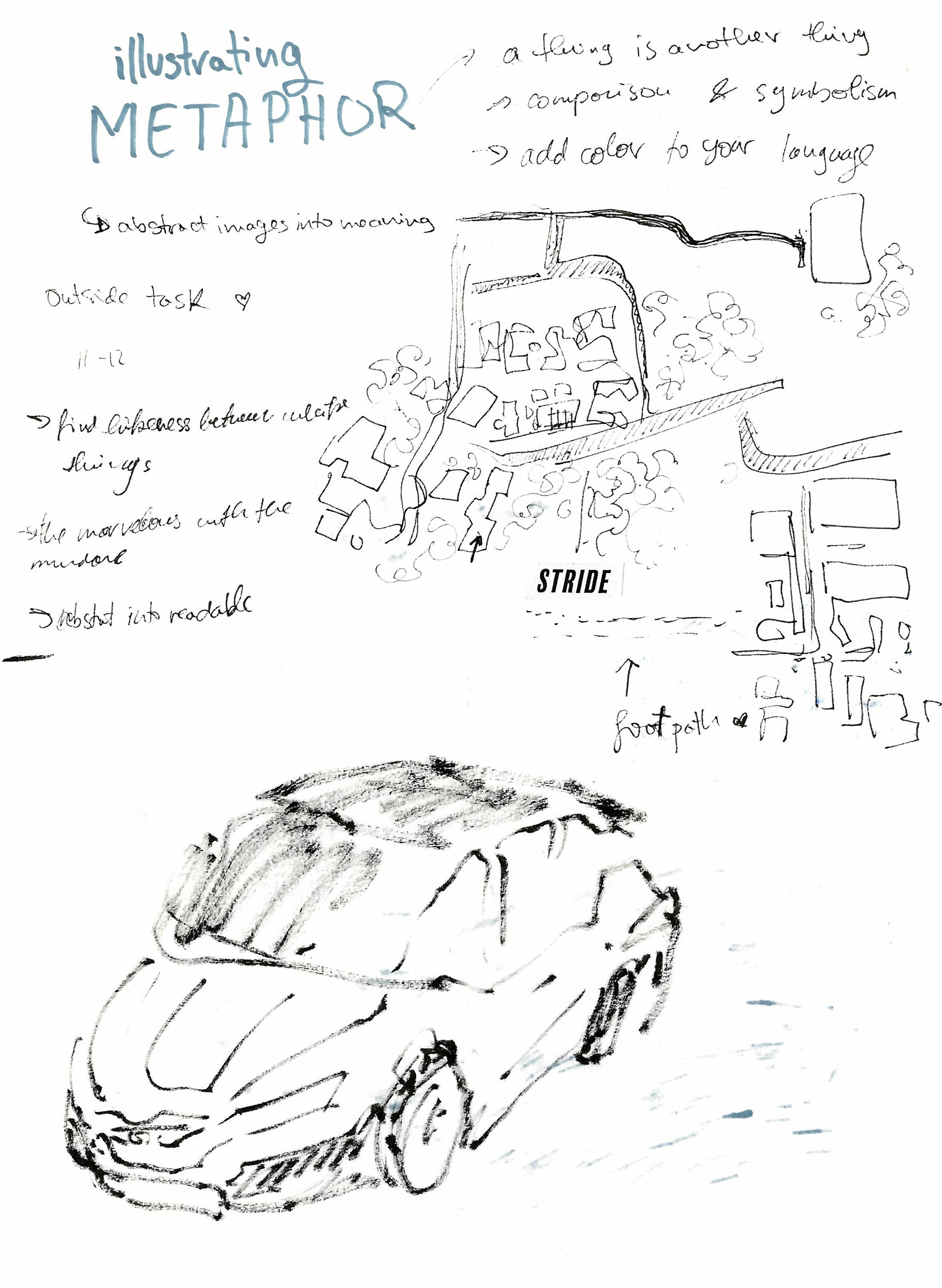
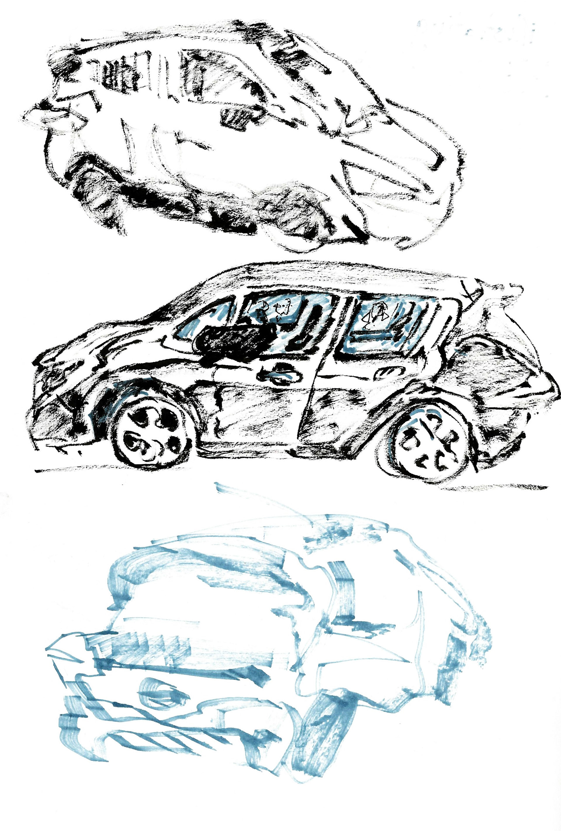
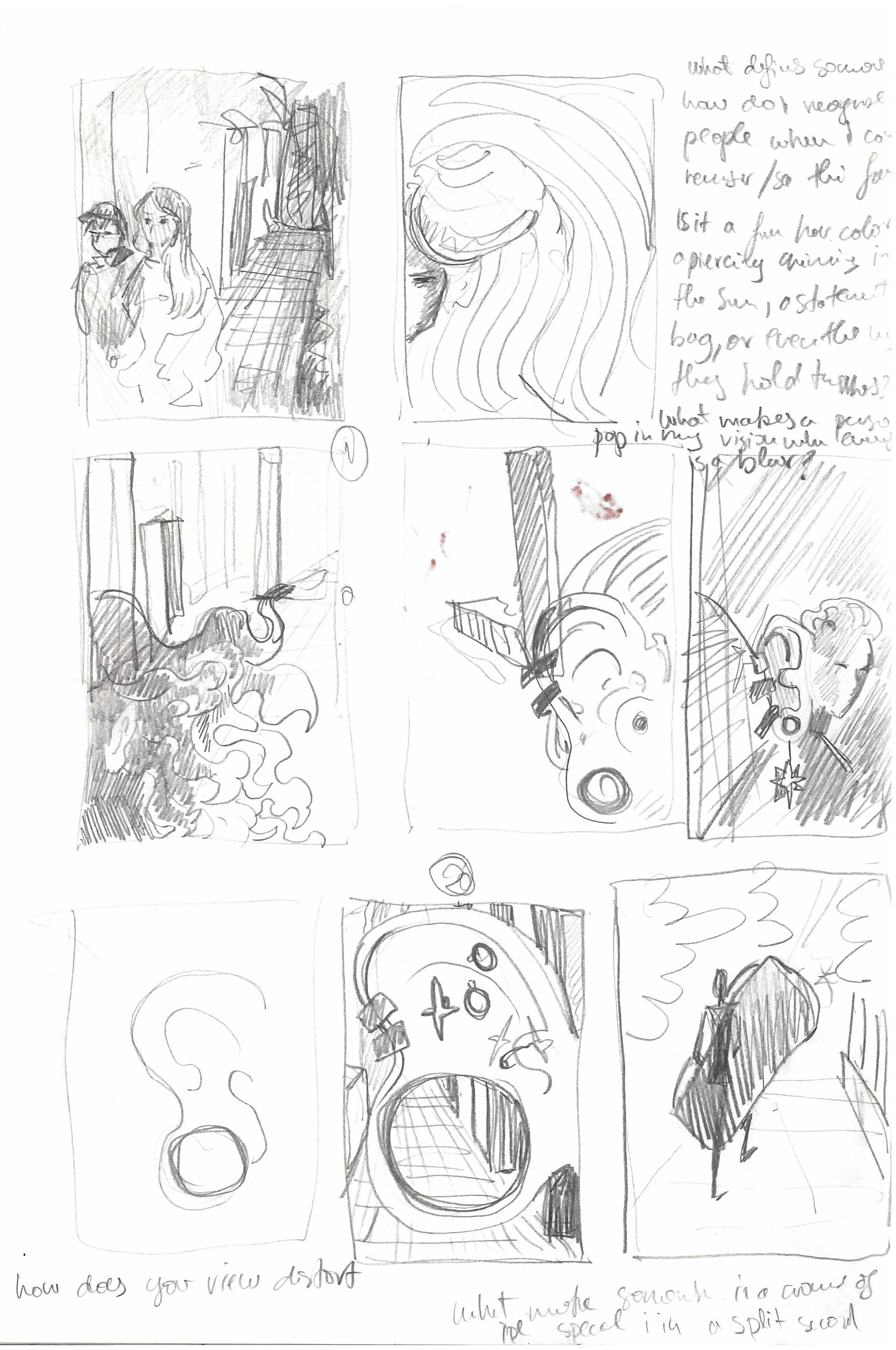
How to draw a car without drawing a car?
For the first drawing, I attempted to draw a car without drawing a car so I drew what I was seeing through the windows of the car instead of the car itself. Next, when the doors and hood of the car were opened I thought it looked a lot like a fish with very fabulous fins.
I didn't really understand the next task so I just drew a vaguely car-shaped scribble.
For the next task, we had to draw the car focusing on a small detail. I decided to go with the stuff inside the hood. This task made me understand the "ways of seeing" brief better, specifically how the fact that I had no idea what I was looking at made my drawing quite chaotic and unclear, reflecting my confusion.
The next task was to draw the car as something else (Home, Weapon,
Stage). I was thinking that since the car wasn't on and we sat around analysing it made it feel like a sculpture in a museum, it's static and its only purpose is to be looked at. Thus, I drew it as a block of marble being sculpted into a car.
Stage). I was thinking that since the car wasn't on and we sat around analysing it made it feel like a sculpture in a museum, it's static and its only purpose is to be looked at. Thus, I drew it as a block of marble being sculpted into a car.
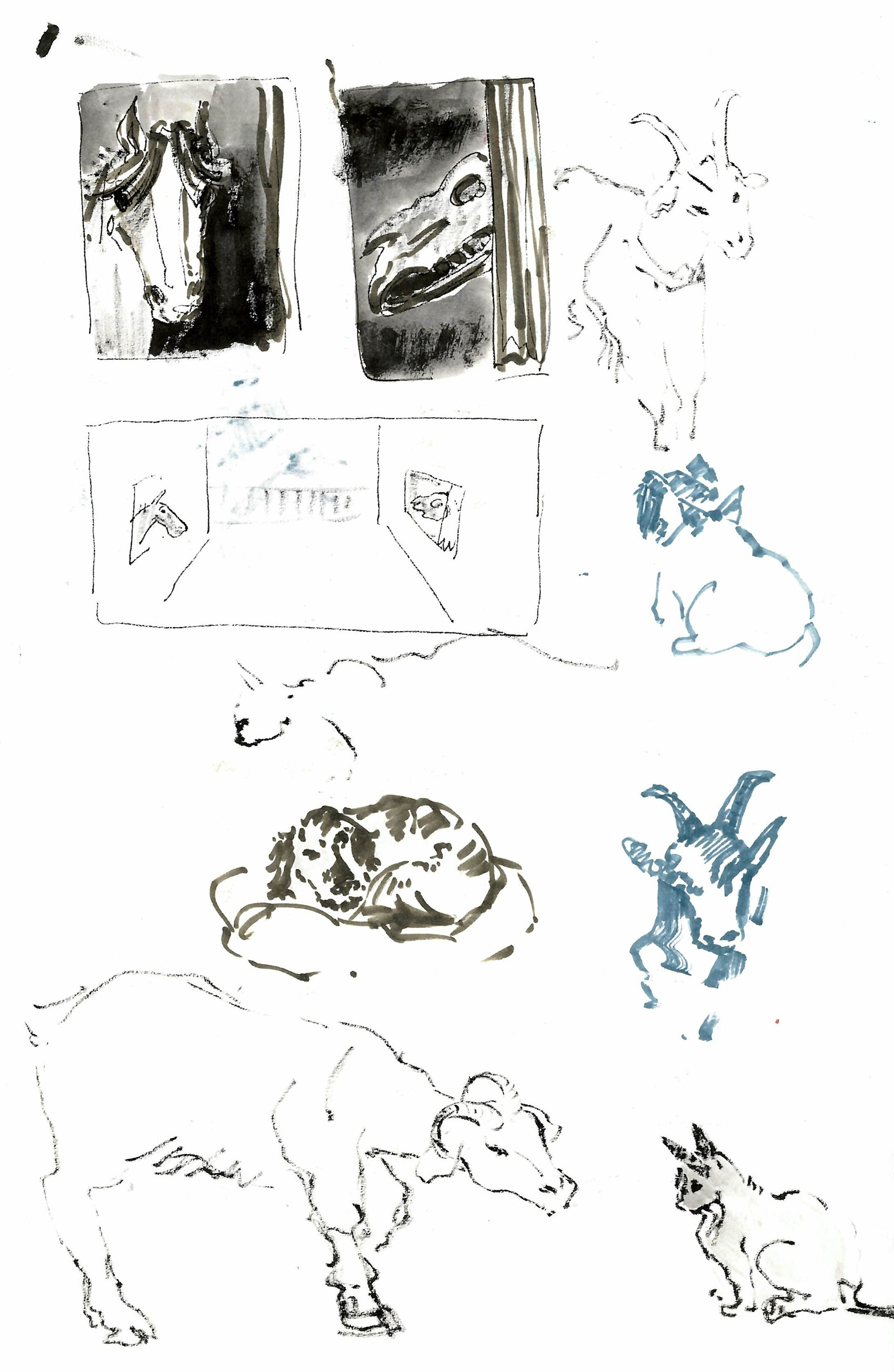
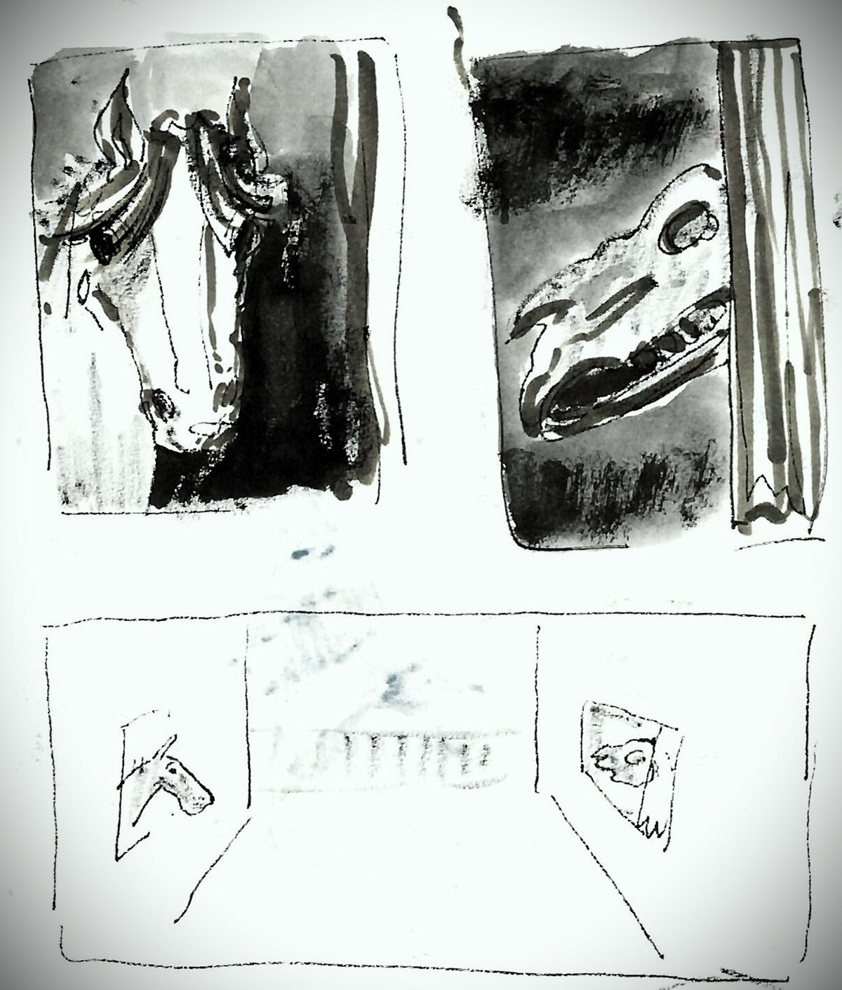
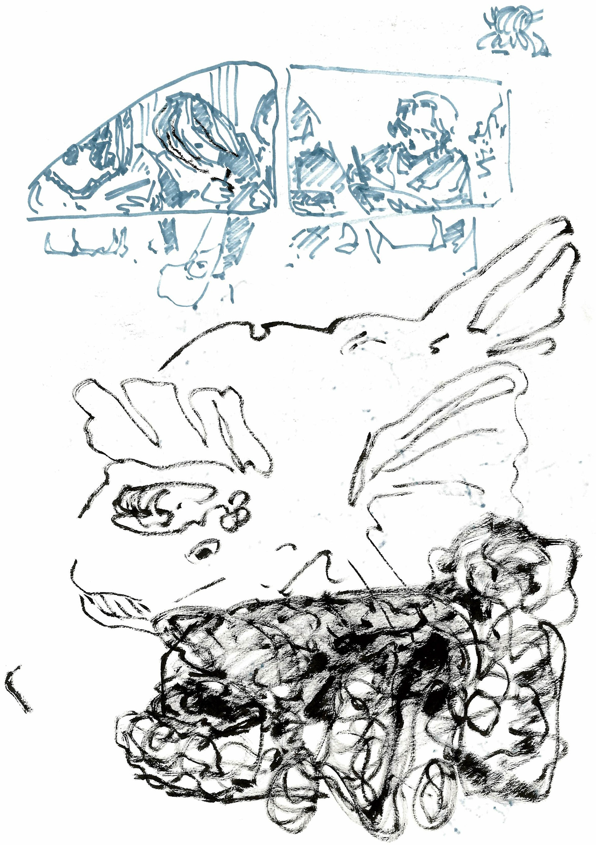
At the Brackenhurst campus, I noticed that the horse stable was right across a building with skeletons in it. As one of the horses was peeking its head out it seemed like it was having a staring context with its dead counterpart, kind of like seeing its future.
During this task, I found that I really enjoy lying about what I see with the purpose of drawing out stories.
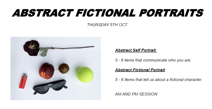
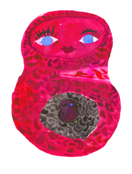
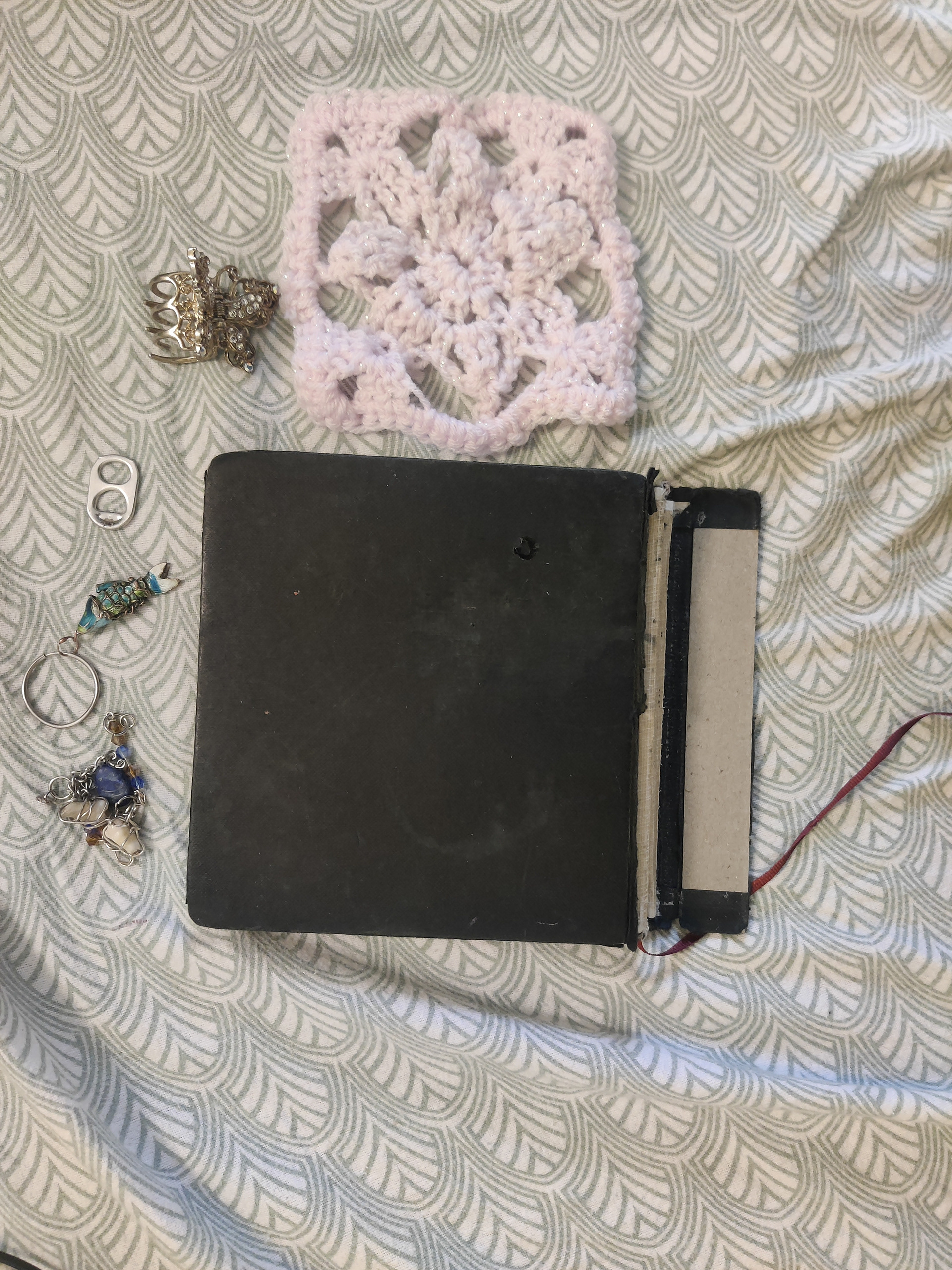
In the first part of this workshop, we had to select 5-6 objects that we think represent us. We were then assigned someone else's objects, and we had to draw what we thought the person looked like.
I thought it was really interesting seeing what people think represents them, as some people choose things they use on a daily basis, while others went with more sentimental options, or objects that they simply like, and even just stuff that represents their personality without them being emotionally connected in any way.
For my objects I picked one that has sentimental value, one that I bring everywhere, one that represents something I enjoy doing, one I wear, one I collet, and also my molar as in the end a part of me is what represents me best, at least on a physical level.
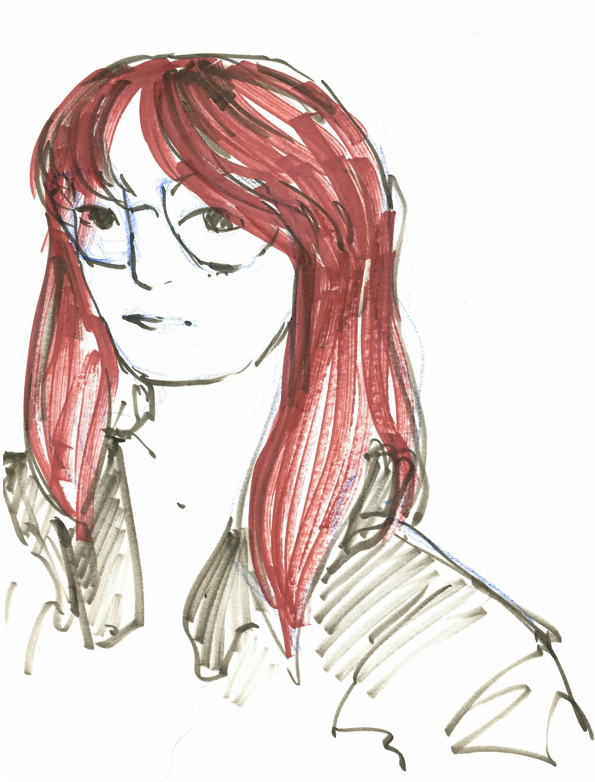
The objects that I was assigned included coloured pencils, a sketchbook, a book with a pretty cover, and a postcard.
Since some of the objects seemed art-related I decided to pick someone whose work on the course evokes the same mood as the objects.
While I didn't get it right, the person I drew had some objects in common with the person I was assigned, most notably the coloured pencils.
In the second part of this workshop, we did the same thing but using objects that represent a character.
While in the beginning, it felt easier than the previous task as it's more comfortable to make assumptions about a fictional being than about a person, it turned out to be more challenging because there are unlimited characters in the world.
During our discussion, we kept stumbling across the same issue in guessing the character, which is the fact that there are so many characters that fit into the same archetypes ( the mean popular girl, the stressed chef). I think this raised a lot of questions about what makes a character unique when there are so many similar ones. I feel like this would be a really useful exercise to try out when designing characters in the future as it might help in making a more developed and complex character that is memorable and stands out.
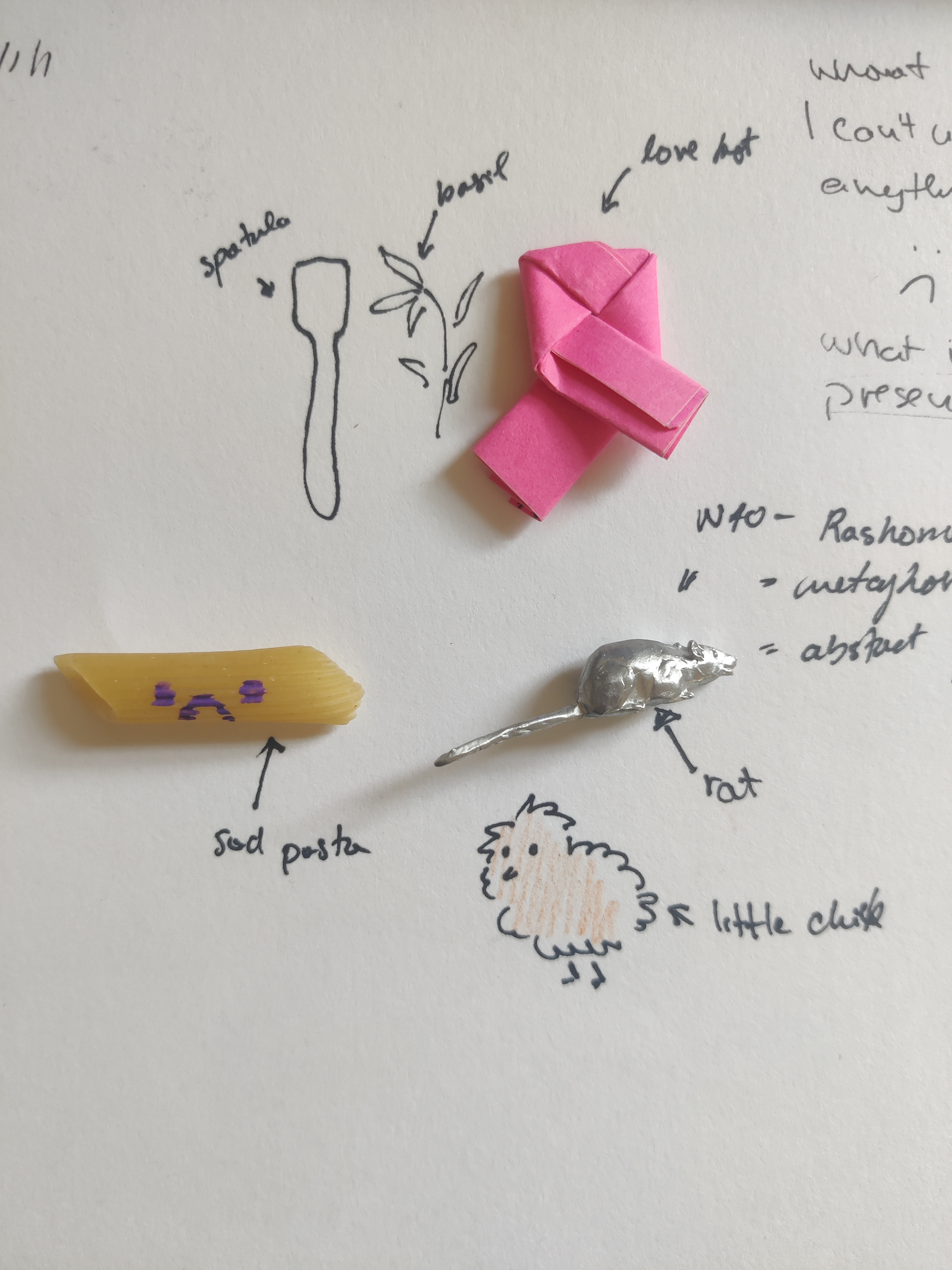
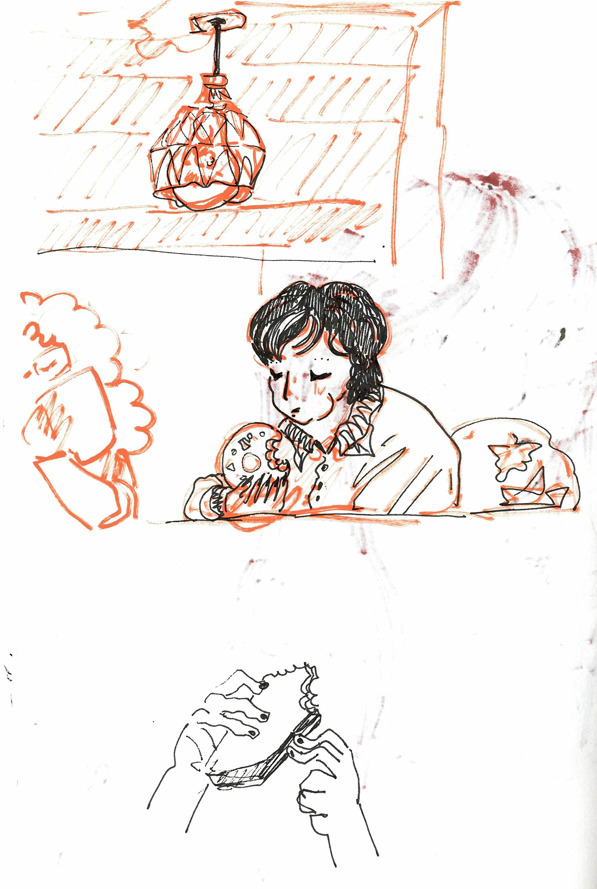
The objects I chose were meant to represent Alfredo Linguini from the movie "Ratatouille".
I didn't take a photo of my objects at the time so I drew the ones I lost on the way back home.
The spatula represents his journey as a chef, from trash boy to opening his own restaurant.
The wilted basil leaf is also a reference to his cooking, but also represents him as a whole: while he might be flimsy and partially wilted, he is still able to achieve many great things throughout the movie, just as the basil still brings a lot of flavour to food.
The pasta represents his Italian heritage while being a reference to his name. The pasta is sad because at the beginning of the movie, he is unaware of his family history (his father is a famous chef) and because he has so much untapped potential.
The rat represents his friendship with Remy which completely changed his life.
The little orange chicken is meant to represent his appearance and also his cowardly nature at the beginning of the movie ( he takes credit for Remy's work and is scared to admit that he got help from a rat).
I really wanted to have an object that represents his love for Colette as that is his main drive throughout most of the movie. I ended up making a love knot.
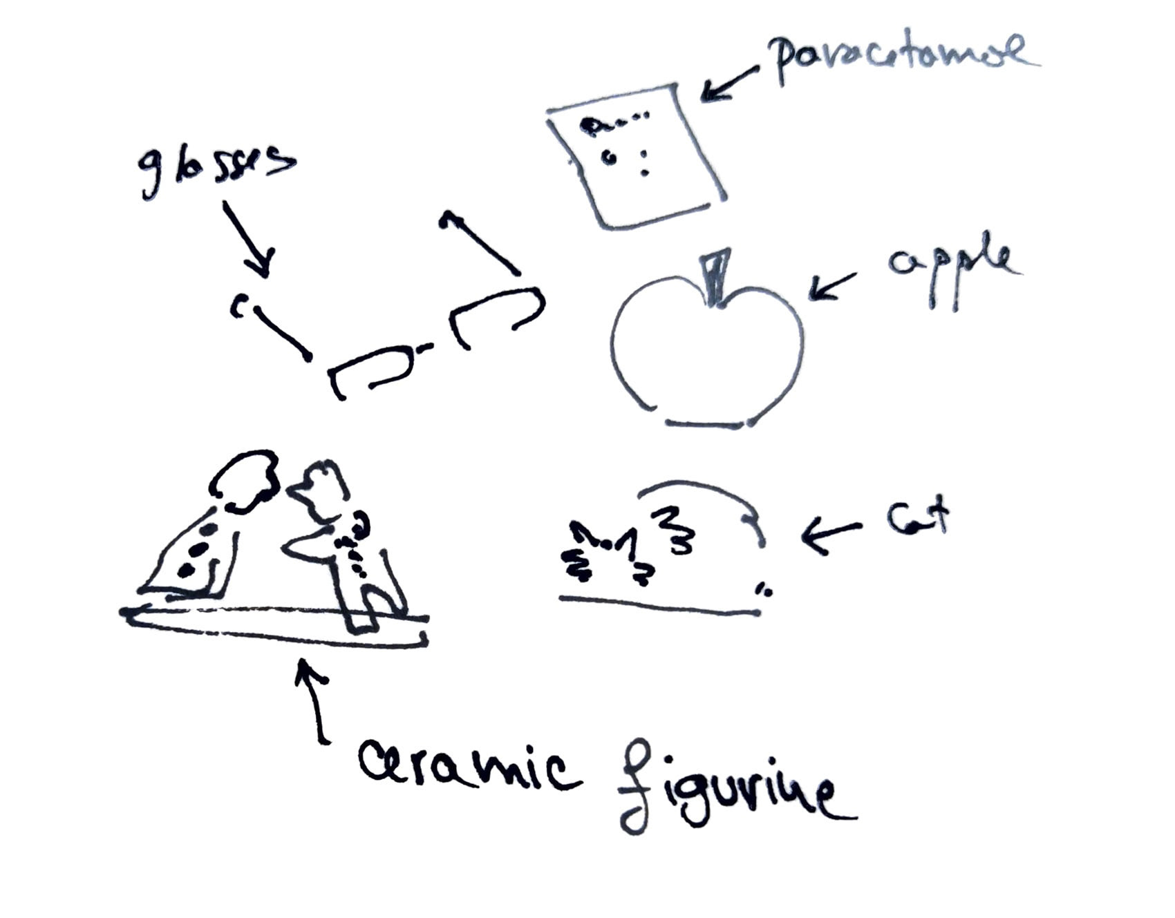
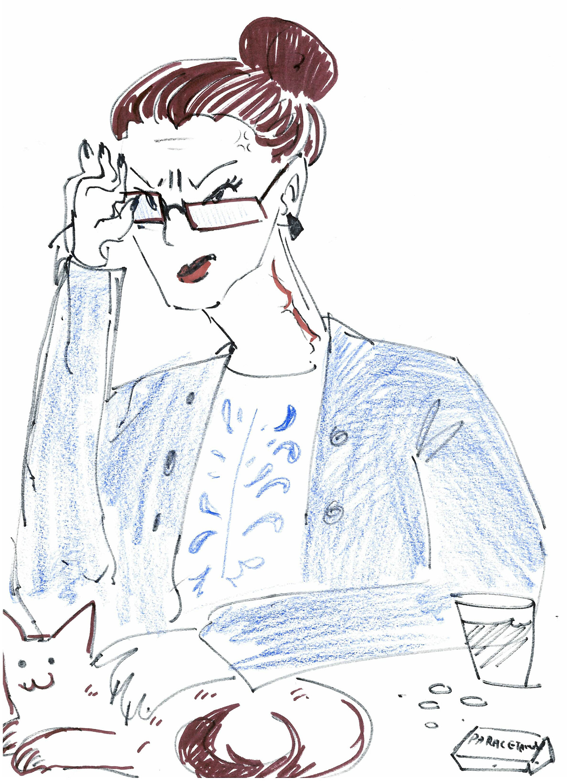
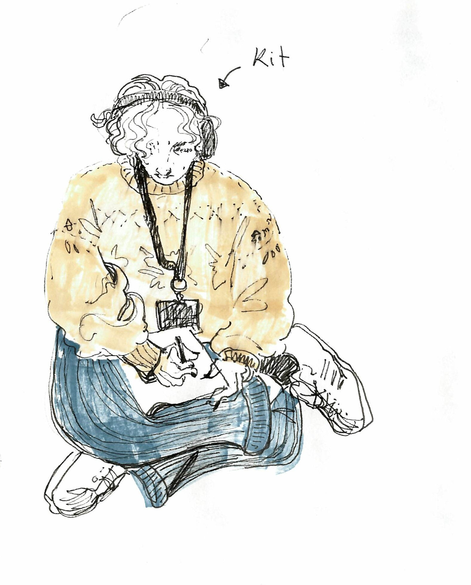
The objects that I was assigned didn't make me think of any pre-existing character so I decided to draw more of an archetype.
What came to mind was a very stressed middle-aged middle school teacher who gets constant migraines, her only joy in the world being petting her cat. The glasses and the ceramic figure made me think that she might be on the older side as old people are known to collect such ceramics and the apple made me think that it's a teacher.
After the workshop, I consulted with the owner of the objects and the character was supposed to be an "old crazy cat lady".
This task made me start trying to be more conscious about what connotations certain objects bring.
Overall, I feel like this week I truly started to understand what "Ways of seeing" refers to. It was quite a thought provoking journey that made me change the way I observe things.
When I was walking back from lunch I passed by someone I knew, but I only realized who they were when I saw the back of their head.
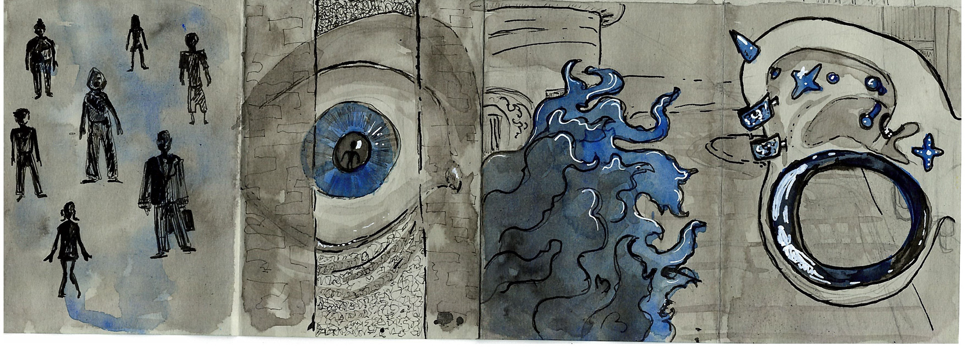
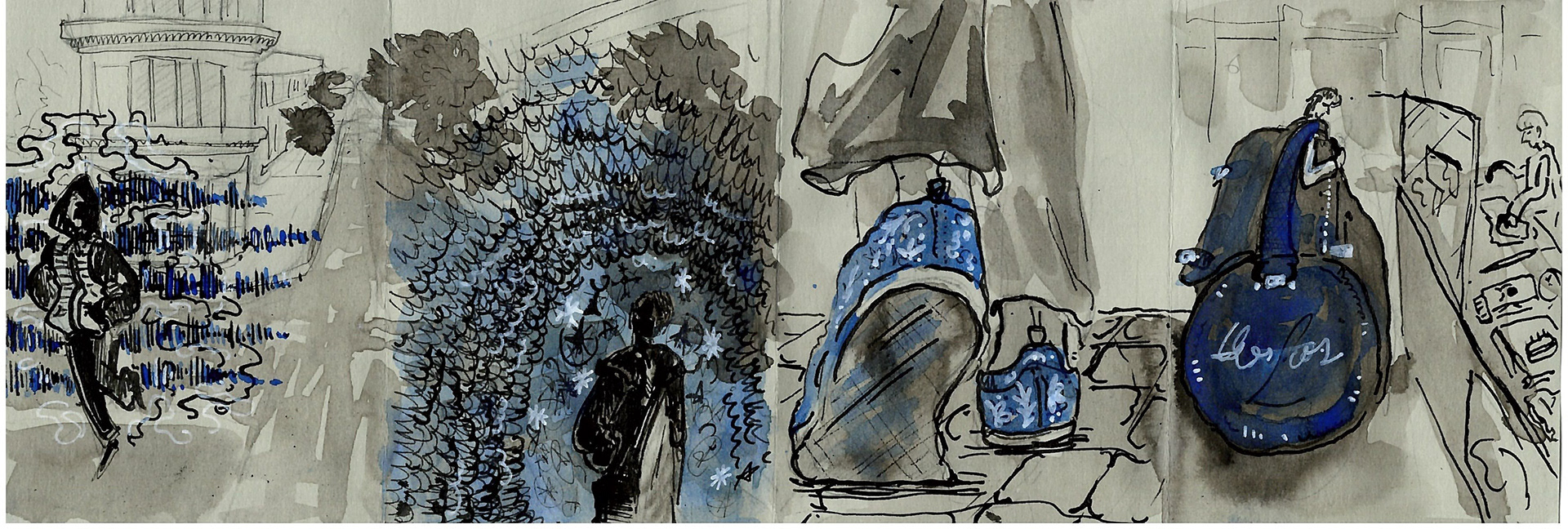
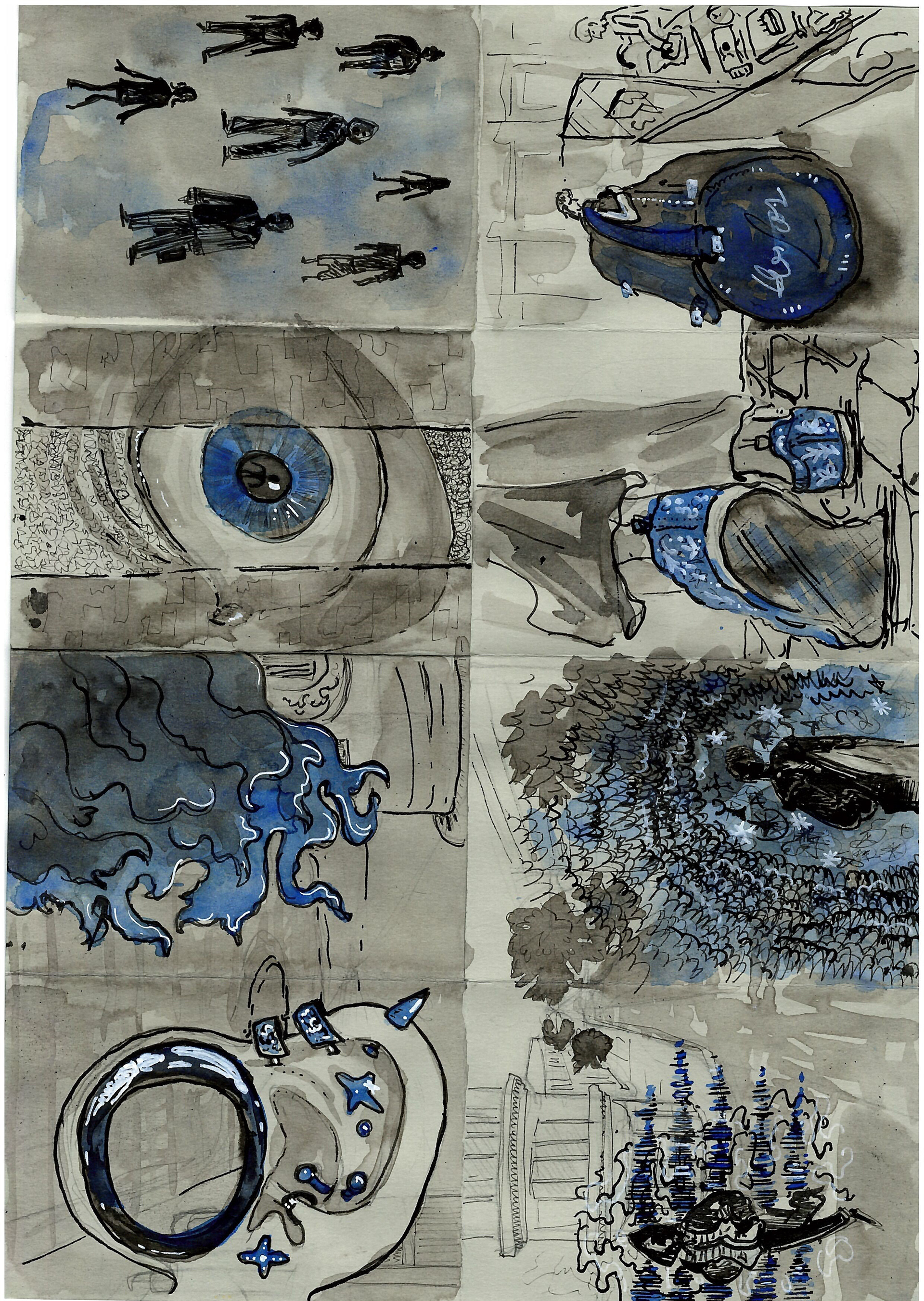
As my eyesight is quite poor when I don't wear my glasses, I can't really see people's faces. So, to add to this brief, I wanted to make a zine inspired by how I see and recognize the people I know. I think this was also a good opportunity to try and visually represent non-visual things like smell and sound.
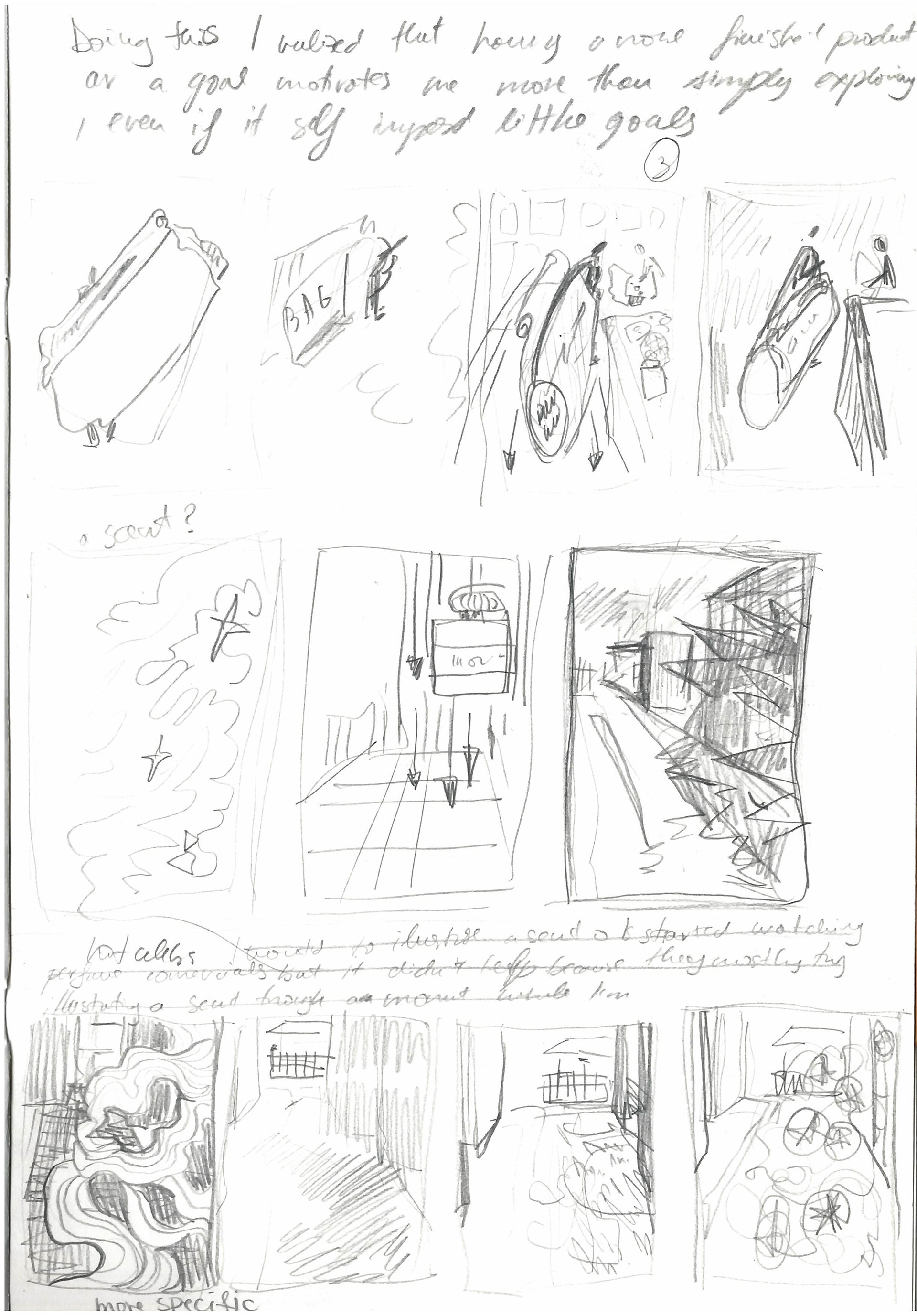
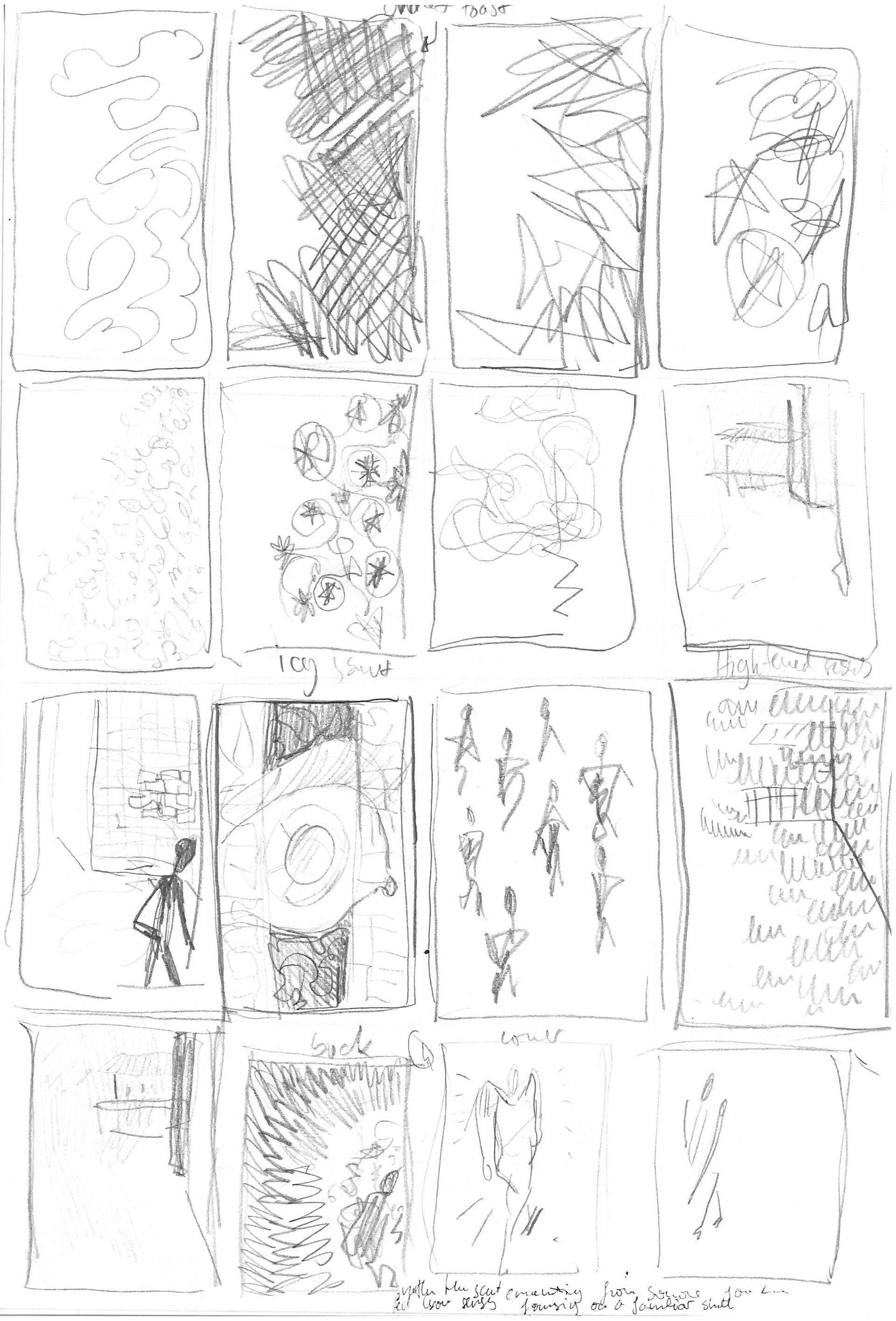
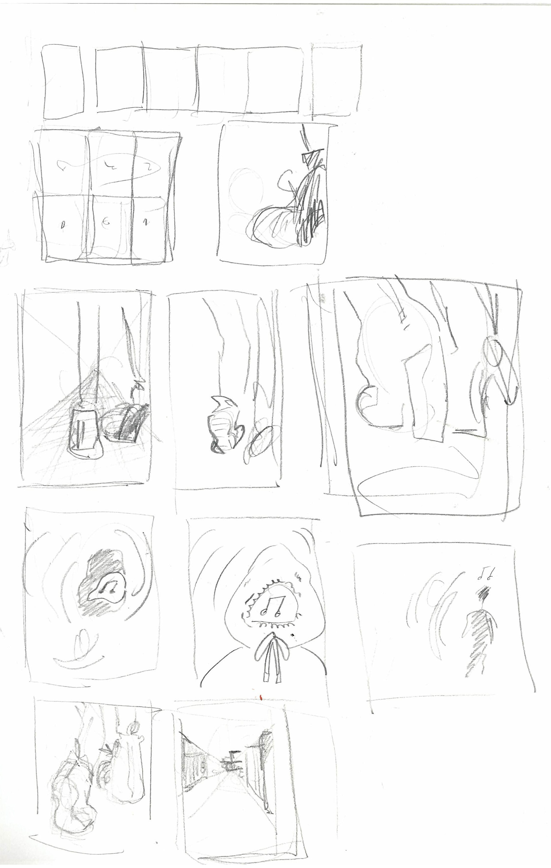
I chose to draw the most significant ques that can make me recognize a person without seeing their face which are: hair, an ear that stands out, the sound of their voice, their perfume, the way they walk, and their statement wearable pieces( here it's a bag). The cover is a simple eye spotting a person.
Smell was definitely the most difficult to draw; at one point I was just testing different types of scribbles to see which could show the specific perfume I was thinking of. I would say the final panel is a half-success as, at least to me, it does give the impression of smell, but since I went overboard with the lines it makes the person look like they're emitting unpleasant, scary smells.
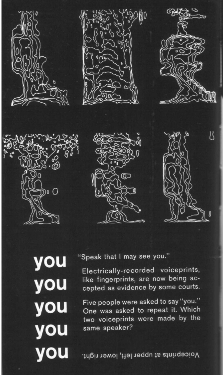
For the voice sketch, I was initially inspired by the voiceprints Marshal McLuhan talks about in his book 'The Medium is the Massage'. In the end, I decided to not go with this as it's not very clear what they are in the context of the zine, and I went instead with sound wave lines.
For the rest of the images I mostly just made the objects the focus oversized and popping towards the eye using perspective.
Making this zine was quite an enjoyable experience.
The main reason I chose to do it was because this brief made me rethink a lot of stuff from first year, such as how I didn't really experiment with more conceptual ideas, even though we were encouraged to do it. One of the things that we were asked to do but I never tried was to attempt to represent sound, smell, or other non-visual senses through visual imagery.
I figured that since we got this non-graded brief to start of the year, I should try to go back and look at some of the things I avoided/ didn't get to do.
Back then, I avoided doing a lot of things because I did not fully understand them or because I thought it might be too difficult. By starting of the year with this I wanted to set a positive example for future me by showing that I should at least try everything that is suggested to me, even if I don't think that it will turn out well.
For this task we had to pick our favourite image and give it to someone to draw over, while simultaneously drawing over someone else's image
before
after
Respecting someone by engaging and respecting someone by diminishing yourself
At the beginning of this task I was feeling quite confident in giving away this image but my opinion changed when I got it back.
The blue portrait stands out a more but it looks much less deliberately placed than the orange one. It feels as if it's not from the same universe as the original image, almost inviting me to peel it of. It's looking straight at me trough the page, taunting me. While it does change the original image, I don't feel like it necessarily adds to it in any way, as it's too far removed from the context of the page.
In contrast, I quite like the orange portrait. The fact that it's softer makes it feel like it could be part of the page, while the angle (profile, looking down) makes it feel like it's looking at the images below, lost in thought. It almost feels nostalgic, similar to how I feel looking back at old drawings.
Overall, I think with both images overlayed it ends up looking quite messy. In the beginning I was a bit upset about it, but after I thought more about it I realised that it's not about my drawing (which I could also just print out), but about the act itself. After that I started thinking about the act of boldly going over my drawing as an act of respect by fully engaging in the task as a whole, which is a good thing regardless if I like the drawing or not.
I think this task was a great way to work collaboratively, as usually with group projects, when they aren't anonymous like this one, people tend to not insert themselves into someone else's idea as much, making this really good practice for future professional projects, when people tend to overlap ideas more.
In the drawing that I made over people's work I didn't want to do something too bold, especially in the first one where I drew on another layer to avoid upsetting the person.
If I were to do this again I would probably try to come up with a better way of changing the image in a significant way instead of just drawing over it thoughtlessly.
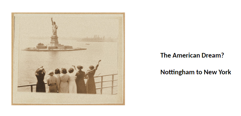
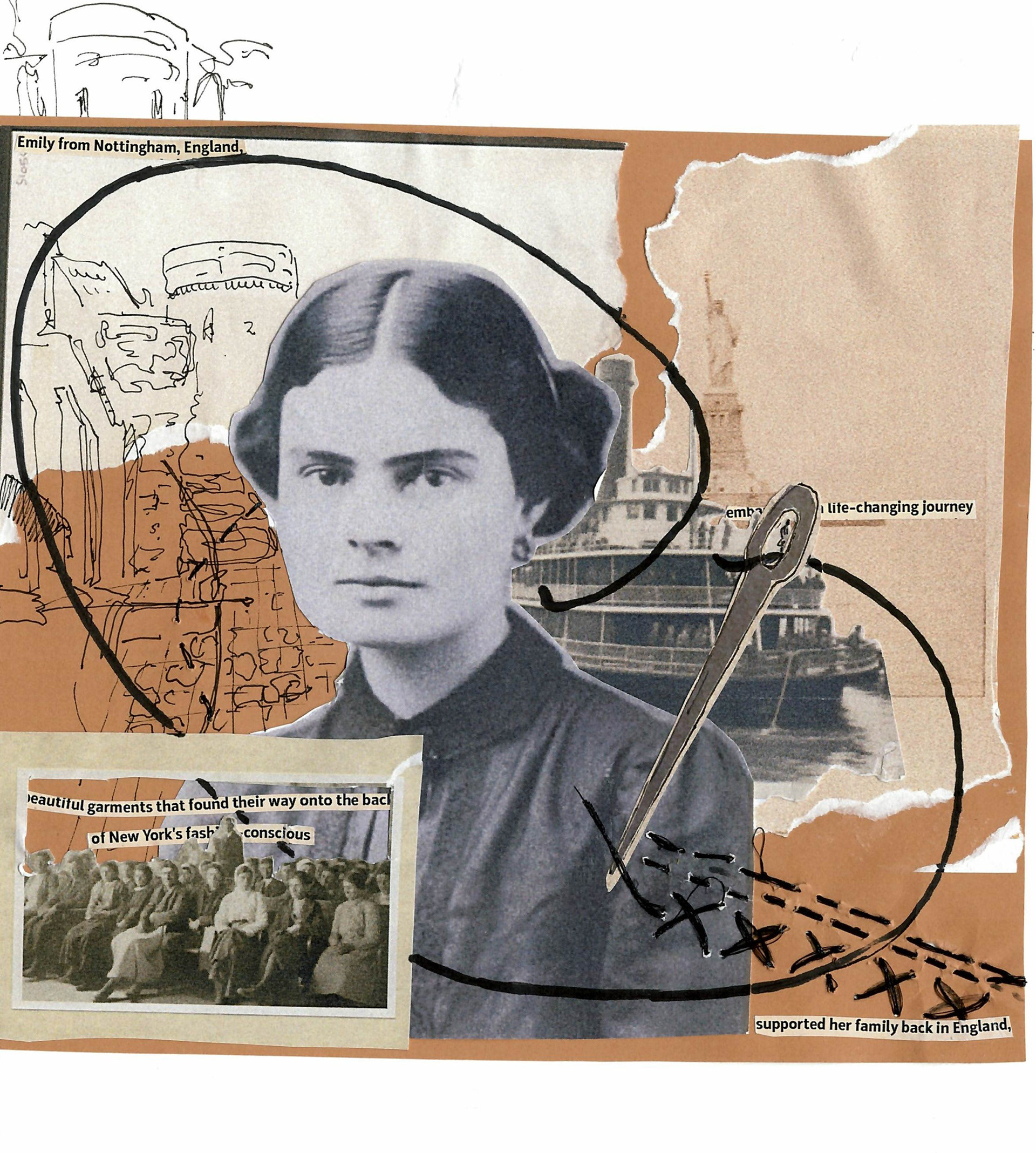
I made the first collage before the reveal.
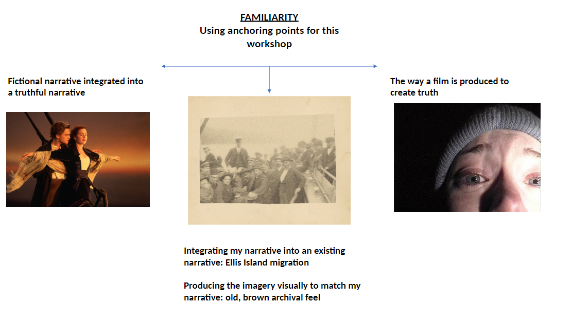
I tried to incorporate general elements that can depict a journey, as well as Emily-specific elements, mainly the fact that she was left to become a seamstress, so I used a piece of thread attached to a needle to guide the viewer through her journey, as her life journey was also dictated by the fact that she was a seamstress. The needle is circling a person on the boat that is supposed to be her.
Working on this collage made me feel quite guilty as I thought that this was a real person and I was using images not related to her to essentially fabricate her story.
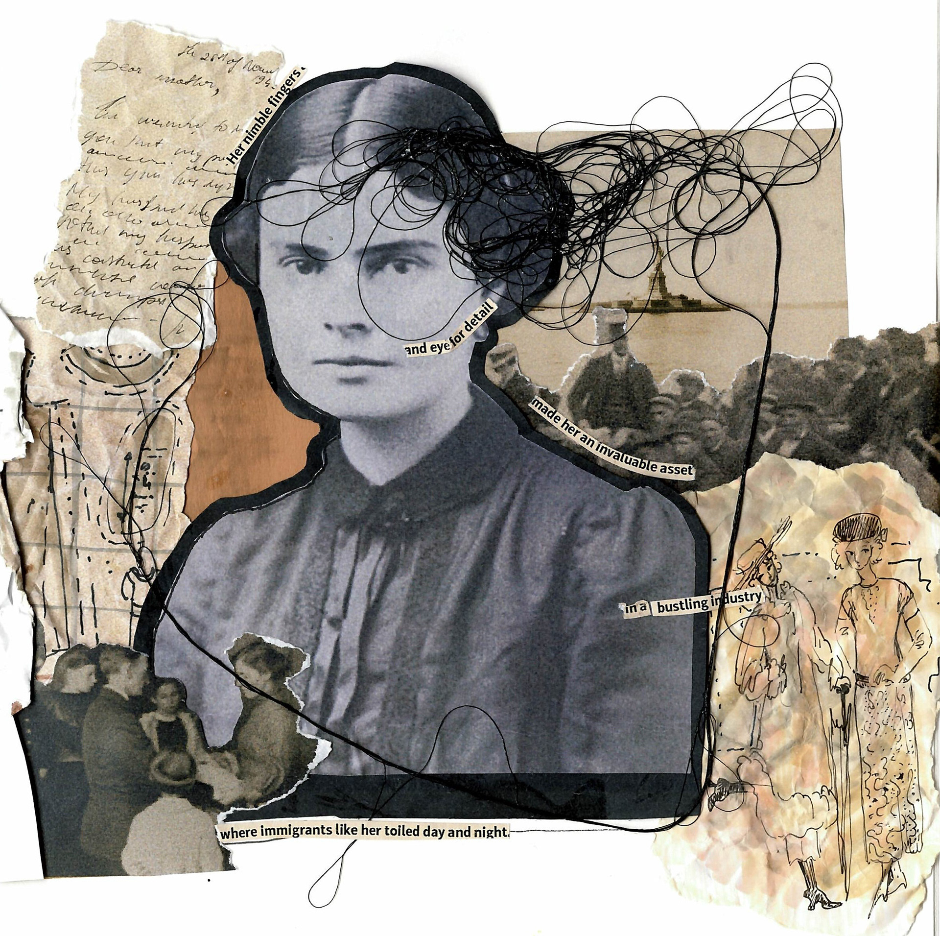
I finished the second collage after we found out that we were lied to.
The knowledge that she isn't real and that neither are the photos made me feel more comfortable lying about her life story.
Here I added a fake letter to her parents as well as clothing patterns that she could've made. Before I knew she didn't exist I hesitated to do this as I couldn't find any info about her or her work and I didn't want to lie about it.
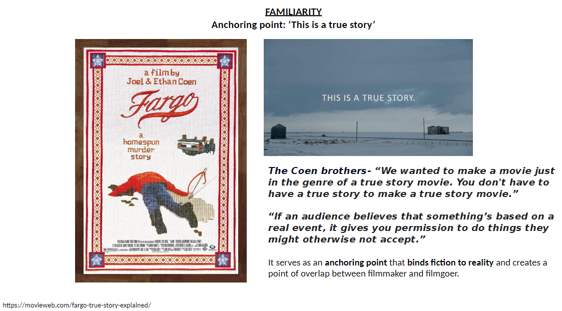
After the reveal, I can see that making this image was very similar to creating a movie about a true story. Lying to create a narrative can be a great way to bring awareness to real events, in some cases being more efficient than news or other, more factual, information-sharing methods. It can make the public more engaged and more empathetic towards the people taking part in said event as they can also partake through the eyes of a character, offering a subjective view as opposed to the objective view we are used to when we observe events far from us or from a different time period. Creating a narrative about a true story, that is made up but still sensible and factual enough can also reach a wider public by being more palatable that simply listing information.