
Bibliography
Castrillon, m., n.d. Melissa Castrillon Illustration. [Online]
Available at: https://www.melissacastrillon.co.uk/
Available at: https://www.melissacastrillon.co.uk/
Crossman, S., 2021. The play cure. aeon.
Rollins, J., 2021. 'Purpose-Built' Art in Hospitals : Art with Intent. s.l.:Emerald Publishing Limited.
When we were initially presented this opportunity I knew I definitely wanted to try it out since I have very minimal experience with commissioned work, but I was also feeling quite uncertain about it because of the same reason.
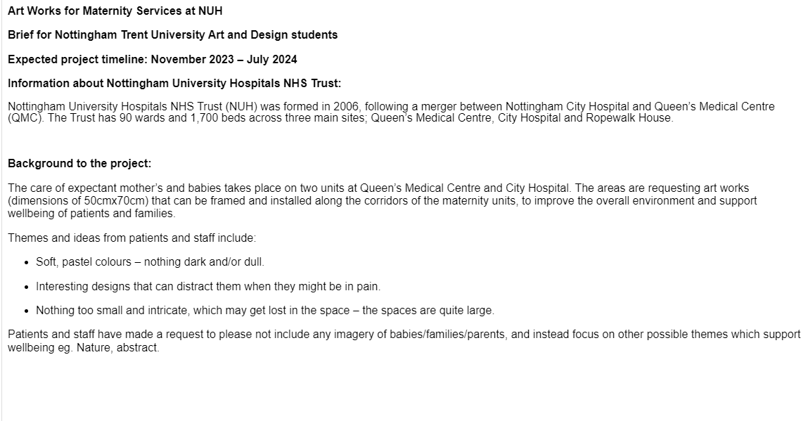
I decided to go to the briefing to learn more about it before making a decision, and in the end I decided to do it since it is a good opportunity to gain some work experience in a university environment which makes me feel a bit less pressured and worried about failing, but also because I found it exciting to design work that will be able to distract people when they are feeling intense worry or panic. I think almost everyone has felt intense panic over something that they could not change or help with, so providing something to distract the patients or the people accompanying them can bring them some momentary relief, which made me inspired to be working on this brief because of the opportunity to help people, even if it's not in a very significant way.
I do not know a lot about hospital art or art that is meant to soothe people feeling distressed so the first step was to do some research on the topic.
While researching the topic of hospital art I found that there is a lot of debate about what fits best since art can be so subjective, so there are many opinions about what art in hospitals should encourage, for example if it should be soothing and relaxing to comfort the patient, or exciting and vibrant, to take their minds somewhere else? Should it be simple to soothe the eyes, or complex and detailed to work as a distraction and challenge the patient? Or should it be a combination of all of those?
Art that can promote well-being is not one size fits all. Therefore, for this brief, I explored some different types of art to try and figure out a way to promote well-being to as many people as possible.
“Arousing Curiosity: When Hospital Art Transcends” proposed that curiosity theory is a rationale for why viewers are drawn to certain works of art and not others in a health care setting or elsewhere (Rollins, 2011). If there isn’t something about the art – whether “soothing” or “challenging” – that causes viewers to pause for a moment, how can we expect viewers to be drawn in and the art have the opportunity to do the work it is intended to do?
Rollins, Judy. 'Purpose-Built' Art in Hospitals : Art with Intent, Emerald Publishing Limited, 2021. ProQuest Ebook Central, http://ebookcentral.proquest.com/lib/ntuuk/detail.action?docID=6587180.
Created from ntuuk on 2023-11-02 13:35:58.
Rollins, Judy. 'Purpose-Built' Art in Hospitals : Art with Intent, Emerald Publishing Limited, 2021. ProQuest Ebook Central, http://ebookcentral.proquest.com/lib/ntuuk/detail.action?docID=6587180.
Created from ntuuk on 2023-11-02 13:35:58.
Initially, I wanted to come up with something more abstract, such as some kind of pattern. Rollins(2021), in her work ''Purpose-Built' Art in Hospitals : Art with Intent, Emerald Publishing Limited' affirms that art needs the 'perceptual and emotional involvement of the viewer', meaning that a more ambiguous or abstract image leaves the viewers more room to interpret it, making them more involved in the process of looking at art. ''Thus, a work of abstract art, with its lack of reference to identifiable forms, puts greater demands on the beholder’s imagination than a figurative work does (Kandel, 2016). Kandel (2016) adds, “Perhaps it is these demands that make abstract works seem difficult to some viewers, yet rewarding to those who find in them an expansive, transcendent experience”(Rollins, 2021).
Moreover, when in a stressful situation, something that is effective at distracting people and helping them regulate their breathing is counting, so I was also considering making something detailed with colourful repeat elements to attract the viewer towards it and to give them a simple activity to do to divert their attention.
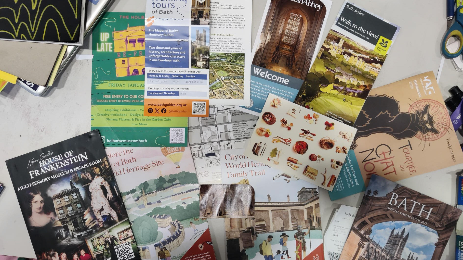
While thinking about a design, I was also looking at this cafe wallpaper which felt like a good example of a distracting design because of the combination of lines and dots that can take the viewers eyes on a ride across the composition.
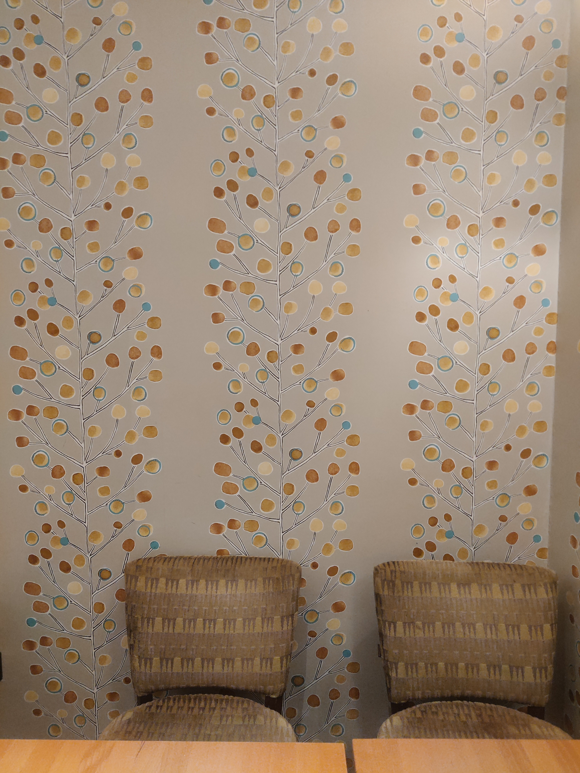
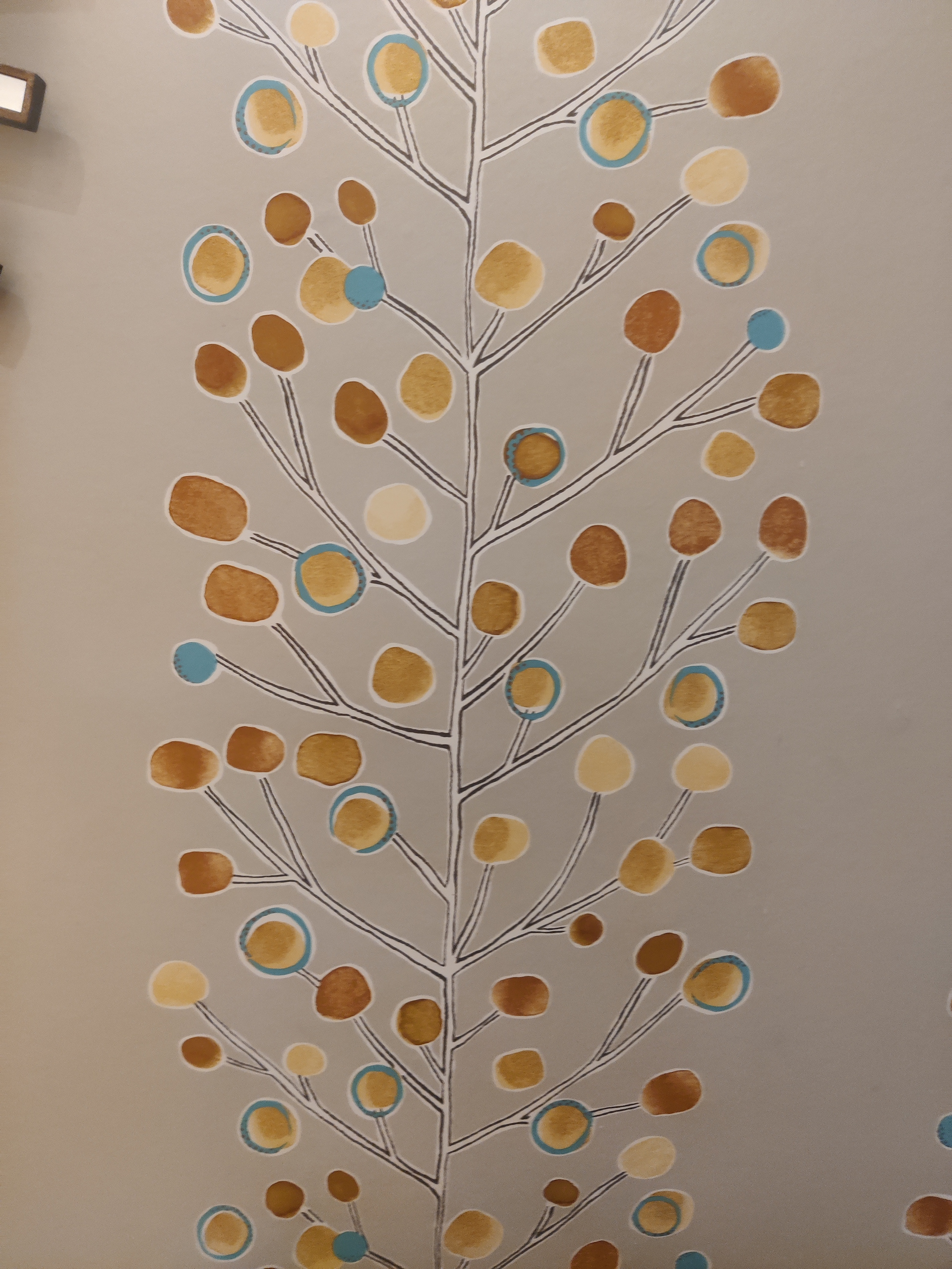
After this, I decided I should further explore the brief, since abstract patterns or art can prompt divisive responses from the audience, and the hospital is not the appropriate place for that. Also, the brief states that the designs should not be too small and intricate, but for an abstract pattern to be interesting and hold peoples attention, it needs a good amount of detail, possibly making it hard to see.
Instead, I decided to explore a topic that is more universally appreciated, such as nature.
According to research one of the best subjects for hospital art is nature, specifically trees: 'A positive distraction is an environmental feature or element that elicits positive feelings and holds attention and interest without taxing or stressing the individual, and thus may block or reduce worrisome thoughts (Ulrich, 1981). Research findings indicate that responses to positive distractions also include positive physiological changes (e.g., reduced blood pressure). The most effective positive distractions are primarily elements that have been important to humans throughout evolution: (1) happy, laughing, or caring faces, (2) animals, and (3) nature elements, such as trees, plants, and water (Ulrich, 1991). Positive distractions can include certain types of music, companion animals such as dogs or cats, laughter or comedy, certain art, and especially nature. The notion that visual exposure to trees, water, and other nature tends to produce restoration or recovery from stress dates as far back as ancient Rome (Ulrich & Parsons, 1990).’ (Rollins, 2021)
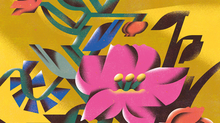
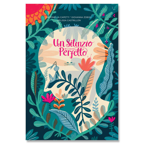
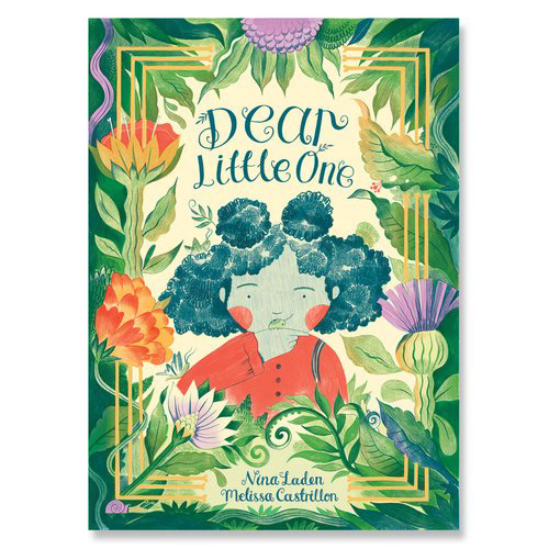
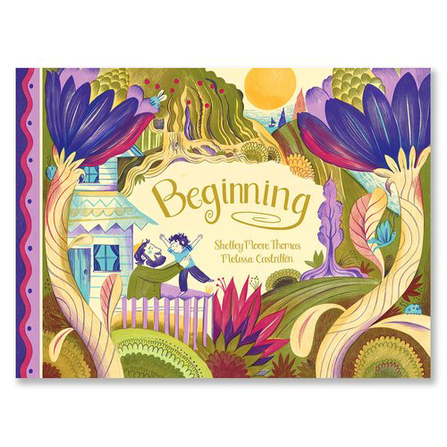
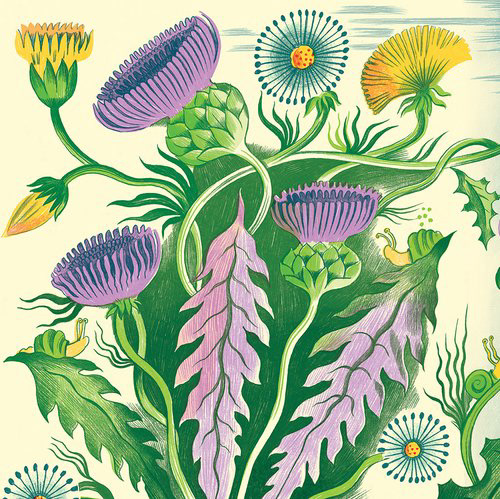
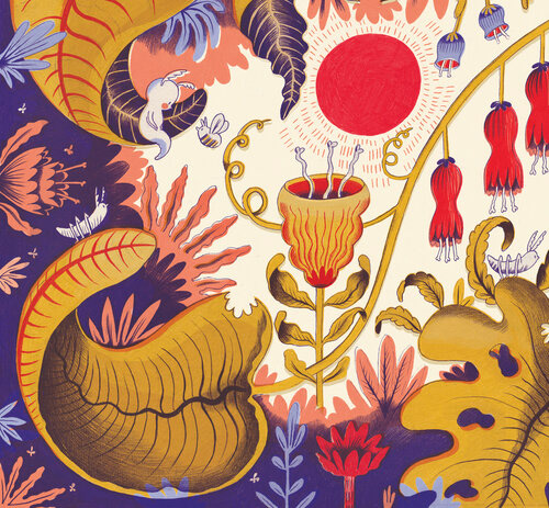
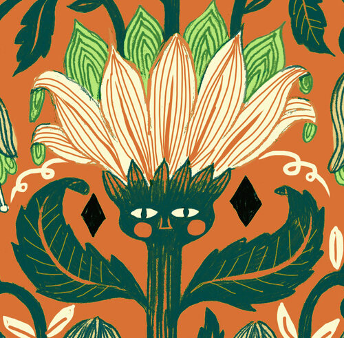
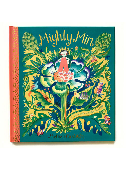
I also looked at illustrator Melissa Castrillon, who creates beautiful compositions that feature a wide array of plants. I love all of the textures in her work, but especially the way she uses the shapes of the plants to frame her piece and to highlight the characters in her work.
She uses cheerful colours while having quite a restrained pallette which makes her compositions seem even more balanced.
MELISSA CASTRILLON
https://www.melissacastrillon.co.uk/
When coming up with the sketches I wanted to do something quite fluid, with curved lines as opposed to something rigid that might make people more tense. I wanted the art to flow out of the border of the canvas, so the landscape isn’t confined by the sides of the paper, so the viewer could imagine it extending beyond the space they are in, hopefully creating an immersive piece that can transport the viewer into a more peaceful space.
Although I do want the picture to have some detail, to give people something more elaborate that can hold their attention for longer, since the piece is quite small relative to the space that it’s in, I also have to focus on making clear shapes that can pop from a further distance. To address this, I am planning to have some bigger leaves in the foreground that frame the picture and that also act as an eye-resting spot in the picture, with more detailed flora in the back that offers the viewer more to look at upon closer inspection. The frontal leaves could also give the viewer a sense of comfort by creating a private and secure space.
Moreover, to make the piece feel more lively I wanted to add an animal to make the image have more storytelling potential. I think having some sort of character in the picture can create a vague narrative that the viewer can participate in (for example: how did the animal get there, what are they going to do next), making the illustration more engaging. I initially wanted the animal in question to be a small feline like an ocelot or a margay as since it’s more similar to cats it can bring comfort to the viewer, however, since a feline might also be considered too scary for some patients, I also included a frog version. I intended to not have the animals be the most noticeable part of the artwork so that they can provide a bit of excitement when they are spotted at a second glance.
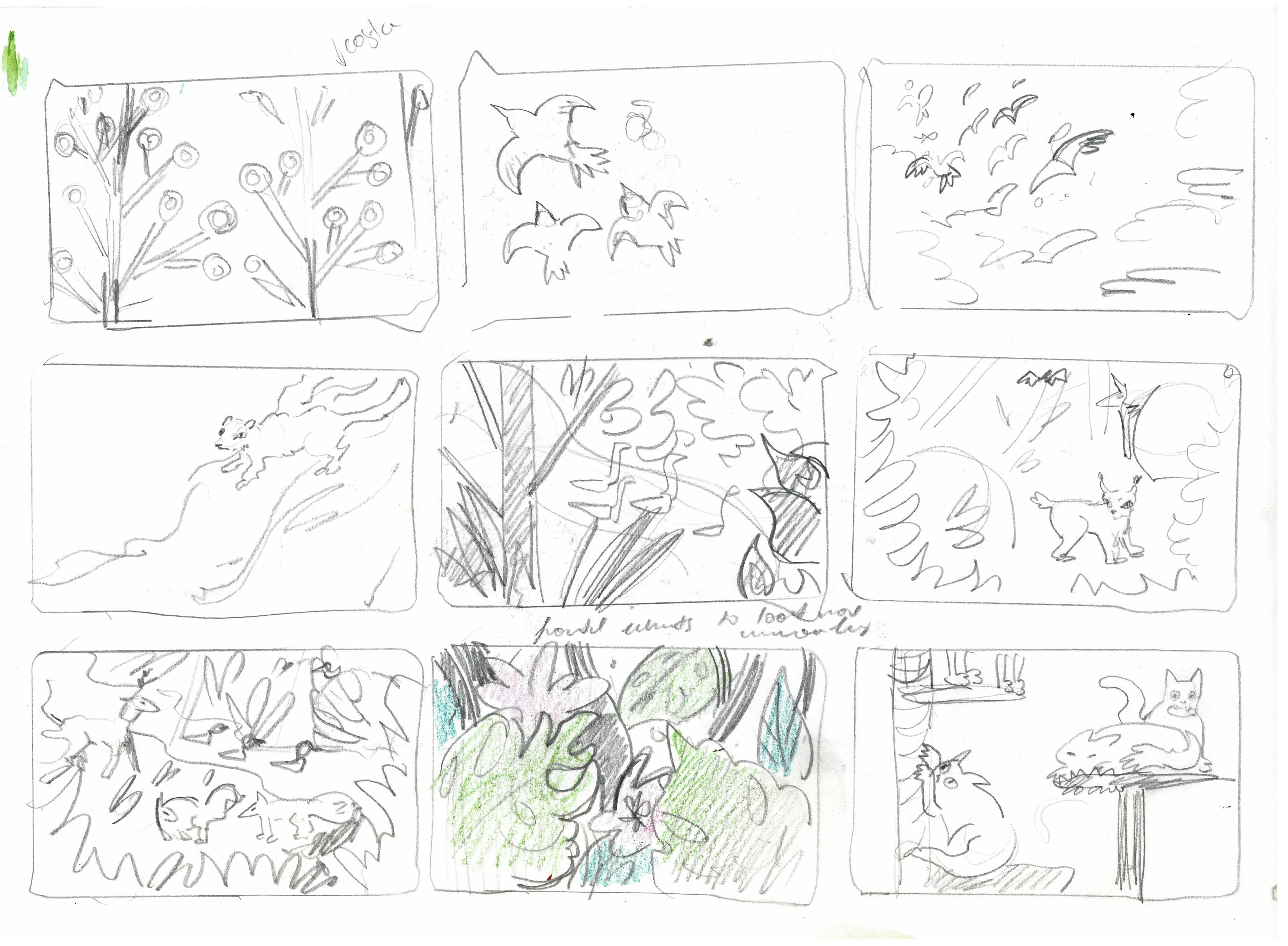
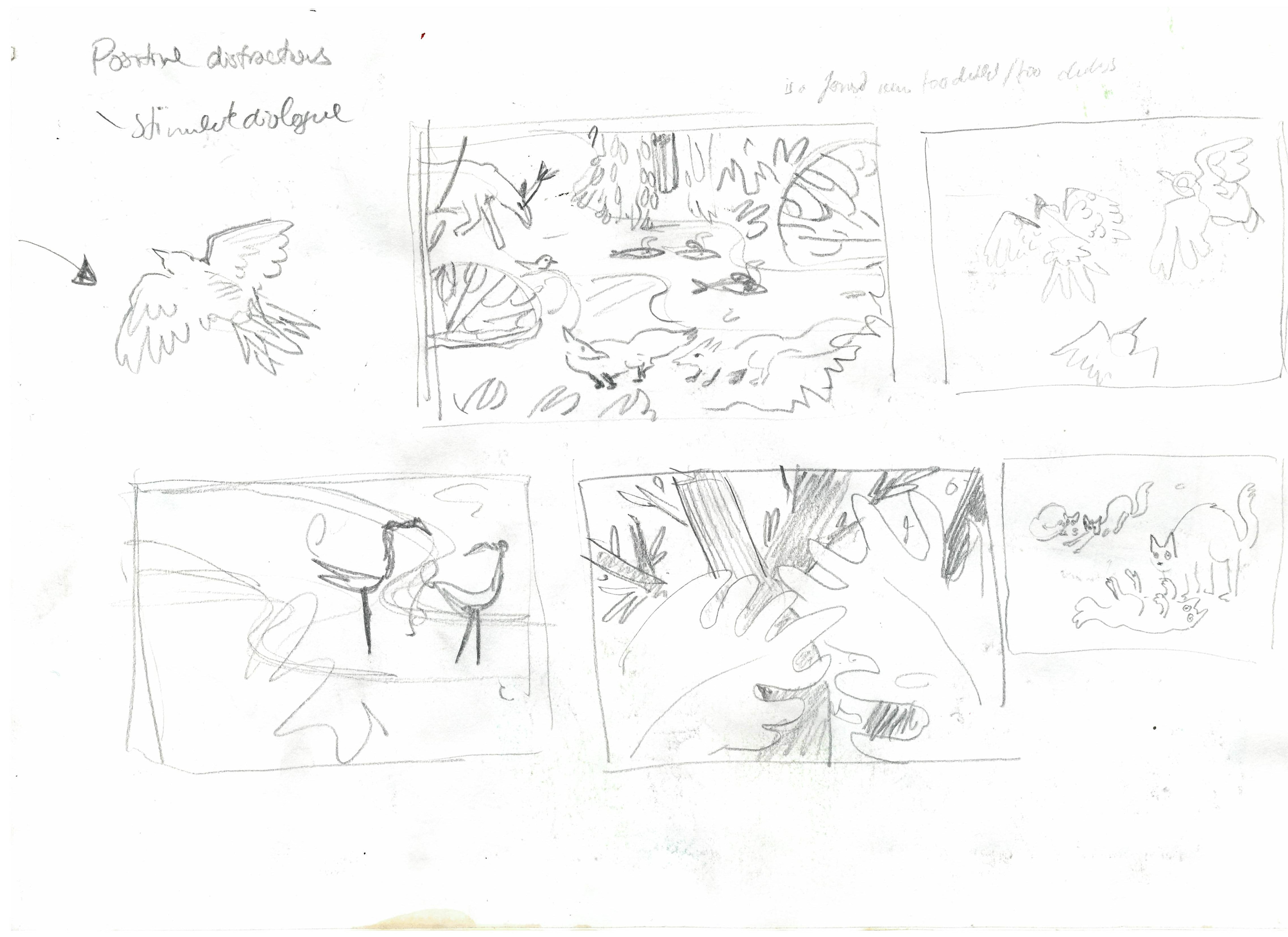
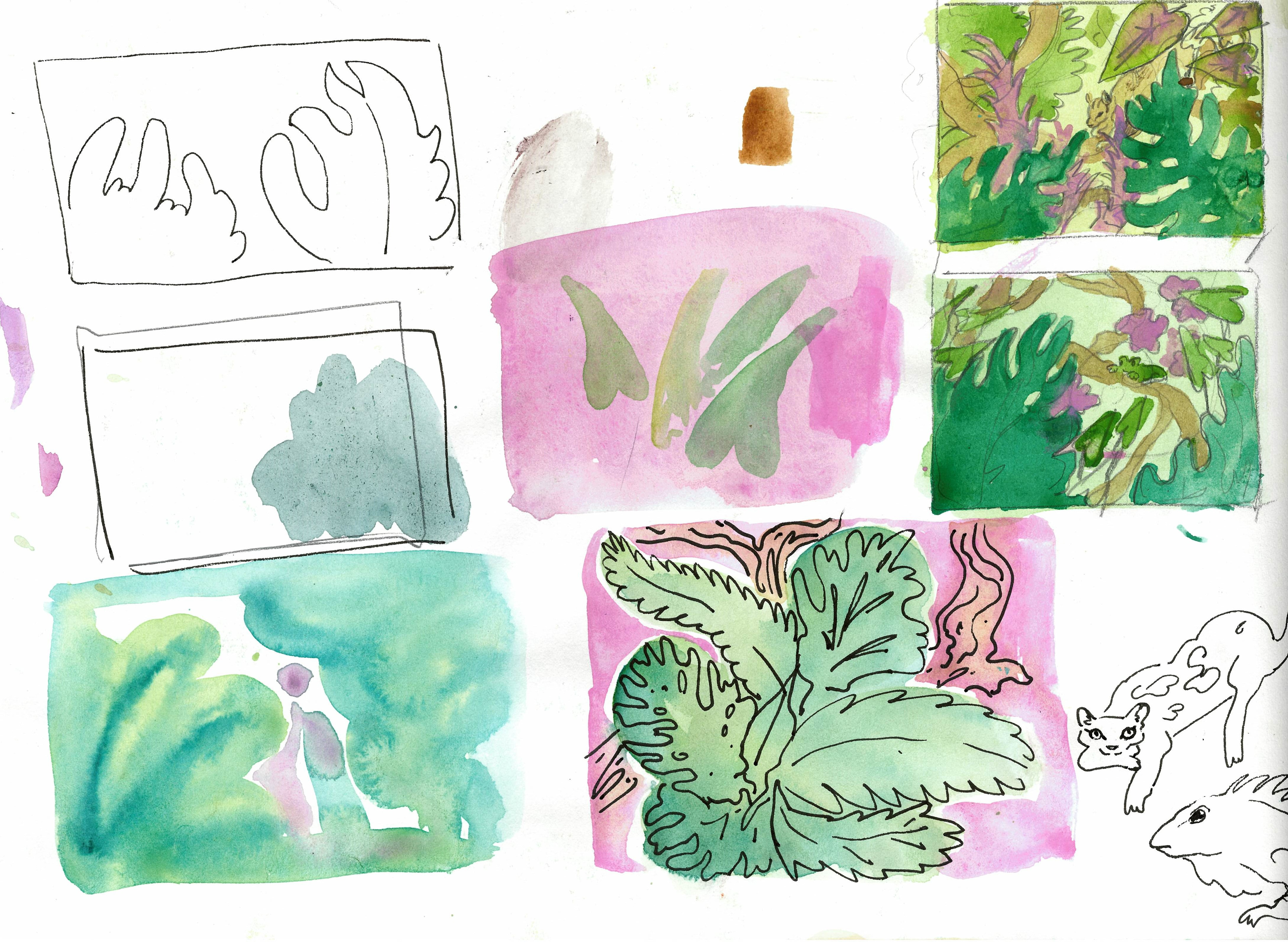
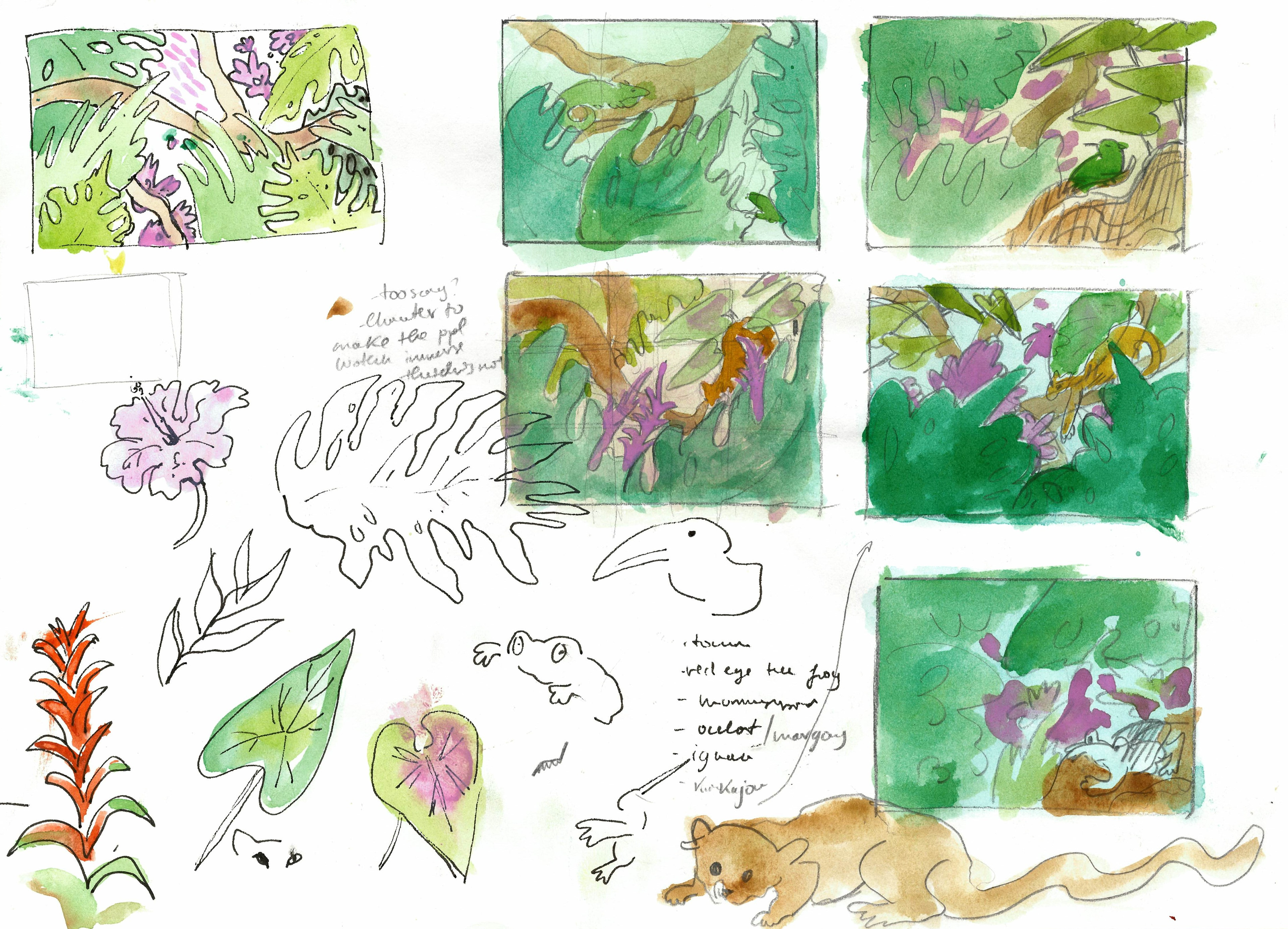
When submitting the sketches, I made sure to provide work that is on a bigger scale and clear enough for the people choosing them to understand what I am going for.
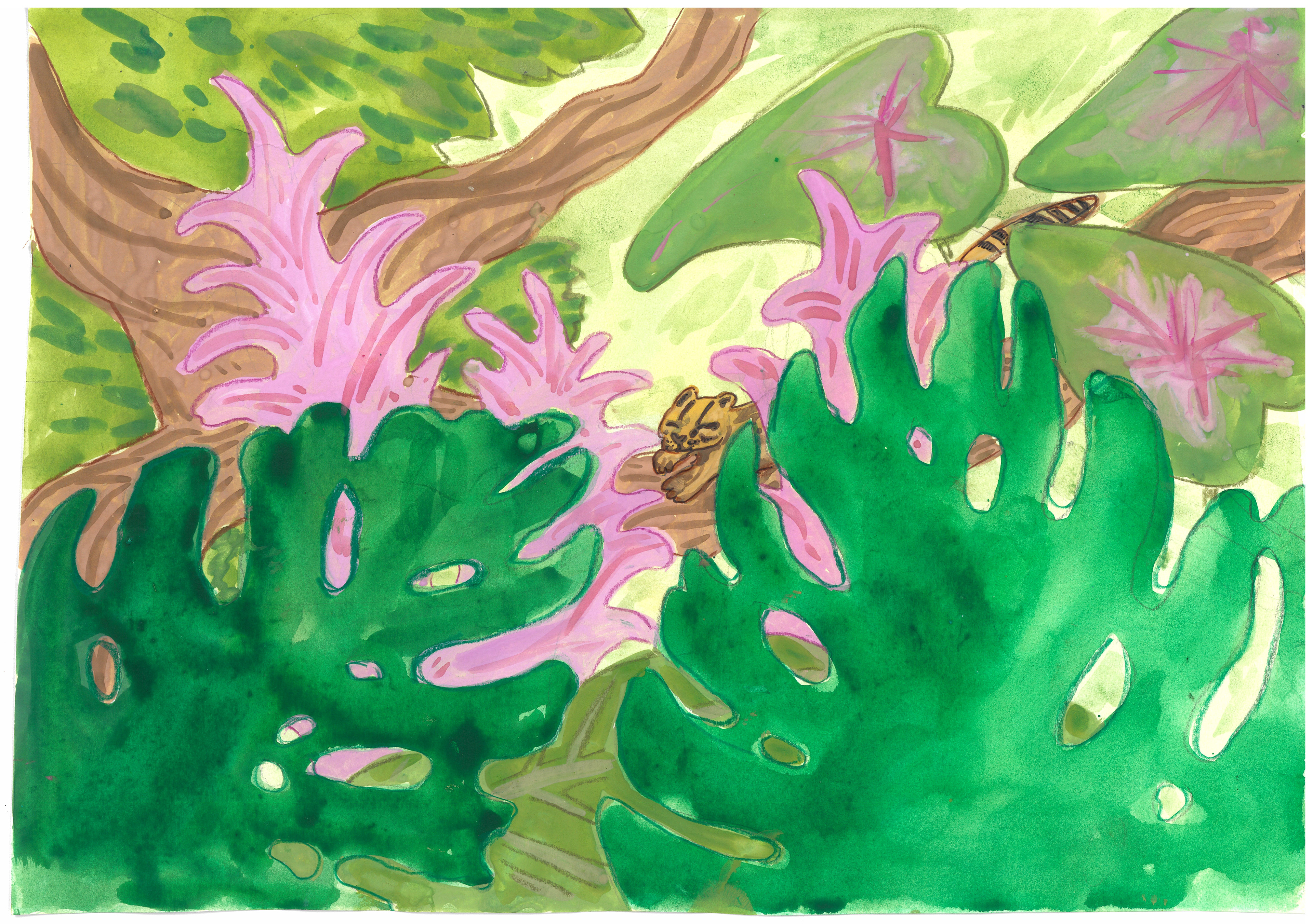
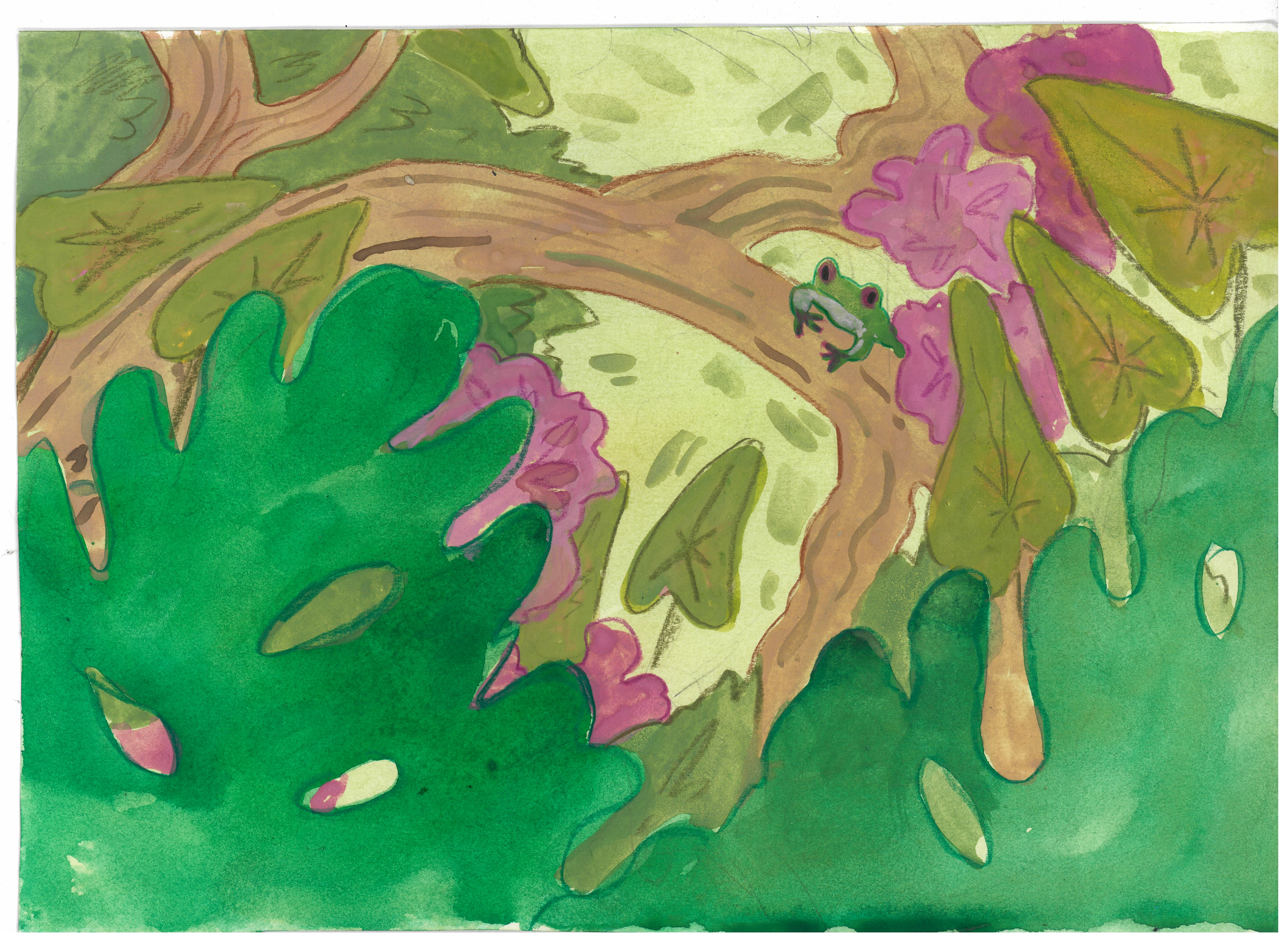
I was asked to take the animals out of the images since they were considered too child oriented. When submitting I thought that this could happen, however, I believed that the wild animals could be considered threatening in some ways, especially the feline as they lurk behind the leaves, so it was interesting to see that they viewed them as too childish.
This made me realise that it's important to consider all members of an audience when designing for a public space. From now on, I will think more about the tone of my illustrations and try to design something more universal.
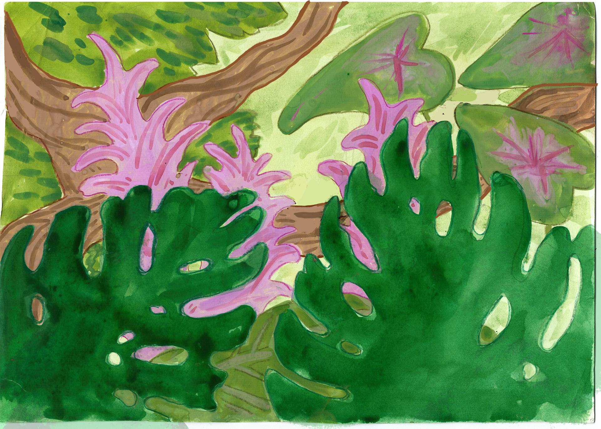
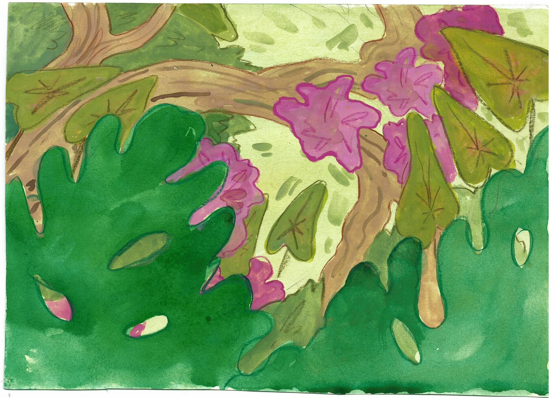
Since my original painted sketches are quite messy, for the final piece I decided to try experimenting with screen printing, which would enable me to have cleaner lines while also keeping maintaining the texture of the paper and paint. Moreover, especially after removing the animals, I felt that the illustration was a relatively uninteresting, and when I feel that way about my work, I usually try to do something new or something that I usually would not do. This usually forces me to produce more interesting work because of the challenges that I have to navigate while working with an unknown medium, while also being a good learning opportunity for myself.
Right away, I knew that there would be some problems with doing screen-printing since I wanted to keep the budget low meaning that I chose to only have two masters\colours, even though I the original sketches have more colours. One way I tried to combat the lack of colours was by printing on different colour paper to see what happens, as well as including some hand-painted elements (branch) and thinning down the paint to be able to see the colours underneath.
I accepted to do this brief early in the academic year, but the clients postponed it by quite a few weeks, meaning that, at this point, this project was overlapped with a few others, as well as over break ( when I could not print). Because of this, it meant that I had very little time to print the images, so I could not participate in another induction to remind me of how everything works.
Thus, I went into printing feeling really nervous and underconfident. Although the process should not have been very difficult, I started second guessing every move I made, which resulted in me making some pretty major mistakes, such as the green paint not going through the stencil, and then seeping through or smearing in places that it should not have because of how I pushed it.
I could have gone and tried doing it again after break, but it would have meant delaying making the final piece. Furthermore, after this experience I did not want to go back to the print room for this piece.
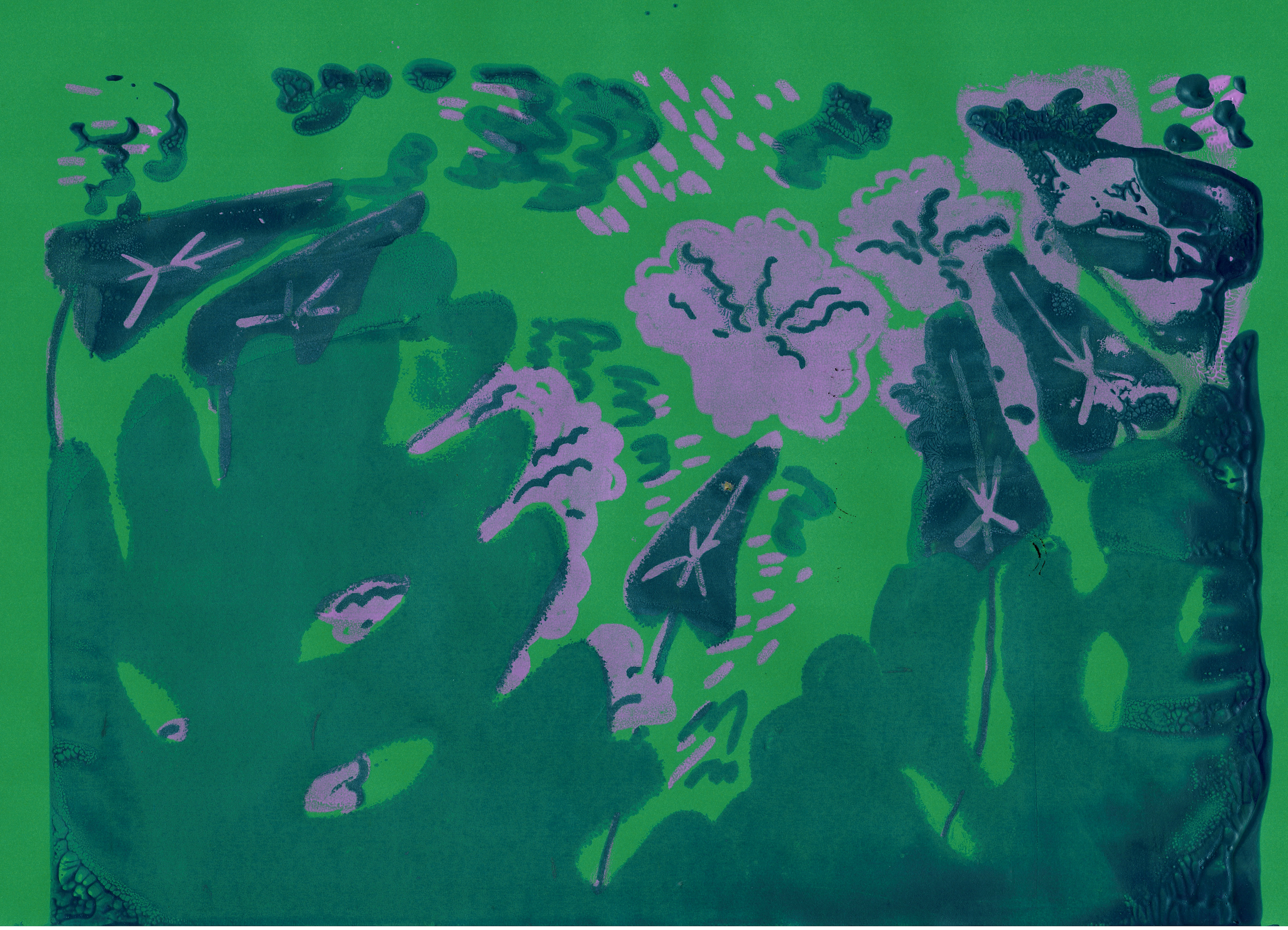
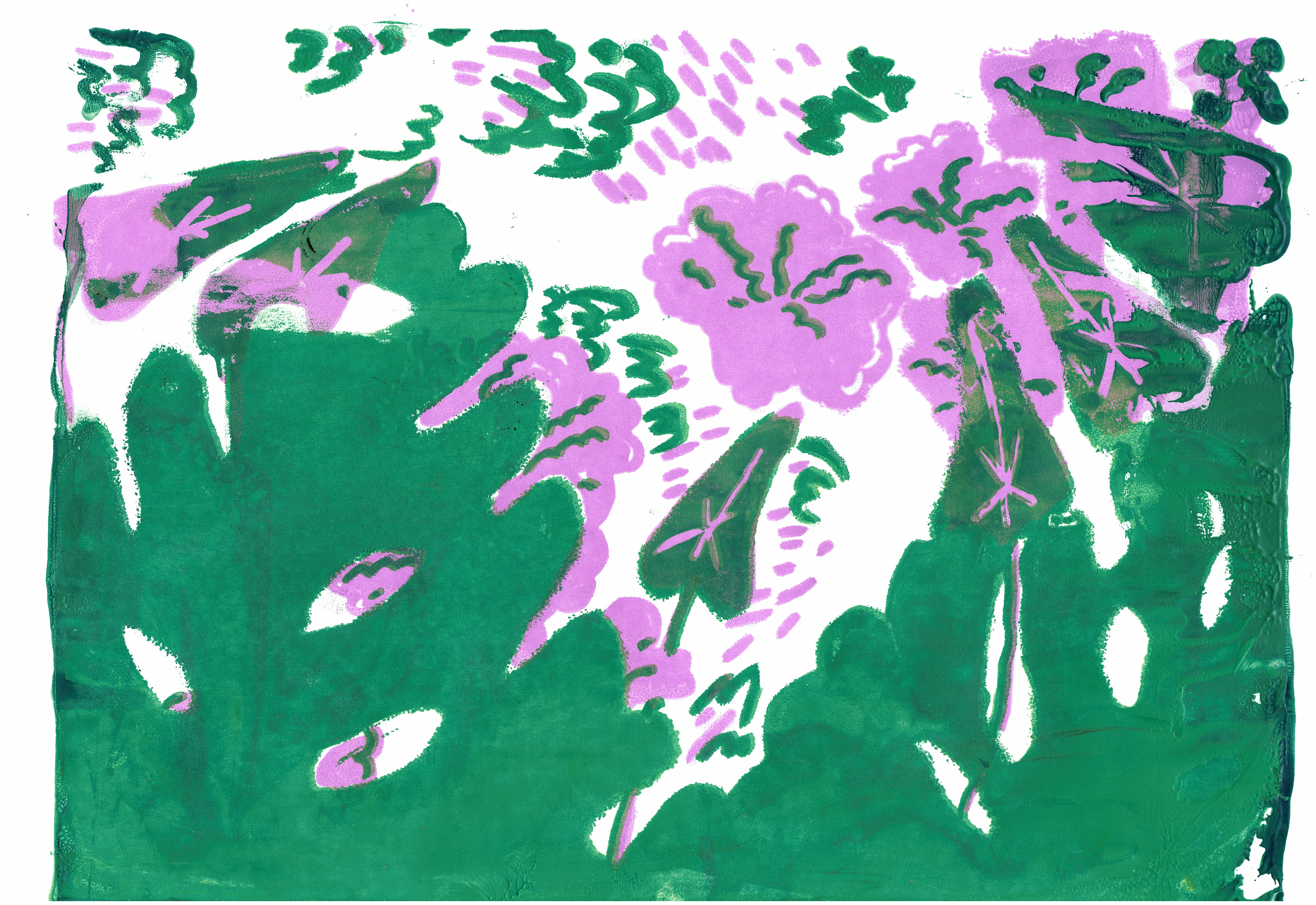
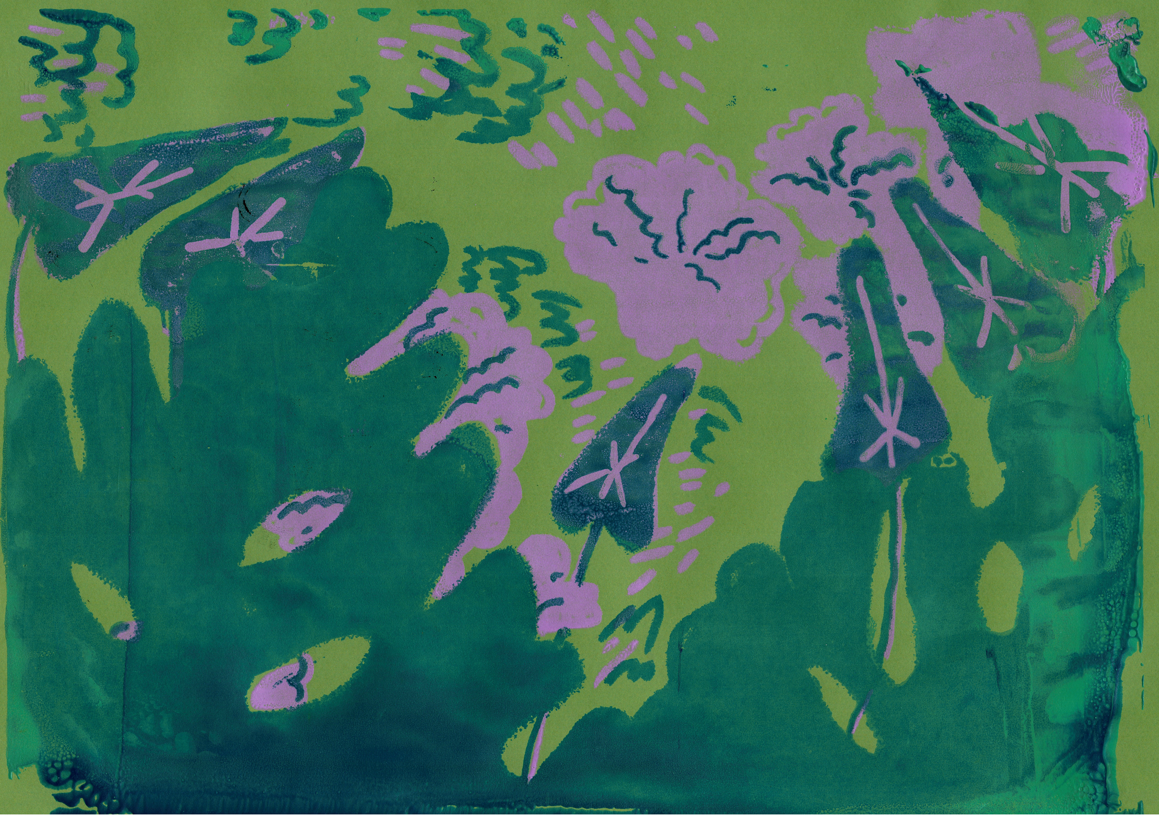
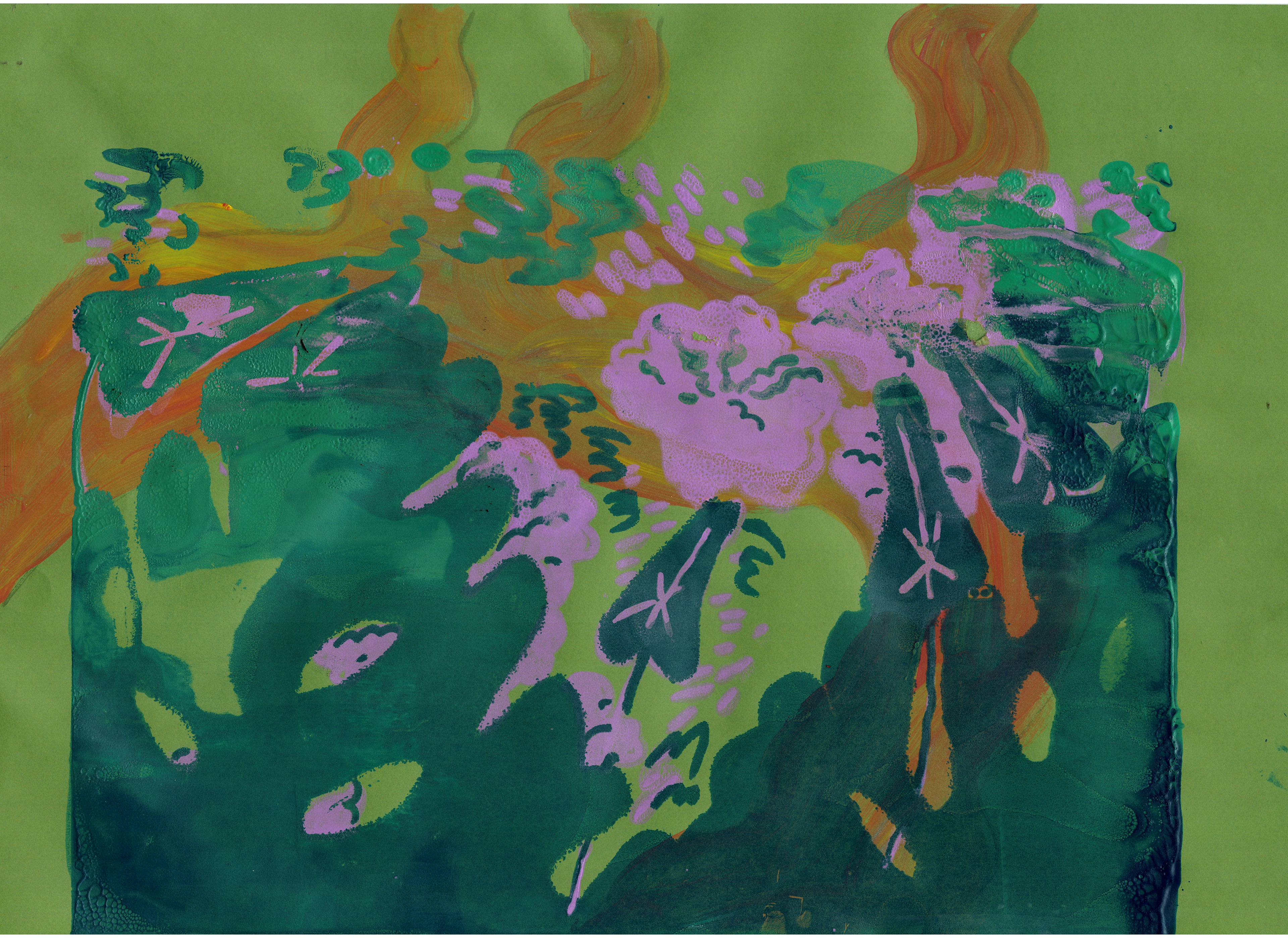
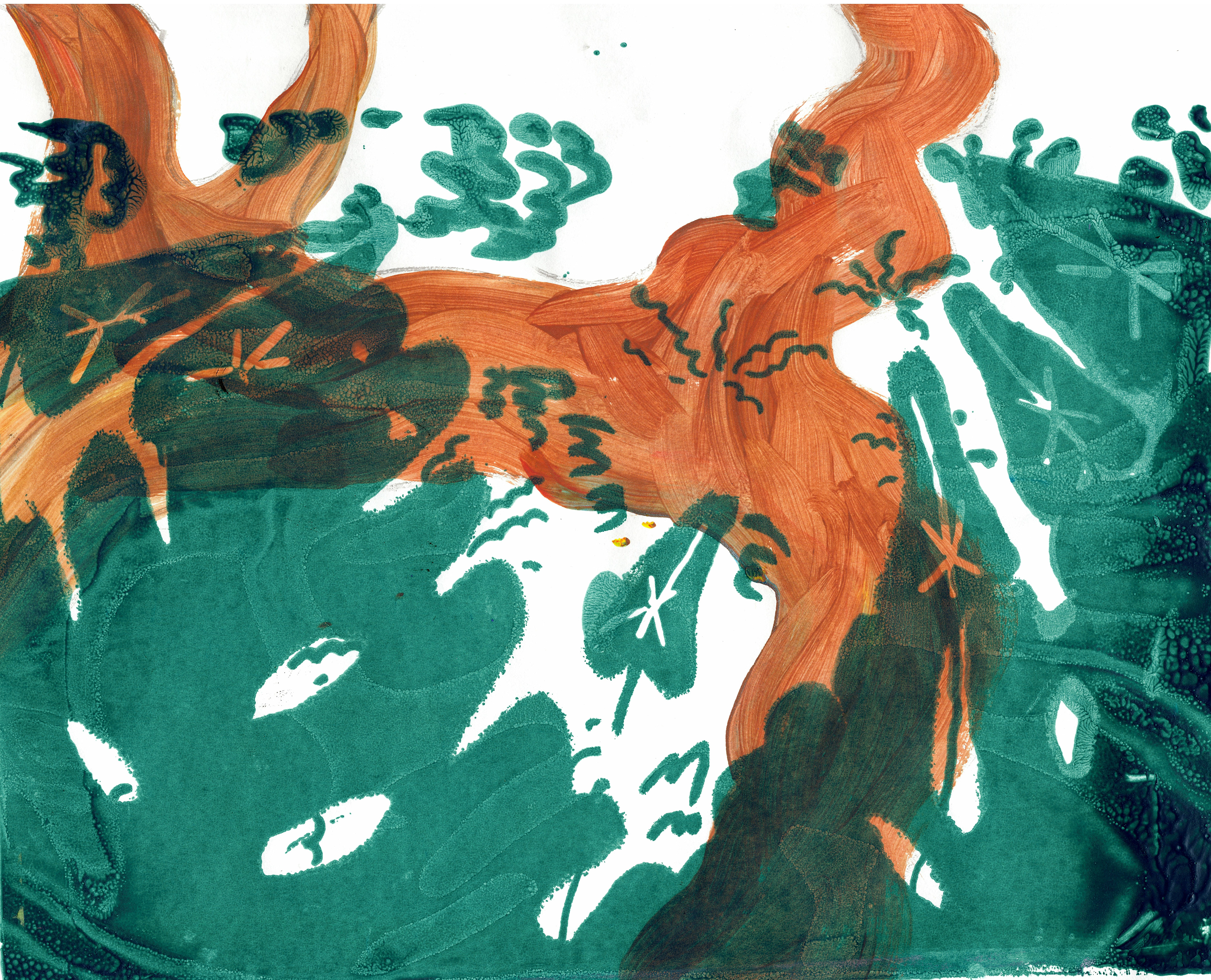
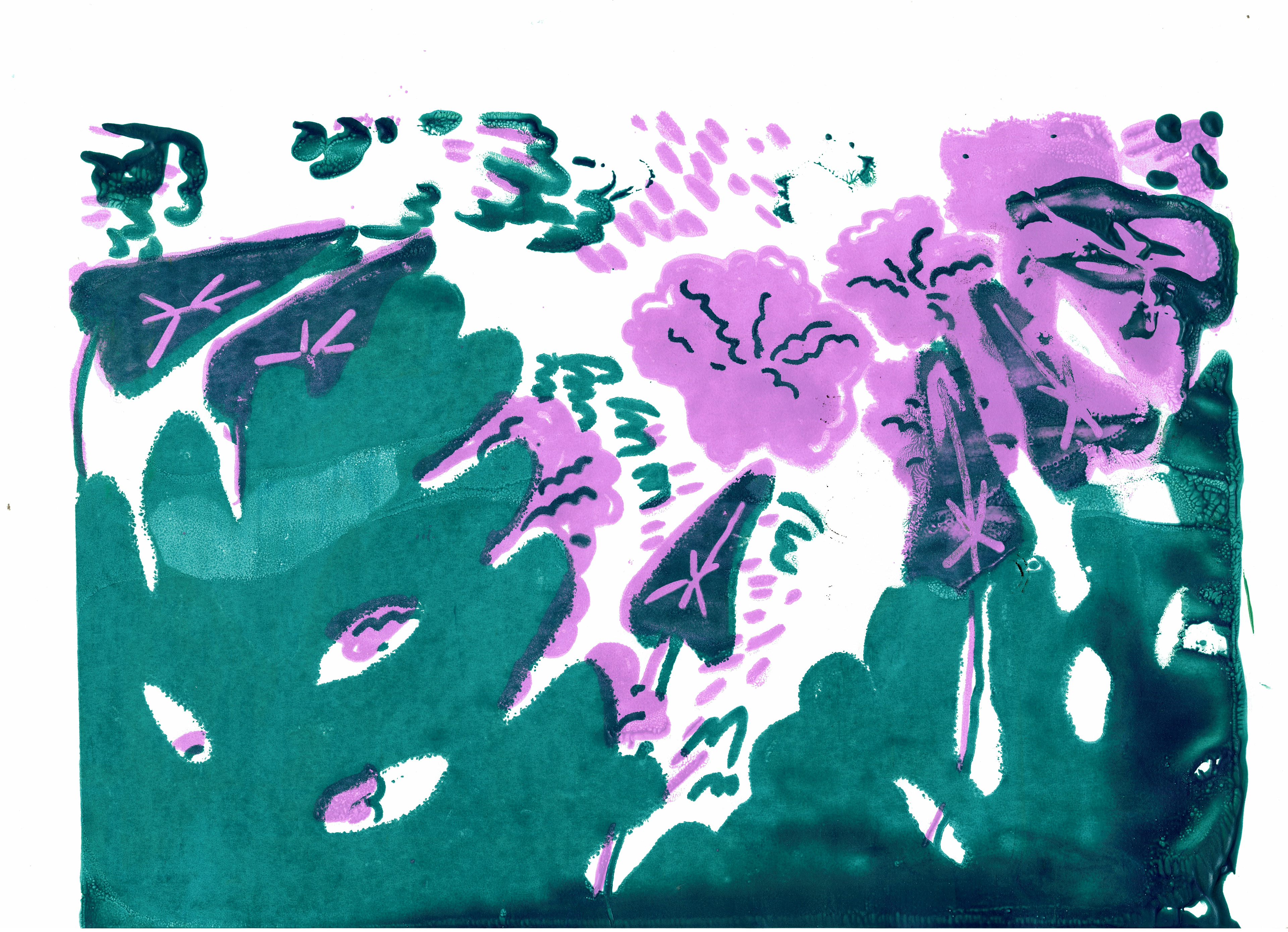
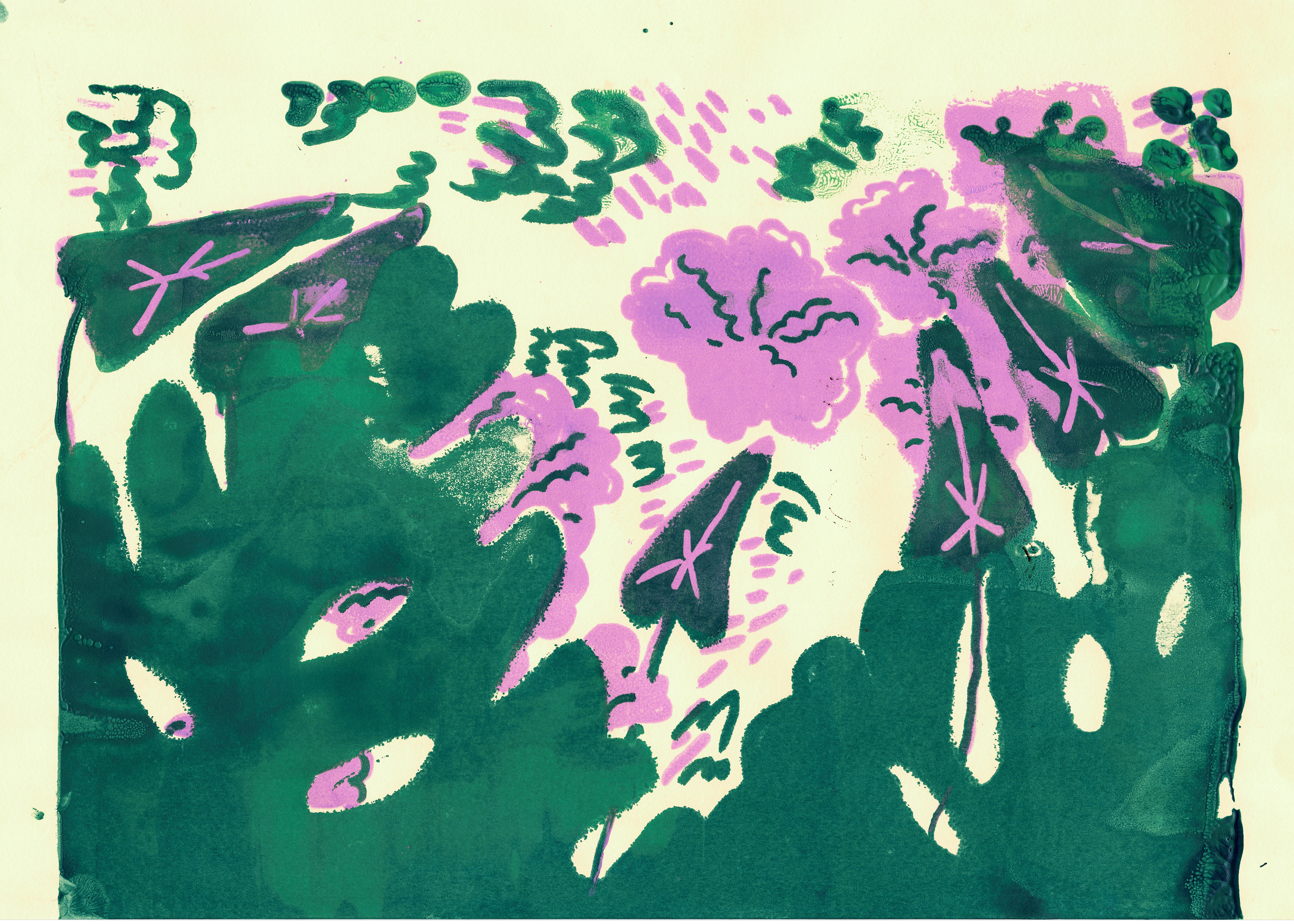
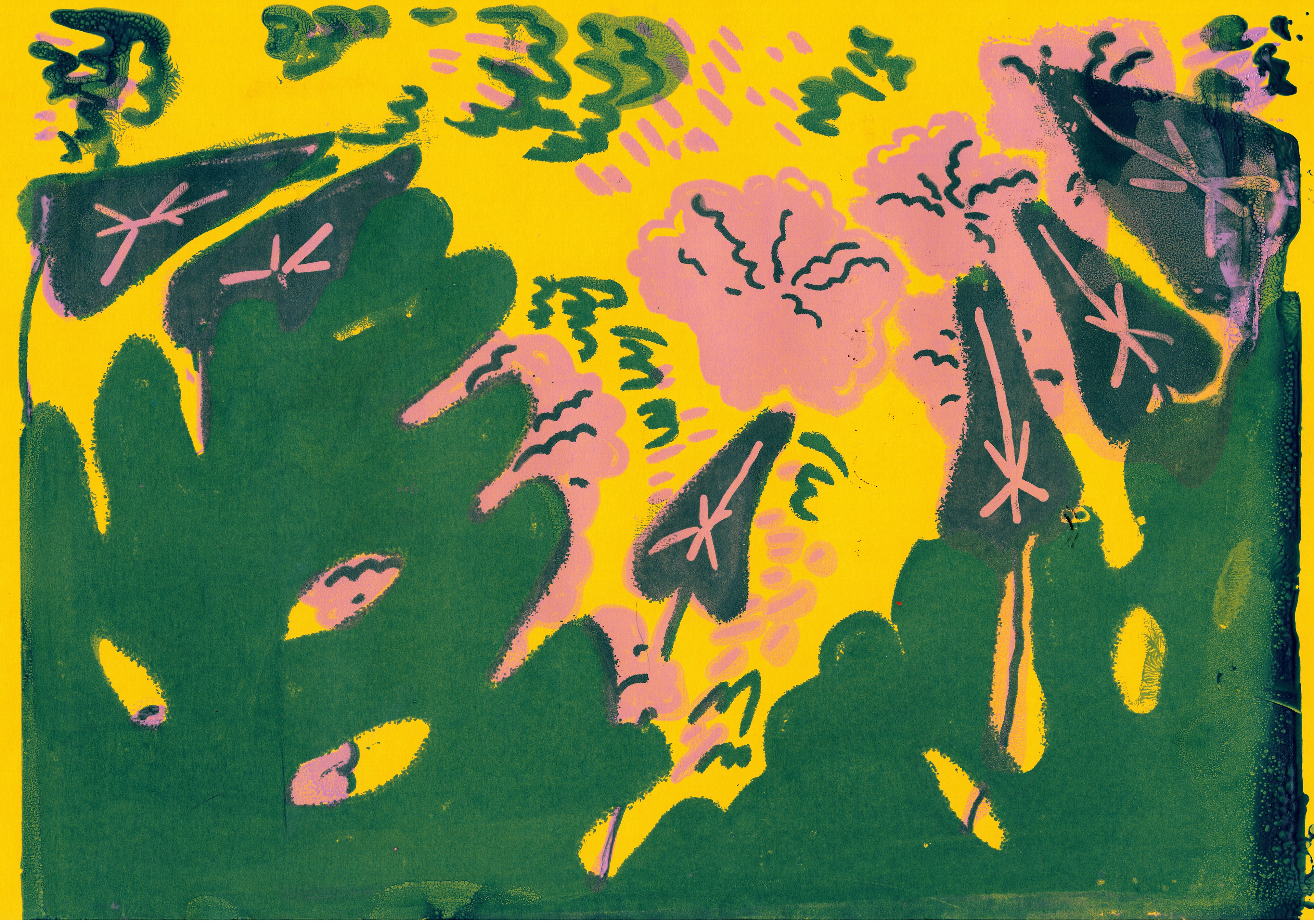
I decided to not scrap the prints since I still liked the look of the textures, but to digitally cut out pieces from the ones that don't look so bad and collage them together.
This meant that the whole process took longer than I expected, and, although I normally would have been able to finish in the time frame given, it ended up overlapping with our 'live brief' presentations.
This meant that I felt rushed while developing the final piece. Moreover, after everything that went down, I was already feeling underconfident in it, so I took even more time simply because I kept going back to try and fix issues that were not really there. Since I took some much time on it, I ended up not liking the final piece all that much, since it feels overworked and messier than I would have wanted.
I do not regret trying screen-printing since I think it's great to familiarise myself with new methods of creating while I am still in university even if they might go badly, I chose a bad time to try it out since it was in such a busy time of the year. It was also not necessary to include them in the final piece, since, even though I think they add a nice look to it, I don't believe the people that offered us this brief cared that much about that.
I feel like I ended up overworking myself in an already busy time, especially in relation to their expectations, (they would have most likely been fine with a simple and flat illustration). I wanted to create something that I am also satisfied with and that I can learn through, but I ended up overcomplicating the whole project and having to rush to complete it.
In the future, I will prioritise achieving what the client expects before going on to try and create an illustration that I personally am satisfied with.
Also, from now on, especially when doing commissioned work, I will first focus on achieving the basis of what is expected of me, and only try to experiment if I definitely know that I have the necessary time for that, especially if I want to try working with an unfamiliar medium.
I preferred the look of the first image, with just the shapes, but I decided to add some darker lines since I feel like a crisper look would be preferred by the clients considering the size of the space that it will be situated in.
Overall, I think taking this brief on provided a good opportunity for me to practice a lot of skills necessary for commissioned work, which proved helpful later on during the live brief.
Over the course of this brief, I practiced communicating with someone from a professional art environment, while also getting better at time management and handling multiple different projects at once. I also learned that for a smoother and more efficient process, I should prioritise the wants of the commissioner and meet the requirements of the brief instead of overly focusing on providing work that I am personally happy with when they might not have the same idea of good work that I do.
